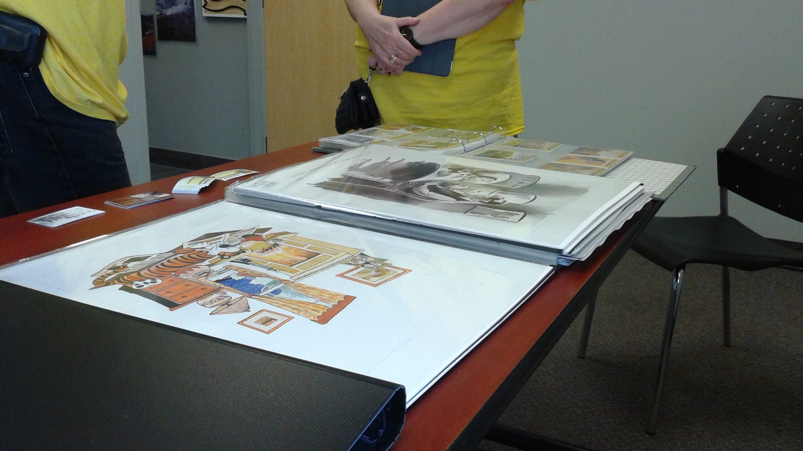
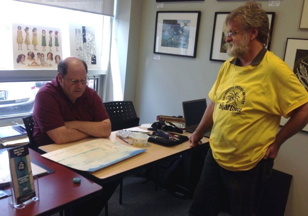
I joined Big Art Buzz, an artist’s collective for people across Ontario, in 2015. Besides having my work posted on the core website and its social media affiliates, I also enjoy the opportunity to display pieces in person at various events and to conduct demos. Here are some pictures from events that took place in recent years. The first images include pictures of the art work. The last two have me at my table with Keith Moreau, creator and organizer of Big Art Buzz, speaking with visitors. (I can say there’s somewhat less of me now than when those pictures were taken.) You can visit the site at www.bigartbuzz.com. Visit also the Big Art Buzz channel on YouTube. There is also the work of Keith Moreau on YouTube, which if you click on his name in this article you can see.
A collection images from one of our shows at UNIFOR’s Canada Pavilion during an annual festival of world cultures in Brampton.
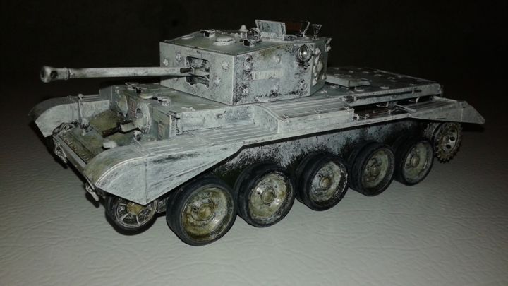
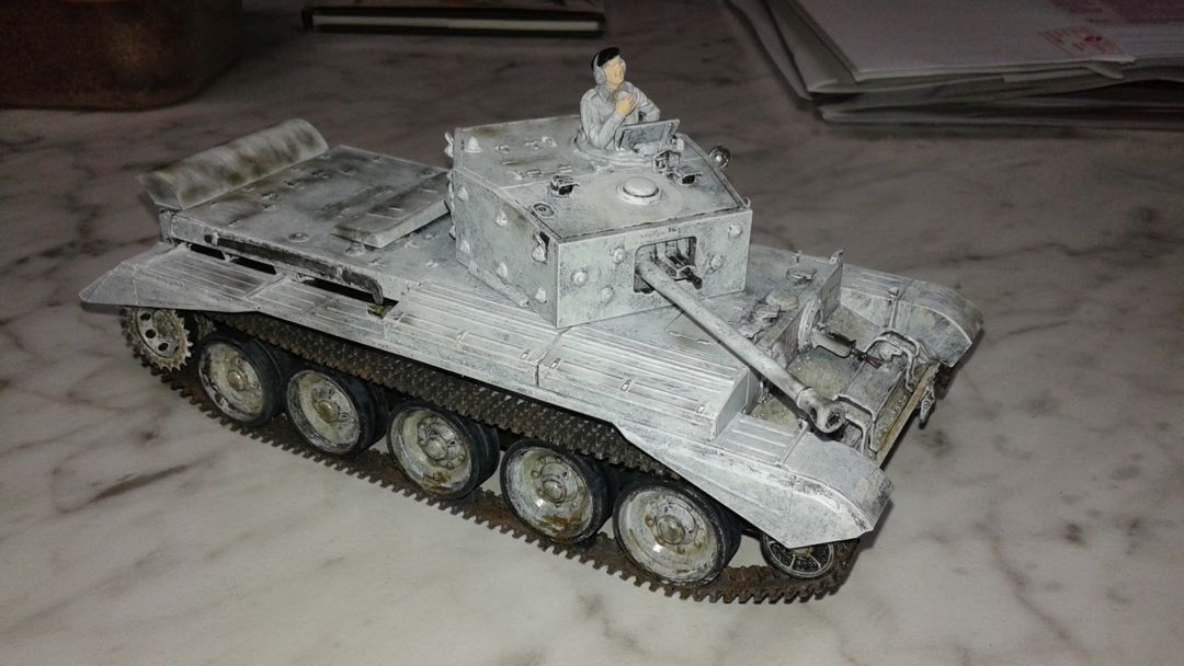
The Cromwell tank was very active in Northwestern Europe from D-Day to the end of the war in 1945. Whatever weaknesses it had against German armour like the Tiger, Panther and King Tiger, the Cromwell acquitted itself well as a cruiser tank, using a relatively low profile, good speed and a gun that could match most of what the enemy could throw at it- save for the vehicles mentioned above and the dreaded 88mm field gun.
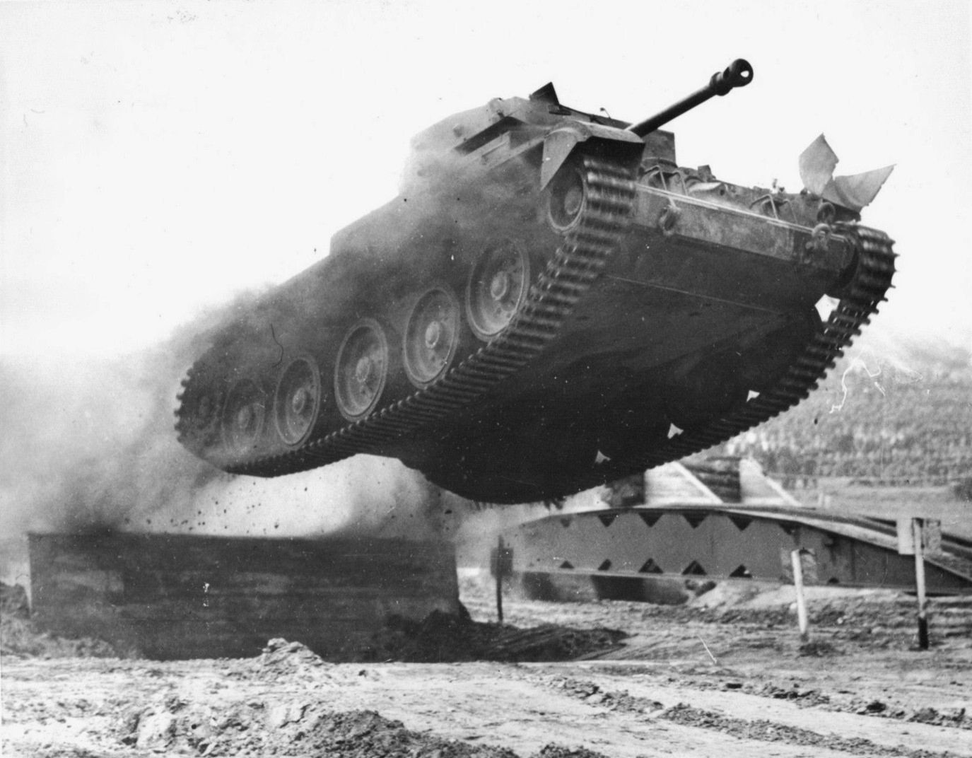
And… it could fly!
This is a famous image from the war of a Cromwell taking off from a ramp during trials. It’s posted all over the internet, but if someone could give me the source information, I would like to give it a proper citation. The aerodynamic properties of the Cromwell were demonstrated in the Netherlands in 1944 when three of these machines jumped a Dutch canal to escape enemy fire. The canal was later measured to be over 20 feet wide. For a full account, read TROOP LEADER: A Tank Commander’s Story, by Bill Bellamy.
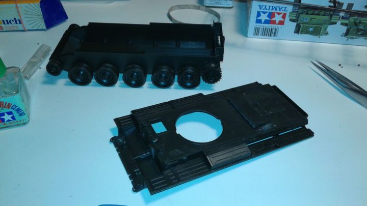
The kit I built was Tamiya’s 1/35 scale Cromwell, a decent model with easy to follow instructions and a great fit in the parts. I had never built a tank before and was nervous, considering the experience I had with the much smaller Austin K2Y ambulance covered in the last article. (Click here for link.) I needn’t have worried. Considering the build was happening during a stressful period in my life involving illness in the family, I found working on the Cromwell to be relaxing.
I built it in two parts- the hull base with the wheels and tracks and the top of the hull with the turret and assorted bits for engine exhaust, towing and such added on. The two halves were sprayed with a base coat of the colour the British were using on their armour at this stage in the war and then given a deliberately sloppy coat of white on top to simulate the winter camouflage that was often hastily applied in the field using a water based lime wash that wore off as the winter ground on. As the wash only went where brushes or mops could be used to slap it on, the finish was inconsistent at best. I then weathered the two halves before joining them, gunking them up with mud, simulated wetness from watery roads, grime and such to show this machine had seen its share of action.
Decals were really hard to apply in places and the fixative didn’t fix very well. Also, there was a problem with the heavy rivets in the turret making it difficult for some of the markings to sit properly on the surface. Decal solvents were of mixed success, so let’s say the whitewash I used served more than one purpose in a couple of places. I learned it was generally accepted to try and paint around unit markings for identification purposes, but best laid plans, etc. sometimes led to the big white star atop the turret being obliterated under a layer of whitewash.
I only hope I will get better with decals as time passes. Tamiya ones in particular do have some annoying habits about them, although the Airfix decals for the Katy also threw a few curves at me.
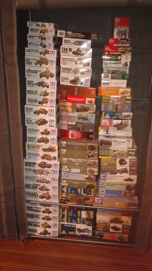
So, here is my Cromwell. It has made me a fan of armour, as witnessed by the vast collection that has found its way into my studio in the last couple of years.
The two halves with just the spray coating applied. They looked like pieces of an old Dinky Toy.
Test fitting the two halves. Weathering is started on the lower half of the hull. No tracks fitted yet.
The winter whitewash goes on along with weathering around the wheels.
the top of the hull. Some parts had to wait until I fitted together the whole tank before being attached, leading to a lot of back and forth in the instructions.
Another test fit, post weathering and prior to fitting the tracks and other details.
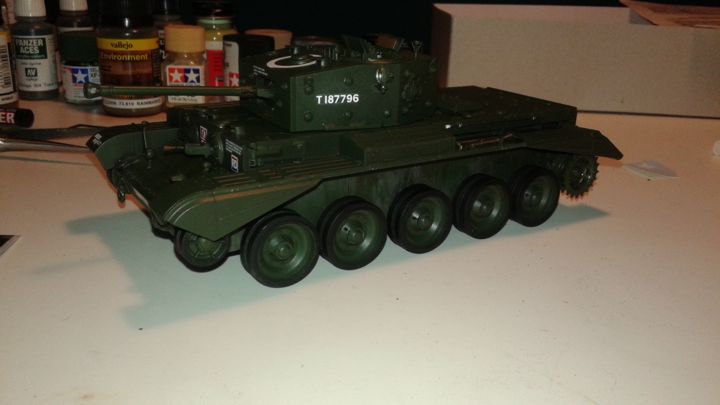
The completed Cromwell.
I glued the tracks to the tops of the wheels to get rid of that rubber band effect. I will have to create a diorama for it at some point, but for now the kitchen counter surface looks just wintry enough to work.
One down. Many more to go… except for ones recently donated to a museum for their gift shop.
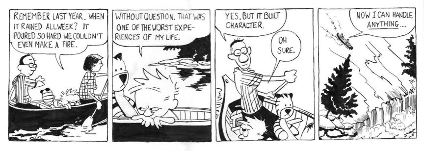
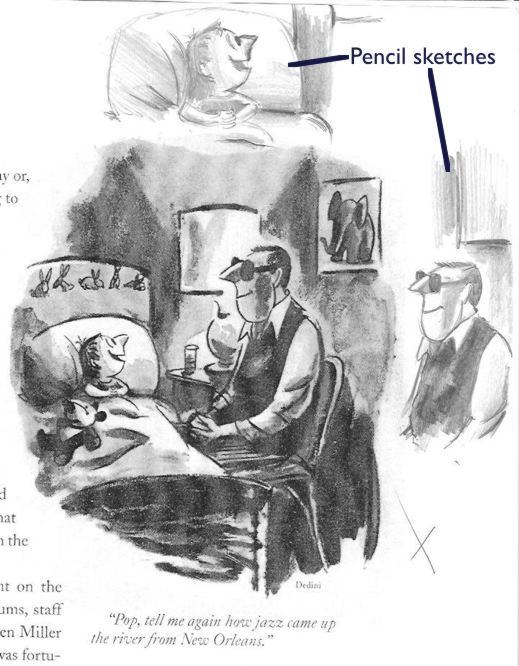
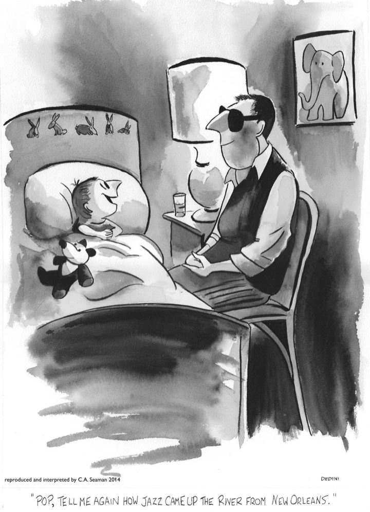
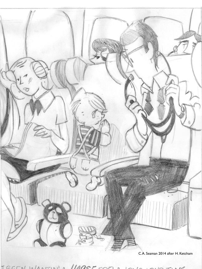
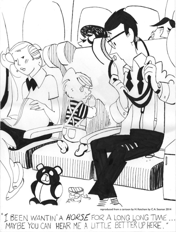
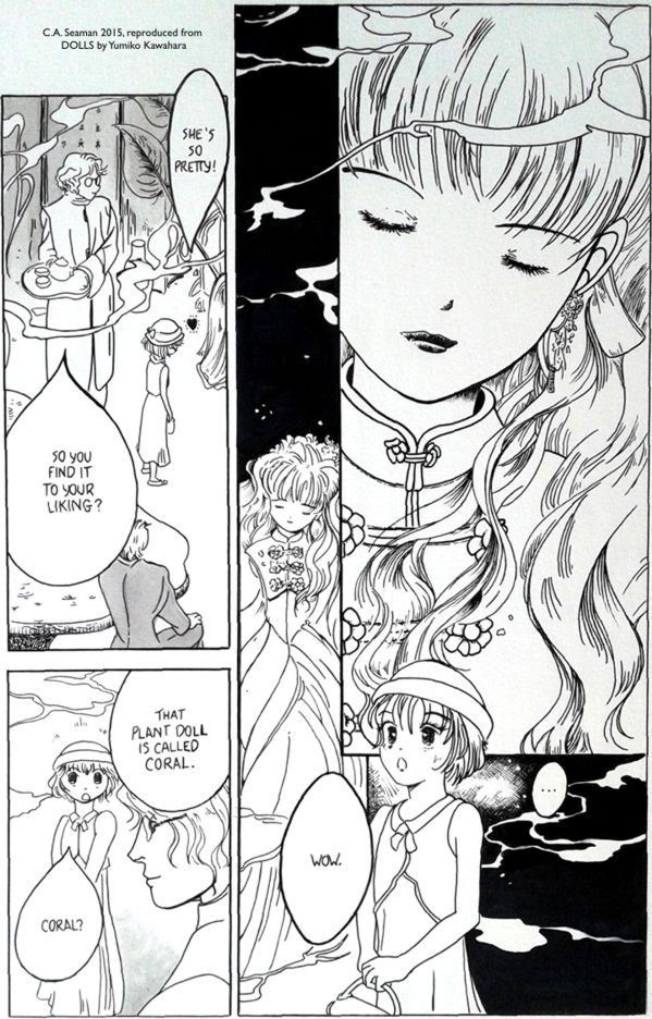
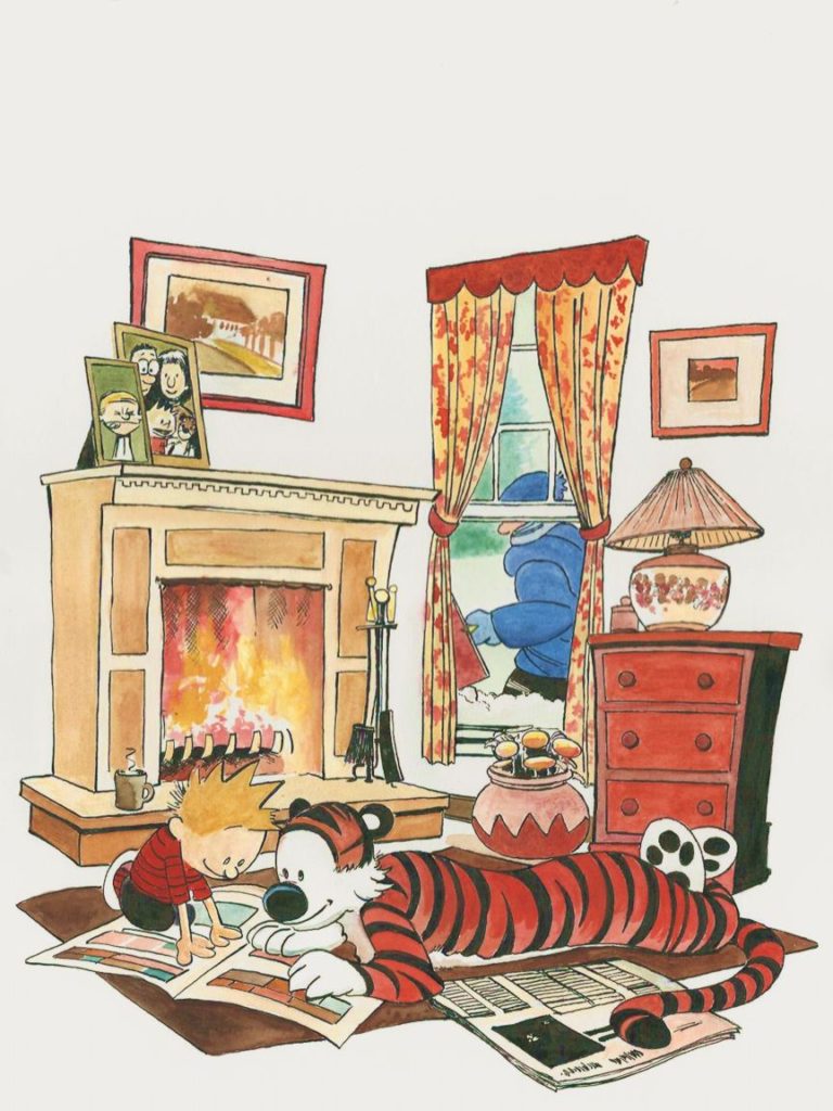
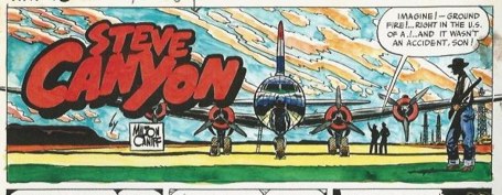
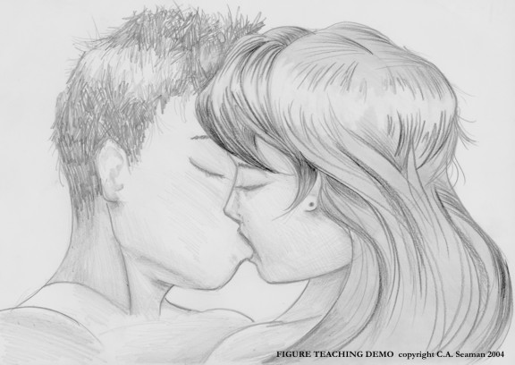
In my courses at George Brown, a valuable part of the instructive process involved reproducing panels from existing cartoons, comic strips and graphic novels. It was a great way to learn the techniques of others, test one’s observation skills, and through the use of comparable media, broaden one’s range in terms of drawing and painting. In one case, reproducing a comic strip had us taking the last panel- which had been blanked out- and creating our own ending for it. Cheating by looking up the original strip was not encouraged. Tracing wasn’t an option either. These exercises were meant to give us something like an atelier experience, where students can spend years copying from plasters and the works of the old masters before venturing out to create their own pieces from scratch. It worked for us. I remember one of the most unusual things I had to sort out was a foot belonging to Dennis the Menace. Hank Ketchum’s rendering of it was stylized, to say the least. In among the other elements, it was unremarkable. Once you looked at it on its own, it became something otherworldly and very strange.
The reproduction of a Calvin & Hobbes strip with my own take on the final panel.
The photocopy of the Dedini piece I chose, with sketches around the margins.
The final version.
My drawing of the Dennis the Menace panel.
Completed with inking.
A page reproduced from a manga. The only time I ever touched mange in the courses.
Calvin & Hobbes anthology cover reproduction.
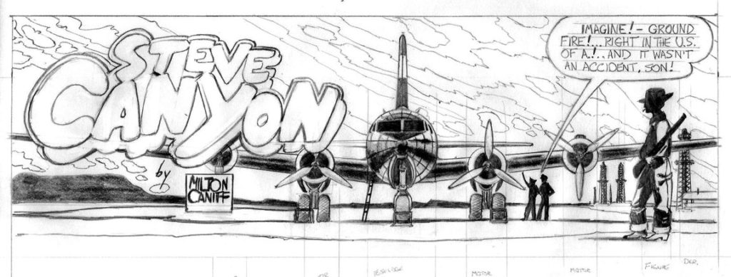
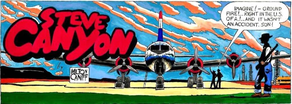
The original scan of Milt Caniff’s Steve Canyon piece
My drawing, using the placement of the engines on the DC-4 to scale the piece
My reproduction, done with pen and ink and gouache.
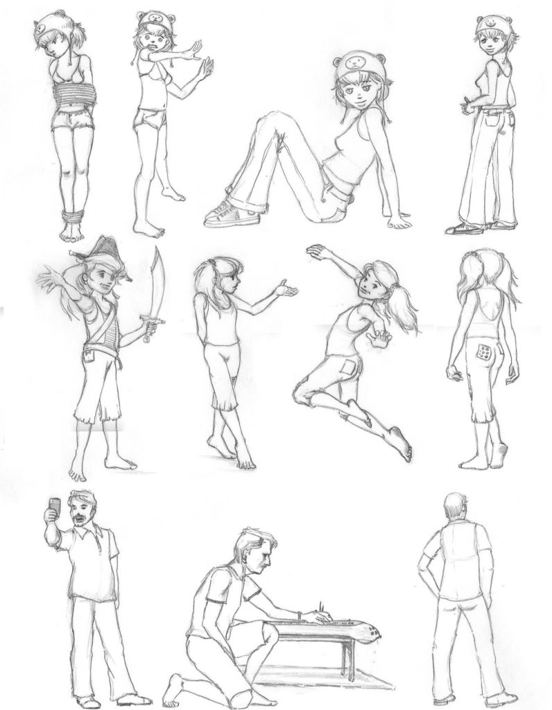
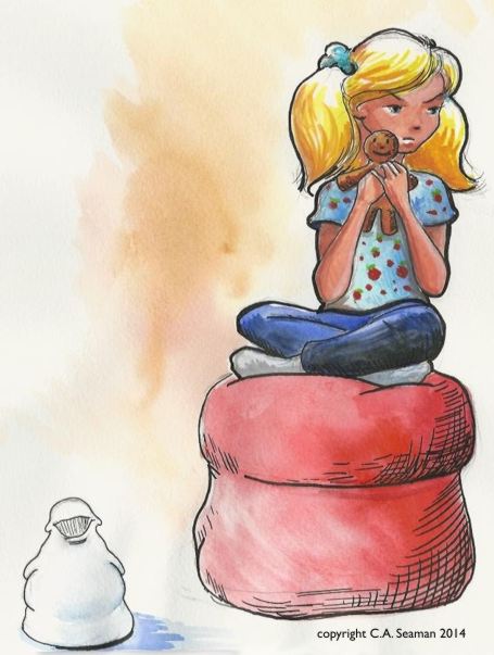
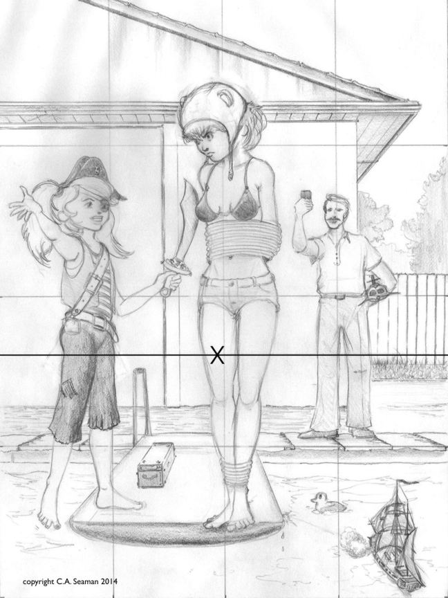
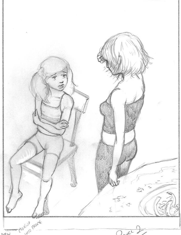
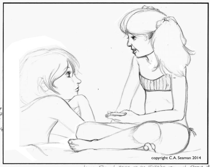
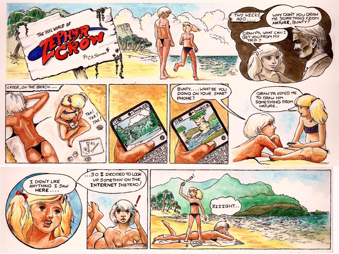
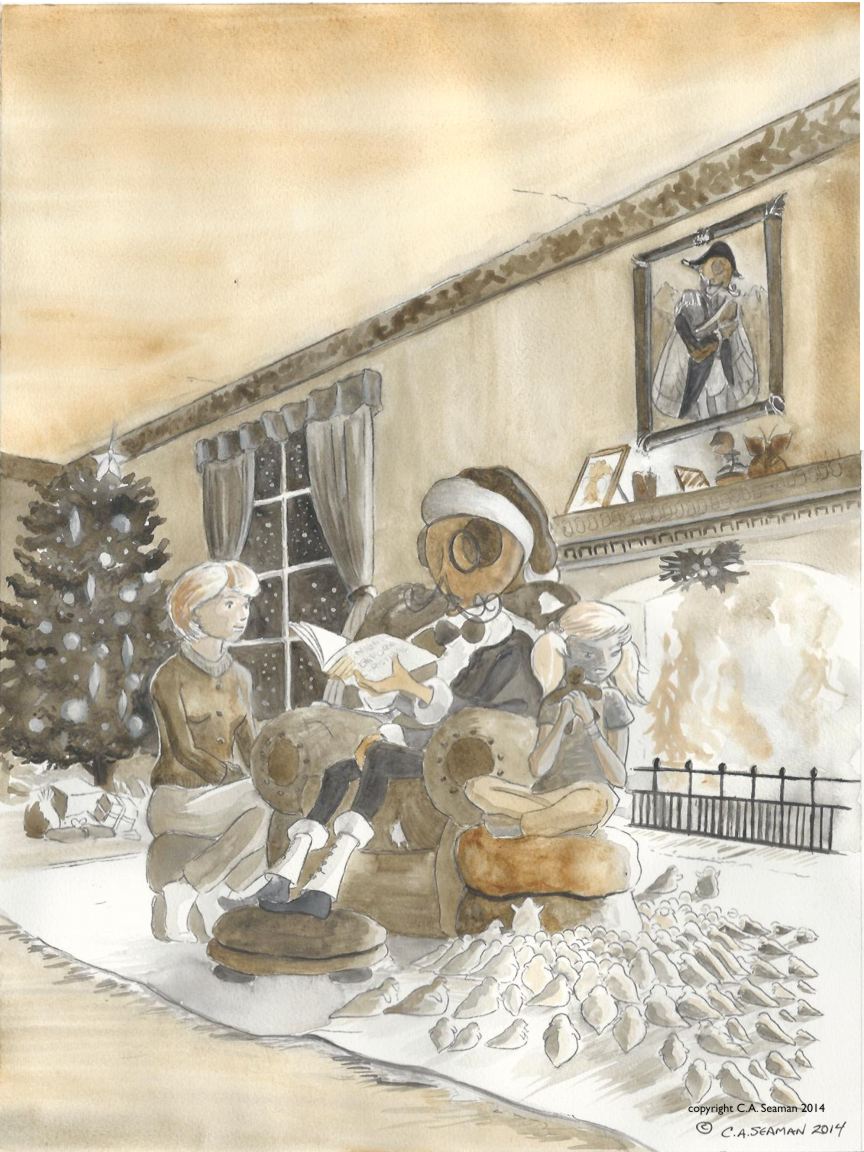
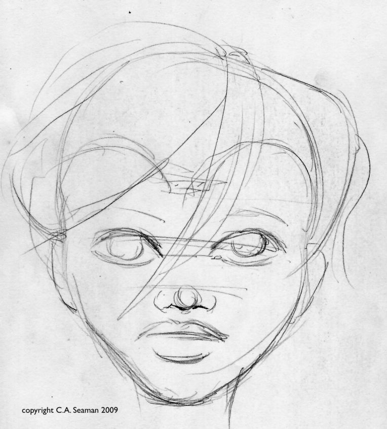
Zephyr Crow is a teenager living with her sister Bunty and her grandfather, Howard Elbee- a retired special effects movie magician from before the days of computers. Zephyr and Bunty’s divorced parents work separately overseas and have left the kids with the one relative they can trust. Howard, a widower, enjoys the company of his grand-daughters, and on the surface all seems relatively normal as they carry on from day to day.
Except for the fact that in Zephyr, Howard, and Bunty’s world normal is defined very differently from what one what imagine. Think Addams Family meets films about Hollywood…
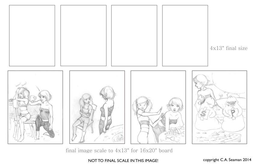
That’s all I am going to tell you because this project is slated for further development, but has been on hold for a while. It was originally developed for the second of the cartooning courses I took at George Brown College and, modified to fit the needs of this particular Cartooning course, took on some interesting dimensions. (To read about the first Cartooning course, refer to the post on Andi, the beach princess with a difference.) What follows is development work, character sketches and completed projects like a sample one panel image, two comic strips and a projected cover design for an imagined anthology. These were all assessed projects and were all hugely useful in developing skills for me in sequential art.
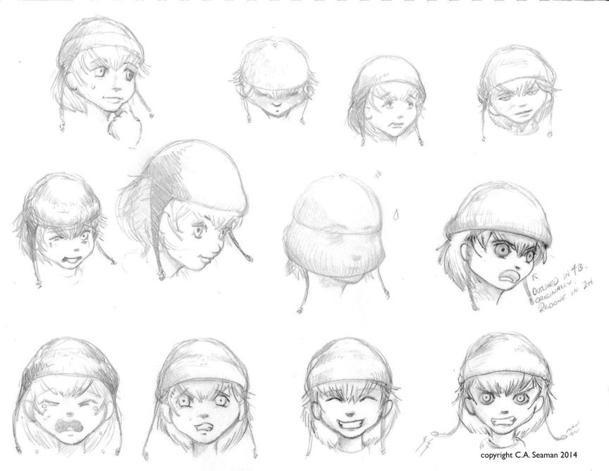
ZEPHYR, BUNTY & HOWARD
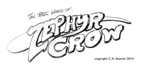
Drawing of proposed title logo
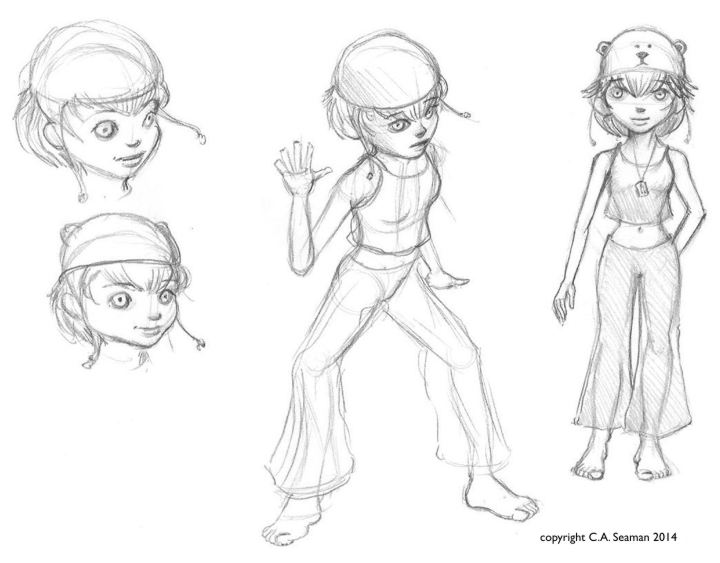
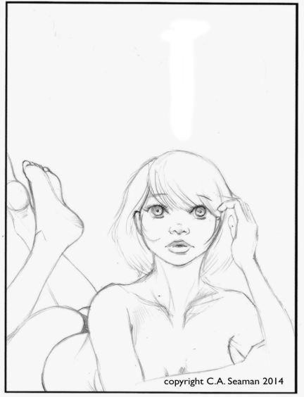
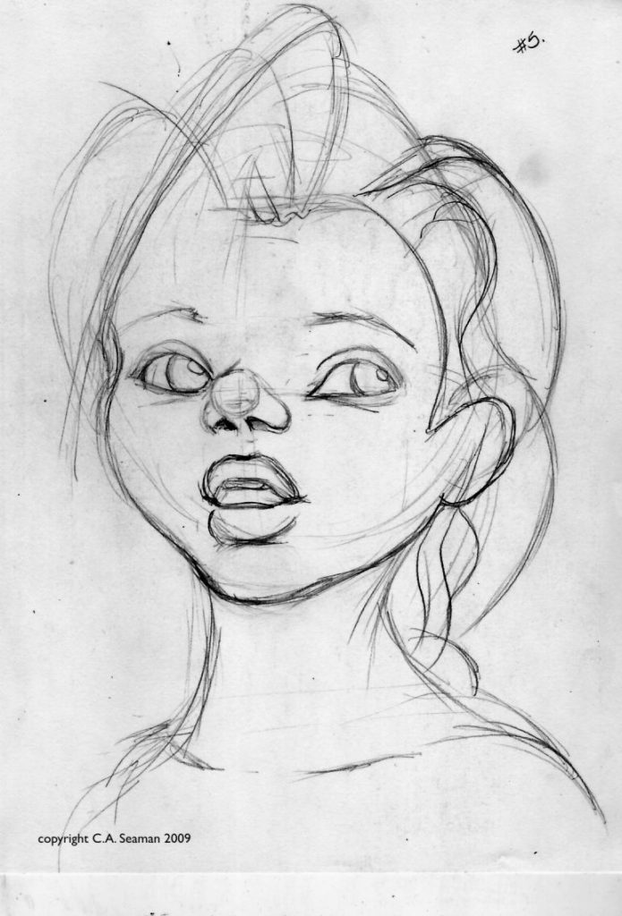
Early Zephyr expressions
Early concepts of Zephyr
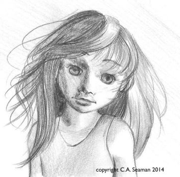
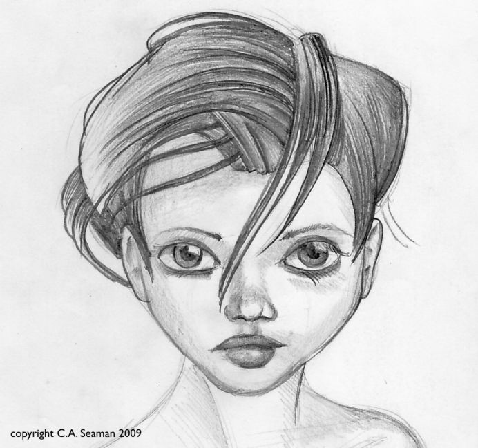
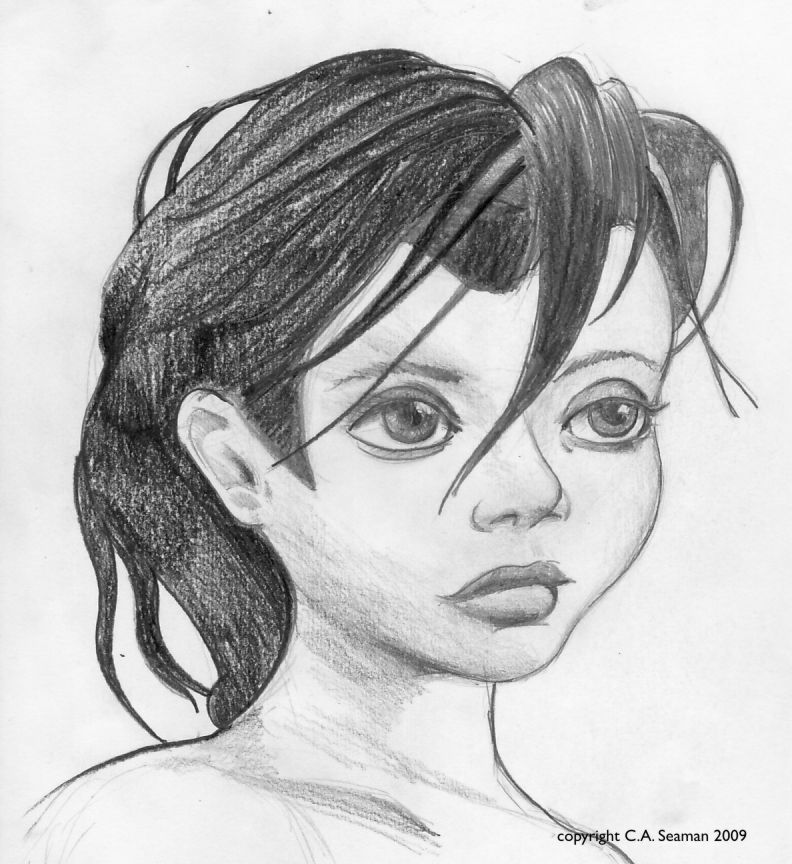
Zephyr
Zephyr
Pencil rough of Zephyr
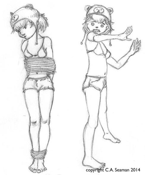
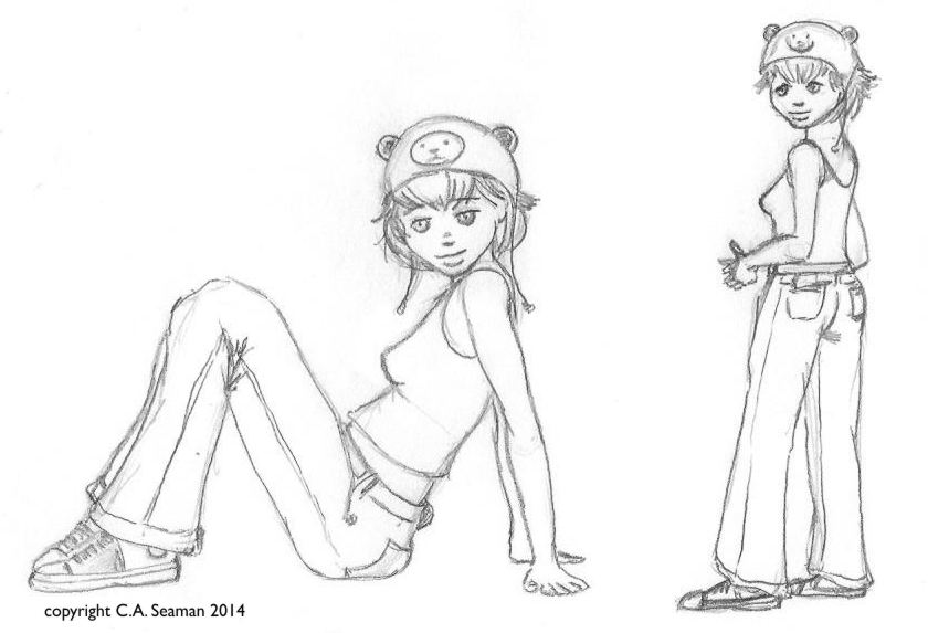
Character sheets with rotations and gestures
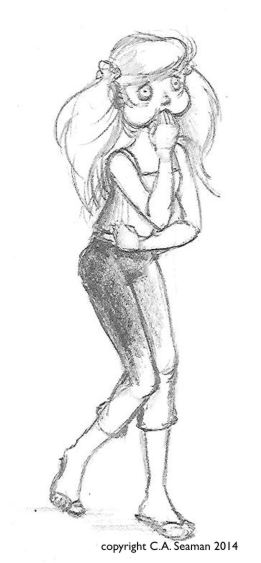
Bunty gestures
Bunty gestures
Pencil gesture of Bunty
Early Bunty study
Bunty and a ‘friend’
Howard in gesture poses
OTHER CHARACTERS…
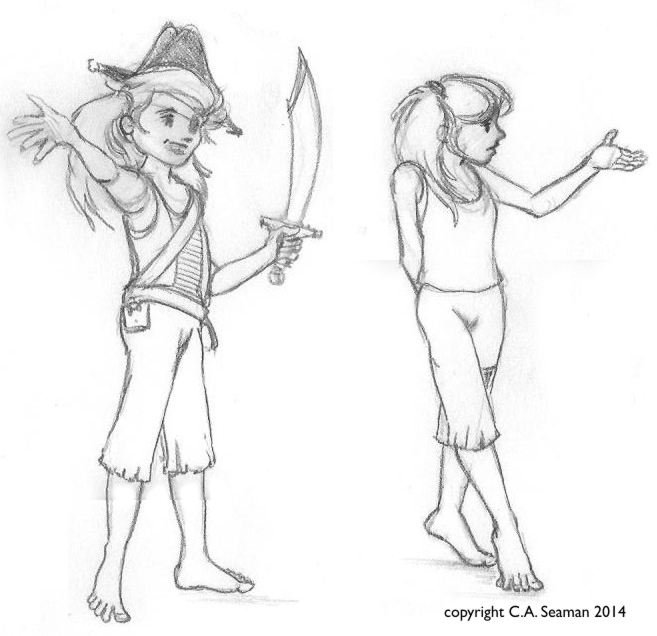
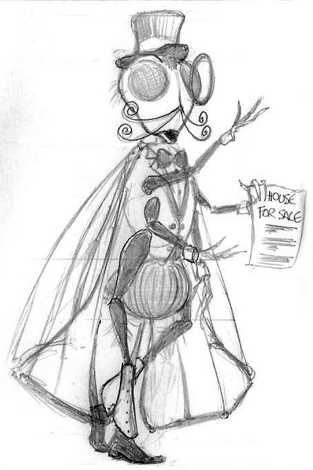
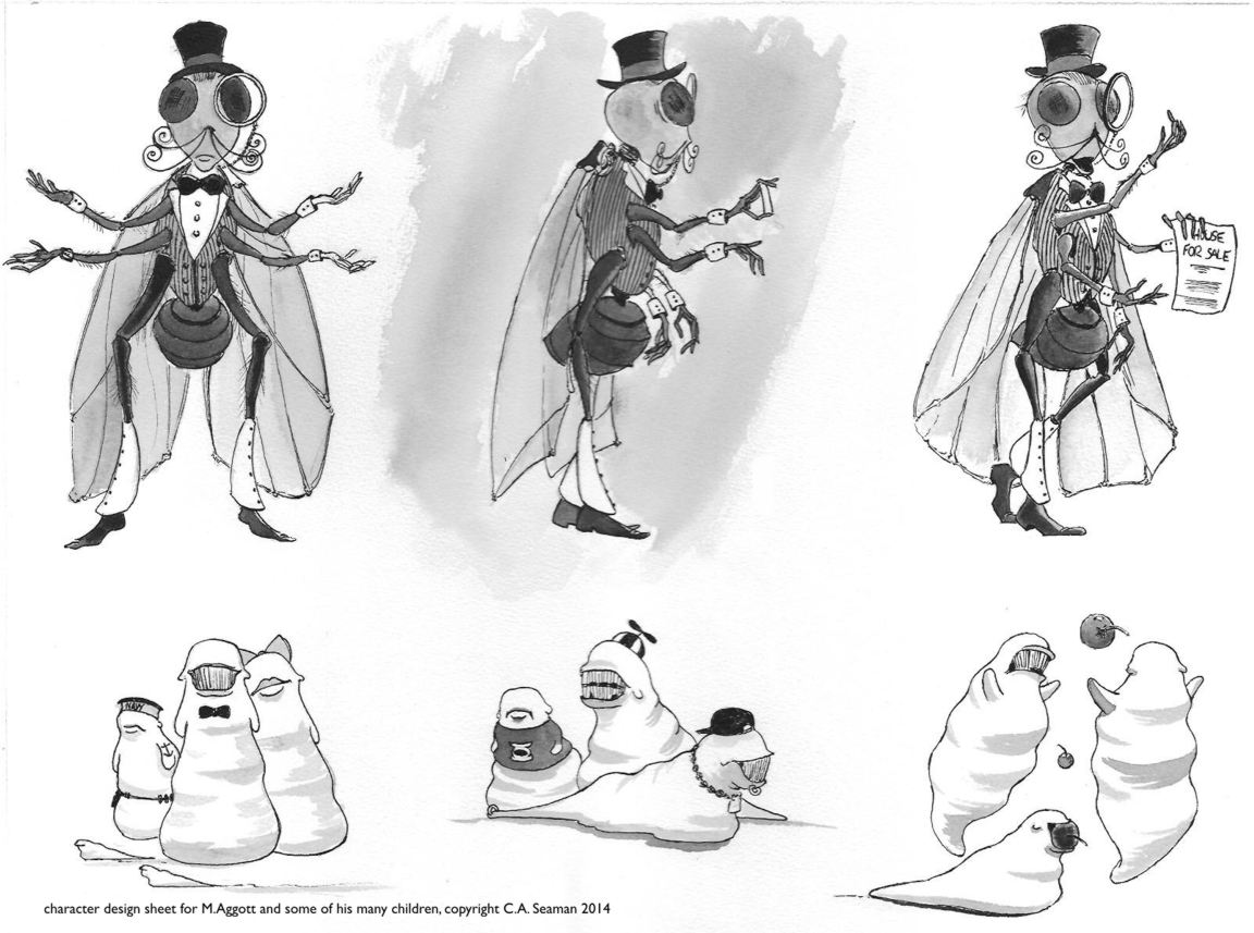
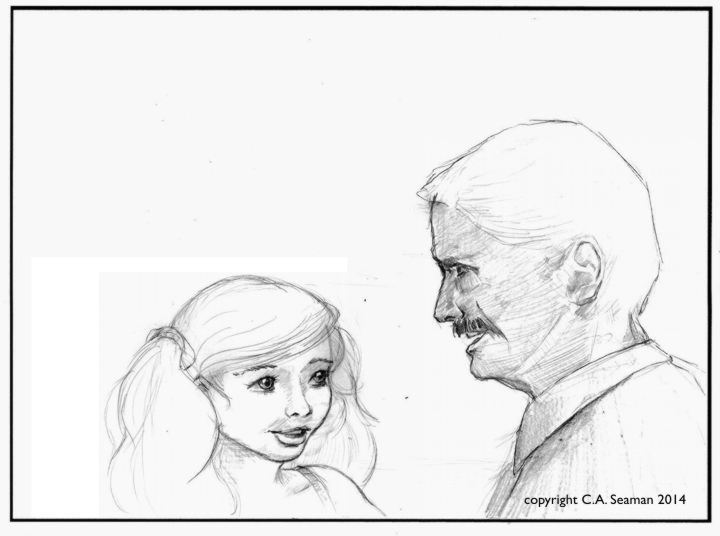
If Bunty is Zephyr’s foil in this story, other characters are actively supporting her in her adventures. I have not considered villains here as they are more likely to emerge with the stories. What appears are some of the peculiar neighbours Zephyr has, like Monsieur Aggot, a single parent and former horror film star. Monsieur Aggot is a family man as loves his children equally. He is also a real gentleman with fine manners.
Pencil study
Character sheet with rotations and some of his children
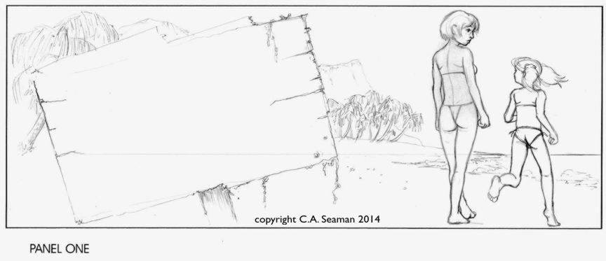
THE PROJECTS: 1 A single panel comic
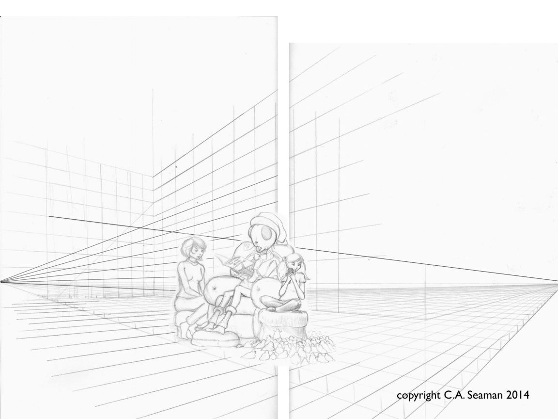
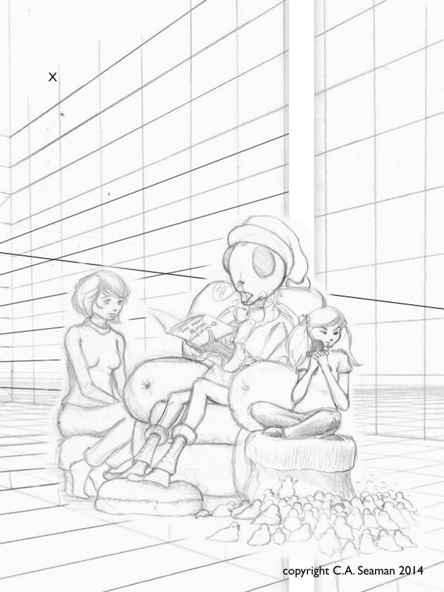
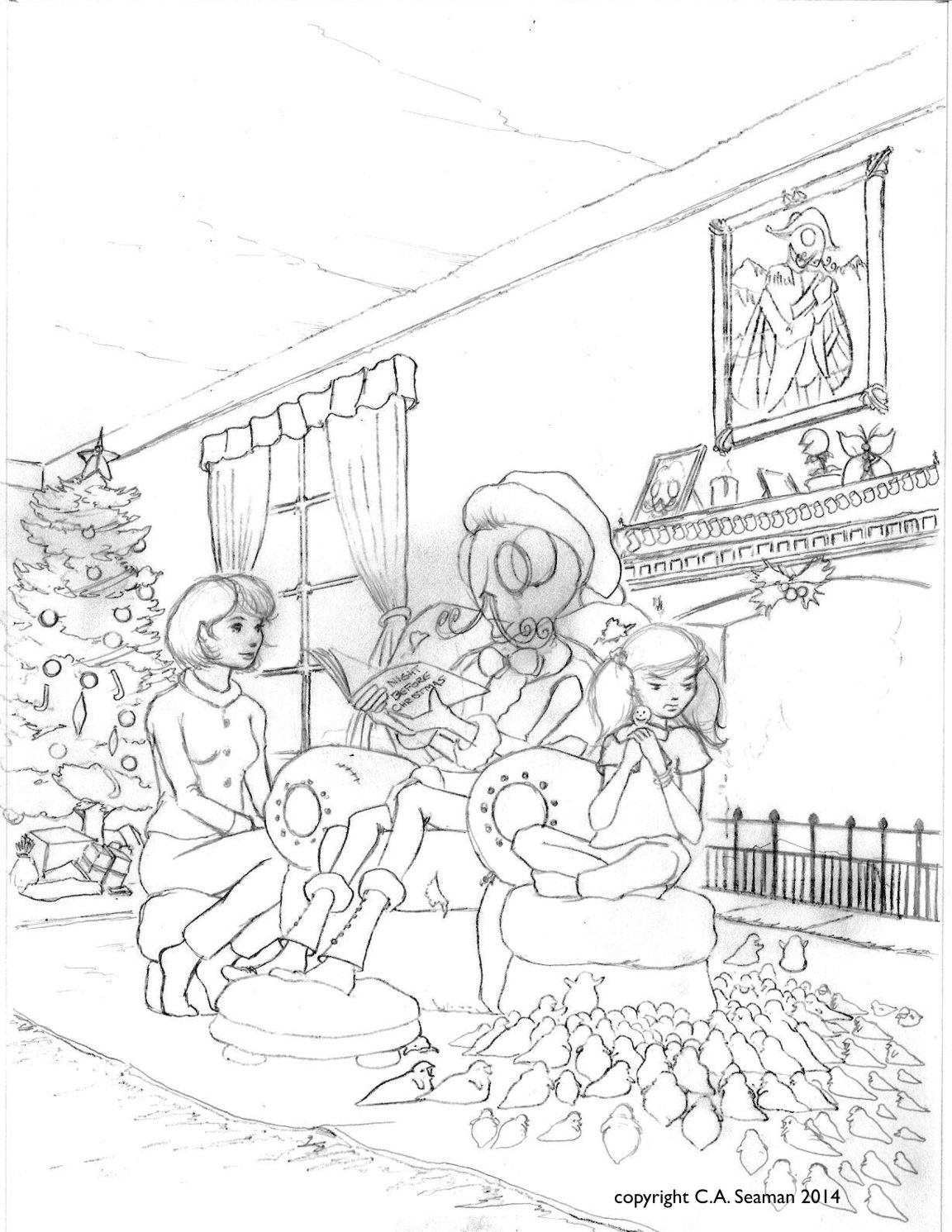
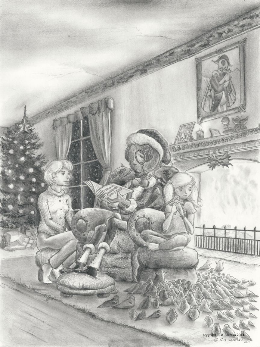
The single panel comic was given to us as a way of exploring the characters in a given scenario. It was completed in pen and ink, with no use of wash or mixed media. There was guidance in terms of the subject, directing it had to be humourous. I think the dialogue was also given to us and we had to fit the subject to the line. Also, there had to be a visible demonstration of grid use and one point perspective in the piece. A good challenge, especially as Zephyr was developing as a much more serious project at that time.
Below are some process frames and the final project. You can enlarge a several images by clicking on them.
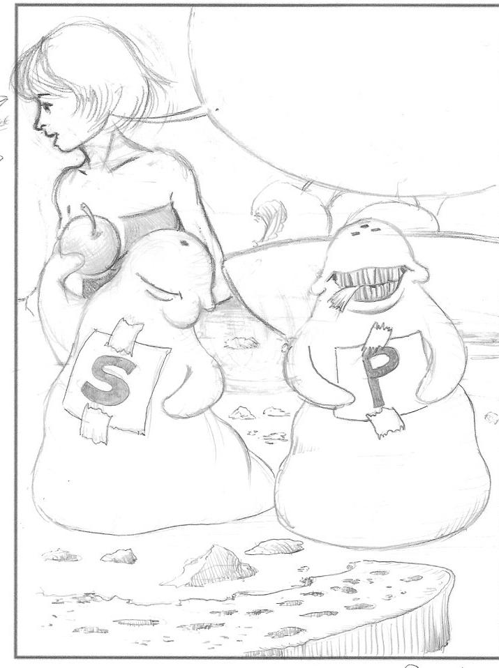
Original drawing with a gridDrawing with demonstration of one point perspectiveFinal pieceSome good points , but it was my least favourite of the project pieces I created. Too much stuff in it. Too much referential material. I also hated my lettering and thought the inking lacked polish.
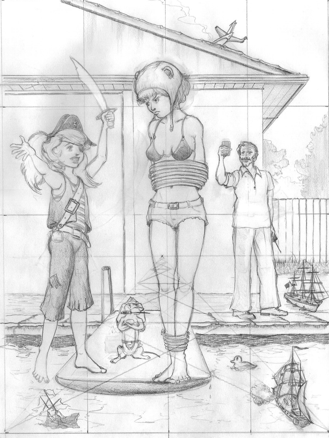
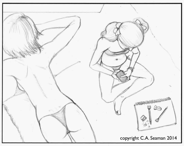
THE PROJECTS: 2 A Second single panel piece, using wash and two point perspective in the design
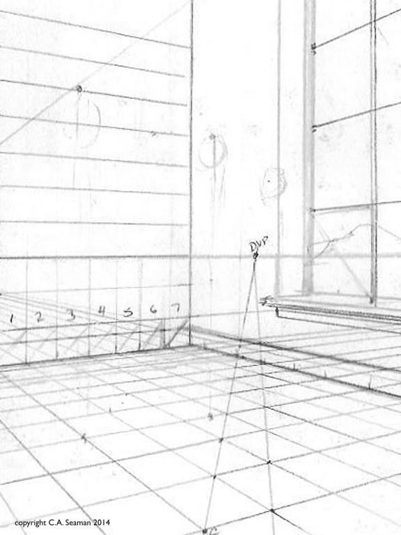
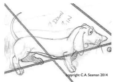
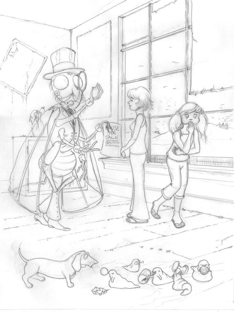
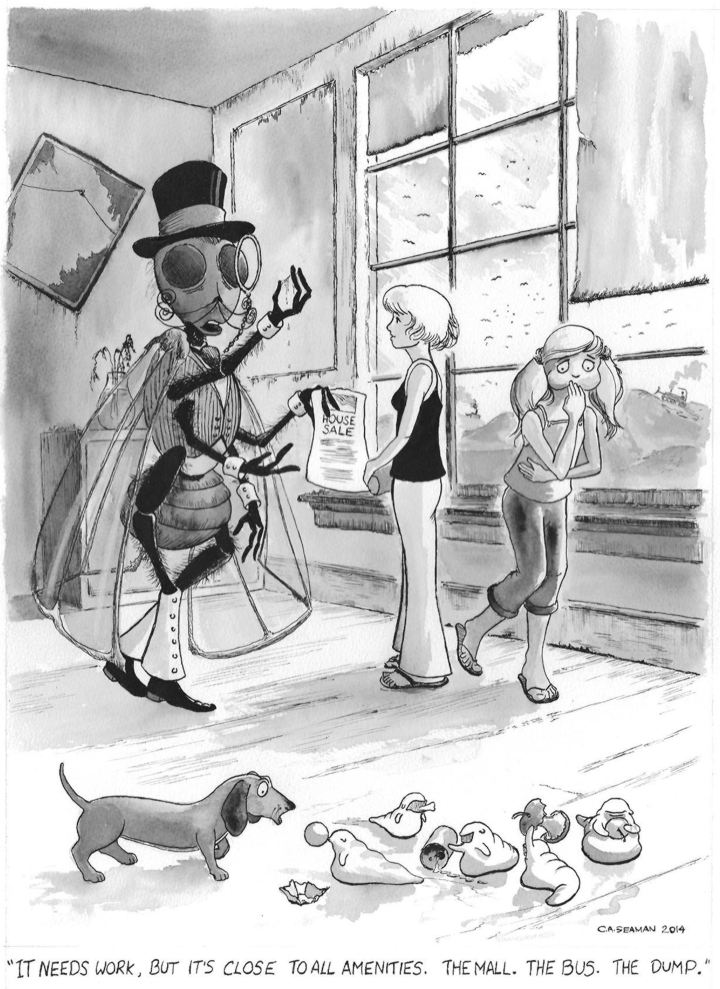
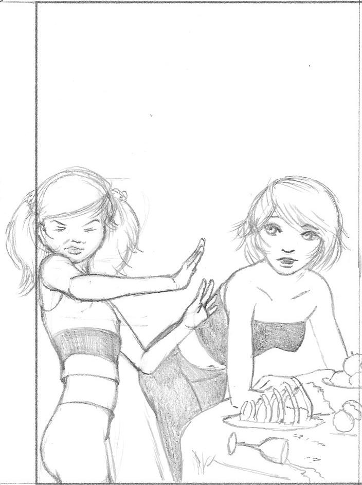
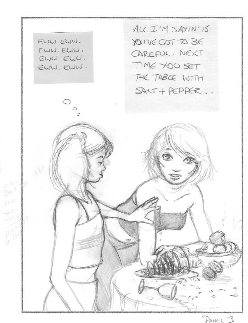
Now we are rolling along with the characters, we step up the work with a new scenario involving real estate, new personalities like Monsieur Aggot and his maggot children, the pet dog and the above mentioned technical requirements. The first image was a two point perspective exercise I did to work out the dimensions in the piece and set the characters in their correct proportions. Yes, Monsieur Aggot is one big bug. He also has a really interesting back story, but I don’t want to share it here.
Setting up the two point perspective
I printed out the perspective sheet full size and drew Zephyr, Bunty and the children into it. Monsieur Aggot was composited using photo rendering software.
Close up
Cleaned up drawing. Note the new poses for the children.
The final piece
Happiness is getting to use a wash with pen and ink. I liked the New Orleans funeral procession in the draft but decided the eating of scraps from the dump was a better fit in the end.
THE PROJECTS: 3 Four panel comic strip
Next, we took the characters, introduced more into the piece and had to develop a four panel work on them. I was having trouble with my drawing hand at the time and created all the panels full page size first, then scanned and reduced them into the final piece to put less stress of cramping my hand with small details. It also helped me see what was worth keeping after the overload of the first piece. I had a lot more fun with this and pared down the texture a lot, giving the strip a cleaner look. If you wonder why there is so much open space at the top, remember it has to be kept clear to fit the dialogue.
The original panels are included separately and together. Click on them, etc., etc. to get bigger images.
Much more effective use of line and texture. Still hate my lettering, but not nearly as much as in Project 1. Poor Zephyr’s face is a bit twisted in Panel 3.
THE PROJECTS: 4 Full colour weekend paper comic strip
The four panel strip was a great way to develop the characters and I was stronger in my sense of what to do with them. This was a fun work to do, pulling in mixed media and full colour. I can’t recall too much else about requirements of the assignment, but getting into the rhythm, I drew the original panels large, but in scale to the finals and reduced them. It may seem like a lot of work, but I know of other professional artists- their names escape me- who do the same thing for the same reasons, often going into completing the panels and then assembling them later in the computer. I can see that in my future for graphic novel projects.
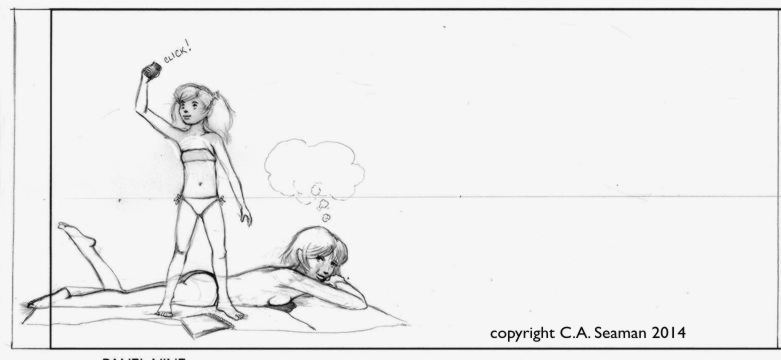
The story is, incidentally, based on something that actually happened to me once when I took a class outside to draw trees and nature and had one preferring to sit in the sun and download her images from Google.
You can’t make this stuff up. Click on the images….
1
2- flashback
3
4-5 Wally Wood always to reuse panels to save time. Who am I to argue with him?
6
7
8
9
Layout before images were added
I had a lot of trouble scanning this piece. The watercolour was a lot smoother than it projected in this image. The red type in the title also should have been orange, but I could not get the balance on that without throwing off everything else. My lettering is looking a bit better now.
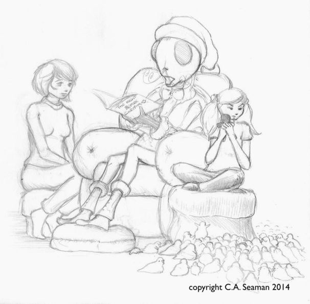
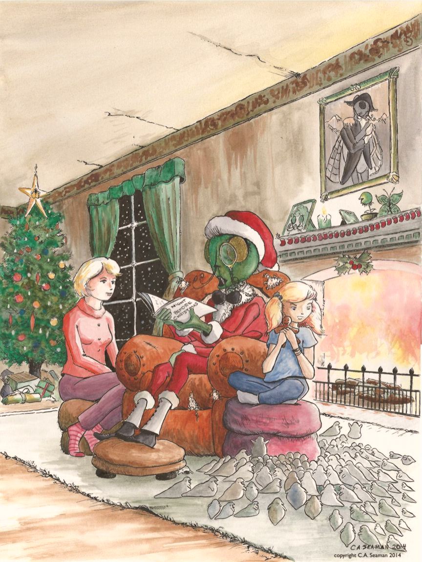
THE PROJECTS: 5 ANTHOLOGY COVER
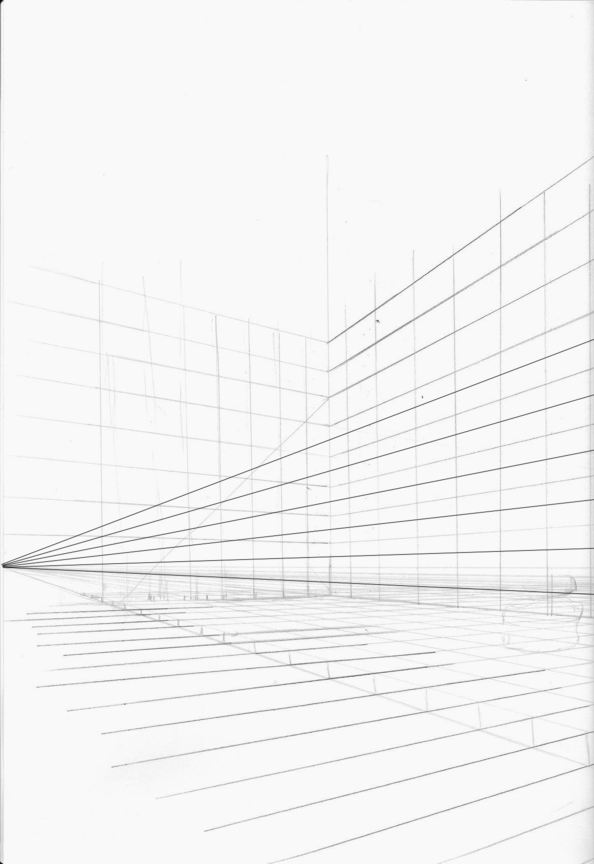
The final project with Zephyr and Bunty was an anthology cover. We studied covers from various works like CALVIN & HOBBES, among others, and considered what time of year it would likely be released. Christmas was coming, so why not? As you can see, there were many parts to the project. Two point perspective, which for me had vanishing points 12 feet, (almost four meters), apart and leading to the parts of the planning being done in the computer using a cg grid. The final piece had to have several versions, as you can see here.
Enjoy…
Preparing two point perspective sceneCompletedPlaying with models in Poser for ideas- one of several scenesCreating the drawing with the groupCompositing the characters with the sceneCropping to create the final compositionFinished line artGraphite versionWatercolour monochrome versionFull colour final in pen and ink, watercolour mixed mediaPeople love the maggot children. I’ve even been asked to draw them at Free Comics Day, instead of the usual superheroes.
I would like to revisit this someday. It has light and dark elements to it that should appeal to a wide audience. Perhaps a collaboration of sorts might be in order to get it moving. Perhaps I should just make clones of myself instead…
Before you go on, this is NOT some tone deaf sexist comic piece.
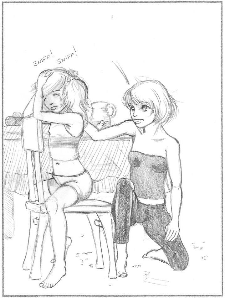
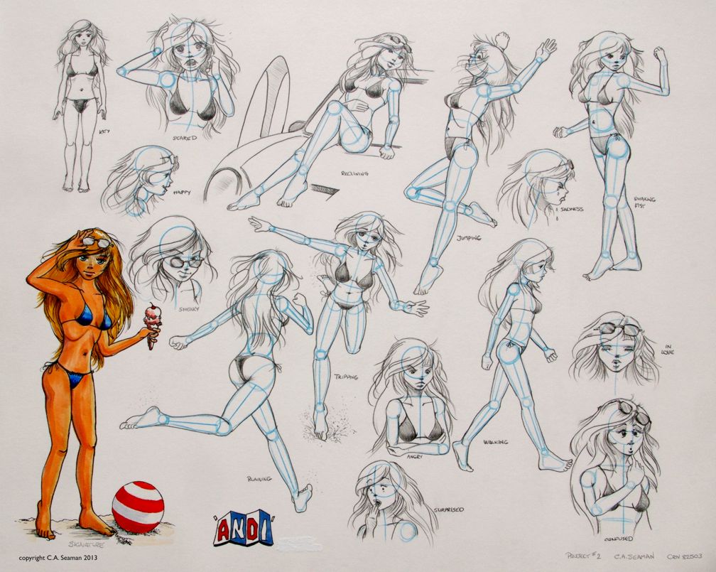
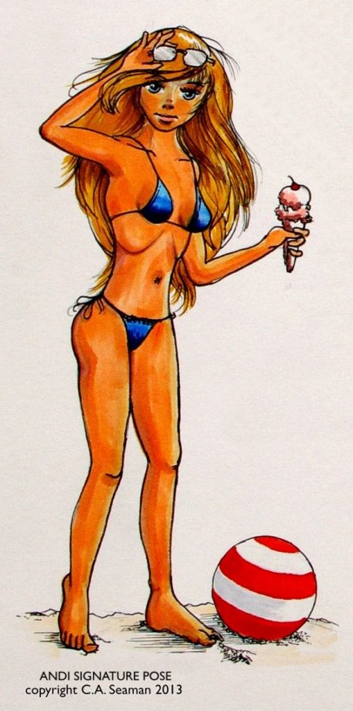
Andi actually is a remarkably complex character who hopefully will sometime once again see the light of day on my art table. She was created for the first Cartooning course I took at George Brown, and a lot of work went into filling out her character. Part of it came from others in the class, who contributed excellent suggestions when we exchanged drawings and brief outlines of our characters one night with each other and the recipient added a second drawing of a foil for our character on the spot and gave broad strokes to a backstory for that person. It was one of the best exercises I did in that class and made me much more confident in what I was doing later.
DEVELOPMENT OF ANDI AND OTHERS
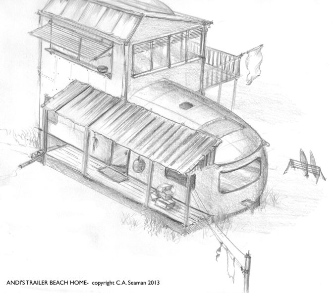
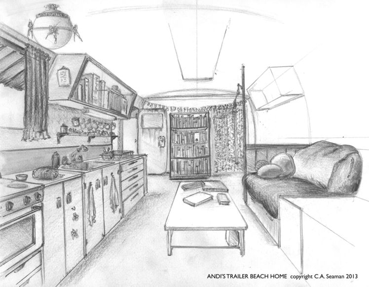
Miranda Andrew- Andi for short, was a rebel in her youth, getting pregnant at 16 and being thrown out of the house and her school. She went to live with an aunt, a progressive woman with liberal democratic ideas and a strong sense of justice for people who have rarely experienced it. She is also a cancer survivor, an activist and the perfect role model for Andi as she seeks to find her place in the world. The aunt lives on the coast and gives Andi a trailer on the beach to call home. Andi completes her education slowly, through night school and correspondence, has frequent run-ins with authorities who want to separate her from her son and over time develops into a clone of her aunt, ready to pick up where she leaves off when she goes into battle with the big C once more.
Actually, as I read this, I’m really thinking Andi is currently the right person in the right place at the right time. However, when the work was done several years ago, I only had time to develop what you see here before moving on to the next project, Zephyr Crow. Read about that in the post of the same name, coming out soon.
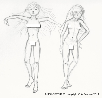
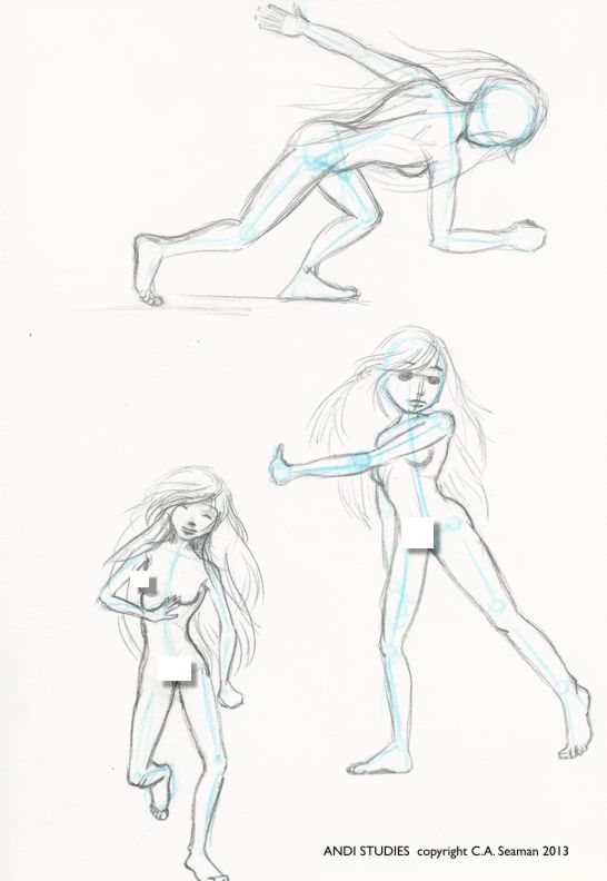
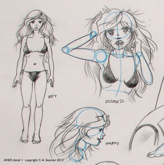
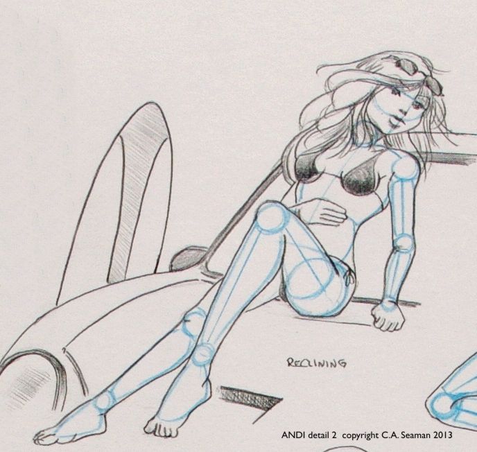
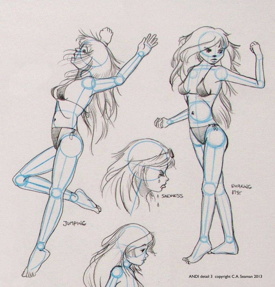
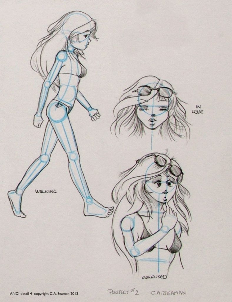
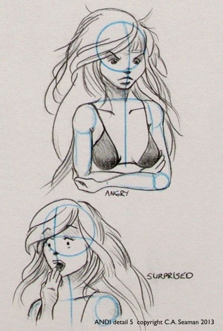
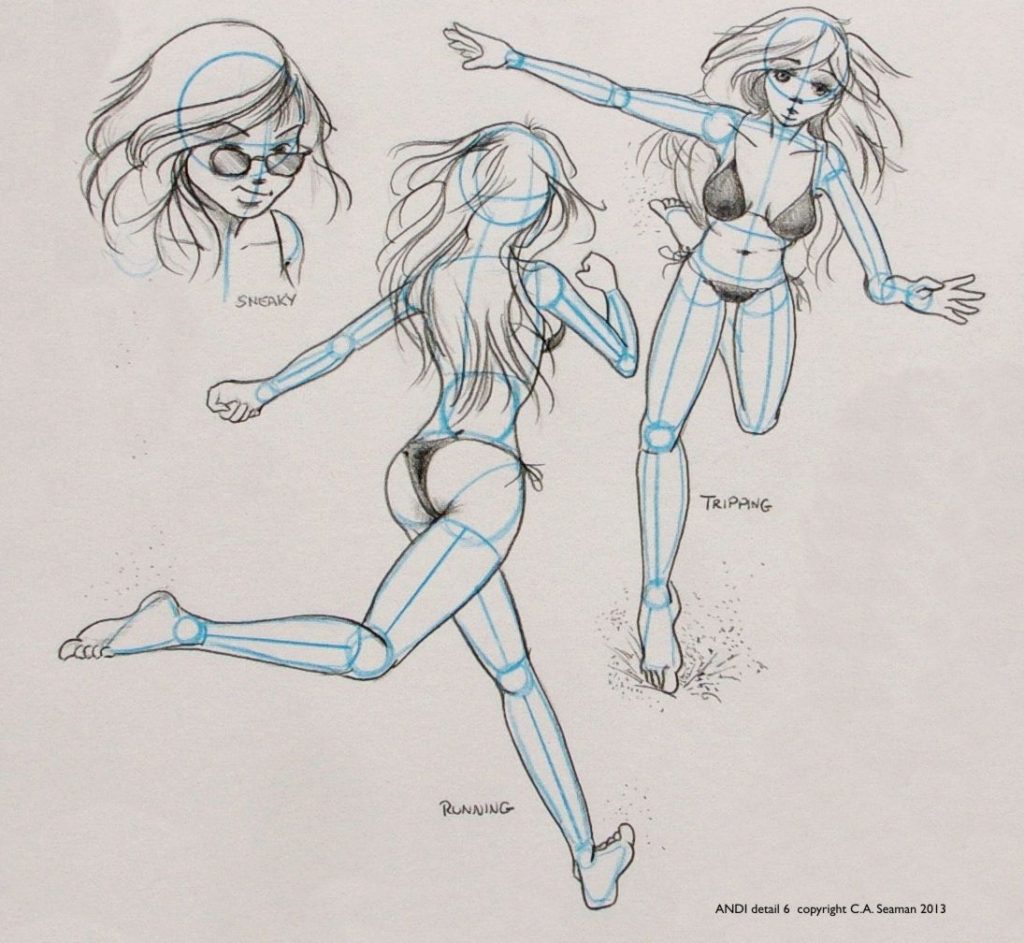
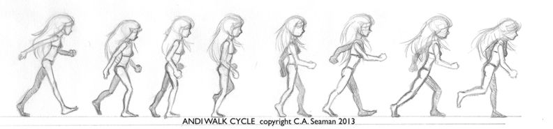
Many exercises in drawing were done to build confidence in rendering characters and drawing them quickly in a variety of gestures without models for reference. The same applied to settings, sidekicks, foils and secondary or antagonistic characters. Here are some of the drawings that came out of those exercises.
Early gesture test while sorting out the figure
Gestures 2
Gestures 3
Character design sheet after preliminary work. Body joints had to be shown in non-photo blue pencil on the final image.
Details 1
2
3
4
5
6
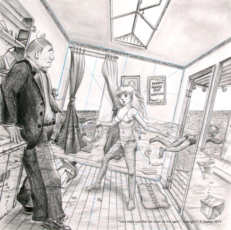
Final piece in the course. Dialogue line was supplied. We had to build the single panel comic art around it. I threw in a lot stage business on this and it was fun for people to go and find these Easter eggs, but as I was to discover later in other Cartooning courses, it would not be wise to do it on every piece.
As with anime and manga, I have been called a fan of comics. While not as touchy about that label, I still feel it is too compartmentalizing. If you have visited other postings in this website, you know there is more to me than the sum of one or two parts. Nonetheless, I have enjoyed creating works in the style of North American comics. What follows are some pieces from the archives of the old website.
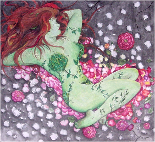
Poisy Ivy in Repose
Catwoman print in mixed media
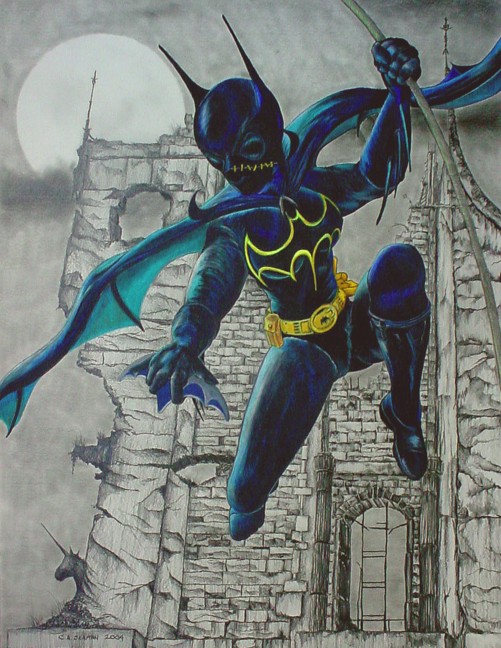
Batgirl (Casandra Cain)
From the Island of Misfit Toys
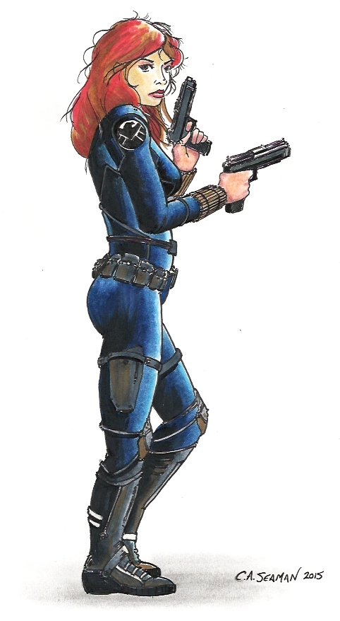
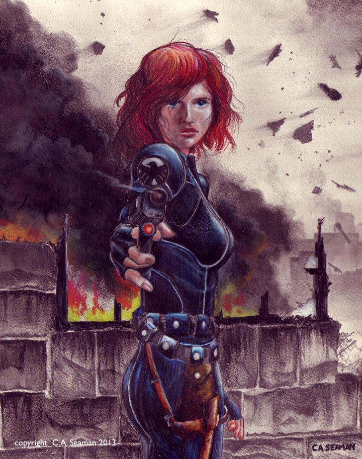
Black Widow
Black Widow mixed media
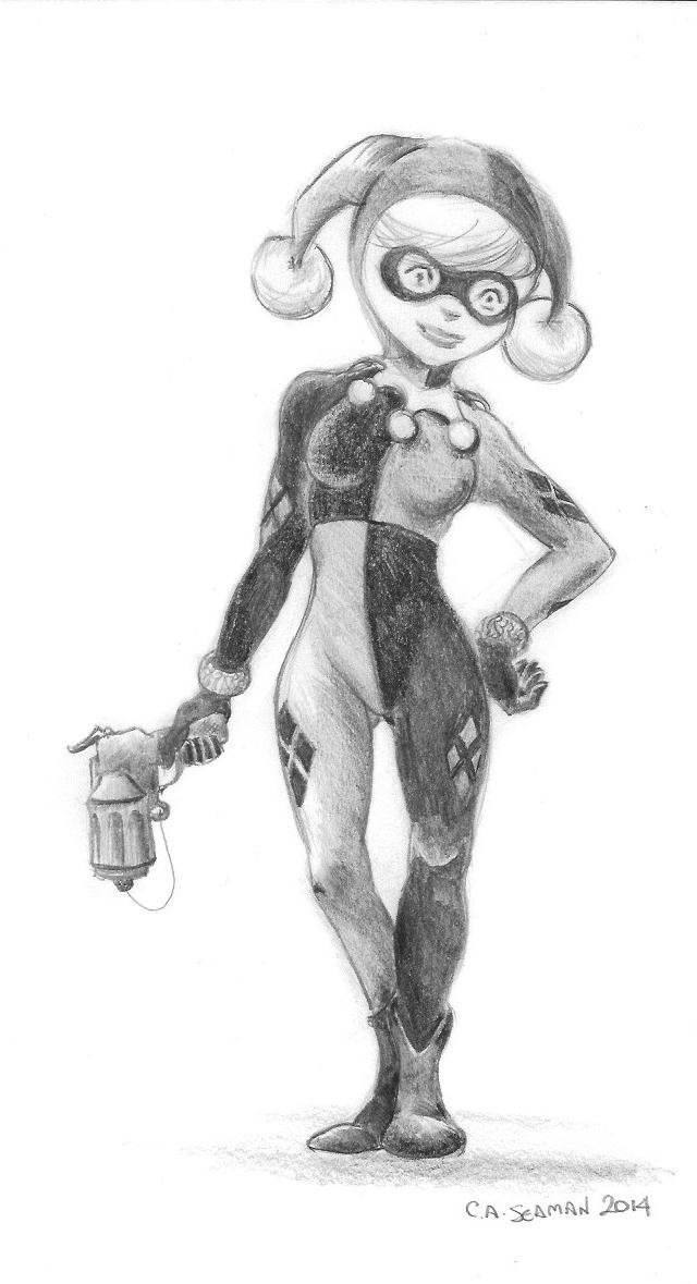
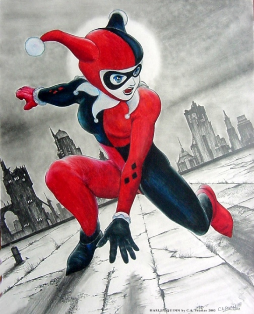
Harley Quinn, inspired by L’IL GOTHAM
Harley Quinn
Line study of Hit Girl
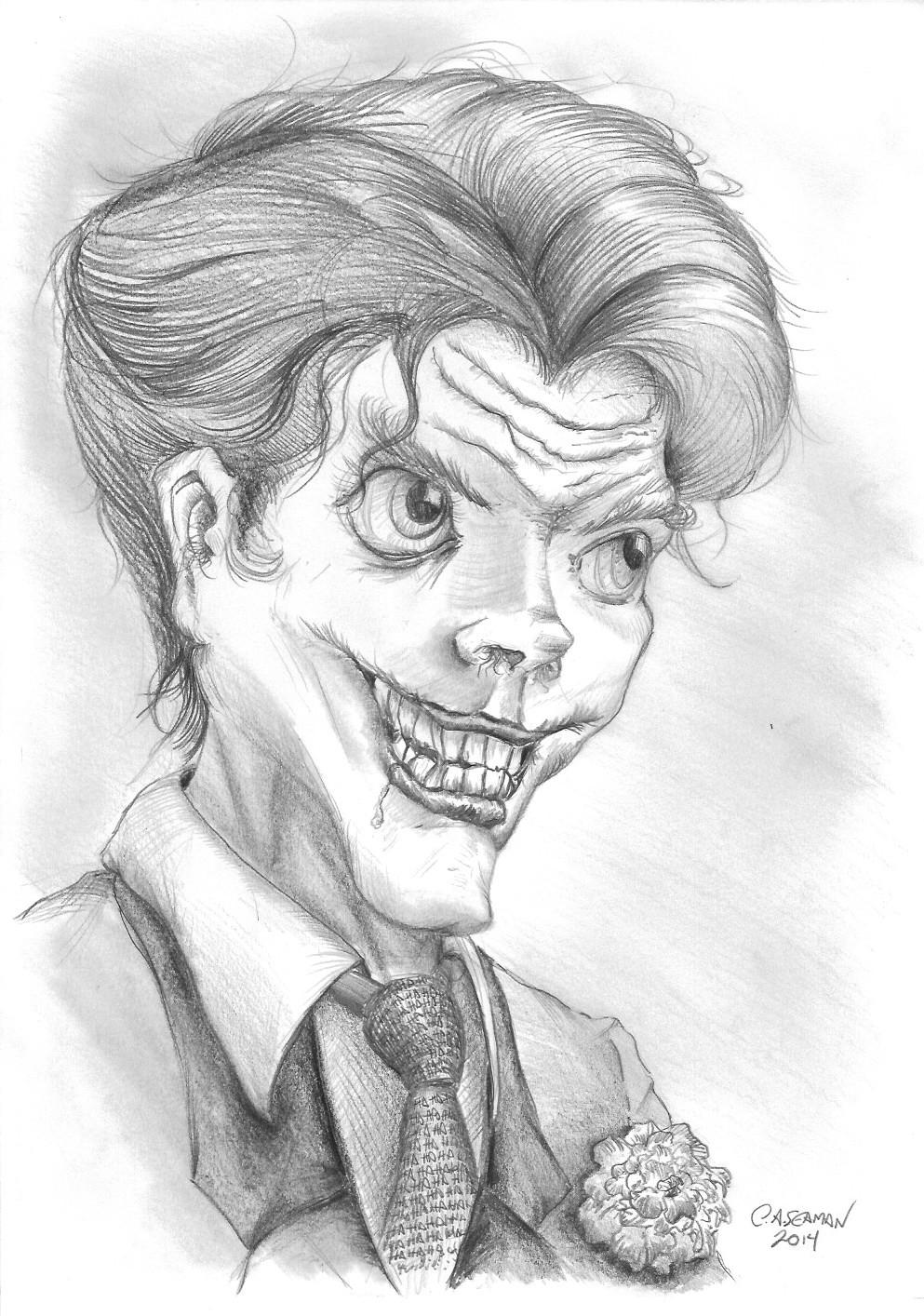
My take on Joker
Poison Ivy in Autumn- completed long before L’IL GOTHAM had Ivy going into a depression over the arrival of the harvest season and the coming of winter.
OTHER REQUEST DRAWINGS
Sonic!
In another post, I will share the creation of a comic book cover for a friend featuring one of STAR WARS’ favourite characters- Darth Vader!
I like the look of some manga and anime. I have often been called a ‘fan’ of it, which I resent intensely, because it is a label that carries baggage in terms of pre-conceptions and associations that make me uncomfortable. While occasionally I stylize my work so that people say it reminds them of manga, I rarely actively embrace the concepts completely to do work that can actually be called manga or anime.
Having said that, I posted images in past versions of the website that definitely have that manga look about them. Some of the pieces were for students to copy, feeding into their interests and giving them the chance to develop their skills. The gallery below is filled with selected postings from that era, some of which haven’t seen the cybernetic light of day in years.
Thank-you piece for a great peer tutor
Another peer tutor piece
Take a wild guess…
This was a great team
I usually posted this in the classroom before reports came out. It never failed to grab their attention.
This piece was actually published as fan art in NEON GENESIS EVANGELION: THE SHINJI IKARI RAISING PROJECT. (Vol. 3) It’s mixed media coloured pencil with graphite.
Another one
Study for texture, detail, contrast and value
For the modified students at the old school
The Girl is a computer generated model that has been around for years. These studies were from poses set up in Poser, drawn when I was switching over to cg models in my art classes to deal with absenteeism among students, allowing them to keep up when, with live models, they would otherwise have foundered. And you know what? IT WORKED!
The Girl study- 2
More finish on the pieces to give students working exemplars.
The story of CORRUPTED began just as work on SARGASSO, my self-published series of books, was winding down. ‘People who knew people’ stuff happened and I was offered the chance to meet Paul and Jeff, who were developing this game for the X-Box Indie platform. We got along well and before long, I was brought in to work on character designs for the project.
Here are some things you might want to know about me at the time I began work on CORRUPTED.
I had never played a video game on either X-Box, Playstation, or Nintendo beyond Wii. I had flown a bit on Microsoft’s Flight Simulator, (and got vertigo on the screen?!), played some games on a desktop computer that had me using directional keys to steer cars onto sidewalks and fun stuff like that. But that was it.
I had no formal training in character design.
Any character design I had done was based on looking at model sheets I saw in books and copying the format of figure rotations and gestures. “If that’s how Disney does it, I can too.”
I had no concept about the architecture of what these games looked like, what sprites were, what characters and stories were popular in gaming culture or anything like that beyond FINAL FANTASY, because of the anime connections it had.
Basically, I was clueless. And being clueless made me perfect for the job apparently because although I had what was then self-taught art smarts, some skills and experience publishing a few books, my mind was a blank slate untouched by the influences of video games. Consequently, I wouldn’t inadvertently slip in some materials that buried themselves in my subconscious from previous game play experiences, leaving potential players saying things like “Hey! That’s just like the Blade of Pohtus used by Dojt Sryvat from MAGA 4: WASTELANDS OF THE REPUBLIC!”
Fans can be annoyingly observant about things like that…
Anyway, here we were, embarking on this amazing journey, and I must say I have only fond memories of my experiences with Paul, Jeff and the creative process that went into CORRUPTED. It was, in the end, what brought me to taking courses at George Brown and finally learning what all that stuff I’d been doing was actually called.
There are three parts to this story. Scroll down to read them and see the accompanying process work.
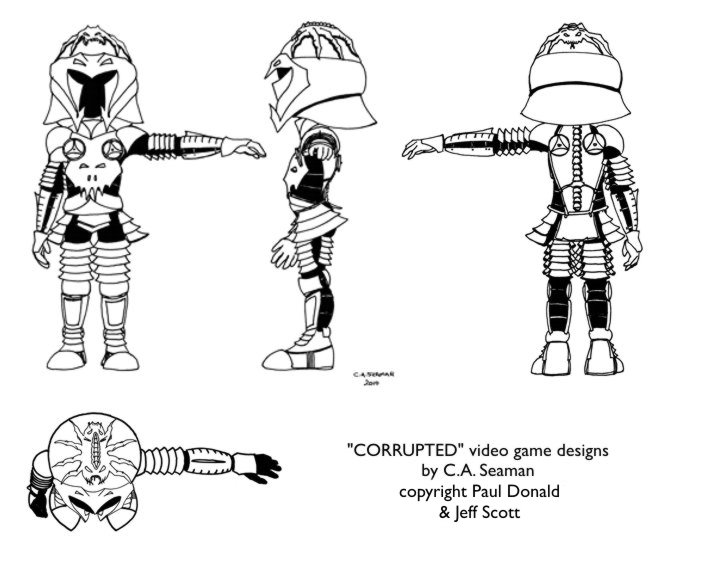
ROUGH DESIGNS
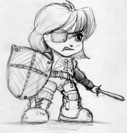
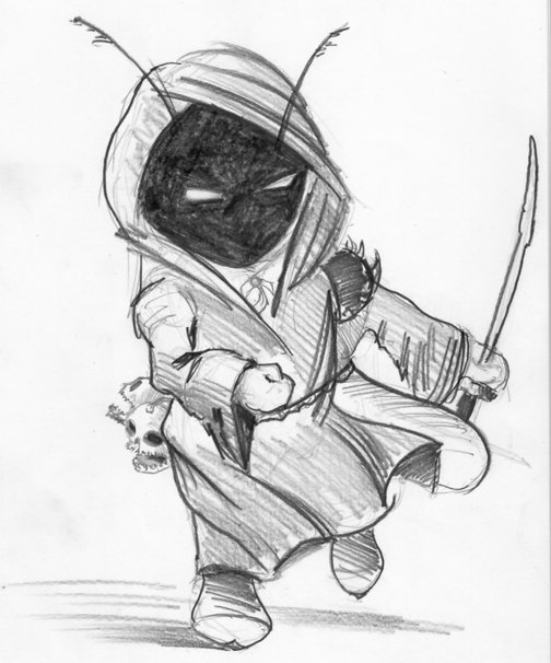
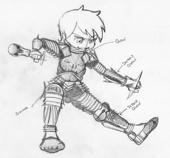
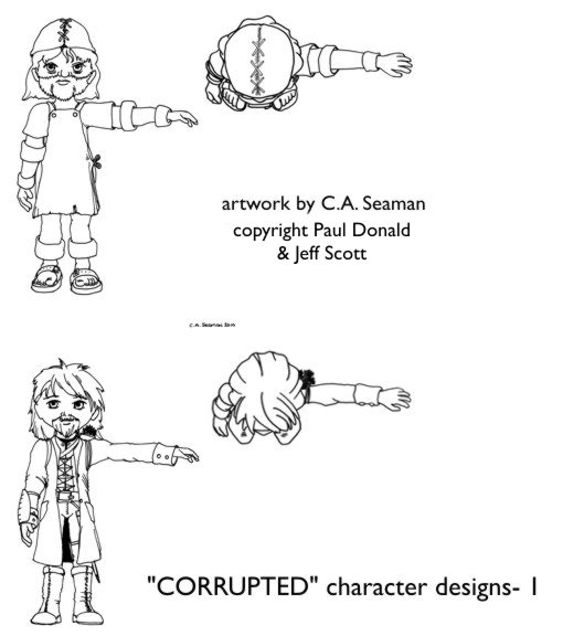
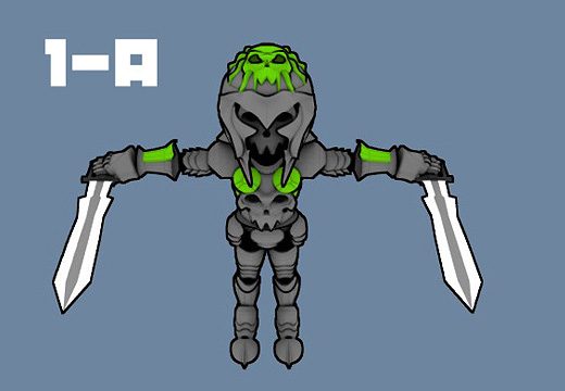
Paul saw my work from SARGASSO and while he was impressed with the illustrations, he wasn’t sure I had what he and Jeff needed for the game until I started pulling out books on manga character design and he identified with the super-deformed characters called ‘chibi’. Chibi is a super-cute form of manga character design where the figure is about three to four heads tall and the eyes are huge. The body proportions are all distorted so even crazy looking weapons look ‘cute’ to an outsider. Knowing I had resources and watching me explain them, Paul agreed to meet me again once I came up with some concepts. For that, I needed information on the characters- who they were and what they were like. I took the information and began with some further research into video game character designs, receiving much help from students in the form of screengrabs of sprites from ZELDA. One even tried to create sprites of his own to show me how it was done. From there, I sat down one day while the classes were working and I had nothing else to do and came up with two ‘chibi’ styled characters.
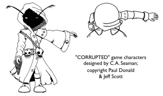
You can see the guidelines on the knight as I blocked out the character. The other one was something I did for fun, turning out to be a big hit with the students. They loved the antenna and the Jawas look to it, but really went mad over the fact the skulls on the belt were supposed to talk, hurling abuse at passersby. Originally, I was going to keep that one for myself, but with the work on SARGASSO taking up so much time, I decided to gift him to Paul and Jeff, who made him into the merchant for CORRUPTED.
Two elements carried on from this sketch of the knight to the final version, ie. the breastplate and aggressive posture. Everything else, as the character evolved, changed. As uniformity was going to be key, I did more reading, purchasing a great book called SUPER CUTE! KODOMO MANGA, written and illustrated by Kamikaze Factory from Spain and published by Collins Design (ISBN 978-0-06-192755-3). From that research, I created my own original base body template, based on a ninja pose on page 206 that caught the eye of the guys when they first saw the book. Thus, in a scrum around the dining room table in my house, we could now bash out ideas for the characters and just draw on the sheets until the pile was exhausted. The interesting thing was, though, given the information I had from Paul and Jeff, when we sat down to do this and I showed them the first revised concept, they went for it with only minor changes.
Anybody need some template sheets? I’ve got lots left over!
These were the base templates. The image below was the first- and main development sketch for what would become the evil knight in CORRUPTED.
A helmet design would emerge in much the same way and, unchanged, I will show it in the next section. I wanted the knight to be shown in action as befitted the nature of the game. So, the template was created to work with this as the premise from the beginning. We also worked on swords, bows and arrows and created a list of characters to be created at that point. Then, as you will see in the next section, I would create the unifed character reference sheets for an animator to use in creating the sprites. Click on “Final Character Designs” to see how they came out.
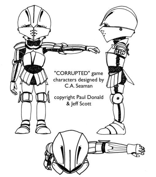
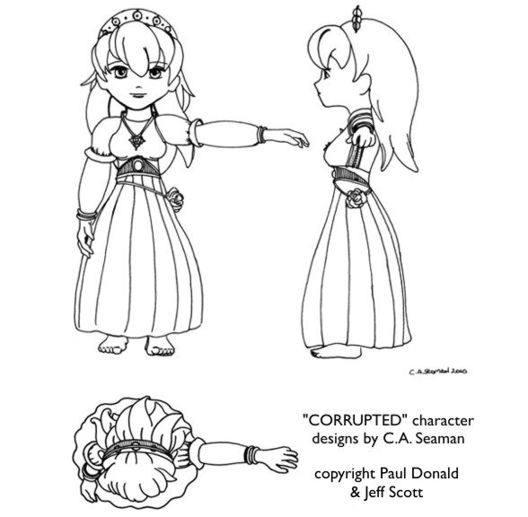
CHARACTER DESIGNS
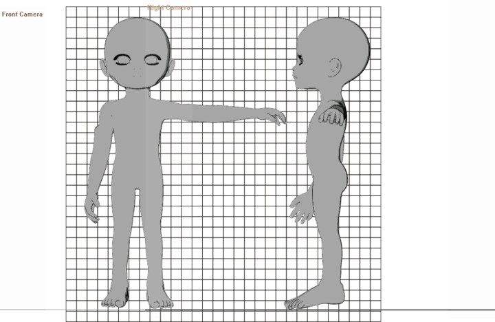
I knew the animator would need to have characters that worked from all angles, with armour and clothes lining up in multiple poses. Having read many books on the making of movies and series, I decided to create for the main characters- the evil knight, the good knight and the princess- templates with front, side, back and top views done to scale on a grid background. For the others, top and front views would do. Paul and Jeff wanted the characters to be see from the top in the game, so it was agreed to put some emphasis on heads where possible.
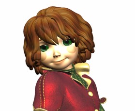
To unify the designs, I fired up Poser on the computer and opened Sadie a computer model who was the foundation of the original Poppy in SARGASSO. (Refer to the article on the art of SARGASSO to see some imagery to put this into context.) Enlarging her head and making her body as gender neutral as possible, I created the above mentioned views by rendering her from those angles with Poser’s cameras. By not moving the cameras once they were loaded, I was able to guarantee consistency in proportions and scale in the renderings, making it easier to line them up on the grid I would later create in Corel Photopaint.
This is Sadie, in case you haven’t seen her before.
This is how I modified her for the body template. Note how the camera names are on the images I composited. I also enlarged the feet, as requested by Paul and Jeff.
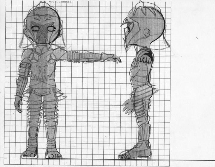
Below is how I drew on the costume for the evil knight over the photocopied template. I followed the same process for all the characters, thus keeping them fairly consistent.
From there, I took the images to Staples, photocopied the sets and shaded on the back of each copy with a soft pencil. I then carbon-traced out the drawings to clean paper. As the grid was only useful for the initial layout to keep everything lined up, I did not need it for the final inking, which was done afterwards. I use carbon-tracing often when working on large projects to preserve all reference materials in case of a foul-up and this has proven to be a smart practise over the years on those occasions when I have had to modifiy a piece or redo the final work. I also keep the reference materials after the job is done for years in many cases, just so I can recall the creative processes used when I need to do so.
THE EVIL KNIGHT- FINAL INKS
The top of the head was an important part of the design as this was what players would see most when playing the game. With the chibi design, it meant the head would overwhelm everything else around and beneath it. Thus, the evil creature possessing the knight was created as a focal point. I think that was my idea, but I could be mistaken. Looks nasty, though.
THE GOOD KNIGHT
The armour on the evil knight was meant to be spiky and concave, glowing green between the plates. By contrast, I suggested the good knight should have softer forms and curves, with the armour looking more like the material I saw in reference books I consulted from the local library’s childrens’ section. Good call on the part of the librarian who helped me. The best books really were there- not in the adult section upstairs.
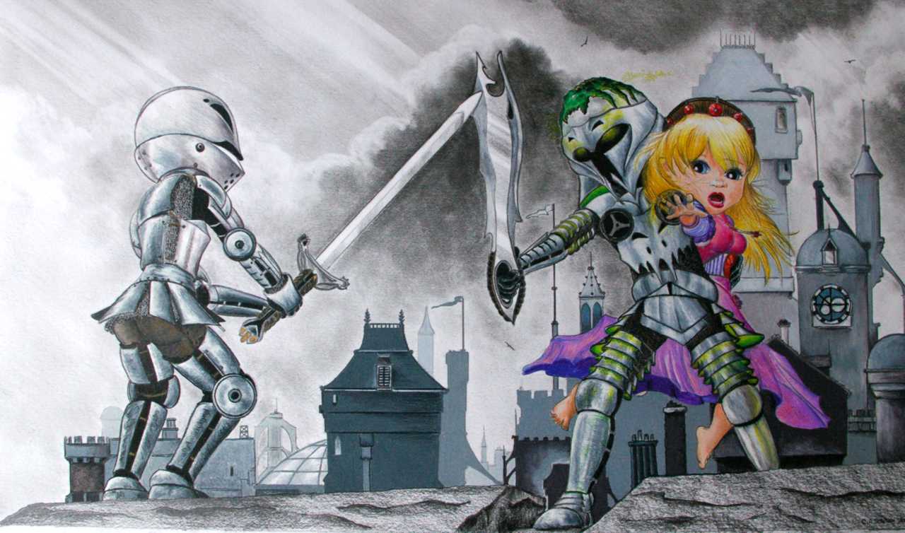
THE PRINCESS
There is a reason why she is barefoot. I suggested she might have been grabbed from her chambers while engaging in her daily ablutions. There was something innocent in this presentation as well, I thought, and I transferred it to the final cover art.
THE MERCHANT
I moved the skulls to the front for more impact and gave ‘him’ nasty looking nails and a little more detail on the cloak to make him look a little less like a Jawa.
THE RANGER AND VILLAGER
What can I say about the Ranger? Everything I’ve ever seen of them in fantasy art seems fairly consistent. Paul, Jeff and I agreed to keep it within those common concepts. As for the villager, he looks like he could be happy in a field, at the forge, or behind the counter of the local tavern.
To see how the cover and the animated evil knight came together, click on the link “The Cover Art and Logo.”
COVER, LOGO AND ANIMATION
Once the characters were done and signed off, it was a race to get the cover completed. Time was flying and I needed to start prep work for the main gig- school. Paul, Jeff and I worked through some ideas and I developed some concepts using Poser and Corel Photopaint which I thought might work. Neither Paul nor Jeff felt the love, though, and these early efforts simply became stepping stones to the final work. The meeting when we hashed out the cover concept, though, was some of the best fun I had in the whole project. It was like being in the big studios working through a creative session on a movie where everything went on the table and was bounced around until it stuck or fell apart.
Poser was fantastic as a pre-visualization tool at this stage. I used the Sadie base I developed for the templates and posed versions of her with prop weapons and sets to give the guys a feeling for the final piece. They made suggestions and eventually, we agreed on this composition after I tweaked three versions and they cast ballots by phone and email.
I blew up the images and carbon traced these basic forms onto larger art sheets- one each for the good and evil knight. With those templates, I then drew the armour, weapons and costumes based on the original designs. The new drawings became the foundation for the final work.
Without the CG base reference for proportions, I don’t think I could have finished the piece in time. I prefer going freehand whenever possible, but that armour and the princess’s dress was very hard to do. So having the bathing suit Sadie template as a guideline made getting to the freehand stage a lot faster. As you can see below, the guidlines are still in place, although the bodies have disappeared under the clothes and armour. Only the face of the princess remained relatively un-altered at this stage. The background is clear in both images.
I added all the buildings and background elements directly to the final piece later, hoping all the time they would work with the characters and not overwhelm them.
Please note in the gallery below, double-click on each image to bring up a larger version in a separate gallery.
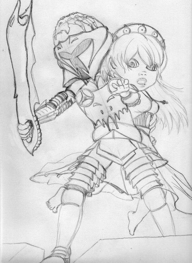
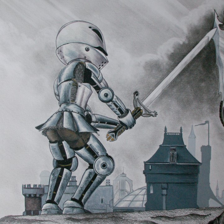
The heroic knight…
…fights the possessed villain of the story
Drawing for the cover art
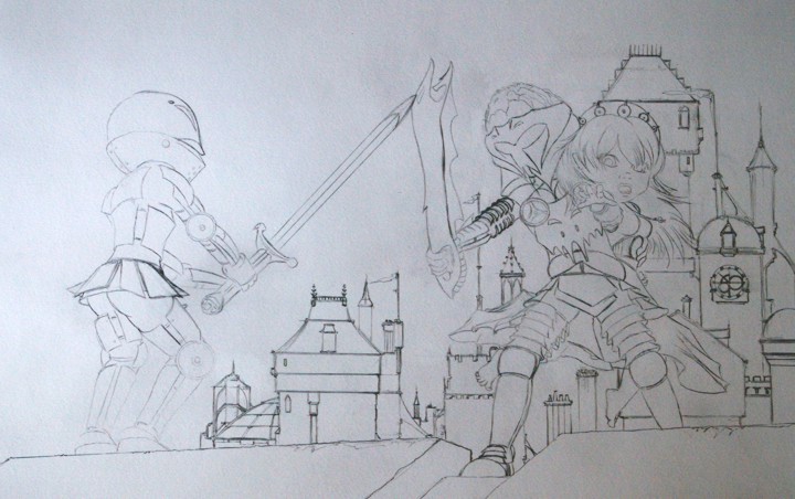
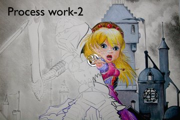
Back to Staples to create photocopies of these drawings. They would be transferred afterwards onto the 100lb paper I bought for the final art. What follows are snapshots I took as the work progressed. They are not very good, but did give Paul and Jeff tantalizing glimpses of what was to come. Paul and Jeff wanted the final work in coloured pencil- something I had not used on this scale since 2007. It was great getting back to it, though. There’s so much computer work out there that people forget that wonderful results can be obtained from these simple tools.
Process 2
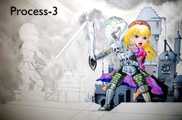
Process 3
Detail
Detail
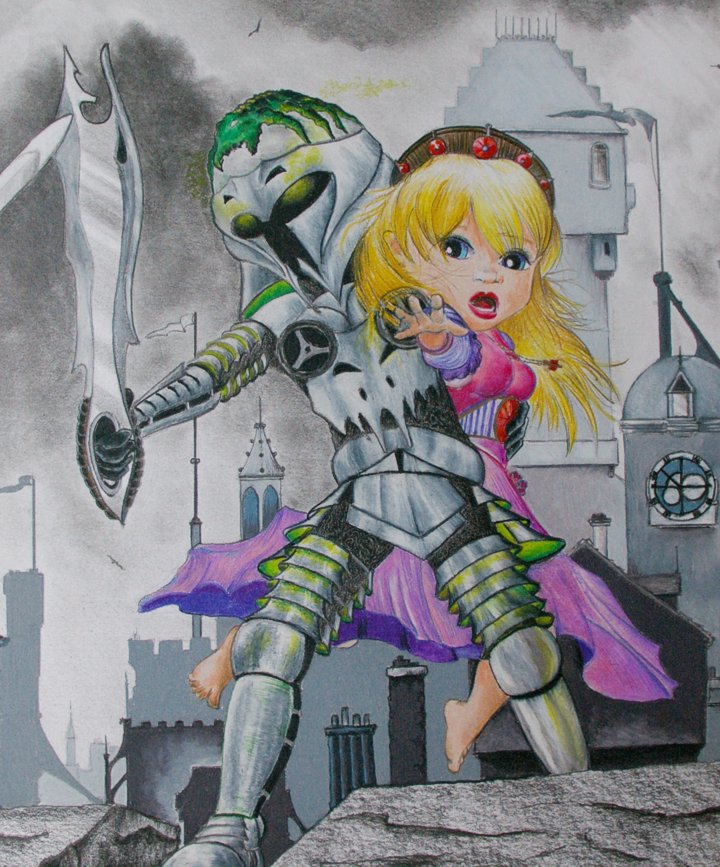
The final product
Look closely…
Did you see it? Just before I finished this part of the image, I reversed the sword in the hand of the evil knight. Check the transfer drawing again if you missed it. I was not happy with the piece as I working on it, but could not put my finger on it, being too close to the work. The moment I concentrated on the sword, I knew that was the problem. Once flipped, I felt hugely better about the piece and it was done in no time.
This is actually a mixed media work. The sky and stones are done with graphite pencils. Only the buildings and characters are completed with coloured pencils. The cover design at the top of the page has the colours tweaked a little from what you see here, which is closer to the original. However, I think the cover with the composited title looks wonderful. I don’t know who did it as I signed off after the cover was done. I definitely like it, though.
THE LOGO
This was the second design. Green was the order of the day. I used red in the earlier version with original text I created that looked like a graffiti tag. As you can see, if you compare this one with the logo on the cover art at top, the texture on the letters has been redone. We agreed on what you see here, but I like the other on the final cover better. It looks like scales! Oh, the nasty looking thing underneath is a view of the sword in regular graphite pencil.
A WONDERFUL SURPRISE!
This arrived in an email one day- the evil knight as rendered by an animator in Sweden. If you read Paul and Jeff’s blog at the time, you could follow links to the creator’s own site. I think the drawings translated really well into the final model. The sword was simplified in the blade, but the handle remained pretty much as imagined. And you should have seen this guy move in the demo animation!
And that was it. At the time of writing, the game was still available on the X-Box Indie platform. People I’ve talked to who played it had a lot of fun. I did get an X-Box later and played a few games on it, but never became a huge fan because of the time involved and all the other projects I wanted to work on. I will not say ‘no’ to another stint of character design, though. CORRUPTED was just too much fun.
The following galleries are from the old website, featuring images that were taken during the 1990s and 2000s. As on the page of black and white images, a number are reproduced from old prints. I transitioned completely to digital with the purchase of an SLR camera sometime around 2005.
TOKYO
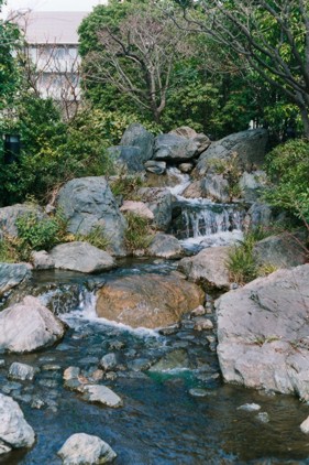
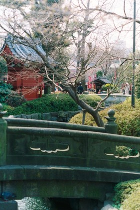
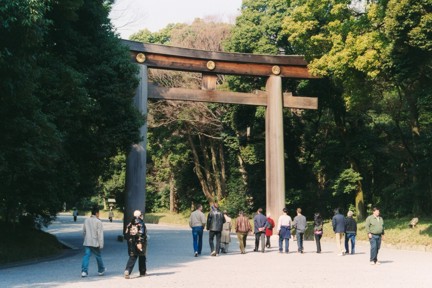
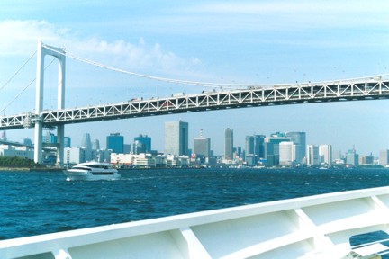
In March, 2004, I visited Japan for the first time, spending the week in Tokyo going on tours and doing a lot of walking around the place. Tokyo has to be one of the cleanest, and most workable big cities I’ve ever visited. With a population of 12.8 million, I was truly amazed by how easy it was to get around, and how polite people there were. They certainly show us how it’s done! Anyway, here are some of the 100 plus photos I took while there, visiting places like the Meiji Shrine, the Asakusa Kinnon Temple, Ginza, the Imperial Palace, and Tokyo Bay. Frankly, I’m not a fan of big cities, but Tokyo works so well I’d move there in a second. Don’t even get me started on the anime and manga… I have grouped the larger images within the galleries, so you may not have hyperlinks off all the thumbnails below. This way, all the various locations can be grouped together where necessary.
Click on each of the images in all the galleries to hopefully open and explore larger versions of them.
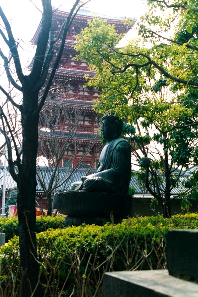
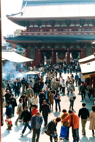
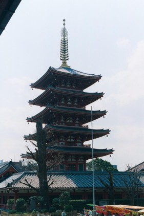
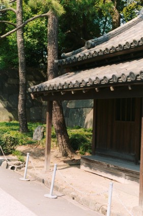
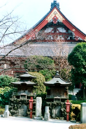
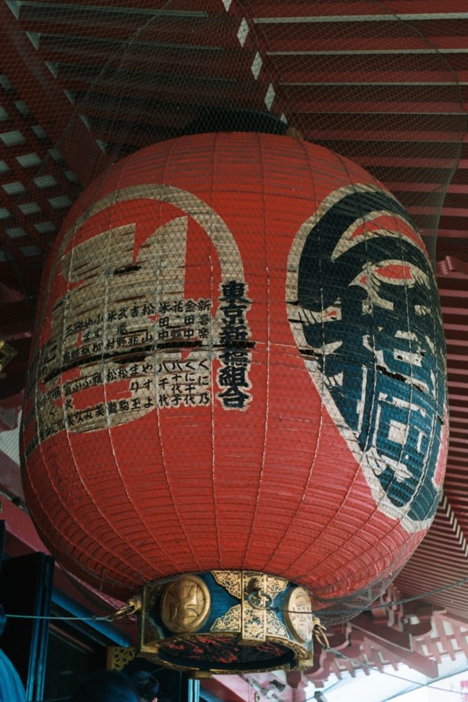
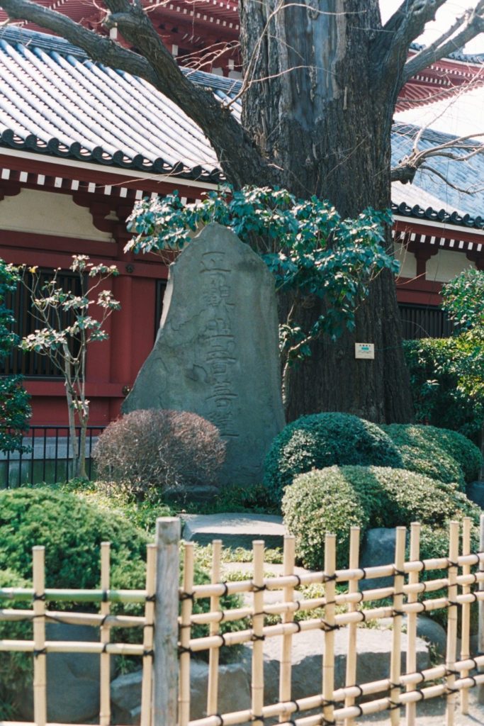
Asakusa Kanon Temple 1
Asakusa Kanon Temple 2
Asakusa Kanon Temple 3
Asakusa Kanon Temple 4
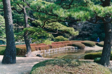
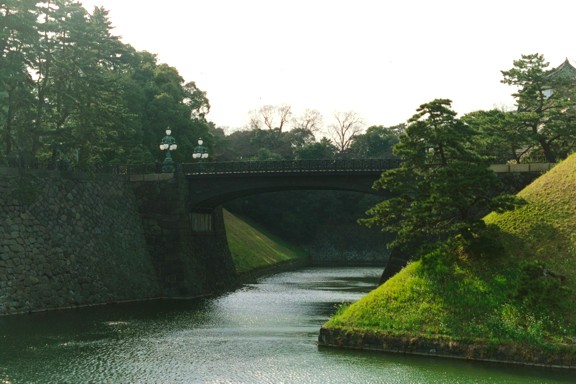
Imperial palace public gardens
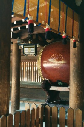
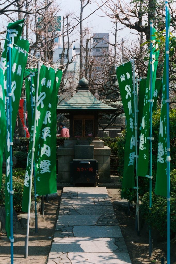
Temple shrines
Tokyo temple
Shinto shrine
Shinto shrine 2
Shinto shrine 3
Shinto shrine 4
Tokyo Bay
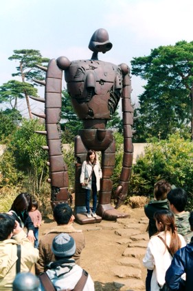
Studio Ghibli museum 1
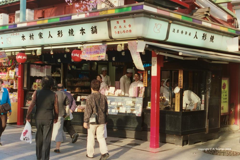
Tokyo candy store
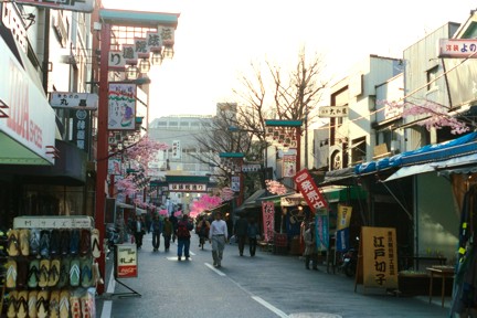
Asakusa market
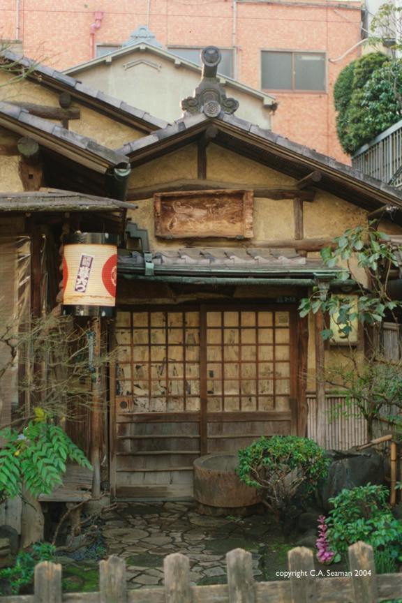
Residental Tokyo
Imperial palace public gardens 2
Imperial palace public gardens 3
Imperial palace public gardens 4
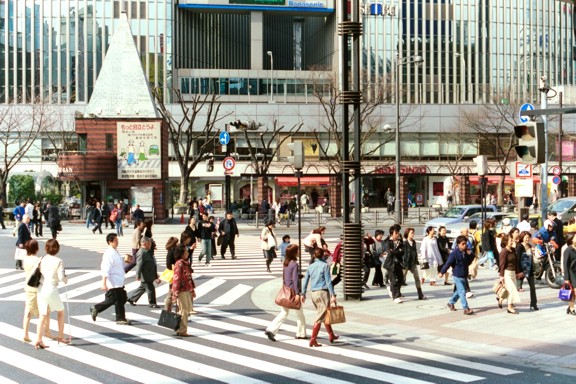
Classic Tokyo intersection
Famous Tokyo theatre
Tokyo shrine
Highways made earthquake proof
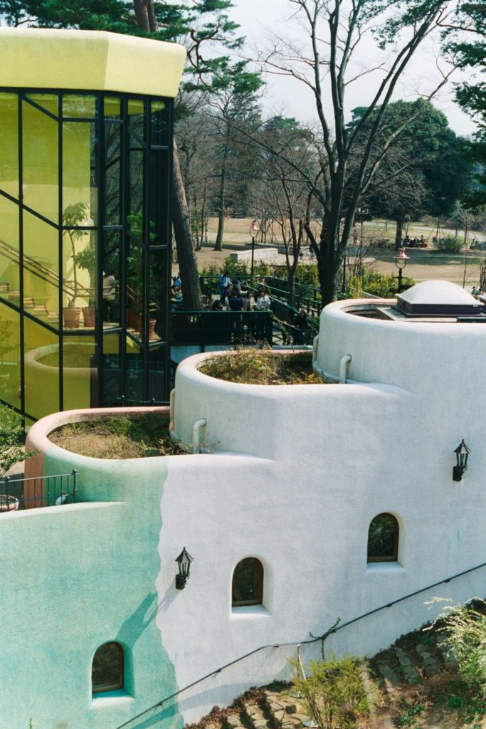
Studio Ghibli museum 2
Museum of Modern Art Tokyo
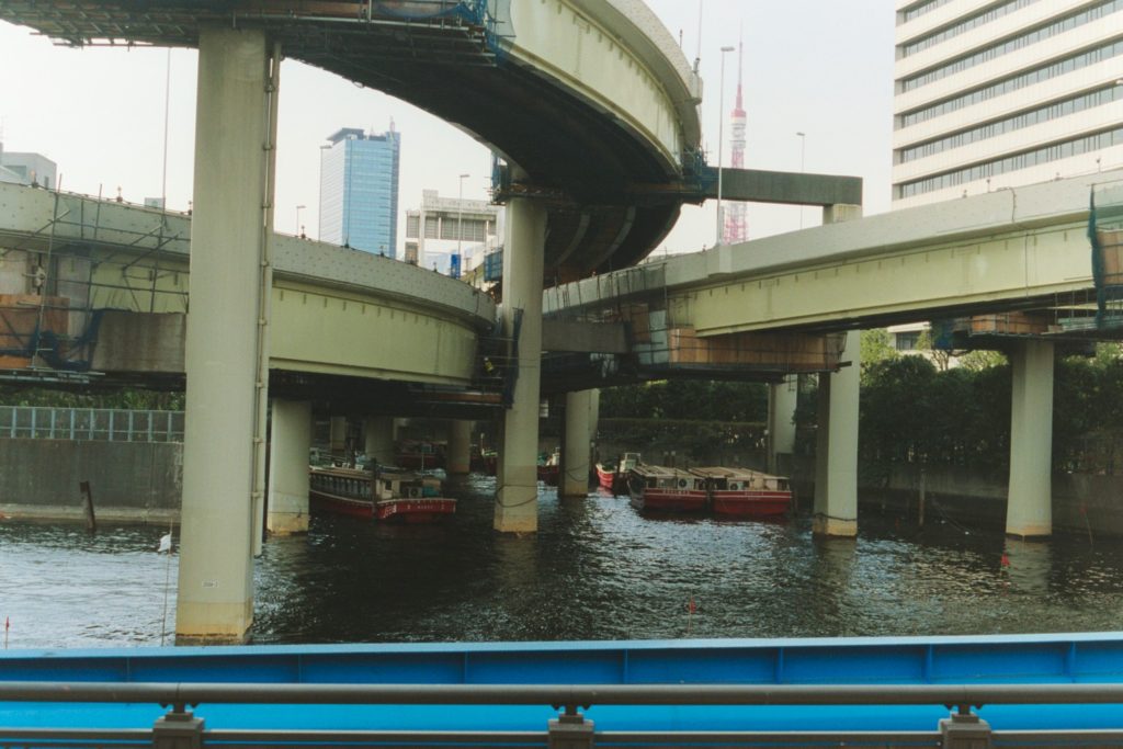
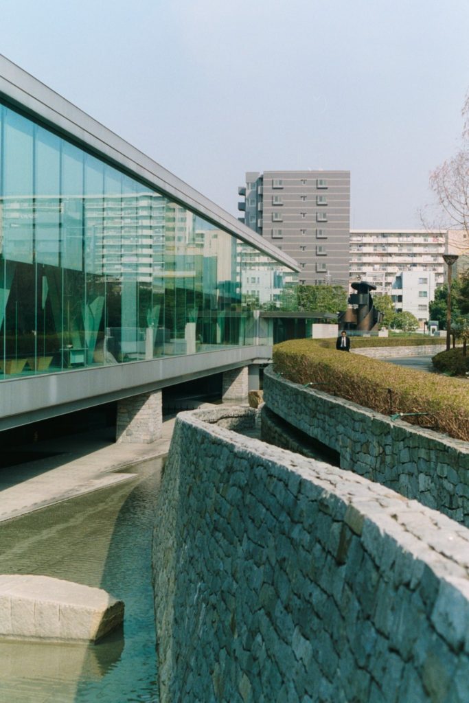
Bridge across one of many rivers in Tokyo
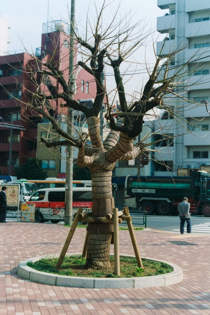
Tokyo tree bundled up for the winter
Imperial palace public gardens 5
Tokyo shrine
Tokyo shrine
Tokyo shrine
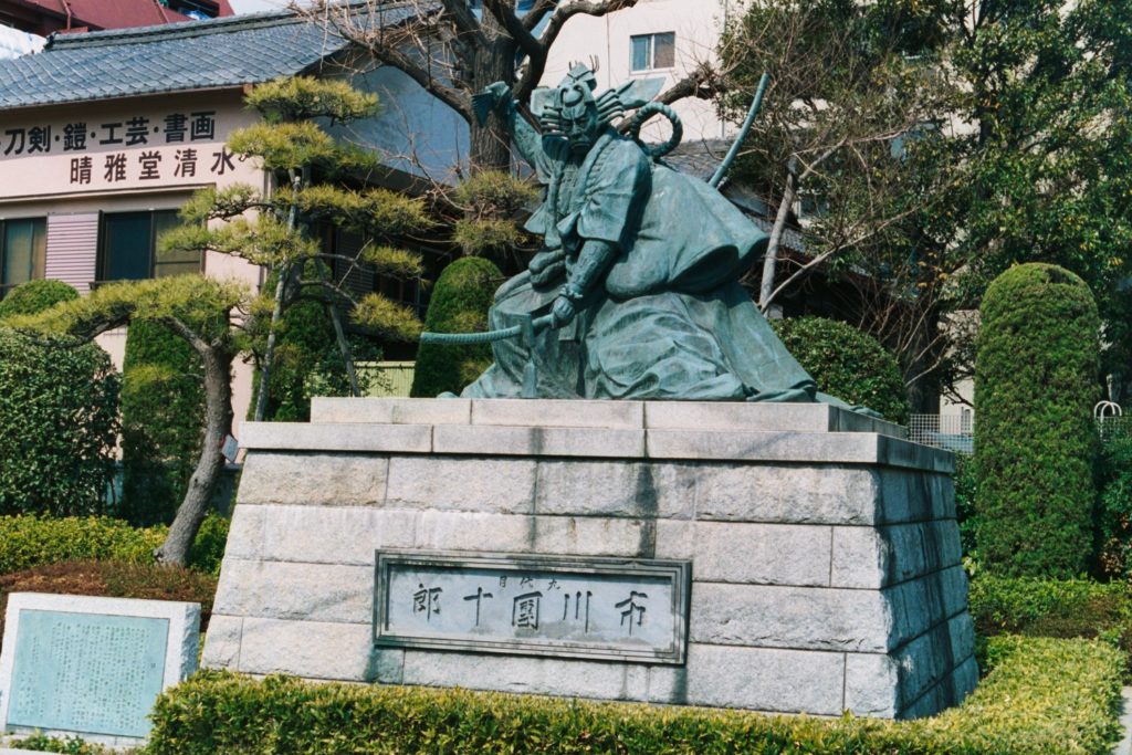
Warrior memorial
View from the New Takanawa Prince Hotel
Gateway to Shinto shrine
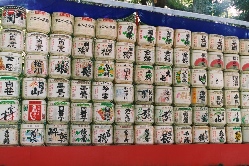
Offerings of sake
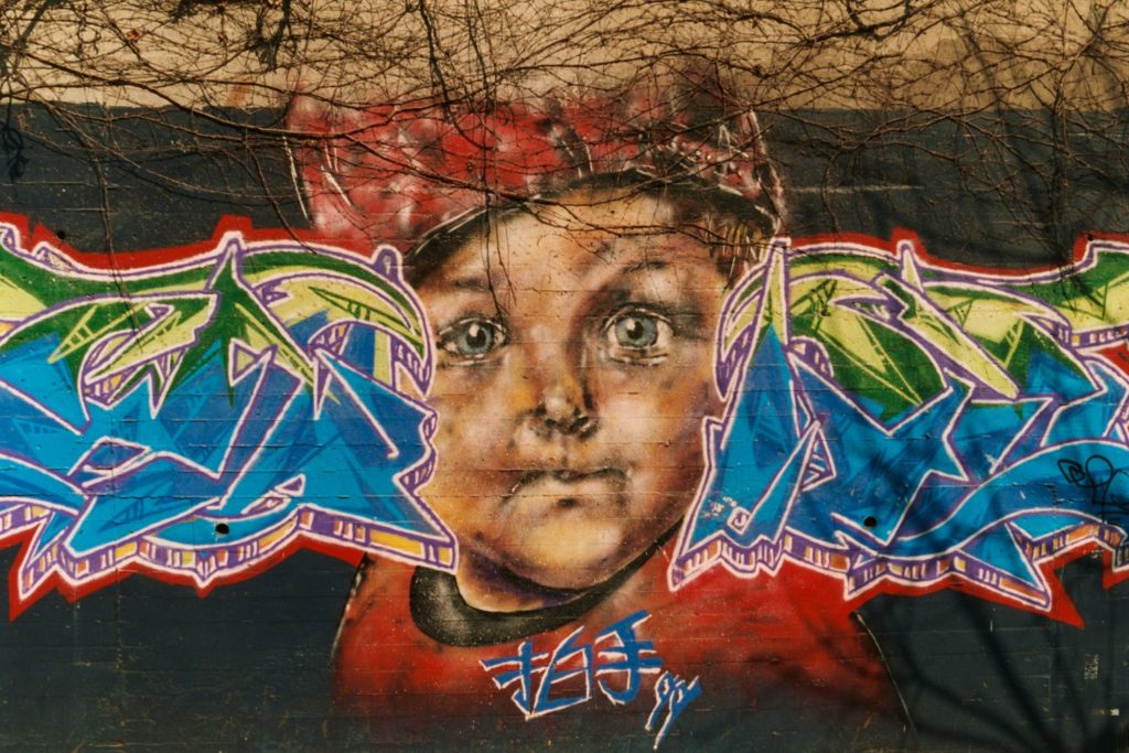
Tokyo graffiti
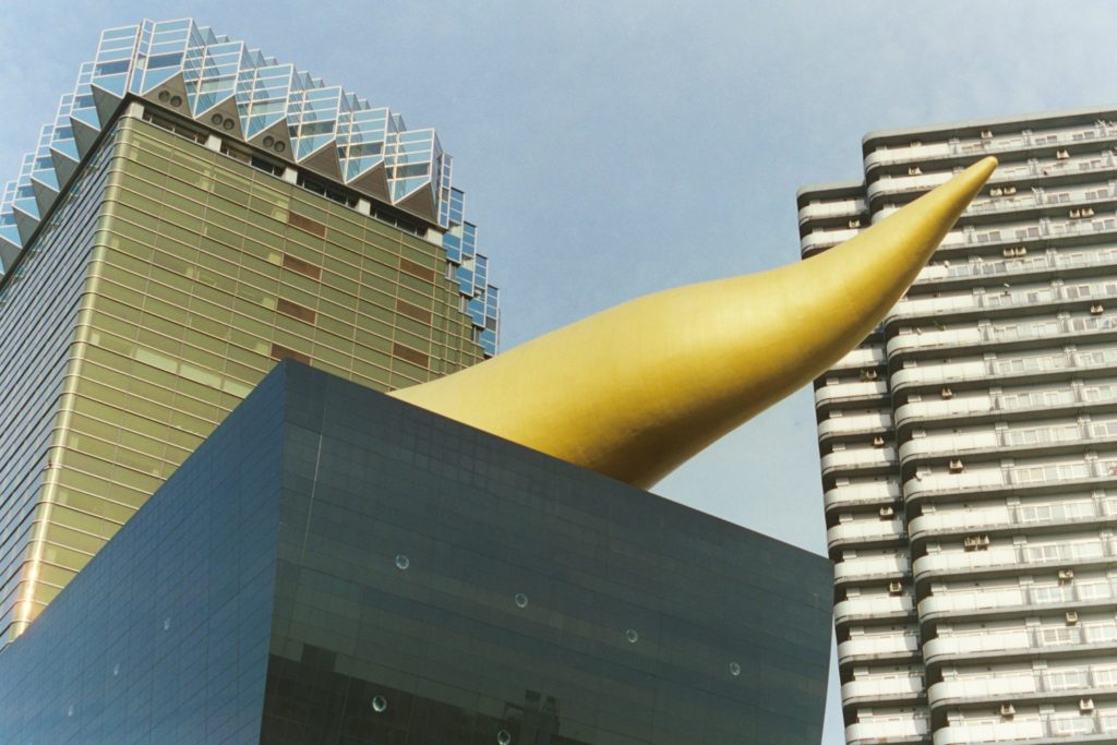
Modern sculpture adorning roof of classic Japanese beer brewer’s headquarters.
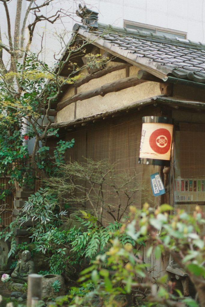
Japanese home garden
ENGLAND
I have traveled to the British Isles more than any other place. What is shared here will be some of the photos from trips prior to the most recent visit of 2014, which will be in a separate posting later.
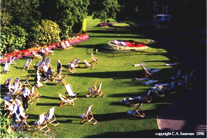
Bath
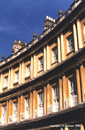
Bath 2
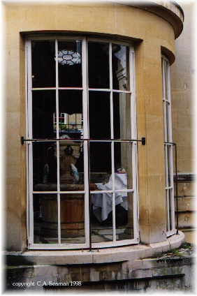
Pump House, Bath
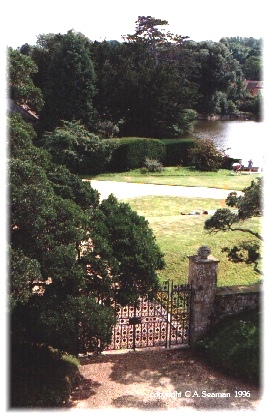
Beaulieu Abbey
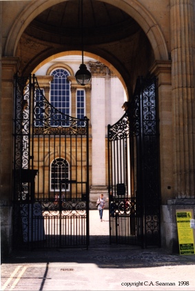
London
York
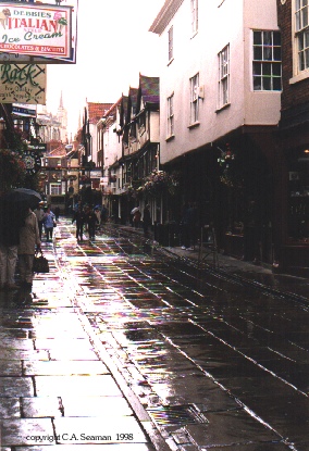
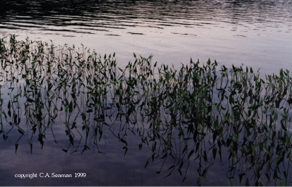
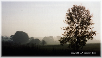
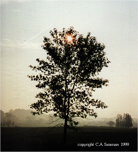
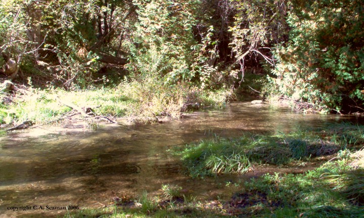
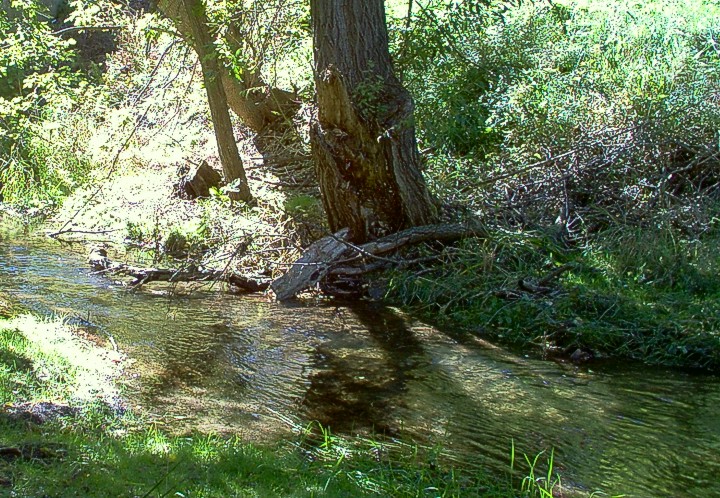
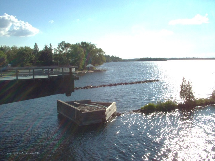
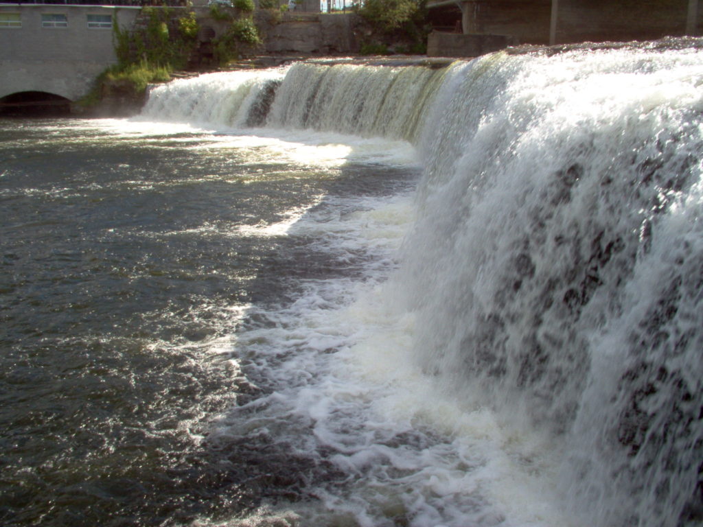
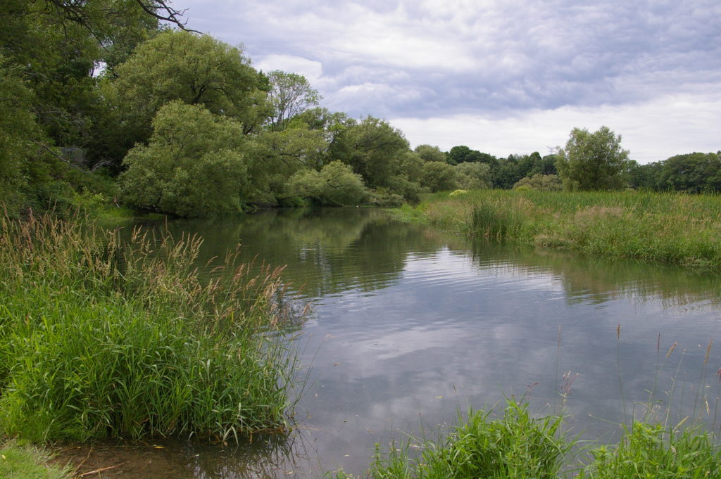
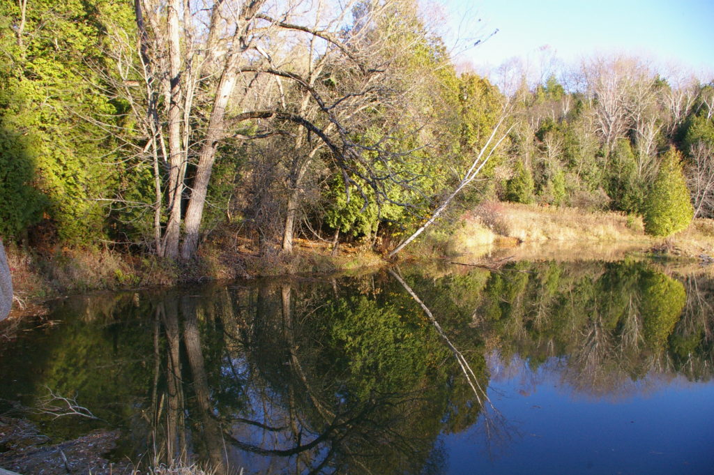
CANADIAN SCENES
1
2
3
4
5
6
7
8
9
10
11
12
13
14
15
16
17
18
19
20
21
22
23
24
25
26
27
28
29
30
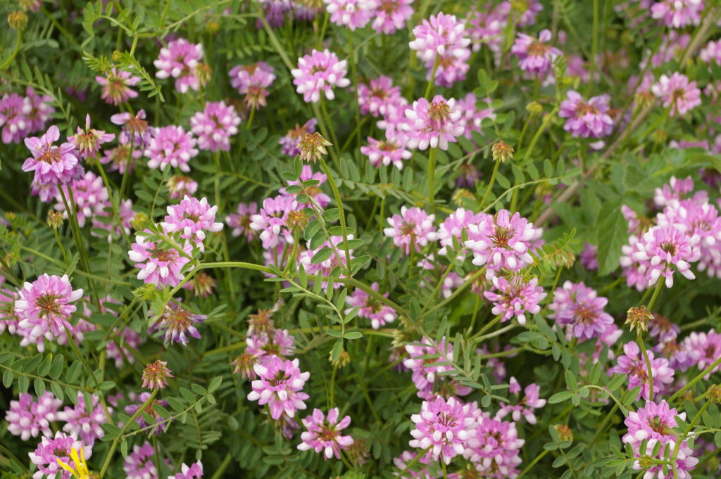
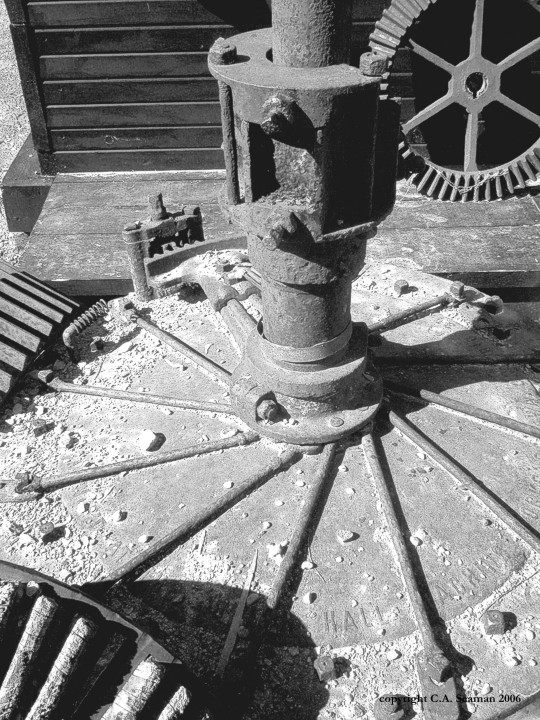
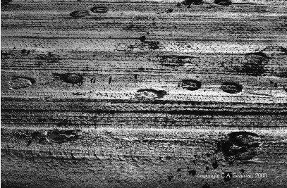
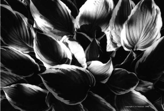
ASSORTED OTHER IMAGES- ELEMENTAL LINES, SHAPES AND FORMS
1
2
3
4
5
6
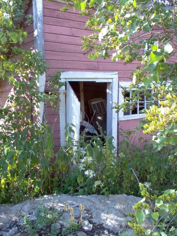
Newtonville
Uxbridge 1
Uxbridge 2
Uxbridge 3
All images in this page are copyrighted C.A. Seaman and may not be reproduced without permission.
There was a time once when you needed to buy something called ‘film’ for your camera, which itself was something self-contained and not part of that mini-computer that tries to pass itself off as your phone.
Okay… enough sarcasm. The photographs displayed here are ones I took years ago with either a traditional SLR camera, developed using traditional means, or the earliest of digital cameras, using floppy disks or something like them for storage- as far as I can remember. I actually took a course in black and white photography at Durham College in 1998, using darkrooms and enlargers and other tools of the trade that at that time were just beginning to be replaced by digital media. I’m glad I had the experience of that. It taught me the plan the work ahead of time and respect the process of development, knowing each image cost paper, chemicals, time and money. Today, with UNDO functions, Photoshop and the like, students of photography have many safety nets to catch them if they mess up, unless they first forget to hit AUTO SAVE.
With cameras and social media now so prominent in society, I think it can be argued the world and the people within it have never been photographed as much as they are today. And as to the quality of the overwhelming majority of images out there? Well, let’s just say if people had to pay for each one, the internet wouldn’t be choking on the many narcissistic selfies that appear on social media platforms every second of the day. Privacy might not have to be so carefully protected against unwanted recording in someone’s random imagery.
Photography was once a novelty. It was an event when the camera was taken from its case. Now, it is almost a substitute for vision and memory as we know it. People don’t watch concerts. They film them. People barely savour the moment of meeting a celebrity. They reach for their phones to let the device record the memory of that moment for them instead. It goes on…
You didn’t click on this page to read rants, though, and I won’t take up any more time on this rant because I could really go on and on….
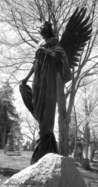
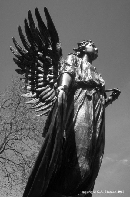
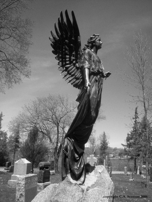
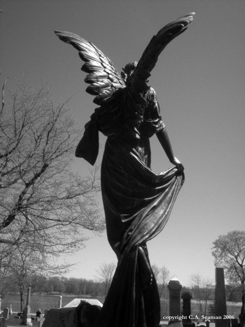
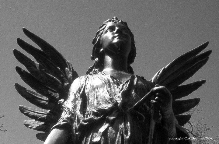
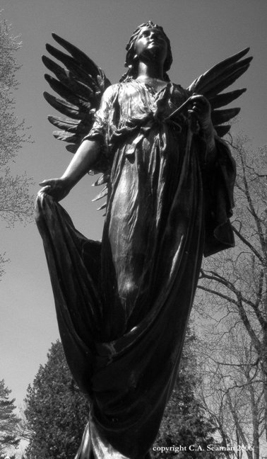
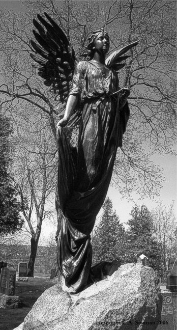
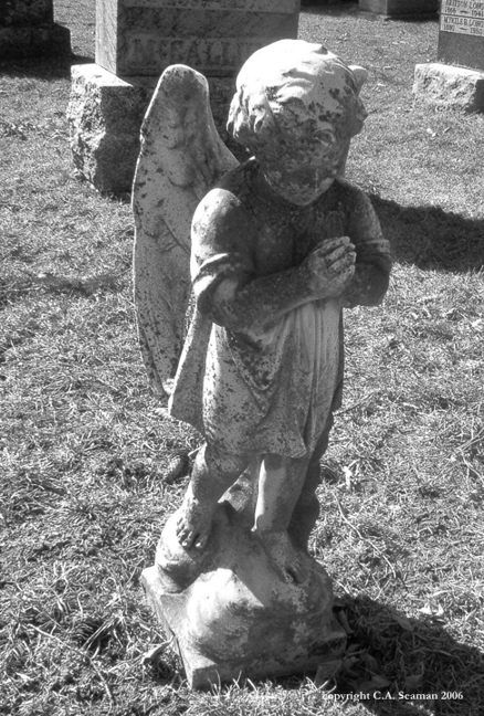
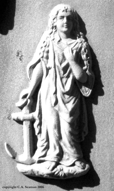
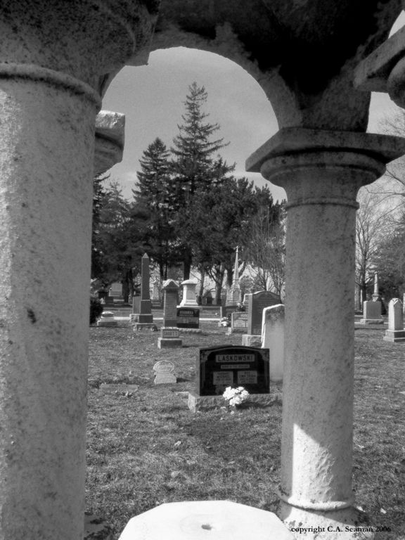
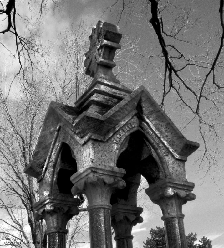
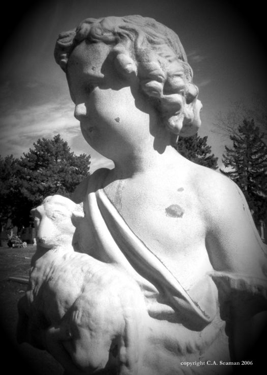
BLACK ANGEL OF PETERBOROUGH
This cemetery just on the outskirts of Peterborough featured many interesting memorials, but I must admit I feel in love with this statue of an angel sitting atop the grave of a former Lieutenant-Governor’s son. It is at least life-size, and looked fantastic from any angle. I believe these may have been in colour originally and shot with an early digital camera.
1234
5
6
7
8
9
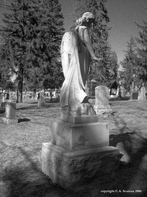
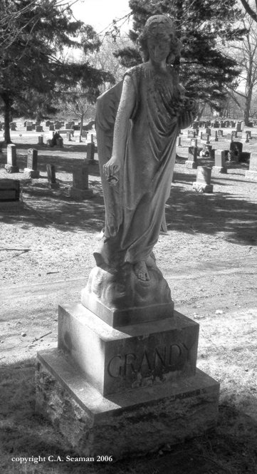
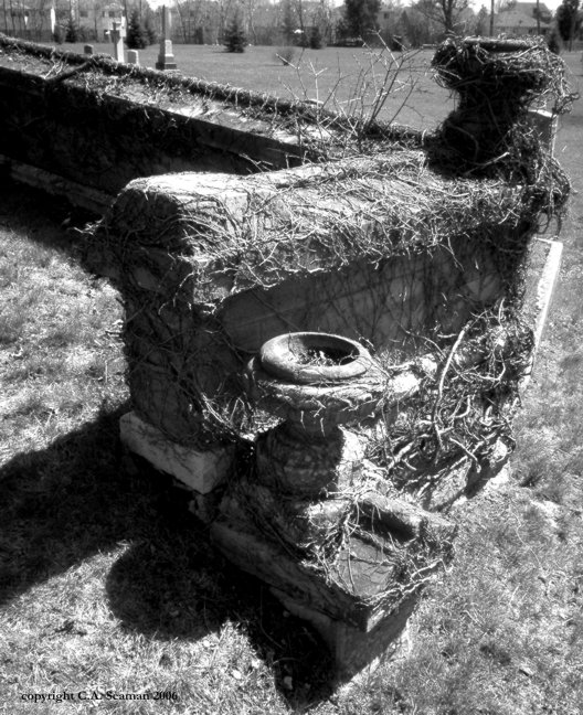
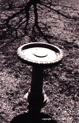
COBOURG AND PORT HOPE
These two old towns have some interesting cemeteries of their own, with a couple of pieces that stood out from the rest. In Cobourg, it was the strange structure that sat all tipsy on the side of a hill, overgrown with vines and looking something like a beached stone TITANIC. In Port Hope, it was another angel, and…CREEPY!…a grave marker with my family name on it and no dates… These pictures were taken at roughly the same time as the Peterborough set.
10
11
12
13
14
15
16
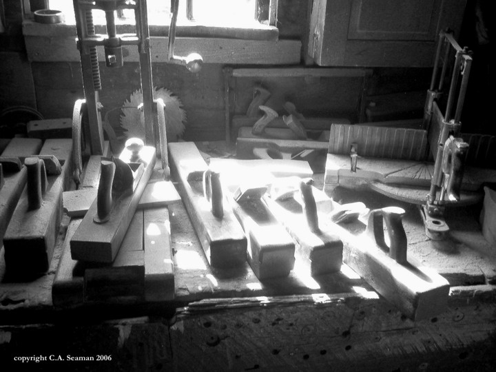
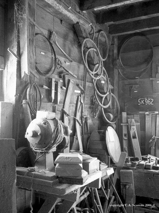
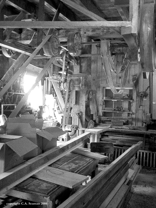
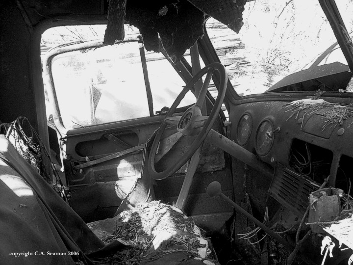
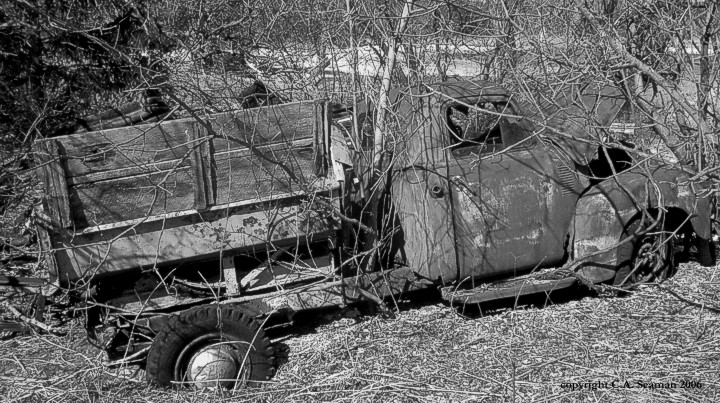
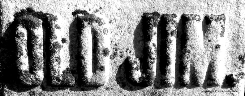
TYRONE MILL SERIES
Tyrone Mill is located just north of where I live, and is still an operational saw mill and cider refinery. It has stood since the mid 1800s, and is a dream photo location site. Inside the mill, wood is stacked ready for cutting. Tools used when my great grandfather was alive line shelves around the shop. On the lower level, you can buy cider and donuts made on site. Outside the mill, you can walk around a lake, or along the river created from its runoff. Then there are all the other little touches, as seen in this gallery.
I hear it has changed a lot since these pictures were taken. In that case, the images here represent an historic record of days gone by. While uploading this set, I found the original colour digital files of these images. I’m happy to still have them, but they look much better in black and white.
17
18
19
20
21
22
23
24
25
26
27
28
29
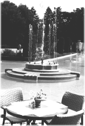
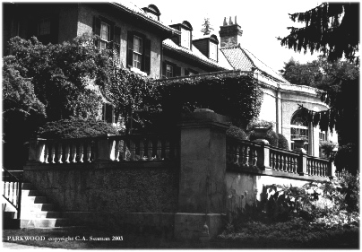
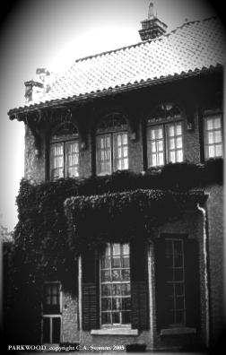
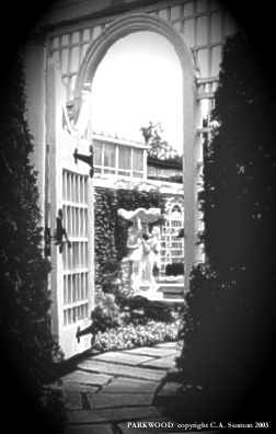
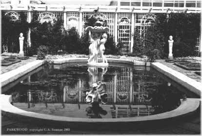
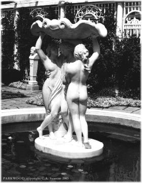
PARKWOOD SERIES
The following are photos taken by me recently at Parkwood Estate in Oshawa, the former home of R.S. McLaughlin and his family. For those you who don’t know who he was, he helped create General Motors, and his philanthropic ways helped create many other venerable institutions in Oshawa and around Ontario. I took these pictures in colour, but converted them to black and white in order to catch more of the period in which this grand building and its grounds were created, between 1915-17.
30
31
32
33
34
35
OSHAWA UNION CEMETERY
I have lived in the Durham area for 14 years, and yet only just vistied this old and very interesting place of rest on the corner of Highway 2 and Thornton. Here are some of the images I captured there. I have played a little with the settings, to bring out the detail in the stone.
36
37
38
39
40
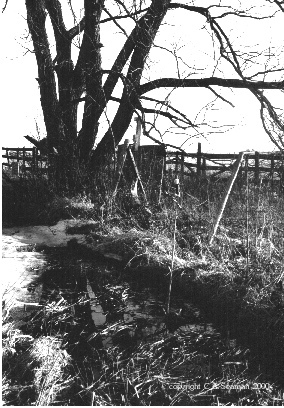
GHOST ROAD SERIES
Ghost Road was the name of a band in Oshawa, playing a selection of original and cover tunes with a country rock theme. I was invited to become a photographer with the band in 1999, and then followed like a roadie on the trail with them as they played some of their gigs. I felt like an older version of the kid in ALMOST FAMOUS. (Somehow I missed Kate Hudson along the way…) This gallery contains images of the mysterious Ghost Road itself, just outside Port Perry in Ontario.
41
42
43
44
45
46
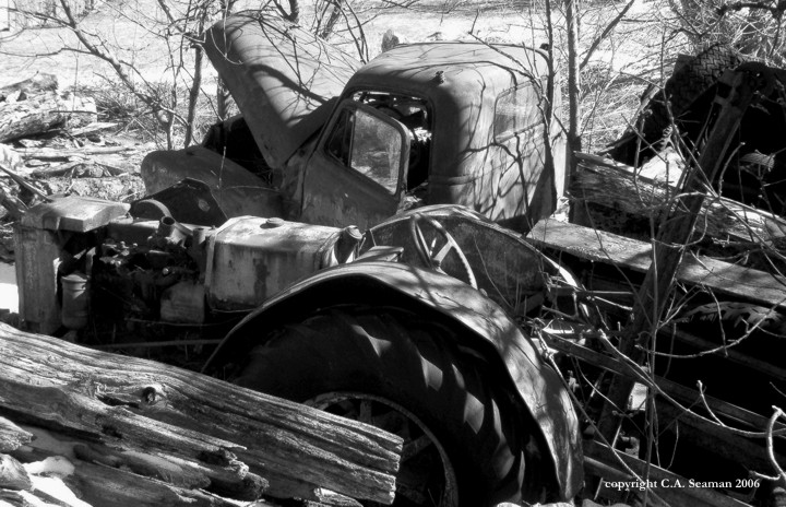
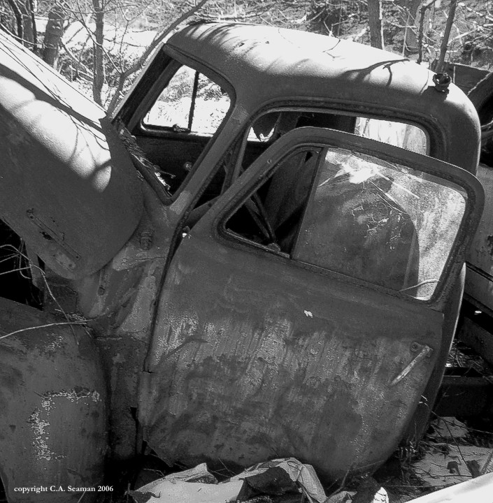
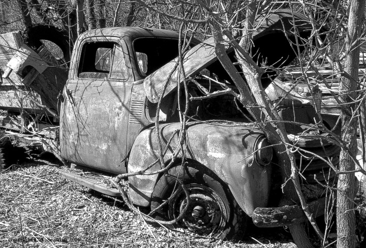
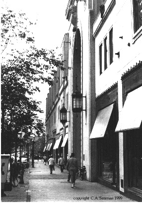
ASSORTED OTHER VIEWS
These are assorted other images from the archives. Some may be recognizable to you in terms of locations. Others may be more abstract in their composition and not meant to be part of anything representational or narrative in context.
47
48
49
50
51
52
53
54
55
56
57
58
All images are copyrighted C.A. Seaman from the time shown on the identification and may not be reproduced without permission.
I first became interested in aviation and naval art in high school, and still have some of the pieces I did then in my old portfolio. What is shown here is a collection of pieces done since 1990. Many are in private collections now and are not shown in public any more.
Let’s start with the Bristol Monoplane…
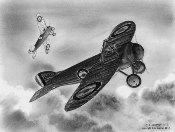
This piece was supposed to appear in an art show in 2012, but being the only black and white work, stood out as such an oddity that I left it home when it was time to hang the exhibition. Featuring the graceful and little known Bristol Monoplane of the Great War, it is a tribute to an aircraft that was ahead of its time and unfairly maligned by the powers in charge of the RFC during the war. Serving largely in the Middle East, it performed well and examples of it survived years after the fighting stopped in 1918.
BRISTOL MONOPLANE. Graphite on paper, 14x11in. Copyright C.A. Seaman, 2012
“REMEMBERING THE WAR IN THE AIR”- an exhibition in 2012
2012 was the year when aviation art returned in force to the studio. An invitation in early July to participate in a book talk at the Brampton Public Library on CANADA AT WAR, by Paul Keery, was based on the assumption that I would simply put old pieces lying around the house on display. However, the organizer of the book talk became concerned when I told her many of those pieces went into private collections and in some cases, were unaccountable in their whereabouts because the owners had moved, passed on the work or died. I proposed instead of hunting them down to create new works more reflective of my current style, rather than that of the 1990s when most of the original pieces were created. What follows is a catalogue of new works done in four months on a variety of British and Canadian subjects. For BOMBS GONE OVER BRUNSWICK, where the original is now in England and the process of its completion is documented below, I included a print of the image produced from photos I took of it before it left for its new home.
What also follows after that is an assortment of other pieces completed in a variety of media over the years leading up to the 2011-12 show. Where possible, I will include further information about those pieces, their composition and completion dates.
DEATH AT DUSK. Coloured pencil and watercolour media16x12in. Copyright C.A. Seaman, 2012.
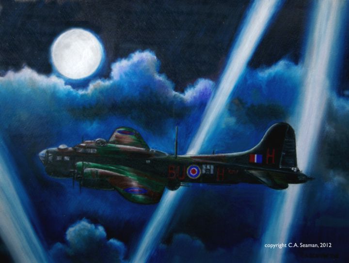
COUNTERMEASURES- Electronic Warfare B-17 in Action. Coloured pencil and watercolour media, 16x12in. Copyright C.A. Seaman, 2012.
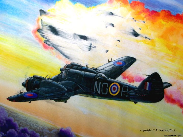
CANADIAN OVER COLOMBO. Coloured pencil and watercolour mixed media, 14x11in. Copyright C.A. Seaman, 2012.
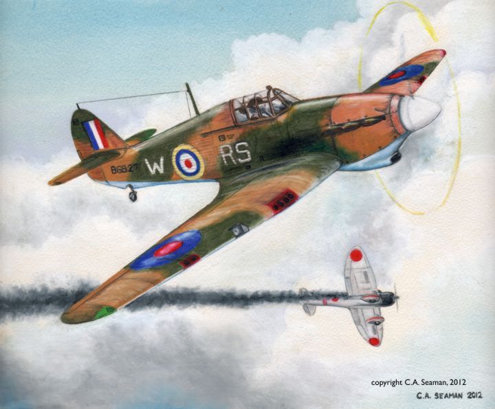
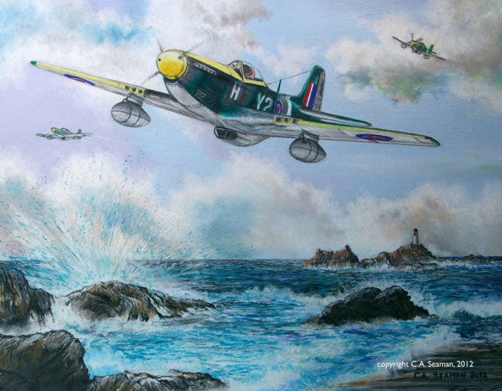
CHARGING MUSTANGS- 442 SQUADRON LIBERATES THE CHANNEL ISLANDS. Coloured pencil and watercolour mixed media, 14x11in. Copyright C.A. Seaman, 2012.
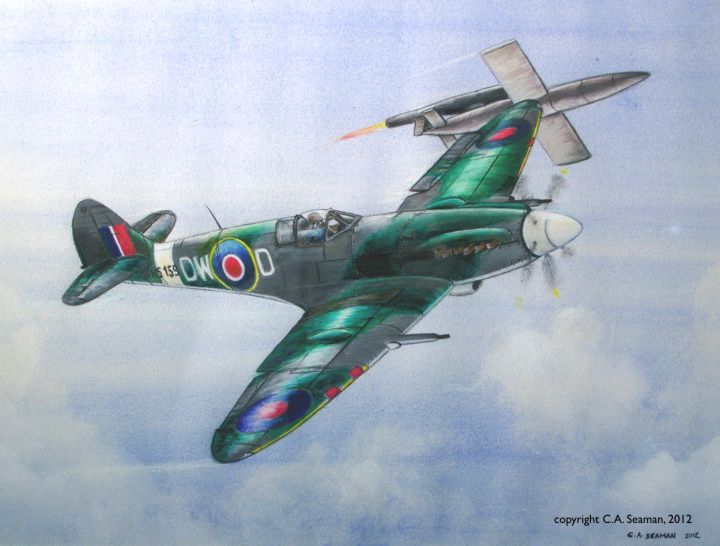
TIP AND RUN- BOUNCING A BUZZ BOMB. Coloured pencil and watercolour mixed media, 16x12in. Copyright C.A. Seaman, 2012.
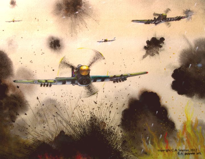
CLOSING THE GAP- TYPHOONS OVER FALAISE IN 1944. Coloured pencil and watercolour on paper, 14x11in. Copyright C.A. Seaman, 2012.
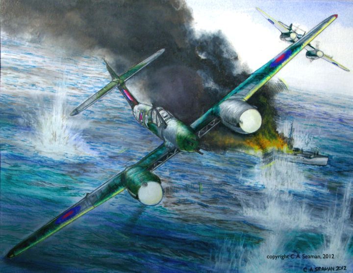
REAPING WHIRLWINDS- HUNTING E-BOATS IN THE CHANNEL. Coloured pencil and watercolour mixed media on paper, 14x11in. Copyright C.A. Seaman, 2012.
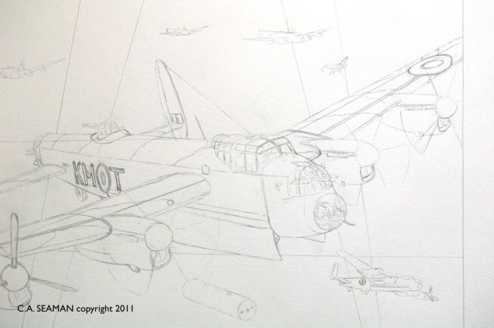
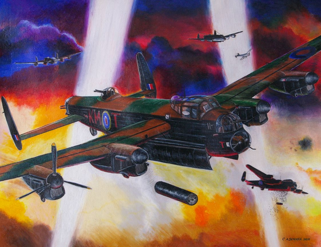
BOMBS GONE OVER BRUNSWICK- process to completion
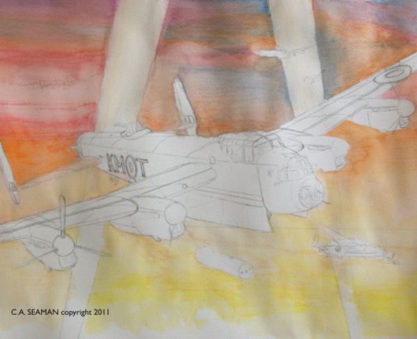
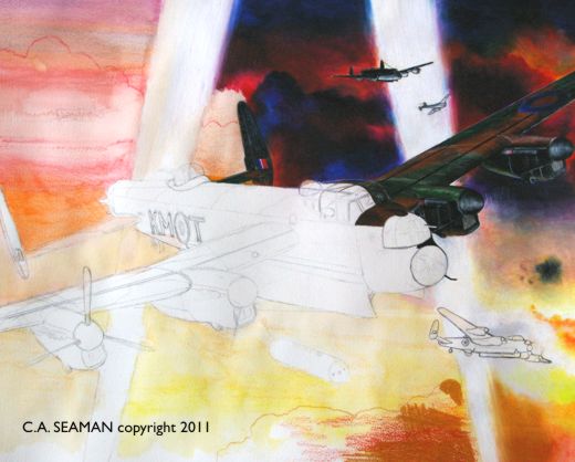
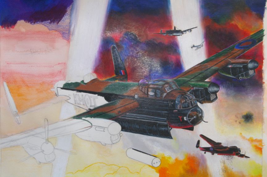
In late 2010, I was invited to create an image of a Lancaster bomber for my aunt and uncle’s 50th wedding anniversary. The way in which the aircraft was created was left up to me. Not having completed a large scale aircraft piece in six years, I elected to use coloured pencil for my medium on 140lb. watercolour paper stock. Research took place early in March, after I had already decided on a composition. Admittedly, this was an odd way to compose the piece, but once I sorted out the aircraft, using Touchwood’s Lancaster computer generated model in Poser and my own photo reference material for the background, I hunted through books and the internet until I read of an account of a Lancaster in trouble while on a raid over Brunswick sometime in 1944. Satisfied the account matched the composition, I transferred the squadron codes to the aircraft- already drawn out on the board- to create the first stage of the work shown below, as completed on a Friday. Next, I washed in a kind of underpainting using watered down acrylics to establish a tone range for the background. Yes, it was messy and the paper wrinkled badly at this stage. I was not bothered, however. The coloured pencils- Prismacolour, to be precise- were to be used next, and the sheer pressure of the waxy ‘lead’ on the paper would be enough to flatten the image and shatter more than a few pencils in the process. Detailed images follow the process as the picture progressed.
The final piece, completed the following Thursday after some 22 hours in total, looked like this…
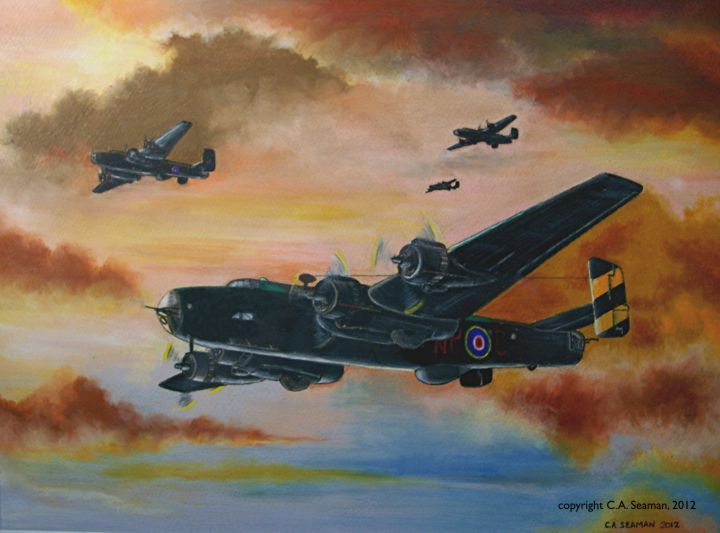
BOMBS GONE OVER BRUNSWICK. Coloured pencil and watercolour mixed media on paper. 20x14in.Copyright C.A. Seaman, 2011.(In private collection)
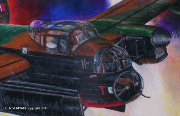
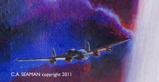
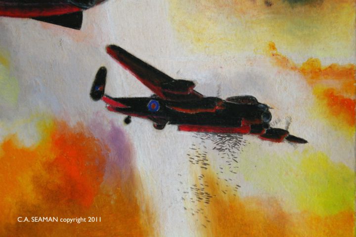
Some detail studies…
…and other aircraft, too!
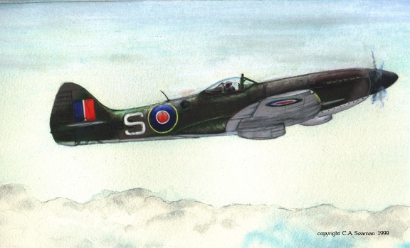
LATE MODEL SPITFIRE. Coloured pencil and watercolour mixed media on paper. Copyright C.A. Seaman, 1999.(In private collection)
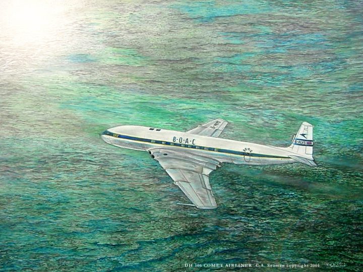
DeHAVILLAND DH 106 COMET AIRLINER. Coloured pencil and graphite on paper. 30x22in. Copyright C.A. Seaman, 2004.
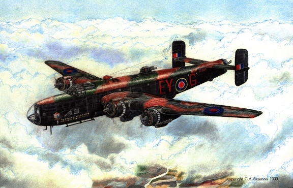
HANDLEY-PAGE HALIFAX OF NO.87 SQUADRON, R.A.F. Aircraft flown by Len Broadhurst, who I had the pleasure of meeting many years ago, and who received the original of this work. Coloured pencil and watercolour mixed media on paper. Dimensions unknown. Copyright C.A. Seaman, originally 1998. (Posted 1999).
NOTE: Mr. Broadhurst passed away a few years ago. If anyone knows what happened to this piece, please contact me through this website.
(This essay reflects a practical academic application for some of the techniques and work I have developed in recent years. Feel free to read and use it. However, if you are to use it, be sure to give me credit.)
APPLICATION TO ESL
How can ESL benefit from the use of sequential art in the classroom? Historically, sequential art has already been used to help people learn the language better. Dry comics showing characters learning numbers, key words, concepts and other communication skills are present in many ESL guides. Indeed, those of us who have taken French as a Second Language at a young age will not soon forget the adventures of Jacques, Suzette and Pitou, the dog (the Francophone equivalent to Dick and Jane). However, beyond the basic function they possess in helping familiarize new learners with the language, there is little in the current material which exists that can capture the imagination of an immigrant audience in this language, and encourage it to read on in English as much for the enjoyment of reading a good story as for the obvious learning benefits it has. If immigrants are continuing to read, it is often in media printed in their own language.
What follows are some ideas on how to use existing comics, or photos to help improve literacy in the ESL learners we teach. You need not be an artist to understand these concepts.
SUGGESTED INSTRUCTIONAL STRATEGIES
Existing comics can provide a useful basis for teaching beginning language for the ESL learner. The sources are readily available in the daily newspaper. The instructor needs only to clip out strips with appropriate material and clearly defined images that are neutral in terms of controversial content, and photocopy them, (giving credit to the creative source, of course!), for the class. The use of a good photocopier is key to this process, as blurred, smudged images with poorly copied text will not work for the students. If size matters for the instructor, enlarge the strip to fill a larger piece of paper. If colour copies are available, the teacher could use them. However, many of the best comics or manga in the world is printed in black and white. Stylistically, as well in the sense of reproduction, this is a lot easier to work with, providing clearer images and less visual clutter for the reader.
What the teacher does with the strips as tools is up to that person, and what they are trying to accomplish in the class. Three possible uses for the completed comic strip are identified below:
1) Simple reader’s comprehension. Students read the strip and develop better language skills from the experience.The instructor may opt to replace text that is hard to understand or conceptually abstract with language of their own in the speech bubbles. However, remember that the material is someone else’s and copyright concerns may exist. Students can be evaluated on pronunciation, clarity of voice, inflection and knowledge of body language, expressions and basic content. Being visual, comics can teach a lot of communication skills to students simply through the way characters on the page are drawn. Many books on how to draw comics contain reference sheets on how faces that are happy, sad, frightened, or exhibit other emotions look on paper. Some of this material could be used to help educate students on the visual language of sequential art.
2) There is also the possibility that the teacher may want the students to interact more with the text of the comics. In that case, the speech bubble content may be erased and the students could be encouraged to place their own text inside. Whether the students complete this task alone or in groups is the choice of the instructor, considering the abilities of the pupils. Students could be evaluated according to appropriateness of dialogue, based on visual cues such as the action taking place, the body language or facial expressions of the characters portrayed.
3)The third strategy employing existing comics could be to take frames from strips which are familiar to students and chop them up, leaving the students to re-arrange them and develop a narrative of their own. This can also be done using magazine photos and other visual media, creating a kind of storyboard project, where images are described in short sentences or paragraphs by the students in the order in which they are arranged. This can be the most interesting of the assignments as the skills applied in this project are varied from art based to literacy based. The students could finish the project with an oral presentation, honing their skills as orators in front of their peers.
4) Students could also take existing strips, if the skill levels are not up to creating an entirely new narrative, and simply continue the story, or, if the last frame is removed, create an ending of their own.
5) Finally, take images from magazines, and lay them out for students. Using the images of their choice, they can arrange them in some order of their own and write a sentence of descriptive text to go with each. They could be encouraged to figure out some kind of narrative to go with the images and tell a story with them using three or four select pictures.
All text is copyrighted C.A. Seaman 2007, and may not be reproduced without written permission from the author/artist.
Since I was old enough to hold a pencil, I have created art. Since I was old enough to read and write, I have written stories. As I write this, I have no interest in stopping in either of my pursuits.
I was born and raised in Brampton, Ontario. after graduating from high school, I attended studies at the University of Toronto, obtaining both a Bachelor’s Degree in English and History, with a Minor in Sociology and shortly afterwards, a Masters Degree in Modern Military History and Anglo-American relations. From there, I worked with the Brampton Public Library as a Library Technician and then returned to the University of Toronto to complete a B.Ed and then become an employee of the Durham District School Board, where I worked for 29 years.
Arts Education- teaching and learning…
Once in the classroom, I shifted my teaching interests from English and History to Visual Arts and Media. To support this change in direction, I upgraded my skills through taking courses in Photography and Multimedia at Durham College, and in taking a computer course at the International Academy of Design in Toronto. A few years ago, I completed a program in Cartooning and Graphic Novel design at George Brown College and enjoy keeping up with my studies whenever time for travel and work allow me to do so. Coincidentally, I also taught art both privately, and in places like Curry’s Art, the Robert McLaughlin Gallery, and Comic Book Addiction and have been a guest artist at CBA’s Free Comics Day events for several years .
Notices…
In 1997, I received a Civic Arts Achievement award from the City of Brampton, for work I had displayed across the country at places like the National Aviation Museum in Ottawa, the Durham District School Board offices, the Granite Club, the Brampton Public Library, and the offices at the City of Brampton. I acted as a photographer for a band called “Ghost Road”, won an honourable mention in an international postcard art show, and had work published in an alphabet book published by Visual Arts Brampton. My artwork, ranging from landscapes to historical aviation themes hangs in the homes of collectors in Canada and the United Kingdom. Currently, I am a member of Big Art Buzz, an online arts collective that has exhibited in various locations across the Greater Toronto Area.
Projects…
In 1999, I created the Rocket Girls, later known as the Kaiten Angels, as part of a Millennium project hosted by Visual Arts Brampton. The first piece appeared in an alphabet book published by V.A.B., created from a drawing scanned in Photopaint and coloured using that software. Over the years that followed, more images were created, along with story outlines, a short story- never published- and several calendars given to friends and associates. The characters became more computer generated, with less drawing involved up until the release of the last calendar in 2007. After that, I began work on my current project, called SARGASSO. Three books will have been published in the series by Christmas 2010, with the fourth on the way soon after. The story and art are both created by me and the books may be purchased at www.blurb.com. you can also read separate postings on the book and view some of the art related to it by searching this website.
From George Brown to Zephyr Crow and MANNA
I finished work on the first story arc for SARGASSO at the time I began my studies in Cartooning, the Graphic Novel and related illustration or anatomical courses at George Brown College in Toronto. In the Graphic Novel course, we were asked to create a short story of several pages for the final assignment. I had already done some work on a new story involving a character named Zephyr Crow and set in an old movie studio back lot. I will show you more about that in separate postings. For the final project in the Graphic Novel course, I began to develop MANNA, which is a coming-of-age story set mostly in the Netherlands during the Second World War. At the time of writing, MANNA is, as I call it affectionately, my herd of elephants in the room. Years of research, acquiring models and materials for the story, writing the script and sampling different formats for the book have brought me to the point where I am eager to get on with the production of the piece and other stories that have developed around it. As with the other projects, I will include separate postings on MANNA and the other stories as materials become available. Now retired from my work at the DDSB, I will have plenty of time to develop all of these projects and more.
One thing I enjoyed a lot in the last few years was working on creating animated sequences for AVENUE Q with the Whitby Little Theatre. I got to design the animations, put them together, see how puppets were made and be part of a very special production. Please take the time to read my article on working on the show, included in the section on Design and Commercial Projects. I’d like to explore puppetry more in the future and perhaps use it as a way of telling my stories. I’d like to explore the different types of puppets and the ways in which they are made. Puppetry is practically as old as theatre itself, with a long and rich tradition. Some say it is a dying art. I wonder, though. Can it not perhaps re-imagine itself for the new century? Like thinking of the next project and where it will take me in the future, who knows?