In January of 2013, I took a course at George Brown College in Toronto on illustration for Children’s Books. This was the first formal studio courses I’d attended for marks since 1983. It was a great experience and I learned a lot in terms of composition and technique as a result. My work for this course led to a series of works related to Paul Gallico’s novella, THE SNOW GOOSE, first published in 1940 after the evacuation from Dunkirk. Subtitled “A Tale of Dunkirk,” it was a story about Philip Rhyadher, a reclusive artist, who while tending a lighthouse on the Essex coast in the last years before the outbreak of the Second World War, was approached by a girl of the marshlands who had found an injured snow goose that had been blown across the Atlantic from Canada. Rhyadher heals the bird and allows the girl, Fritha, into his life. A closeness between them develops as the years pass, with the snow goose being at the centre of their platonically loving relationship. Fritha becomes a woman who grows to love Philip, only to have the events of 1940 come between them.
No spoilers beyond that…
This story won awards when released in the U.S. in 1941 and helped Gallico establish himself as an author of note, creating later books like THOMASINA, and THE POSEIDON ADVENTURE. THE SNOW GOOSE itself was adapted into an award winning film for the Hallmark Hall of Fame in 1973 with Richard Harris and Jenny Agutter and while it does not appear to be available beyond the world of YouTube, audio books are more accessible to modern audiences.
I chose this book as the core work for my study in the class, developing several works around it and spending a lot of time researching the time, the location and extrapolating on ideas I was developing for the costumes. I even created a music mix to listen to while working on it, using music from JOYEUX NOEL by Philippe Rombi in a rearranged form intermixed with radio passages from Churchill and Chamberlain to add more weight to the work. Ironically, the music did so well in my mix, it was hard to remember it coming from that wonderful and so tragic film. It is available from Virgin Classics (0946 338279 2) and helped greatly in the creation of the final pieces below. I would also recommend you seek out the progressive rock group Camel’s album from 1975, THE SNOW GOOSE, inspired by the book. (Label: Decca – Universal Special Imports. ASIN: B00005V1B2)
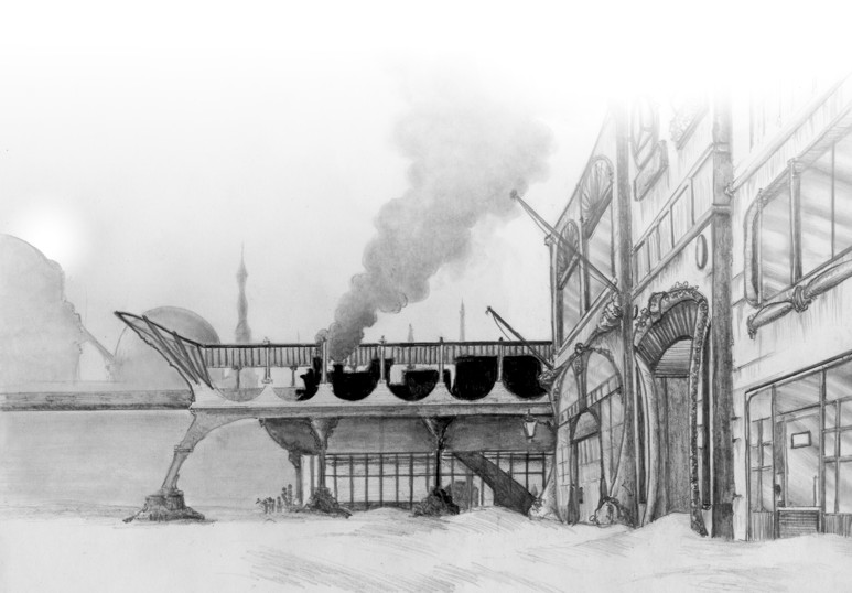
I think the idea for doing this came from driving into Toronto one day for the class an seeing in the distance black oily smoke rising from a fire on the docks in Oshawa. It reminded me vividly of one of Peter Scott’s illustrations for the original edition of the book in 1941 and one thought jumped to another and the images below were the end result. I think my work on it in turn helped bring about the creation of MANNA later on.
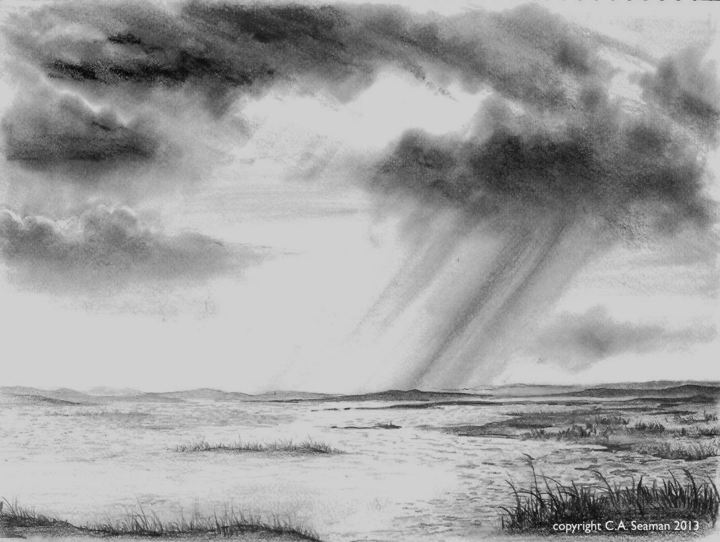
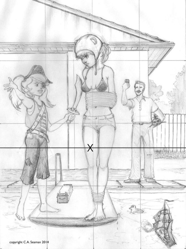
SKETCH OF PROPOSED SETTING FOR STORY. 10×8″ graphite on acid free cardstock. Copyright C.A. Seaman, 2013.
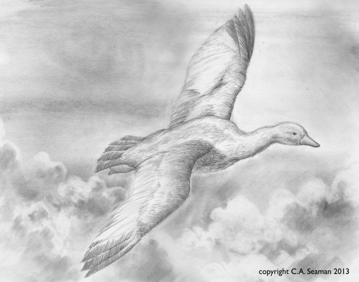
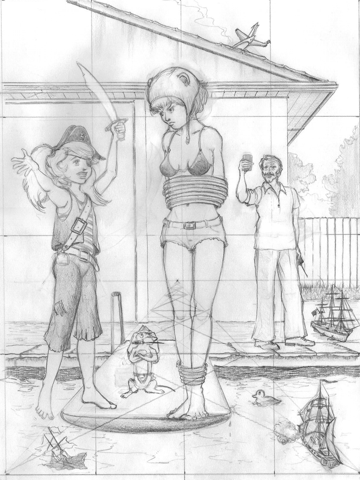
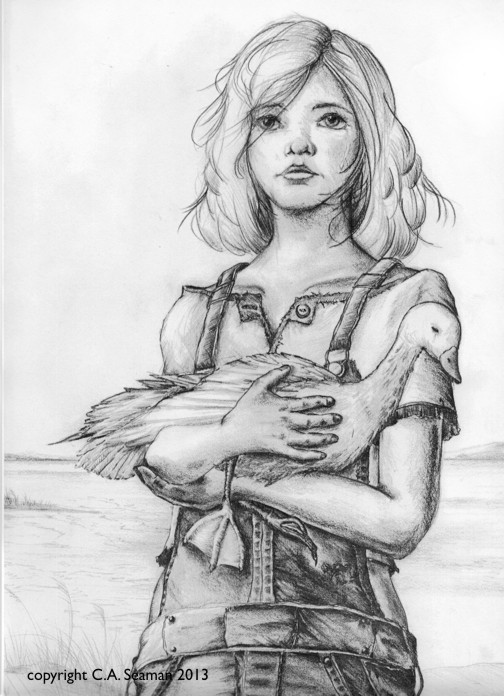
THE LOST PRINCESS. 11X14 in., graphite on acid free paper. Copyright C.A. Seaman, 2013.
I had never drawn a goose in my life. I used the same techniques I employed creating a piece I never put in the aviation art show of a Bristol Monoplane. The clouds were blended graphite with a white eraser being used to bring up the details.
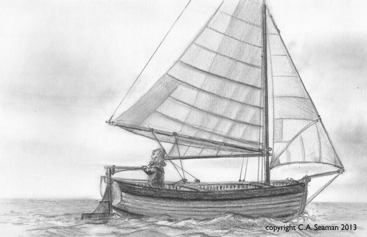
RHYADHER’S BOAT. 9×12 in. graphite pencil on acid free cardstock. Copyright C.A. Seaman, 2013.
This was a study of Philip’s boat, which figures prominently throughout the book. I made the sails a little transparent, as I had noticed in some of the photos of small sailing craft I studied, you could see the shadow of one of the sheets through another when the light was right.
Pencil treatment- graphite on vellum
Watercolour monochrome study
Pen and ink version
Detail from the pen and ink study
Mixed media coloured pencil and watercolour
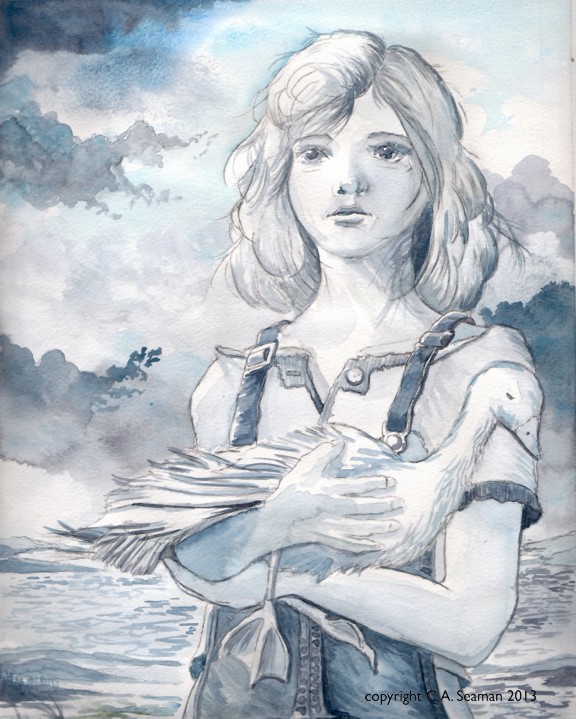
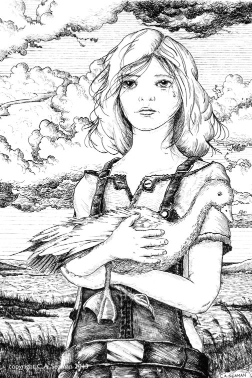
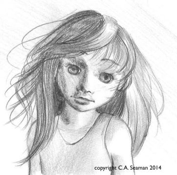
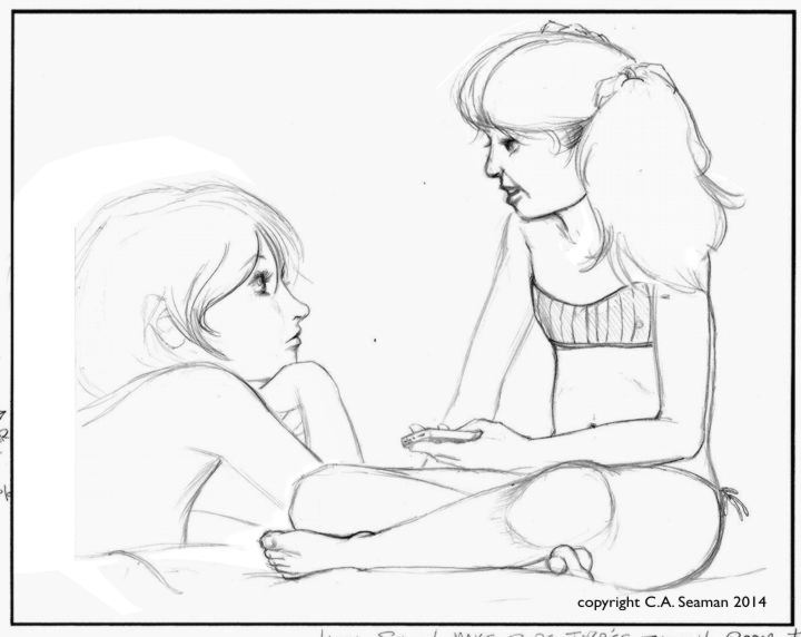
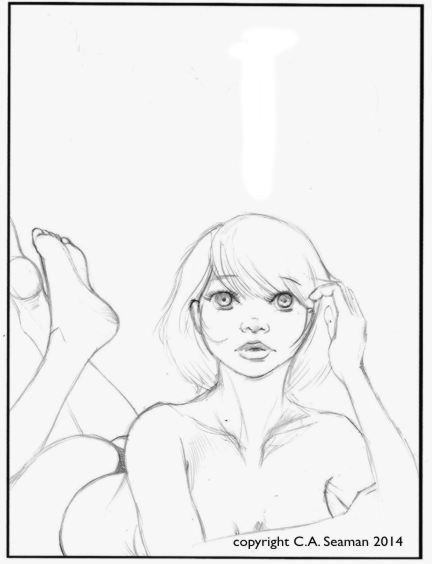
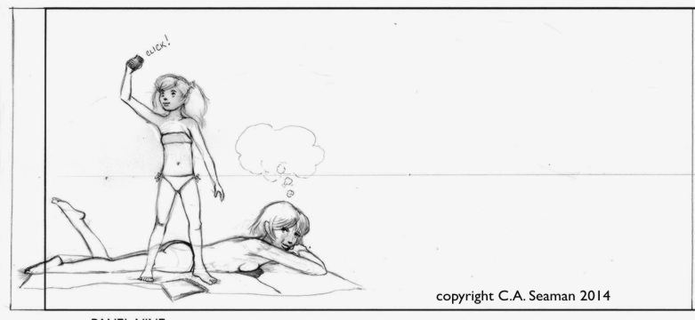
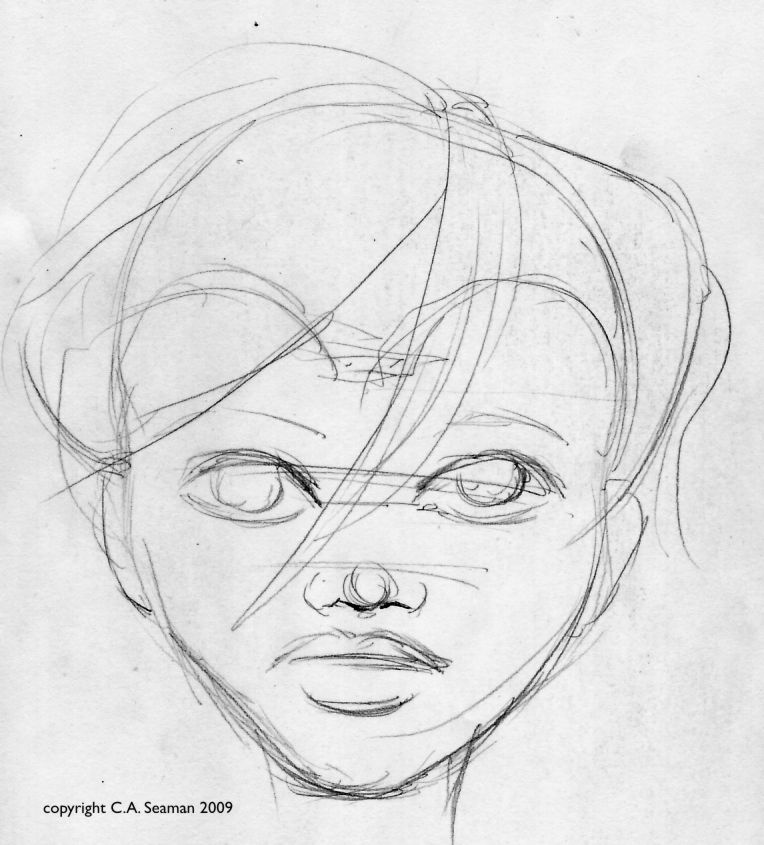
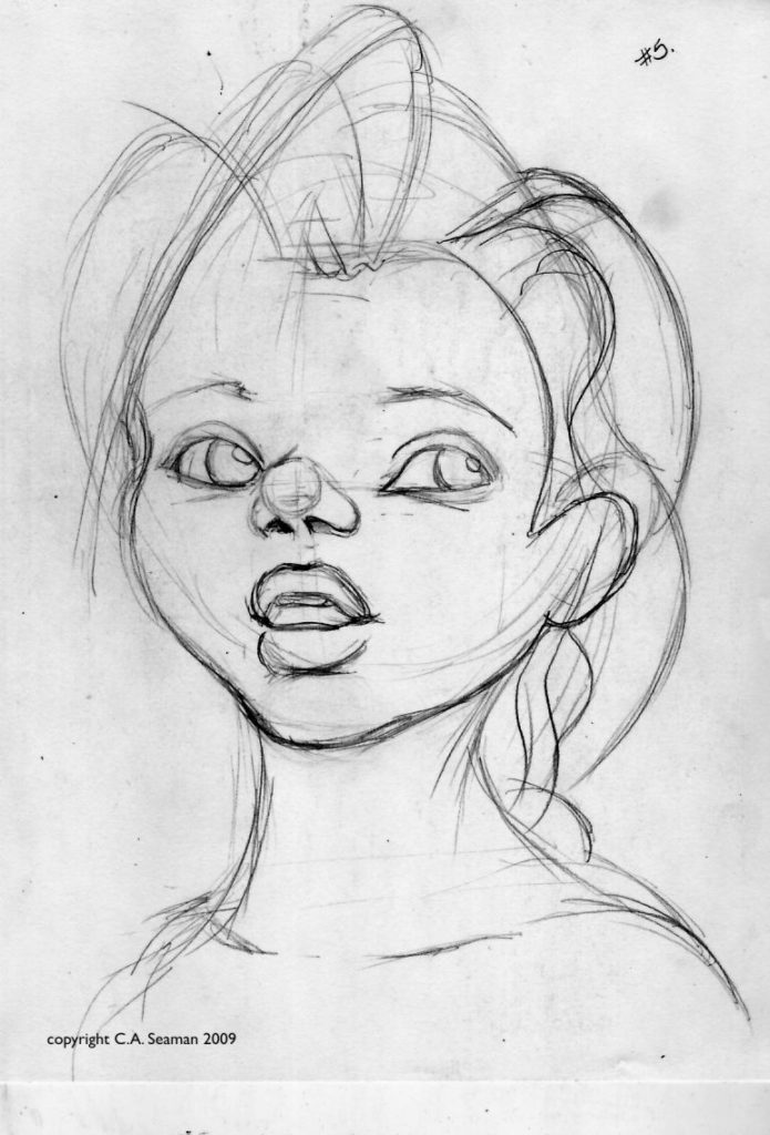
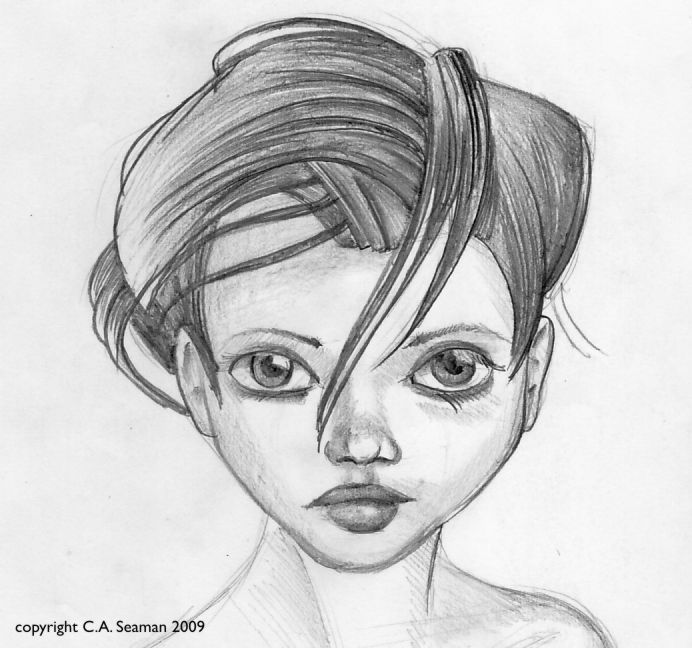
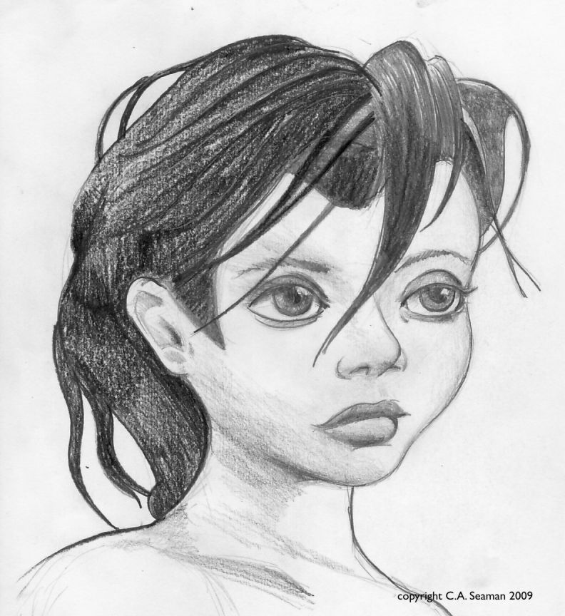
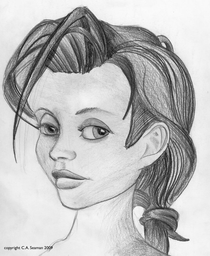
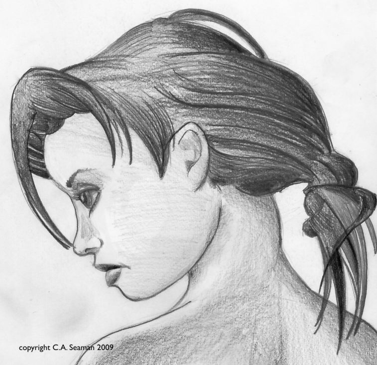
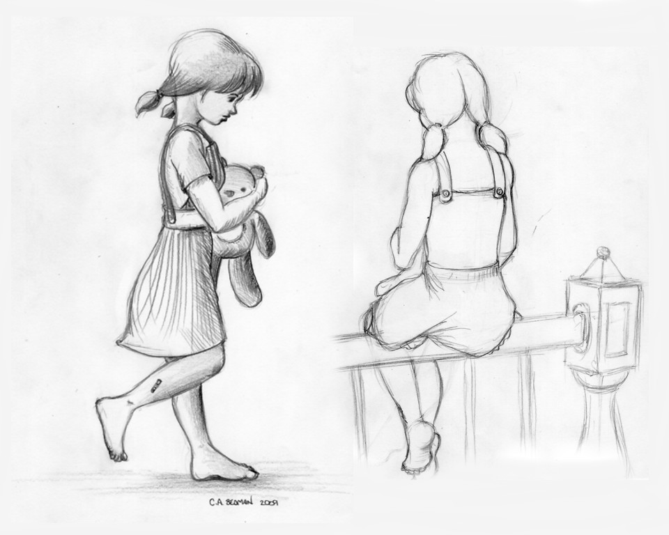
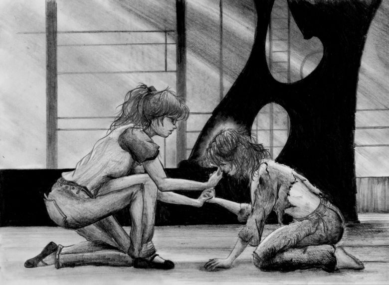
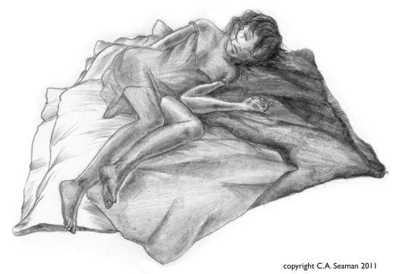
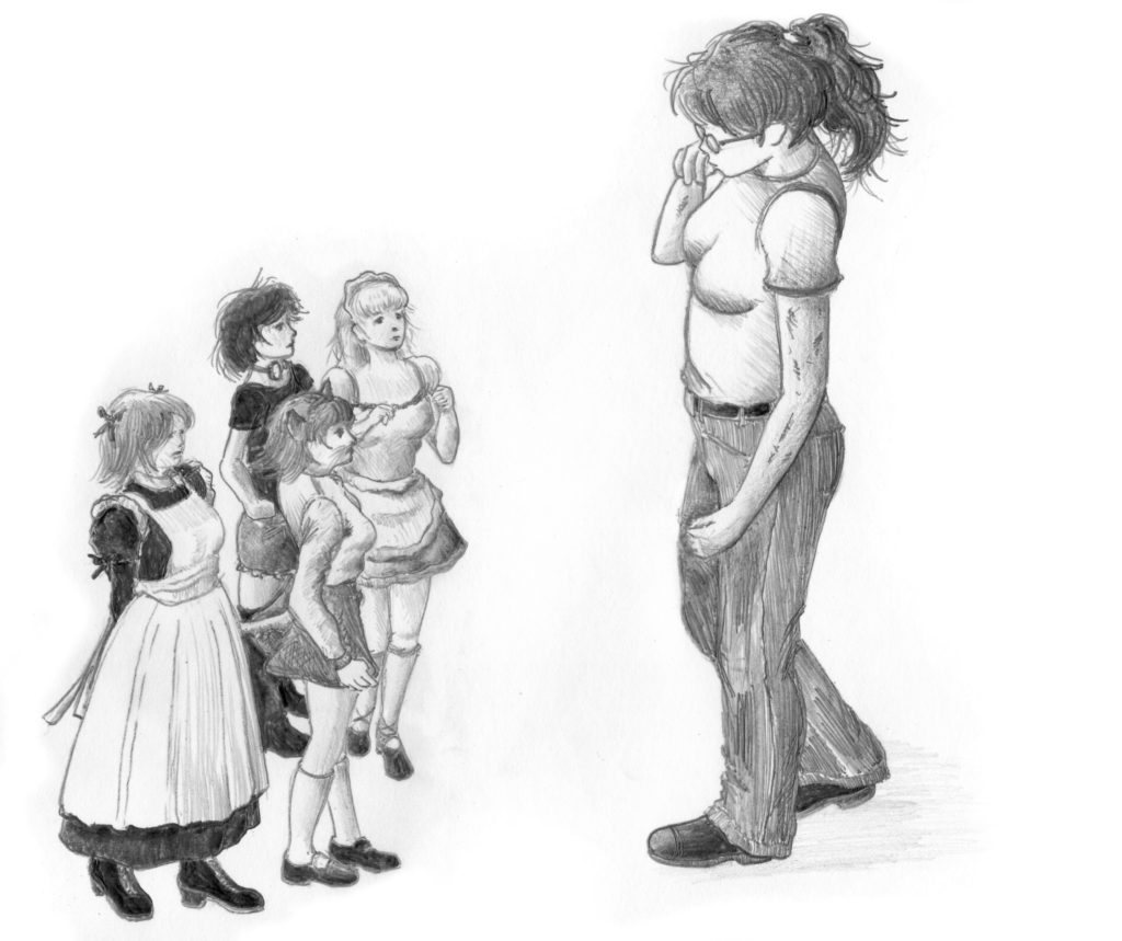
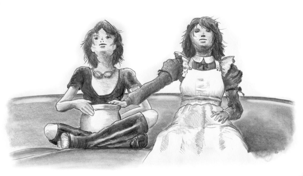
FRITHA AND THE LOST PRINCESS- four different versions. 12w x 16h in. graphite pencil on vellum (60lb.) stock. Copyright C.A. Seaman, 2013.Other versions in watercolour, coloured pencil and mixed media and pen and ink on illustration board.
Here, after creating various thumbnails showing other compositional possibilities, was the first run at the final piece, sized the same as the hand-in work but done as a graphite tonal study. It remains one of my favourites. Fritha is as scruffy as Gallico describes her, with a dirty face. Mind you, if you saw the marshlands on the Essex coast, it would not be hard to imagine her this way. They look really wet. The overalls and top are all frayed and worn. Gallico never went into detail on her clothes, but I imagined one described as wild-looking as Fritha could look like this when she showed up on Rhyadher’s doorstep with this little bundle in her arms.
This is the big one. This is the biggest project I have ever worked on, let alone the biggest project since SARGASSO. It will be years before it is completed and it is years since it was started. However, I take comfort that Art Spiegelman took 12 years to create his landmark graphic novel MAUS, and other writers and artists have laboured over many years to complete their most famous pieces. If anything it to be learned from this, it is that it’s better to do something like this ‘right and slow’ than it is to do it ‘quick and dirty’. The latter results in a product that cannot come close to respecting its subject and one who cannot respect topics like the Second World War, the horrors of Nazism and the Holocaust, fighting in the war or struggling to survive in an occupied country during the war shouldn’t ever cross my radar, let alone my path.
You can tell I feel strongly about this. You would understand why if you sifted through the thousands of pages of reading I have undertaken since I began to research the book. I defy you to do so and not be moved as I have been throughout this process. It has been a powerful force in my life since I came up with the idea on Christmas Day, back in 2014, and has only grown more so as I meet people who were there and listen to their stories.
FLASHBACK TO THE ORIGINS OF ‘MANNA’
With the completion of the Cartooning certificate program at George Brown College, work in cartooning and illustration did not end. A new program, focusing on the graphic novel, was created at the college and now all work was to be dedicated to ongoing efforts in that area.
The primary assignment we were given was to create a six to eight page story to show we could set up a plot, establish characters, apply skills we had learned in previous courses and somehow put it all together in a short narrative in the media of our choice. Because of some fun I enjoyed working on a recreation of a panel of artwork by Milt Caniff for another course, I wanted to continue with a period theme in my story and relate something to the reader about the Second World War. On Christmas Day, while relaxing after a huge lunch by sitting and reading Edward Jablonski’s massive work, THE AIR WAR, I came across the story of the relief missions flown by bomber crews in the R.A.F., R.C.A.F., R.A.A.F. and U.S.A.A.F., among others, to deliver food to millions of Dutch civilians still living under enemy occupation at the end of the war.
The text and images below illustrate some of what has been accomplished already. Like SARGASSO, this is a substantial undertaking, more in the fact that unlike the former piece, where the illustrations supported the text, the illustrations here dominate the text.
‘MANNA’ CHARACTER DESIGNS
MANNA is a coming of age story set in the Netherlands mostly during the Second World War. It features two central characters- Pauli, a riches to rags girl who befriends Hilde, from an artistically and financially richer background and almost two years her junior, in the last few years before the outbreak of war in 1939. Together, as they mature, they endure the Nazi invasion and occupation and struggle to survive in a world that becomes darker and more hostile with each passing day. It is a macro to micro kind of story, with the events in the lives of our protagonists set against the massive events reshaping the world around them. For anyone who had relatives who lived in Holland during the Second World War or anyone who has read or known the story of Anne Frank, it is not hard to imagine the kinds of things that will be dealt with in this narrative. Originally designed as a short, (six to eight), page story, it has grown- through the encouragement of several people who have seen the plan of the thing- into a massive undertaking that will easily breach 100 plus pages. Like SARGASSO, it has required a lot of research, filling my shelves with many new books on all aspects of issues related to it or the war in general.
Below is the character sheet for the two leads. Pauli is in yellow ochre, and her palette will be consistently made of warm, sometimes bright colours. Hilde will be wearing greens, blues and cooler or pastel related colours. Her red hair is a factor in this. They are presented here as they appear at the beginning of the story, which is in late August, 1938, before the events of Munich and Chamberlain’s ‘peace in our time.’
MANNA CHARACTER SHEET. Copyright C.A. Seaman, 2015. Coloured marker on illustration board.
SELECTED IMAGES AND PROCESS WORK ON THE MAIN CHARACTERS & SETTINGS
Selected images from portrait studies, panels in process and other sources showing Pauli on her own, in relation to other characters and in a variety of situations. Further images show other pages in process or completion.
The first three pages of MANNA, without the text. At least a couple of people have said they can figure out what is going on without the text, but the narrative on the page complements the images and enriches the experience, rather than simply describing what is happening.
MANNA- EARLY TITLE PAGE SPREAD
A full colour title page spread was planned for the book, according to the script I wrote in the winter/spring of 2015. It was not going to be completed at the time, as I was planning to concentrate on the pages afterwards for the course work. When I was asked to participate in Big Art Buzz’s presentation at the Canadian Pavilion in July, 2015 as a guest artist, that changed. I was to do a demo and said, with everything else going on, I wasn’t interested in creating something just for the exhibition. I went to the instructor of the course and said I was going to include the spread now as a part of the final project and as the demo piece for the show.
The individual pages were to be 10″ wide and 15″ high, which when reduced would be compatible with traditional graphic novel formats. Thus, a two page spread would be 20″ wide by 15″ high, or twice the width. Based on the research done on clothes, bikes and aircraft, the final composition was designed first in Poser, and then drawn onto sketch paper at full scale. I only applied shading to the girls in the original drawing, and thus, that is the only part I’ve shown below.
Here are shots of the girls in progress, showing watercolour washes and layers of coloured pencil applied on top. You may notice Pauli’s legs were very skinny in the pencil drawing. They were beefed up a little in the final, but not too much, though, because she would have been thin anyway. At that point in the story, the average food intake for the Dutch was equal to 250 calories a day. We average over 2,000.
Drawing set up
Process laying down wet media undercoat
The final with coloured pencil blended in
SOME NOTABLE DETAILS
In case you are wondering about the bike, it is a construct based on a Hungarian design, modified with wooden wedges shoved into the metal rims of the wheels to replace the rubber tires which would have been likely confiscated by the Germans during the war. Packages of food from a ‘hunger trek’ into the country fill the basket and rear pannier. Neither Hilde or Pauli are wearing socks, but Pauli is wearing some cut down boots, likely from a Dutch worker. How Pauli got them is a matter for speculation. Hilde’s shoes are improvised sandals cut from worn out saddle shoes popular at the end of the 1930s. Both coats are period accurate. Hilde’s hair is short, typical of her style anyway, but also practical in the later months of the war, when water, soap and shampoo were all in short supply because of the occupation forces’ closing of the borders around the Netherlands not liberated in Operation Market Garden, (September, 1944). In this image, Pauli’s hair is long. However, in more recent art, I have made it shorter as well for the reasons stated above.
As you can see the composition was designed to have nothing of importance to the right, as that would have been where the gutter between the pages would be. I still had to make it interesting enough not to make this design choice obvious, however. The final piece had to hang together and hang apart.
The sky was finished with coloured pencil. A tip: Prismacolour’s Light Cerulean Blue is a perfect match for Winsor & Newton’s Cerulean Blue! Blending was achieved with colourless blenders by Prismacolour and Derwent, the latter being better for covering the illustration board, which was Canson watercolour paper based on an acid free board support. The problem when working with this material is that little white spots where the paint or coloured pencil don’t reach really stand out when the work is scanned. The Lancaster bomber below, dark in colour, was problematic in this area, looking sparkly when scanned later. A solvent like Turpentine applied with a brush ‘solved’ the problem, filling the gaps nicely. Another tip: get the orange scented solvent. It’s a lot easier to work with in the studio.
Other problem areas included the tree line at the edge of the field. More grey and even pink went into that area than green. A little green goes a long way. Green is very difficult to work with in art, often being far too intense when applied out of the tube. In the distance, make it as blue grey as possible, and if warmth is needed, a soft pink from Derwent will tone down the problem spots. The amount of paint on the board caused mild warping, which is slowly levelling out after months of touring about in flat-pack portfolios. Applying primer to the back did not help straighten the board. I will have to deal with this again as at least three more pieces are planned in this format for each section in the book.
In historic details, this whole scene was a bit of a construct fantasy. A cordon would likely have been put around the field. Guards would be standing by organized piles of food. The danger of overshoots and missed drops was very real during Operation Manna/Chowhound in 1945. Looting was also a concern at the time, although incidents of it seem to have been very few. For the sake of providing a way of setting up the title in an homage to Will Eisner, who used creative ways to introduce his graphic stories to readers, I did what I did to make it work. The characters just happen to be excited speactators like their real-life counterparts from the war, enthusiastically waving at the aircraft with their last bit of energy. The more recent version includes more historically accurate details.
The decorated sacks- assuming the armed guards I mentioned earlier are off-screen (^_^)- sit on the ground after having been organized by workers on site, who had to dash out onto the field and grab what they could between drops. Piles of uncollected sacks lie in the distance. You can see I have started building layers of colour here, combining washes with coloured pencil to fill in areas of detail. Note the grey of the buildings in the background. The intense green you see here was virtually gone by the time the piece was done.
THE LANCASTER
The Lancaster itself is a real aircraft, but the squadron markings are not. 642 Squadron never existed. TZ was never used. I have not seen tails painted in bold orange and blue patterns. (Can you guess the symbolism?) I created them all after doing research and deciding with the instructor of the course it was better to create a fictitious unit for equally fictitious characters than use a set real squadron numbers and unknowingly make an OTU into a Bomber Command Squadron and have someone from a society in the UK point it out nicely or otherwise. I have explained to some who feel such research and detail is overdoing it in art, that those interested in this kind of material take such things very seriously. In short, if you are not interested in trying to make it real enough, don’t try historic themes in your graphic novels.
DETAILS…
The Lancaster was painted black underside. Canadian-built Lancasters had shiner finishes than British-built machines. Whatever the finish, the effect of reflected light from the ground would have meant anyone creating this subject in art would be using little black in the colour. Greys, blues and earth tones dominate. Even white, in places. Solvent was used to blend the colours. Grey is used for the sacks falling from the bomb bay. Most of the food was dropped in cases or bags that once contained cement mix, chosen to withstand the impact of being dropped from 150-1,000 feet in the air.
THE FINAL PIECE
A FORMAT REVISION AND NEW ART
In 2017, I was confronted with the reality that the illustration boards I’d been using for pages in the book were no longer being produced. I switched over to Canson’s comic art paper and found the format was different enough from the sizing used in the boards to make redoing the early pages necessary. I took the opportunity to re-imagine some of the stylizing of the book at the same time and explore media that would allow me to create soft painterly effects without actually painting on the Canson paper, which would buckle if washes were applied to the surface. Eventually, I found powdered pastels did the job well and even blended with the Copic markers, conte and charcoal.
As before, using the models of the characters created in Poser, I made sets and ‘shot’ scenes based on sketches done on mock layout pages. Poser gives me the opportunity to move the camera and search for better angles before committing scenes to paper. From there, I drew out the page in full size and transferred it to the board for inking. What follows are some revised pieces and drawings for pages not yet completed. Click on them for enlargements.
All materials related to MANNA are copyright C.A. Seaman, 2015-2020.Nothing of what you see here may be reproduced in any manner without written permission from the author/artist.
LIKE MANNA FROM HEAVEN, MORE TO COME…
A final note here. Please check the rest of the website for further articles related to MANNA. In the section on HOBBIES/MODEL BUILDING there are articles on building some of the cars, ships and armour used in the book. This will grow on both the website and social media as both become available. Also, in the section on WRITINGS there will be articles about the extensive research that went into the book to do what is possible to fact check and keep errors to a minimum- as it will be impossible to eliminate them entirely. Finally, in PHOTOGRAPHY there will be entries related to the photo research I’ve done in museums and exhibitions. Credit to related institutions will be given with each entry. If you find links or information of your own, please contact me through the Comments section and I will happily follow up with you.
In my courses at George Brown, a valuable part of the instructive process involved reproducing panels from existing cartoons, comic strips and graphic novels. It was a great way to learn the techniques of others, test one’s observation skills, and through the use of comparable media, broaden one’s range in terms of drawing and painting. In one case, reproducing a comic strip had us taking the last panel- which had been blanked out- and creating our own ending for it. Cheating by looking up the original strip was not encouraged. Tracing wasn’t an option either. These exercises were meant to give us something like an atelier experience, where students can spend years copying from plasters and the works of the old masters before venturing out to create their own pieces from scratch. It worked for us. I remember one of the most unusual things I had to sort out was a foot belonging to Dennis the Menace. Hank Ketchum’s rendering of it was stylized, to say the least. In among the other elements, it was unremarkable. Once you looked at it on its own, it became something otherworldly and very strange.
The reproduction of a Calvin & Hobbes strip with my own take on the final panel.
The photocopy of the Dedini piece I chose, with sketches around the margins.
The final version.
My drawing of the Dennis the Menace panel.
Completed with inking.
A page reproduced from a manga. The only time I ever touched mange in the courses.
Calvin & Hobbes anthology cover reproduction.
The original scan of Milt Caniff’s Steve Canyon piece
My drawing, using the placement of the engines on the DC-4 to scale the piece
My reproduction, done with pen and ink and gouache.
Zephyr Crow is a teenager living with her sister Bunty and her grandfather, Howard Elbee- a retired special effects movie magician from before the days of computers. Zephyr and Bunty’s divorced parents work separately overseas and have left the kids with the one relative they can trust. Howard, a widower, enjoys the company of his grand-daughters, and on the surface all seems relatively normal as they carry on from day to day.
Except for the fact that in Zephyr, Howard, and Bunty’s world normal is defined very differently from what one what imagine. Think Addams Family meets films about Hollywood…
That’s all I am going to tell you because this project is slated for further development, but has been on hold for a while. It was originally developed for the second of the cartooning courses I took at George Brown College and, modified to fit the needs of this particular Cartooning course, took on some interesting dimensions. (To read about the first Cartooning course, refer to the post on Andi, the beach princess with a difference.) What follows is development work, character sketches and completed projects like a sample one panel image, two comic strips and a projected cover design for an imagined anthology. These were all assessed projects and were all hugely useful in developing skills for me in sequential art.
ZEPHYR, BUNTY & HOWARD
Drawing of proposed title logo
Early Zephyr expressions
Early concepts of Zephyr
Zephyr
Zephyr
Pencil rough of Zephyr
Character sheets with rotations and gestures
Bunty gestures
Bunty gestures
Pencil gesture of Bunty
Early Bunty study
Bunty and a ‘friend’
Howard in gesture poses
OTHER CHARACTERS…
If Bunty is Zephyr’s foil in this story, other characters are actively supporting her in her adventures. I have not considered villains here as they are more likely to emerge with the stories. What appears are some of the peculiar neighbours Zephyr has, like Monsieur Aggot, a single parent and former horror film star. Monsieur Aggot is a family man as loves his children equally. He is also a real gentleman with fine manners.
Pencil study
Character sheet with rotations and some of his children
THE PROJECTS: 1 A single panel comic
The single panel comic was given to us as a way of exploring the characters in a given scenario. It was completed in pen and ink, with no use of wash or mixed media. There was guidance in terms of the subject, directing it had to be humourous. I think the dialogue was also given to us and we had to fit the subject to the line. Also, there had to be a visible demonstration of grid use and one point perspective in the piece. A good challenge, especially as Zephyr was developing as a much more serious project at that time.
Below are some process frames and the final project. You can enlarge a several images by clicking on them.
Original drawing with a grid
Drawing with demonstration of one point perspective
Final piece
Some good points , but it was my least favourite of the project pieces I created. Too much stuff in it. Too much referential material. I also hated my lettering and thought the inking lacked polish.
THE PROJECTS: 2 A Second single panel piece, using wash and two point perspective in the design
Now we are rolling along with the characters, we step up the work with a new scenario involving real estate, new personalities like Monsieur Aggot and his maggot children, the pet dog and the above mentioned technical requirements. The first image was a two point perspective exercise I did to work out the dimensions in the piece and set the characters in their correct proportions. Yes, Monsieur Aggot is one big bug. He also has a really interesting back story, but I don’t want to share it here.
Setting up the two point perspective
I printed out the perspective sheet full size and drew Zephyr, Bunty and the children into it. Monsieur Aggot was composited using photo rendering software.
Close up
Cleaned up drawing. Note the new poses for the children.
The final piece
Happiness is getting to use a wash with pen and ink. I liked the New Orleans funeral procession in the draft but decided the eating of scraps from the dump was a better fit in the end.
THE PROJECTS: 3 Four panel comic strip
Next, we took the characters, introduced more into the piece and had to develop a four panel work on them. I was having trouble with my drawing hand at the time and created all the panels full page size first, then scanned and reduced them into the final piece to put less stress of cramping my hand with small details. It also helped me see what was worth keeping after the overload of the first piece. I had a lot more fun with this and pared down the texture a lot, giving the strip a cleaner look. If you wonder why there is so much open space at the top, remember it has to be kept clear to fit the dialogue.
The original panels are included separately and together. Click on them, etc., etc. to get bigger images.
Much more effective use of line and texture. Still hate my lettering, but not nearly as much as in Project 1. Poor Zephyr’s face is a bit twisted in Panel 3.
THE PROJECTS: 4 Full colour weekend paper comic strip
The four panel strip was a great way to develop the characters and I was stronger in my sense of what to do with them. This was a fun work to do, pulling in mixed media and full colour. I can’t recall too much else about requirements of the assignment, but getting into the rhythm, I drew the original panels large, but in scale to the finals and reduced them. It may seem like a lot of work, but I know of other professional artists- their names escape me- who do the same thing for the same reasons, often going into completing the panels and then assembling them later in the computer. I can see that in my future for graphic novel projects.
The story is, incidentally, based on something that actually happened to me once when I took a class outside to draw trees and nature and had one preferring to sit in the sun and download her images from Google.
You can’t make this stuff up. Click on the images….
1
2- flashback
3
4-5 Wally Wood always to reuse panels to save time. Who am I to argue with him?
6
7
8
9
Layout before images were added
I had a lot of trouble scanning this piece. The watercolour was a lot smoother than it projected in this image. The red type in the title also should have been orange, but I could not get the balance on that without throwing off everything else. My lettering is looking a bit better now.
THE PROJECTS: 5 ANTHOLOGY COVER
The final project with Zephyr and Bunty was an anthology cover. We studied covers from various works like CALVIN & HOBBES, among others, and considered what time of year it would likely be released. Christmas was coming, so why not? As you can see, there were many parts to the project. Two point perspective, which for me had vanishing points 12 feet, (almost four meters), apart and leading to the parts of the planning being done in the computer using a cg grid. The final piece had to have several versions, as you can see here.
Enjoy…
Preparing two point perspective scene
Completed
Playing with models in Poser for ideas- one of several scenes
Creating the drawing with the group
Compositing the characters with the scene
Cropping to create the final composition
Finished line art
Graphite version
Watercolour monochrome version
Full colour final in pen and ink, watercolour mixed media
People love the maggot children. I’ve even been asked to draw them at Free Comics Day, instead of the usual superheroes.
I would like to revisit this someday. It has light and dark elements to it that should appeal to a wide audience. Perhaps a collaboration of sorts might be in order to get it moving. Perhaps I should just make clones of myself instead…
Before you go on, this is NOT some tone deaf sexist comic piece.
Andi actually is a remarkably complex character who hopefully will sometime once again see the light of day on my art table. She was created for the first Cartooning course I took at George Brown, and a lot of work went into filling out her character. Part of it came from others in the class, who contributed excellent suggestions when we exchanged drawings and brief outlines of our characters one night with each other and the recipient added a second drawing of a foil for our character on the spot and gave broad strokes to a backstory for that person. It was one of the best exercises I did in that class and made me much more confident in what I was doing later.
DEVELOPMENT OF ANDI AND OTHERS
Miranda Andrew- Andi for short, was a rebel in her youth, getting pregnant at 16 and being thrown out of the house and her school. She went to live with an aunt, a progressive woman with liberal democratic ideas and a strong sense of justice for people who have rarely experienced it. She is also a cancer survivor, an activist and the perfect role model for Andi as she seeks to find her place in the world. The aunt lives on the coast and gives Andi a trailer on the beach to call home. Andi completes her education slowly, through night school and correspondence, has frequent run-ins with authorities who want to separate her from her son and over time develops into a clone of her aunt, ready to pick up where she leaves off when she goes into battle with the big C once more.
Actually, as I read this, I’m really thinking Andi is currently the right person in the right place at the right time. However, when the work was done several years ago, I only had time to develop what you see here before moving on to the next project, Zephyr Crow. Read about that in the post of the same name, coming out soon.
Many exercises in drawing were done to build confidence in rendering characters and drawing them quickly in a variety of gestures without models for reference. The same applied to settings, sidekicks, foils and secondary or antagonistic characters. Here are some of the drawings that came out of those exercises.
Early gesture test while sorting out the figure
Gestures 2
Gestures 3
Character design sheet after preliminary work. Body joints had to be shown in non-photo blue pencil on the final image.
Details 1
2
3
4
5
6
Final piece in the course. Dialogue line was supplied. We had to build the single panel comic art around it. I threw in a lot stage business on this and it was fun for people to go and find these Easter eggs, but as I was to discover later in other Cartooning courses, it would not be wise to do it on every piece.
This project was not just a lot of fun, it was a really interesting exercise in taking some beloved characters, a story that read like a cracking good yarn and putting them together using mixed media- in this case, Copic markers and coloured pencil. Having read the story and being asked to create a wrap-around cover, I had to design a composition that set up the narrative in the Darth Vader series, which begins immediately after the destruction of the first Death Star and our villain’s rather uncomfortable meeting with Emperor Palpatine to explain ‘his failure’. If you’ve read the series, try to figure out why I set it up the way I did.
The final piece
One of the most interesting fan pieces I’ve ever been asked to create. Click on the image to see a full size version.
This piece is in a private collection and may not be reproduced without permission.
As with anime and manga, I have been called a fan of comics. While not as touchy about that label, I still feel it is too compartmentalizing. If you have visited other postings in this website, you know there is more to me than the sum of one or two parts. Nonetheless, I have enjoyed creating works in the style of North American comics. What follows are some pieces from the archives of the old website.
Poisy Ivy in Repose
Catwoman print in mixed media
Batgirl (Casandra Cain)
From the Island of Misfit Toys
Black Widow
Black Widow mixed media
Harley Quinn, inspired by L’IL GOTHAM
Harley Quinn
Line study of Hit Girl
My take on Joker
Poison Ivy in Autumn- completed long before L’IL GOTHAM had Ivy going into a depression over the arrival of the harvest season and the coming of winter.
FREE COMICS DAY AND OTHER REQUEST DRAWINGS
One of the enjoyable things about being involved with comics and sequential art is that I get to participate in Free Comics Day as a guest artist at Comic Book Addiction in Whitby. For several hours, I speak to fans of comics- all ages, mind you- and draw quick sketches for them while they wait. These are not polished pieces; just quick renders that the person can take away with them. It’s busy but wonderful fun and having the company of a good friend during the day makes it easier. However, the biggest thrill I get from it is the chance to talk to fans and find out what inspires them about the characters they choose. I learn a lot about what is currently popular and what stories are grabbing the attention of people these days.
Below are some sketches done not just for FCD, but also requests by fans outside the venue of the comic shop. Those lead off the next gallery, followed by the quick ‘done in minutes’ sketches at the store. Please excuse the quality of those photos. They were taken on the fly with the cell phone and like an idiot, I tended to cast my own shadow on them.
Which one of the FCD drawings was my favourite? As the compositions were often suggested by the recipients- who had some interesting mash-ups in mind, I think those were the most interesting. Hulk in a snowball fight with Olaf, Darth Vader and Chewie playing chess, Thor inviting Hulk to a dainty little tea.
Sonic!
In another post, I will share the creation of a comic book cover for a friend featuring one of STAR WARS’ favourite characters- Darth Vader!
I like the look of some manga and anime. I have often been called a ‘fan’ of it, which I resent intensely, because it is a label that carries baggage in terms of pre-conceptions and associations that make me uncomfortable. While occasionally I stylize my work so that people say it reminds them of manga, I rarely actively embrace the concepts completely to do work that can actually be called manga or anime.
Having said that, I posted images in past versions of the website that definitely have that manga look about them. Some of the pieces were for students to copy, feeding into their interests and giving them the chance to develop their skills. The gallery below is filled with selected postings from that era, some of which haven’t seen the cybernetic light of day in years.
Thank-you piece for a great peer tutor
Another peer tutor piece
Take a wild guess…
This was a great team
I usually posted this in the classroom before reports came out. It never failed to grab their attention.
This piece was actually published as fan art in NEON GENESIS EVANGELION: THE SHINJI IKARI RAISING PROJECT. (Vol. 3) It’s mixed media coloured pencil with graphite.
Test study for the students
Another one
Study for texture, detail, contrast and value
For the modified students at the old school
The Girl is a computer generated model that has been around for years. These studies were from poses set up in Poser, drawn when I was switching over to cg models in my art classes to deal with absenteeism among students, allowing them to keep up when, with live models, they would otherwise have foundered. And you know what? IT WORKED!
The Girl study- 2
More finish on the pieces to give students working exemplars.
Exemplars- 2
Exemplars- 3
Exemplars- 4
I made these and photocopied them for students to shade or colour when they completed their work. There were about 30 or so, but I am just highlighting a couple here. It was good practice for me and nicer than downloading them off Google, which had started only three years earlier.
I took a trip to the East coast in 2007. I came back with hundreds of photos, priceless memories, some great books and the germ of an idea. Halifax struck me as a fascinating city because of all the history connected with it. The early 1900s- the Gilded Age, the sinking of the TITANIC, the outbreak of the First World War and the Halifax Explosion- have long fascinated me because of the huge upheavals that came with those events. What must it have been like to live in those times and see the wonders and horrors up close?
In my mind I saw a city by the sea and a river winding inland. People trading, exploring, going overseas or up the river into the heart of a continent we might recognize as America, but subtly changed, as if it existed in a parallel universe. When I was home sick one day and put the APOCALYPSE NOW Redux movie into the DVD player to watch for the first time, (I saw the original theatrical version many years earlier), the hot toddie I was drinking to kill the fever mixed with the dreamlike cinematography and storyline to take me deep into this world that was forming in my head.
Over time, characters and settings emerged. I draw sketches and parts of a map of Fairview, as the city state became known. One character- Poppy- was there from the beginning. She ended up changed considerably from how I first imagined her and became not the central character in the story, but a driving force behind some of the action within it. What I took from Poppy I put into Ariana, who, for the first four books became the centre of my world now set in the Sargasso Islands, offshore from Fairview. Her adventures as a researcher from another world sent into exile across space and time for her own protection gave me the perfect foundation for an examination of the period that has interested me for so long.
I did a lot of research on life, culture and entertainment in the early 1900s, focusing originally on the Toronto Islands, Books I read kept comparing the amusement parks there a hundred years ago to those much grander venues in Coney Island, causing me to redirect my research there. If you haven’t seen pictures of Luna Park or Dreamland, look them up. Everyone I showed them to was struck amazement at how fascinating those parks were.
From there, my art research led to revisiting the works of Charles Dana Gibson, creator of the Gibson Girl. Evelyn Nesbit- inspiration for aspects of the character- became the next quest. Her bittersweet and tragic story, recounted in Paula Uruburu’s AMERICAN EVE and re-imagined in E.L. Doctorow’s classic RAGTIME, led me to collect antique postcards of her- giving me real pieces from that long-gone world.
Yet where some might be nostalgic about that era, I chose to portray it as seen through a more critical lens. Ariana/Mallory, the protagonist in the story, experienced the injustices of the period, the hypocrisy and the darkness that lived in shadows cast upon the western world by the monuments of the Gilded Age. She might have been a powerful woman with fantastic resources at her disposal, but in that time she could not vote. Her values were often in conflict with those of others in that era. Knowing what she knew from her life in ‘the old world’, she had to publicly accept her status as a woman of her time in the new world; trying to live like someone in a witness protection programme and only engage in acts of emancipation sparingly so as not to make herself a target here as well. Circumstances being what they were, however, would conspire eventually to make that almost impossible…
Of course, Ariana/Mallory was not to be alone in her adventures. Being a specialist in artificial intelligence and cybernetics, she was accompanied in her journey to the Sargasso Islands by sidekicks in the form of several living dolls, popping seemingly out of the Anime and Manga culture that’s been popular here for a number of years. Quirky and each representing a character archetype from Manga, they made convenient foils to Ariana/Mallory as the story developed. And, typical also to the tropes of Anime/Manga, one among the dolls would prove to be a powerful force herself. That eventually was the part played by Poppy.
PUBLISHING THE BOOKS
SARGASSO remains published by Blurb in California a company that specializes in self-publishing on demand. At the time, it was one a few companies that was willing to do so, providing people like me with the means to generate content without having to order hundreds of books afterwards at great cost. Today, over a decade later, the playing field in self publishing is crowded and authors have a lot of options to consider when seeking the best way to make their work available to the public. Four books were published by Blurb and can be found through a title search or by my name, C.A. Seaman, on the website.
THE ARTWORK
The following images are samples from the four books published in the series, completing the first arc in the story. Unless stated otherwise, all the pieces are completed in graphite pencil on 110lb paper, allowing me to create a range of textures and finishes in the imagery. In some cases, I used a small amount of computer post production work only to add some limited smoke effects, spot lighting or blur to enhance the appearance of the final piece. I also created a number of silhouette illustrations in the books. Silhouettes were popular many years ago in book illustration and seem to have died out recently. Drawing the forms, I then filled them in using Photopaint to create the silhouette effect. The average maximum size of images was no more than 8.5×11″, mostly to facilitate scanning on the machine I had at the time.
EARLY PROCESS PIECES
In this gallery is an arrangement of early drafts, poses and character designs that helped me imagine the world of SARGASSO. The last piece is a study I did from process drawings created for Disney’s animated film THE RESCUERS. I found the images helpful in terms of trying out proportions for younger characters. The computer generated model at the beginning is Sadie, who helped me figure out some early concepts for the character of Poppy. The action poses are my versions of gestures I found in a book of training images created for artists at Warner Bros. working on Bugs Bunny. It’s an amazing book. Grab it if you find one. I did and have had no regrets. Finally, because Ernest Shepard has always been a favourite artist of mine, I adapted one of his WINNIE THE POOH illustrations to the SARGASSO world, just to see how it would look. It was all good training and training never ends for artists, as many know.
These images appeared in the final books. They are published in no particular order and represent a sampling of what appeared in the books.
To access images, double-click on them. Eventually, you find yourself in a gallery setting for viewing. To return to the main page, click on the Back arrow at the top left of the toolbar.