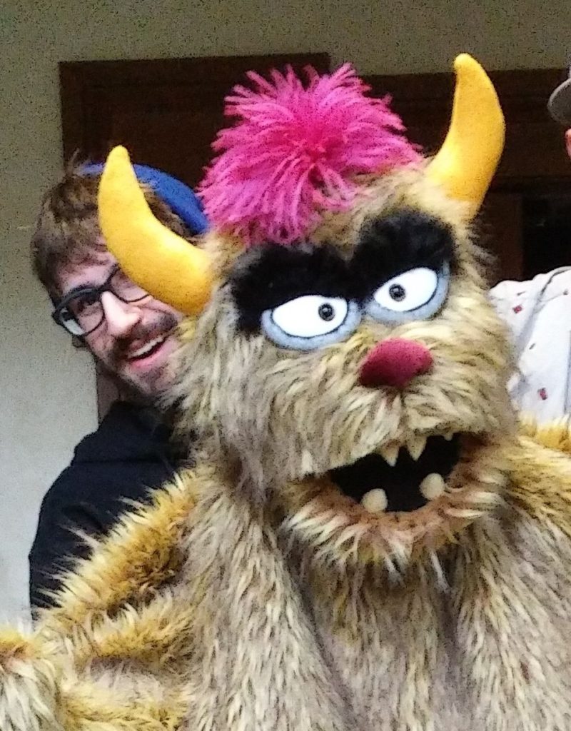
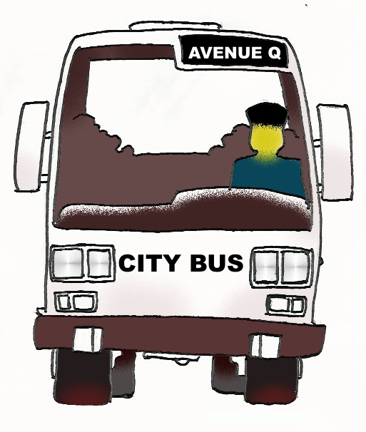
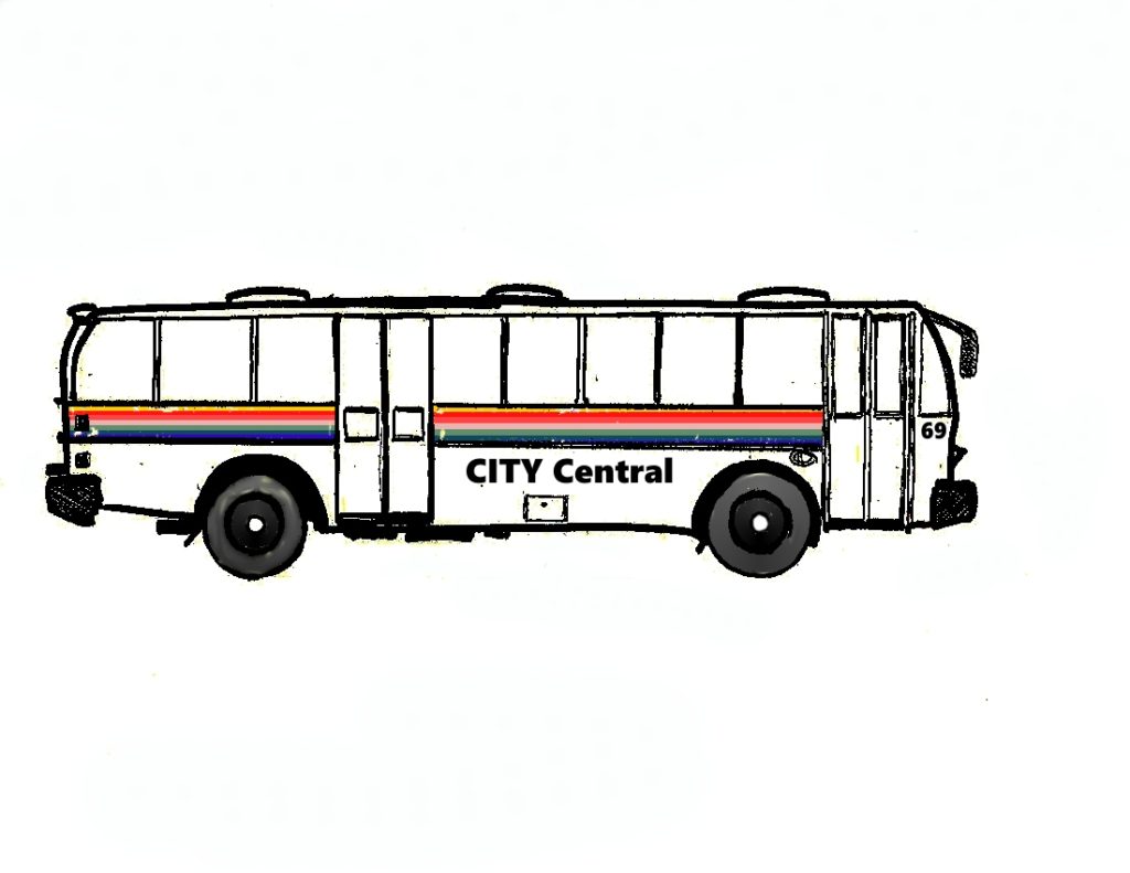
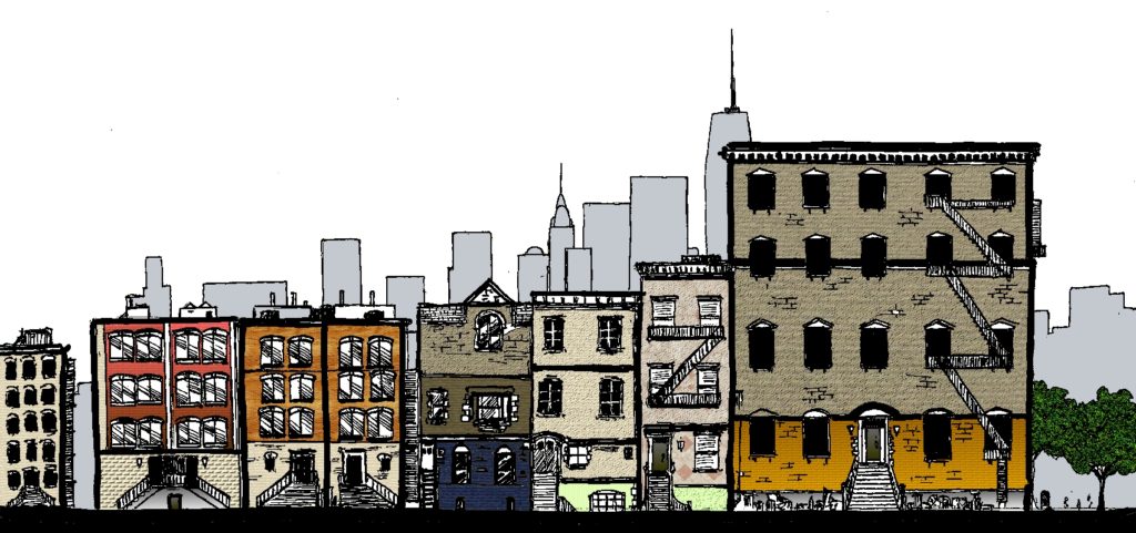
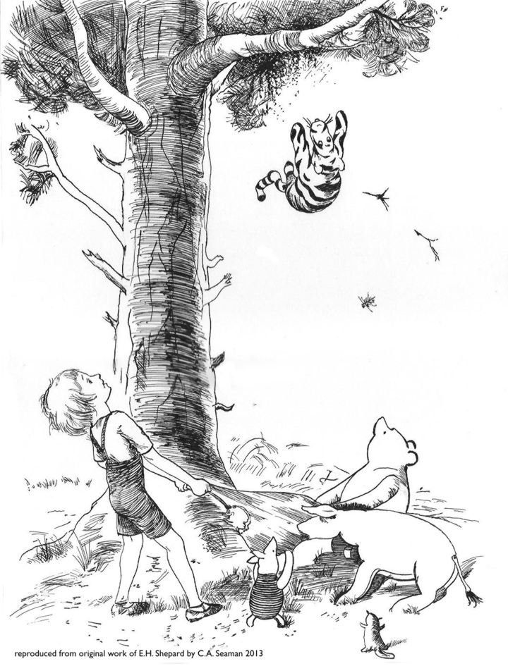
I had the great pleasure of working on a production at the Whitby Little Theatre of this very funny and wise musical featuring foam, fur and fabric covered puppets that might have been at home on a certain other street on a certain long running children’s television show. Wonderful music, over the top and very risque humour dominate the production, and the production values required of the company meant that not only did robust, remarkable working puppets have to be created, but they had to work convincingly on great stage sets with live actors, accompanied by numerous animated title cards and sequences that themselves had musical or sound effects soundtracks.
Bringing together the parts to make the whole that is AVENUE Q was a monumental task, and my dear friend, director Monique Essegern, and a very talented company managed to pull it off. Being involved in the animations, I worked in the background and only had contacts with Monique, the sound effects creator and peripherally with the tech crew who had to sync up the imagery with live music and other actions on the stage.
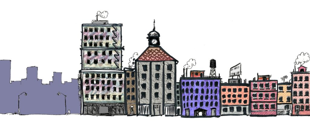
I decided to take a different route for my work, keeping it as loose as possible, using wax crayons and markers to add colour, not using rulers on objects to make buildings, buses and scene details more organic, and often working ‘outside the lines’ to make the images look more child-like. With such great models, it wasn’t hard to become completely immersed in the imagery and realize that behind the laughter the show explored some huge questions we all face in our lives: ‘Who am I?’ ‘What is my purpose?’ ‘Will I find love?’ ‘Will people accept me for who- or what- I am?’ Consequently, some pieces needed to be treated a little more seriously than one might have expected and some great discussions with Monique on these points helped flesh out the scenes much better. I created the animations in Poser and linked them up using Movie Maker.
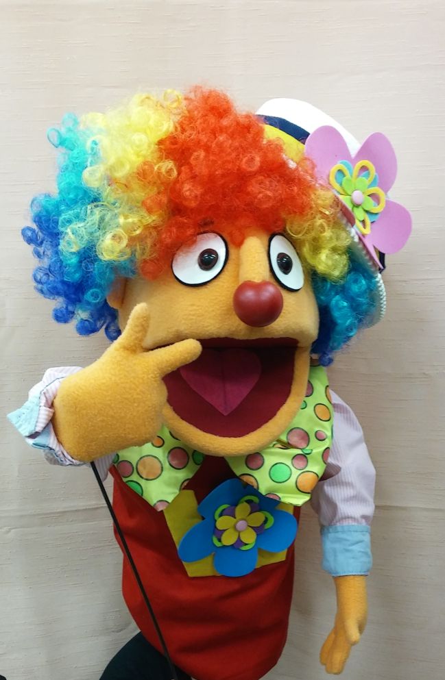
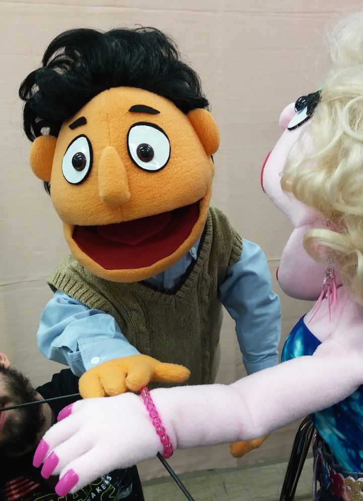
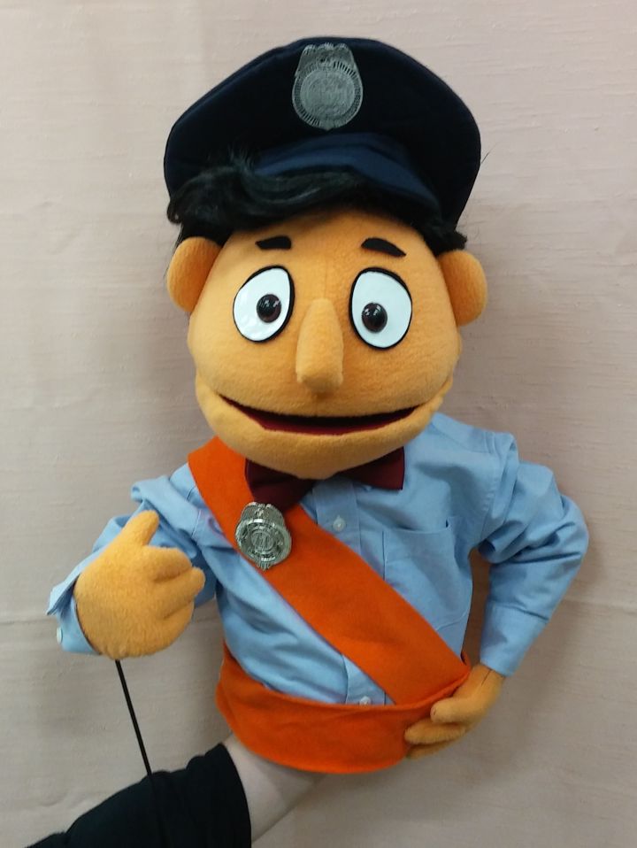
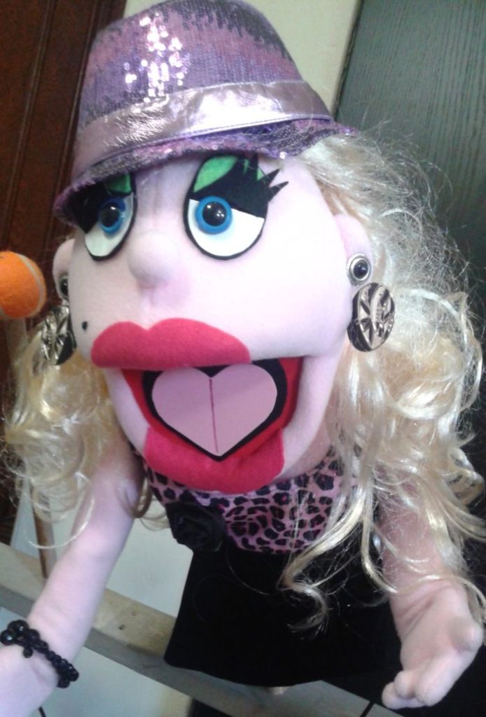
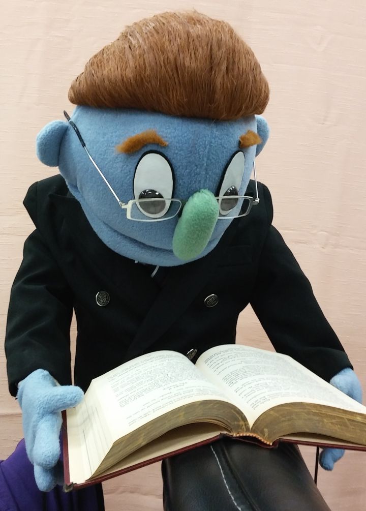
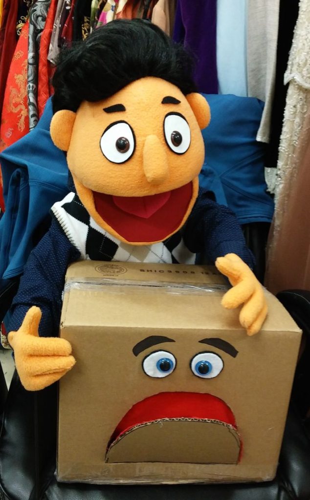
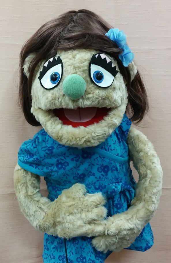
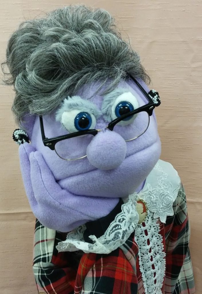
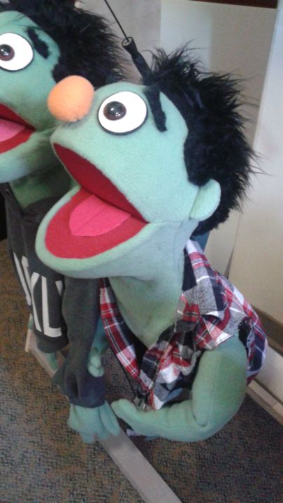
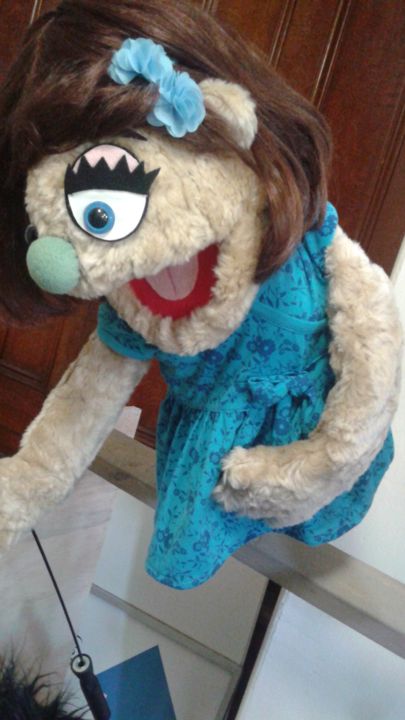
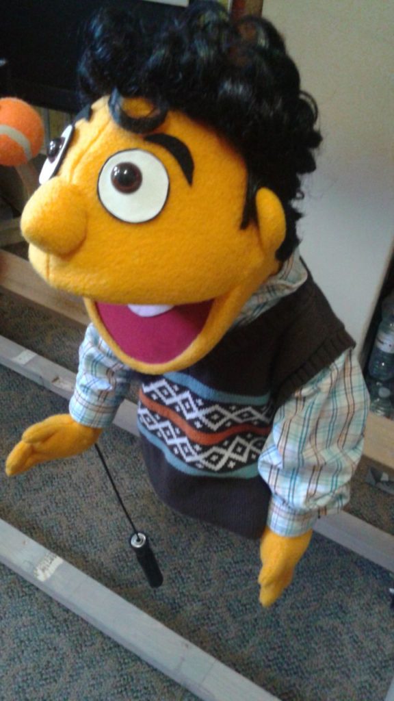
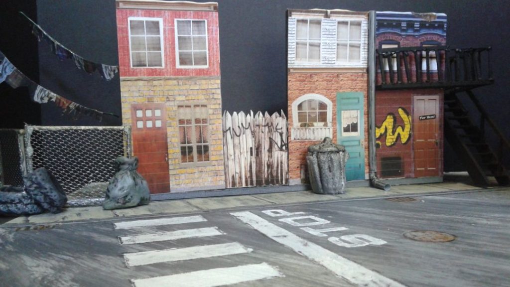
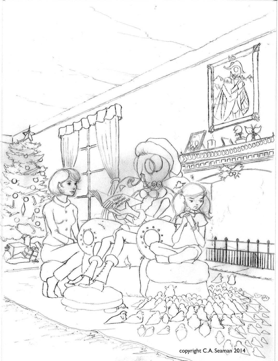
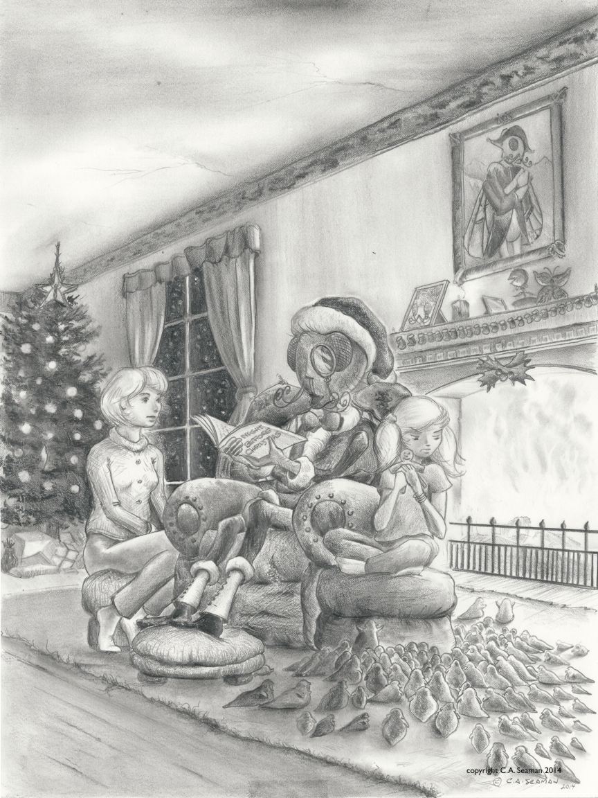
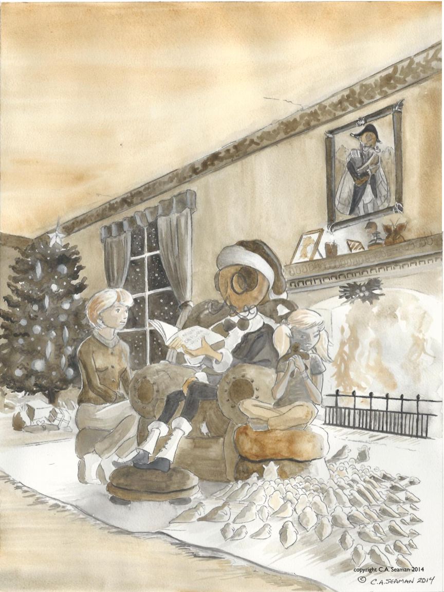
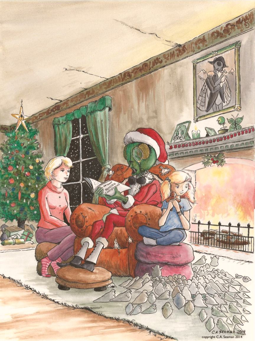
Here are some of the puppets that featured in the production, shown from photos taken either by me, or by members of the company for my use in creating the animations. They are seen in different costumes and at rest with their mouths hanging open in the storage room. I have also included a picture of the stage maquette, created as a guide for the construction of the full stage set, which I wasn’t able to photograph.
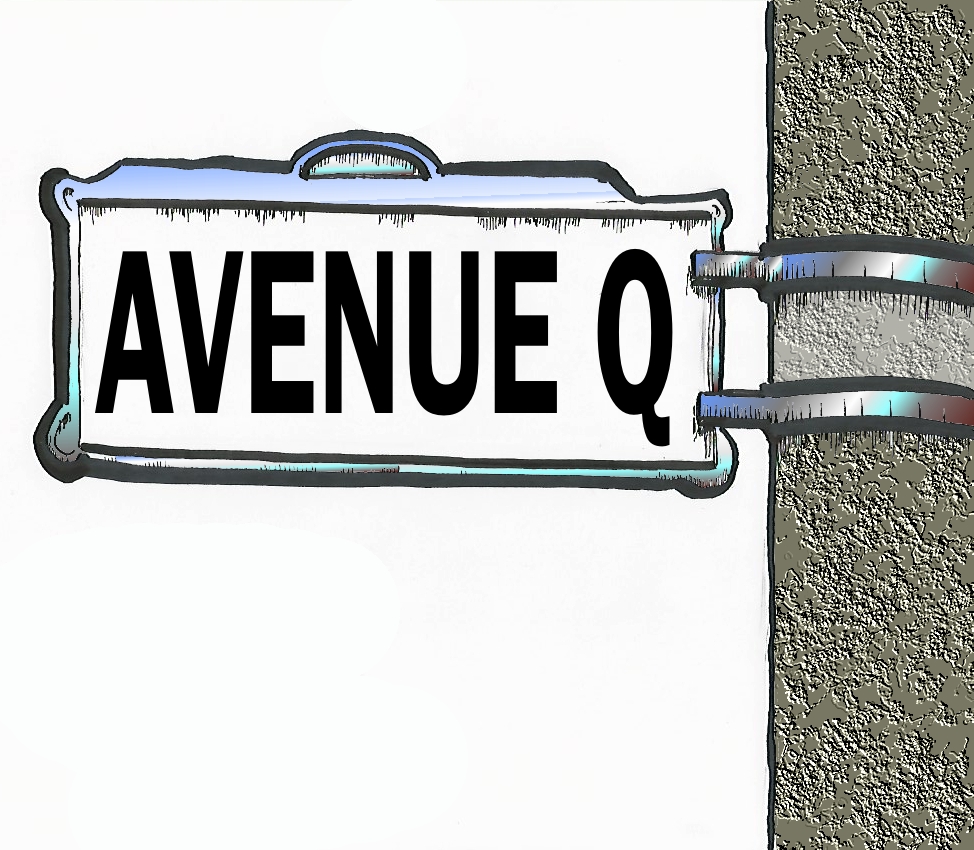
DESIGNING THE ANIMATIONS FOR ‘AVENUE Q’.
I created scrolling backgrounds and animation elements by hand and then loaded them into Poser as texture map images onto flat planes set up on a blank virtual stage. Basically, the idea was to recreate a traditional multi-plane camera in the computer software, similar to ones used in the classic days of movie animation before computers came along. Using the music score as a guide, I then set the length of the animation and manipulated the elements to create traditional 2D cartoon scenes in a 3D modeling software program.
These elements were inserted into the animation and moved about to make the opening look more exciting.
The animation was limited in what I could do to pans, tilts, rotations on the Y axis. I had no time, nor was Poser the best platform to create cel type animation that could have characters move frame by frame, twist, move limbs independently and so on. It might be possible to do so, but I would have to ask if it is worth the effort in making it work. Other software exists that is better suited to that kind of animation. For what was needed in ‘AVENUE Q’, the set up I was using was fine for the job.
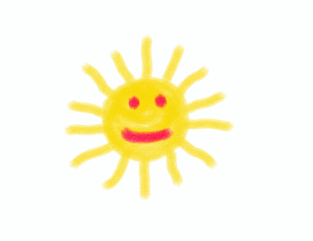
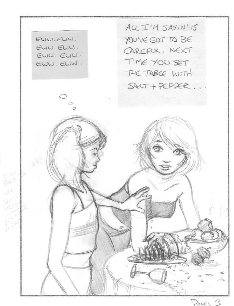
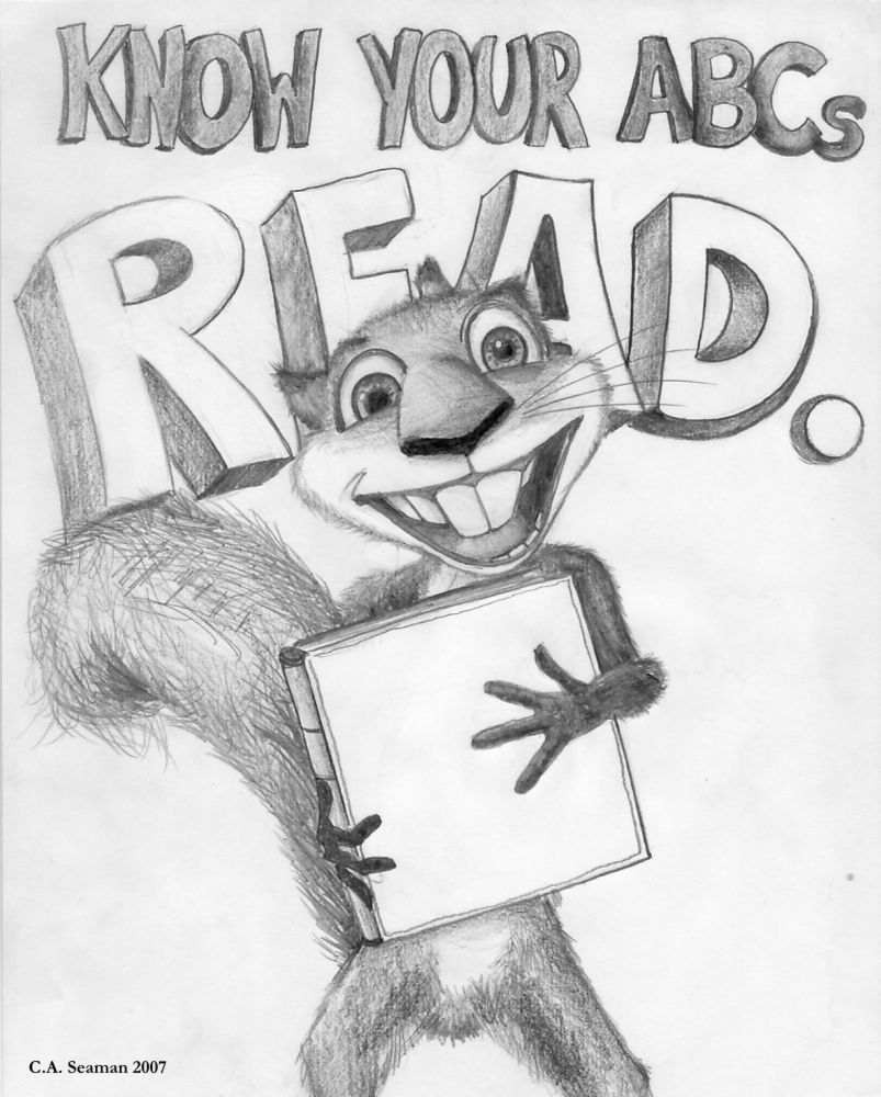
This, to me, was the emotional core of the story. A child asks a question.“WHAT IS A PURPOSE?”A wise mature voice- I imagined an owl- provides the definition.“I WANT A PURPOSE!”Yes… the audience is probably thinking, ‘so do most of us.’These images were drawn using crayons I’ve had for almost fifty years. Thank-you Crayola. They still work great!
I wish I could include some of the animations, but without the music they lack context. Without permission, I lack money after the copyright holders sue me…
So, let’s look at some more pictures.
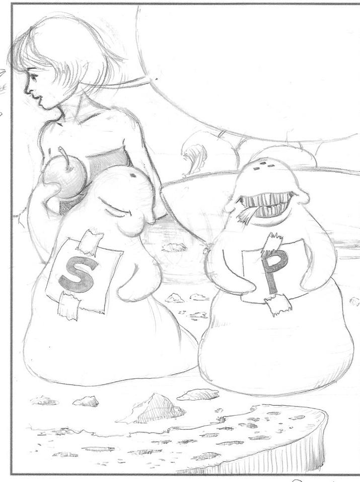
Princeton, a major character, sees his future after university studying English (?!) possibly taking one of these three paths.
Let’s see a few more…
“FIVE NIGHT STANDS!”“ONE NIGHT STAND!”A popular image with of people in the audience. I wonder why…
This project was a for an IT firm in Toronto developing a concept for the auto industry. I am not going into any details about their concept in the project, but I was given permission to reproduce these images for the website and my portfolio.
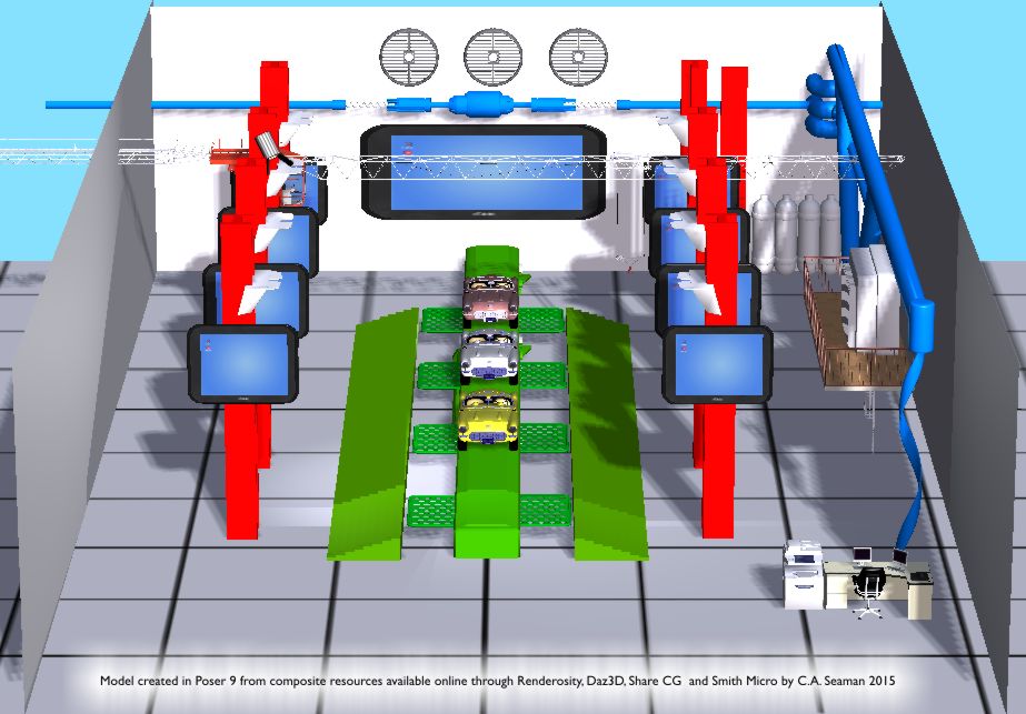
Below is a model I built to study and pose for the other images in the storyboard piece. The model was created in Poser 9 from bits and pieces of different objects that came with the software and some add-ons acquired online. The whole thing is meant to look like a toy. I studied Lego, reading from a DK book I found in the drugstore on the history of the toy building legend and used bright primary and secondary colours to help emphasize the various elements- like the columns I constructed from scratch, the tubing, cobbled together from a model of over 200 objects located on ShareCG.com. I had a list of things I had to include and this image, excluding people, contains everything on the list.
The beauty of building a ‘set’ like this, is that when working with the client, I was able to move the camera around and with him, plan the panels that eventually became the storyboard. My client was intrigued by how I start digtial in projects to create resources and finish the job with traditional media.
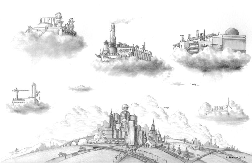
The scene below is a representation for the client of industry in the cloud. It is fanciful, as requested, and I designed it to be reminiscent of some of those maps you sometimes see where cities appear oversized against the surrounding countryside.
INDUSTRY IN THE CLOUD. Reproduced with permission. By C.A. Seaman. Graphite on vellum.
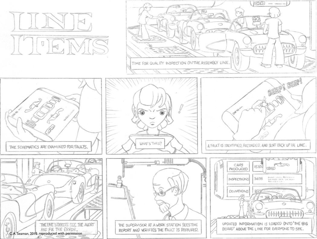
The final piece is a set of storyboards, laid out like a Sunday comic strip. I was asked to provide only line art- no colour, value or texture. It was a different kind of experience leaving something like this. However, the point is if further development takes place, this can be completed any way the client wishes. The assembly line pieces were set up with the model in Poser. I admit, the cars were a ‘light table’ job. I like to work freehand as much as possible, but I needed them to look identical, so took my composed layouts and traced those elements onto the vellum- a technique often used by comic artists- and adding the characters and various other monitor details, along with the text as I went. To create schematics for the tablet readouts, I was given templates by the client to follow and made new ones from scratch. For the automobile, I chose the vintage Corvette because it is a classic car anyone who appreciates such things should admire. Also, it had fine curves that complemented the various other elements like the characters and monitors. I finally created a logo for the piece, as there was a blank space that needed to be filled and I felt we’d come this far with the Sunday comic strip idea, so why stop?
COMIC STRIP AS STORYBOARD TO EXPLAIN CONCEPT. Reproduced with permission. By C.A. Seaman. Graphite on vellum.
LOGO DESIGN
This was a secondary project for the same person a year later, creating a logo for an online site that featured vinyl albums. It was meant to be fun and cartoony at the same time, like the retro styled art that would have been popular in a lot of animation when the albums on the website were produced.
LOGO DESIGN. Reproduced with permission. By C.A. Seaman. Mixed media on vellum.
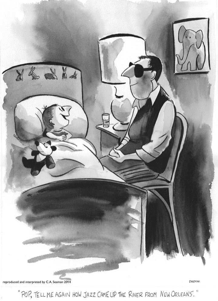
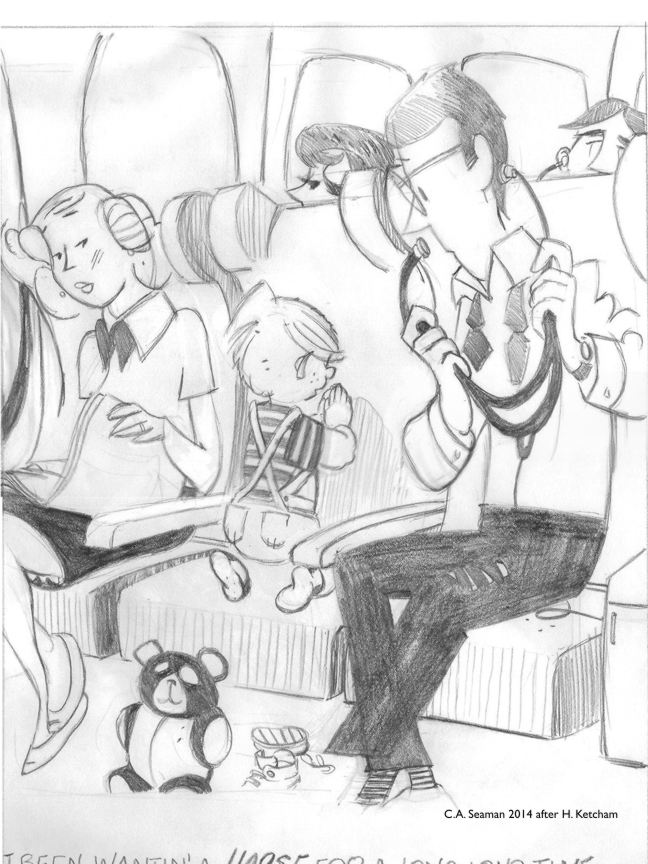
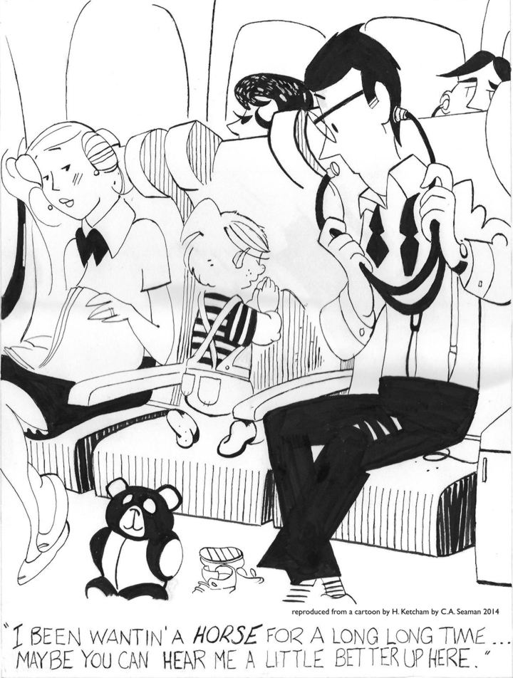
In my courses at George Brown, a valuable part of the instructive process involved reproducing panels from existing cartoons, comic strips and graphic novels. It was a great way to learn the techniques of others, test one’s observation skills, and through the use of comparable media, broaden one’s range in terms of drawing and painting. In one case, reproducing a comic strip had us taking the last panel- which had been blanked out- and creating our own ending for it. Cheating by looking up the original strip was not encouraged. Tracing wasn’t an option either. These exercises were meant to give us something like an atelier experience, where students can spend years copying from plasters and the works of the old masters before venturing out to create their own pieces from scratch. It worked for us. I remember one of the most unusual things I had to sort out was a foot belonging to Dennis the Menace. Hank Ketchum’s rendering of it was stylized, to say the least. In among the other elements, it was unremarkable. Once you looked at it on its own, it became something otherworldly and very strange.
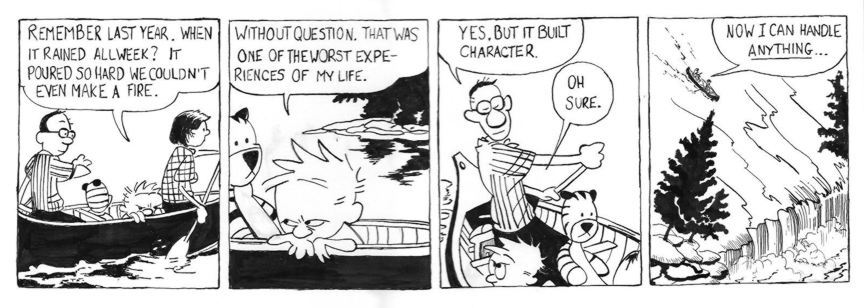
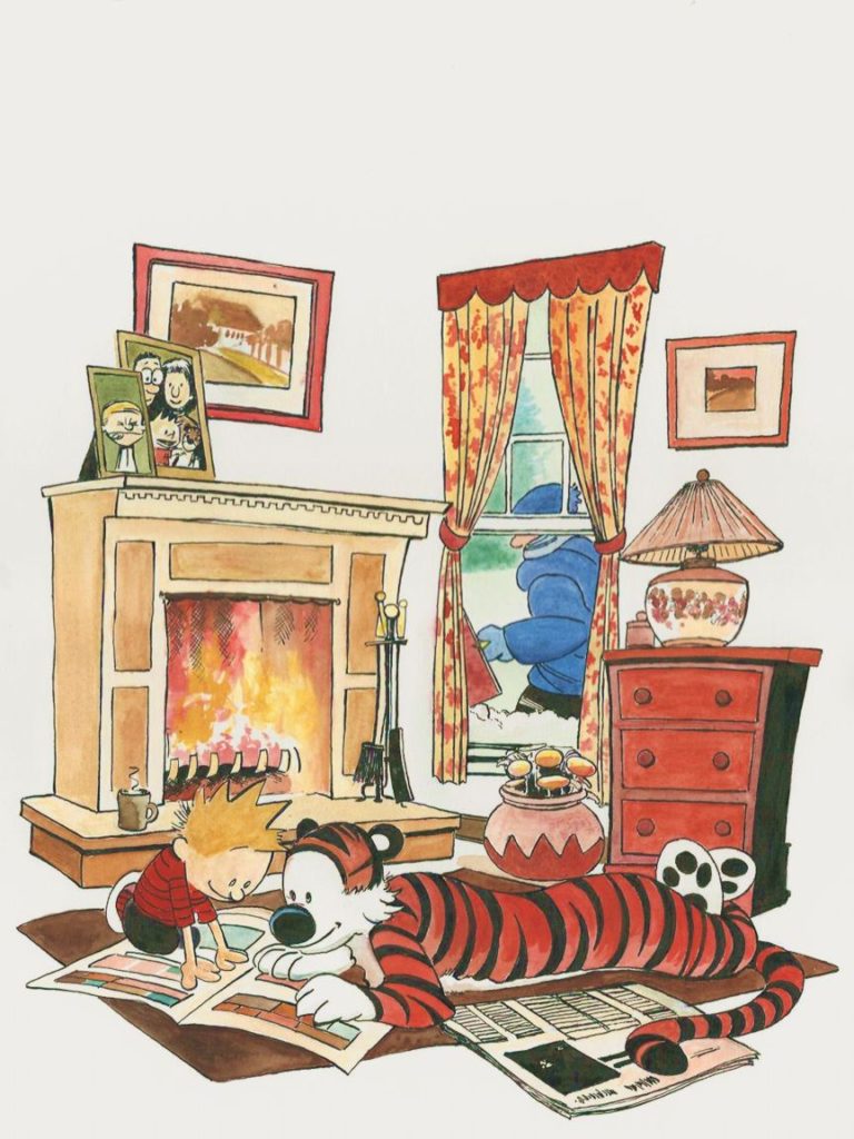
The reproduction of a Calvin & Hobbes strip with my own take on the final panel.
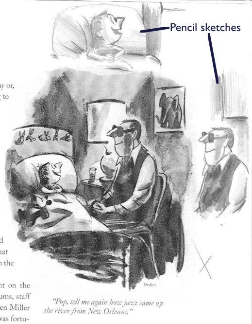
The photocopy of the Dedini piece I chose, with sketches around the margins.
The final version.
My drawing of the Dennis the Menace panel.
Completed with inking.
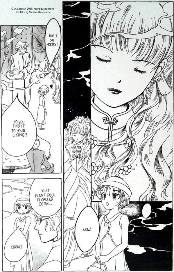
A page reproduced from a manga. The only time I ever touched mange in the courses.
Calvin & Hobbes anthology cover reproduction.
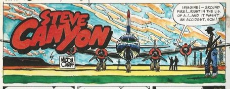
The original scan of Milt Caniff’s Steve Canyon piece
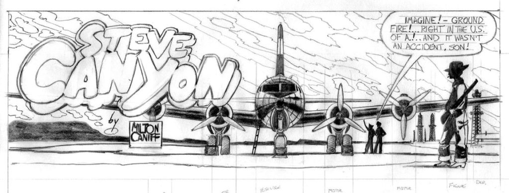
My drawing, using the placement of the engines on the DC-4 to scale the piece
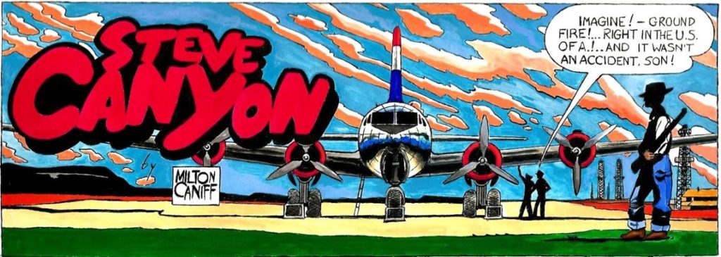
My reproduction, done with pen and ink and gouache.
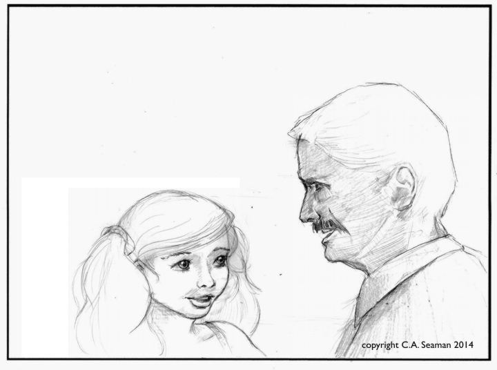
Zephyr Crow is a teenager living with her sister Bunty and her grandfather, Howard Elbee- a retired special effects movie magician from before the days of computers. Zephyr and Bunty’s divorced parents work separately overseas and have left the kids with the one relative they can trust. Howard, a widower, enjoys the company of his grand-daughters, and on the surface all seems relatively normal as they carry on from day to day.
Except for the fact that in Zephyr, Howard, and Bunty’s world normal is defined very differently from what one what imagine. Think Addams Family meets films about Hollywood…
That’s all I am going to tell you because this project is slated for further development, but has been on hold for a while. It was originally developed for the second of the cartooning courses I took at George Brown College and, modified to fit the needs of this particular Cartooning course, took on some interesting dimensions. (To read about the first Cartooning course, refer to the post on Andi, the beach princess with a difference.) What follows is development work, character sketches and completed projects like a sample one panel image, two comic strips and a projected cover design for an imagined anthology. These were all assessed projects and were all hugely useful in developing skills for me in sequential art.
ZEPHYR, BUNTY & HOWARD
Drawing of proposed title logo
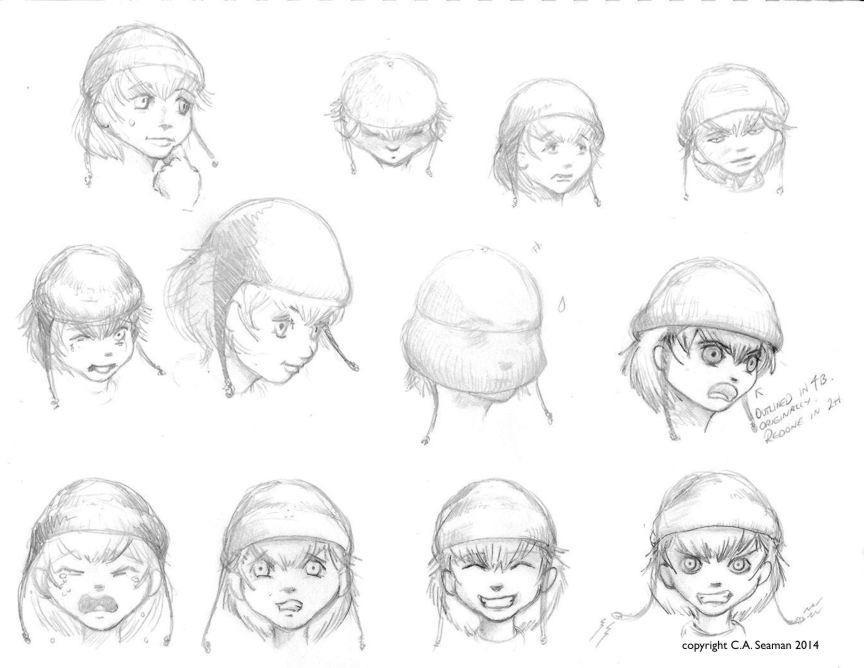
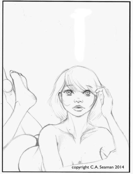
Early Zephyr expressions
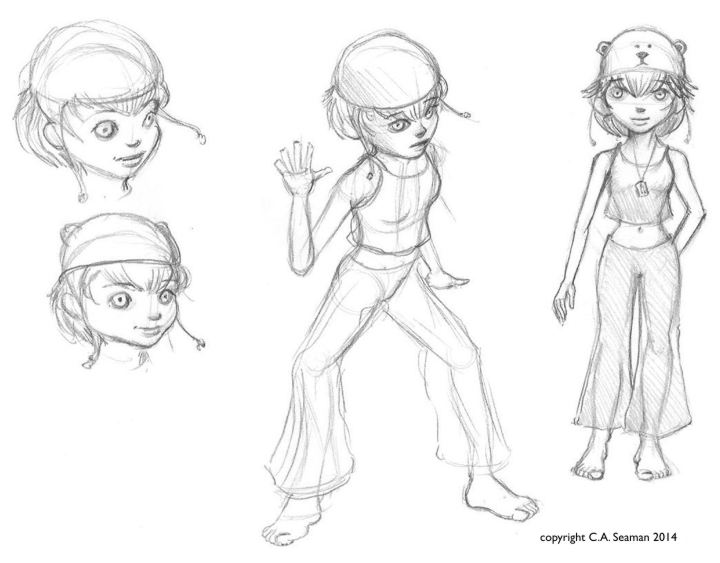
Early concepts of Zephyr
Zephyr
Zephyr
Pencil rough of Zephyr
Character sheets with rotations and gestures
Bunty gestures
Bunty gestures
Pencil gesture of Bunty
Early Bunty study
Bunty and a ‘friend’
Howard in gesture poses
OTHER CHARACTERS…
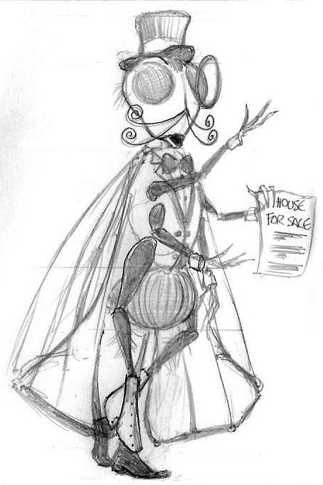
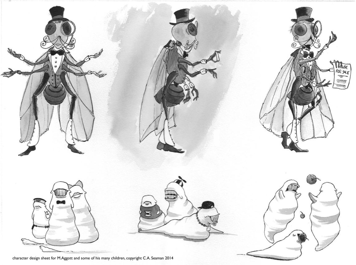
If Bunty is Zephyr’s foil in this story, other characters are actively supporting her in her adventures. I have not considered villains here as they are more likely to emerge with the stories. What appears are some of the peculiar neighbours Zephyr has, like Monsieur Aggot, a single parent and former horror film star. Monsieur Aggot is a family man as loves his children equally. He is also a real gentleman with fine manners.
Pencil study
Character sheet with rotations and some of his children
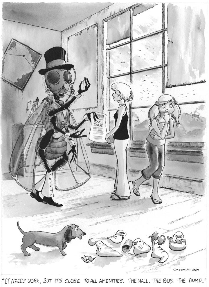
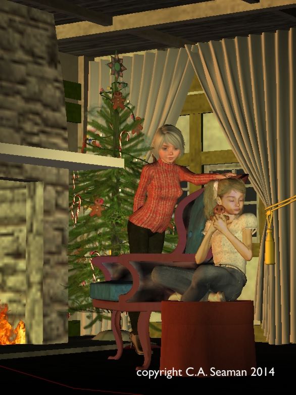
THE PROJECTS: 1 A single panel comic
The single panel comic was given to us as a way of exploring the characters in a given scenario. It was completed in pen and ink, with no use of wash or mixed media. There was guidance in terms of the subject, directing it had to be humourous. I think the dialogue was also given to us and we had to fit the subject to the line. Also, there had to be a visible demonstration of grid use and one point perspective in the piece. A good challenge, especially as Zephyr was developing as a much more serious project at that time.
Below are some process frames and the final project. You can enlarge a several images by clicking on them.
Original drawing with a gridDrawing with demonstration of one point perspectiveFinal pieceSome good points , but it was my least favourite of the project pieces I created. Too much stuff in it. Too much referential material. I also hated my lettering and thought the inking lacked polish.
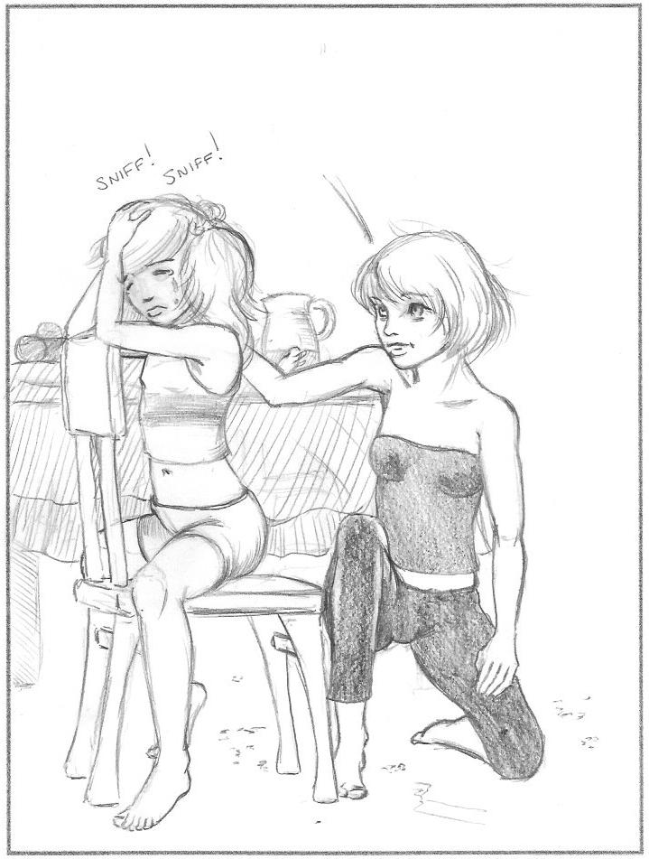
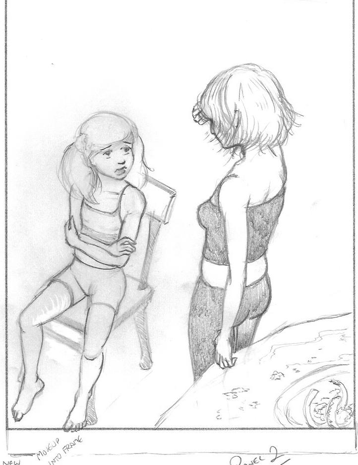
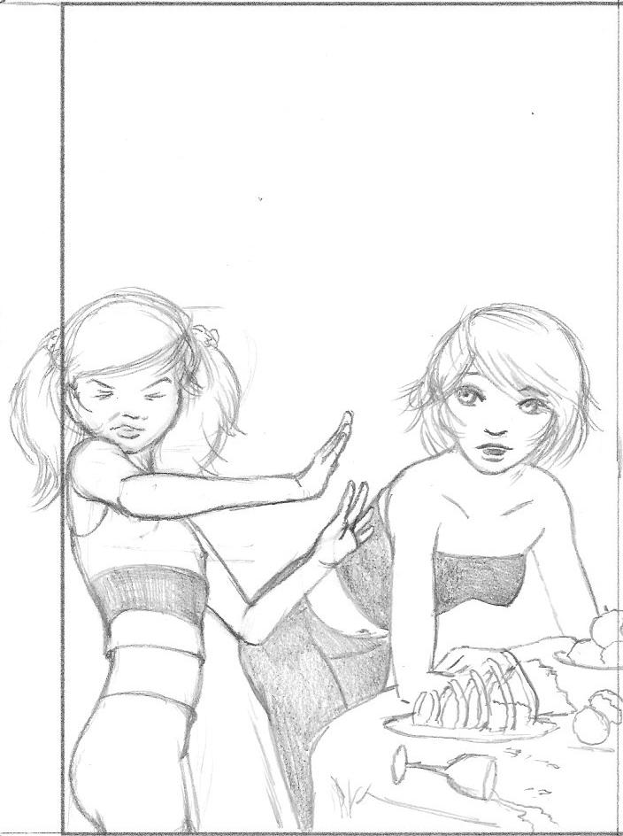
THE PROJECTS: 2 A Second single panel piece, using wash and two point perspective in the design
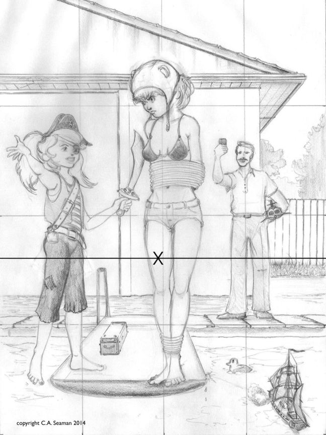
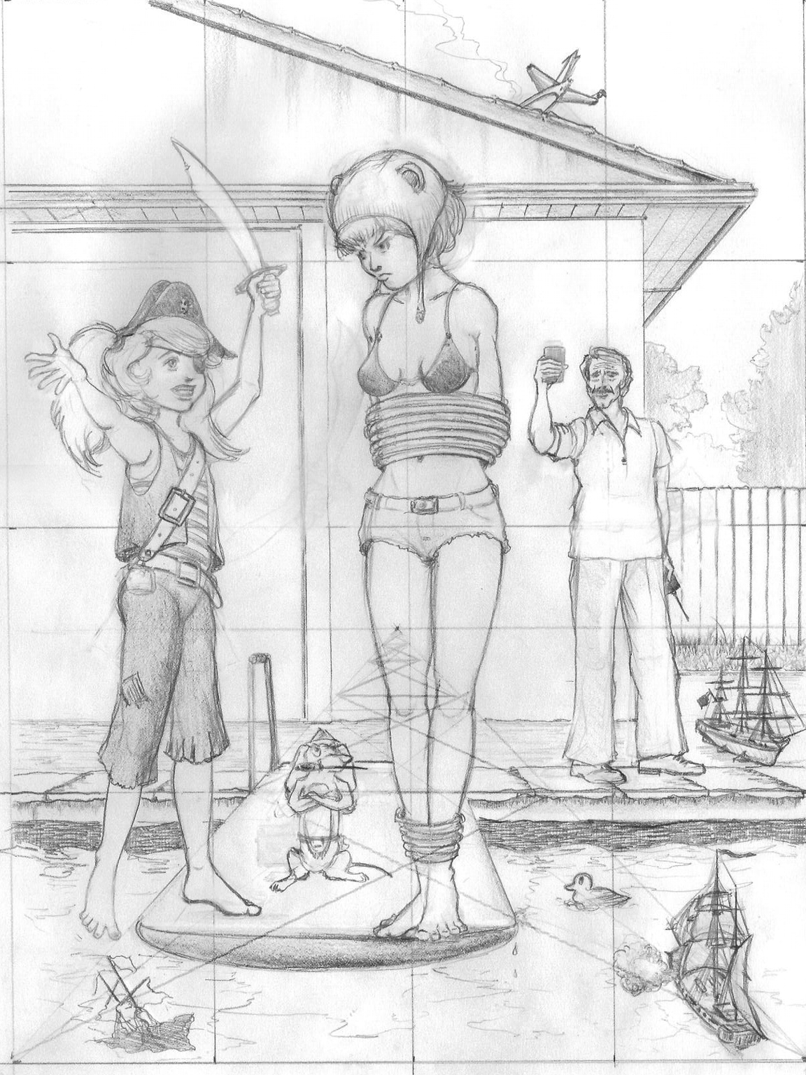
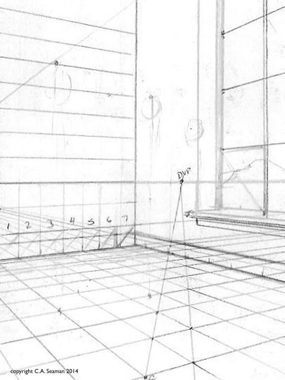
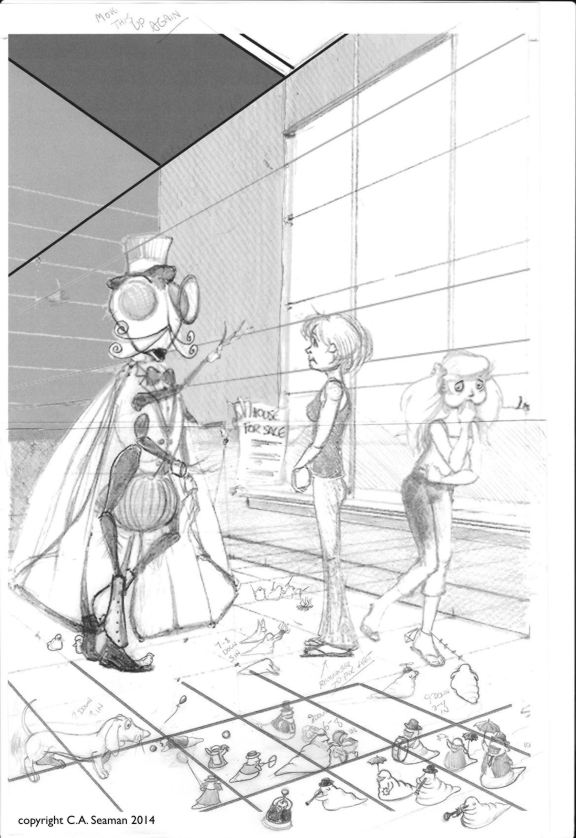
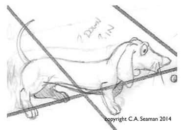
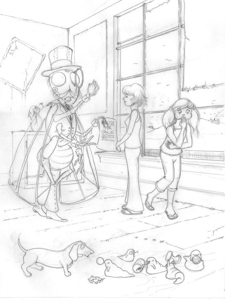
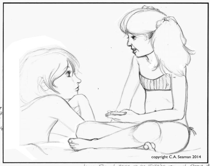
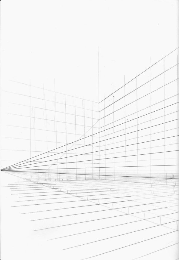
Now we are rolling along with the characters, we step up the work with a new scenario involving real estate, new personalities like Monsieur Aggot and his maggot children, the pet dog and the above mentioned technical requirements. The first image was a two point perspective exercise I did to work out the dimensions in the piece and set the characters in their correct proportions. Yes, Monsieur Aggot is one big bug. He also has a really interesting back story, but I don’t want to share it here.
Setting up the two point perspective
I printed out the perspective sheet full size and drew Zephyr, Bunty and the children into it. Monsieur Aggot was composited using photo rendering software.
Close up
Cleaned up drawing. Note the new poses for the children.
The final piece
Happiness is getting to use a wash with pen and ink. I liked the New Orleans funeral procession in the draft but decided the eating of scraps from the dump was a better fit in the end.
THE PROJECTS: 3 Four panel comic strip
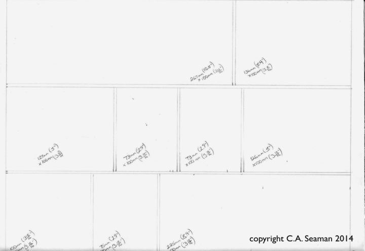
Next, we took the characters, introduced more into the piece and had to develop a four panel work on them. I was having trouble with my drawing hand at the time and created all the panels full page size first, then scanned and reduced them into the final piece to put less stress of cramping my hand with small details. It also helped me see what was worth keeping after the overload of the first piece. I had a lot more fun with this and pared down the texture a lot, giving the strip a cleaner look. If you wonder why there is so much open space at the top, remember it has to be kept clear to fit the dialogue.
The original panels are included separately and together. Click on them, etc., etc. to get bigger images.
Much more effective use of line and texture. Still hate my lettering, but not nearly as much as in Project 1. Poor Zephyr’s face is a bit twisted in Panel 3.
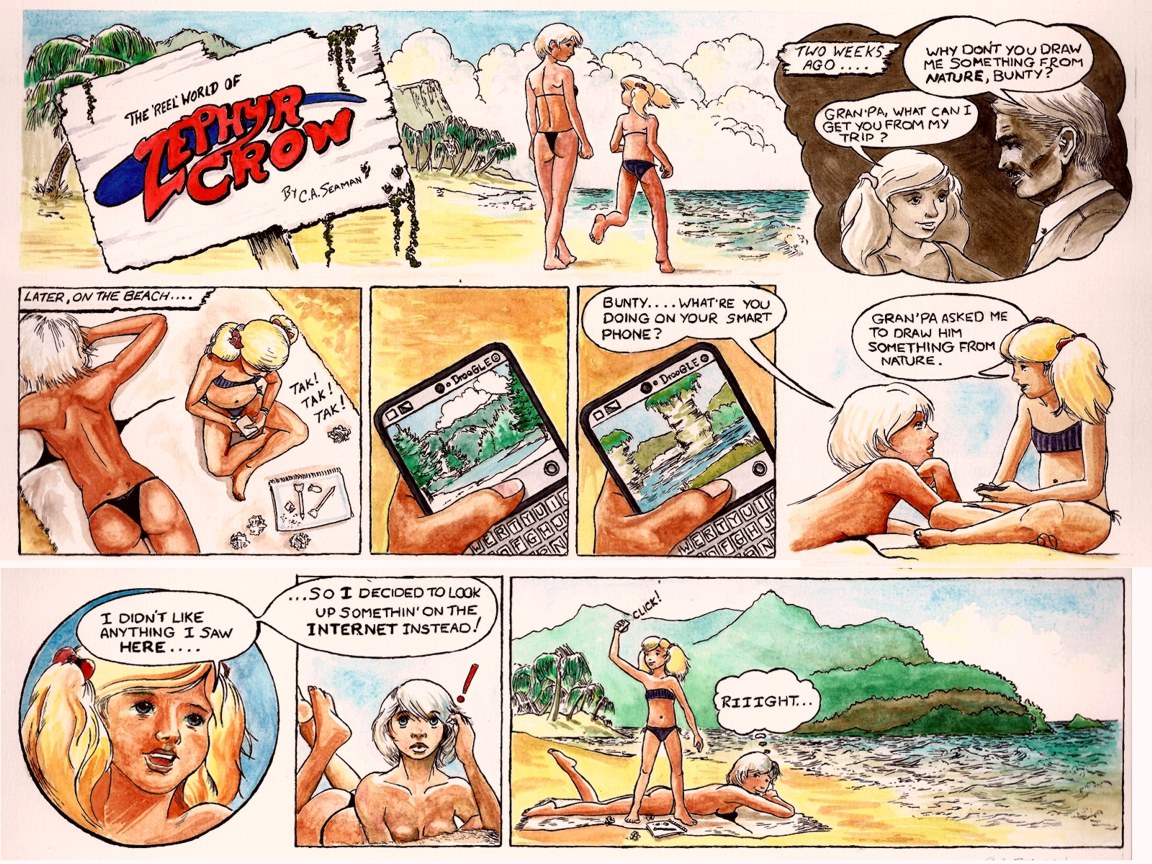
THE PROJECTS: 4 Full colour weekend paper comic strip
The four panel strip was a great way to develop the characters and I was stronger in my sense of what to do with them. This was a fun work to do, pulling in mixed media and full colour. I can’t recall too much else about requirements of the assignment, but getting into the rhythm, I drew the original panels large, but in scale to the finals and reduced them. It may seem like a lot of work, but I know of other professional artists- their names escape me- who do the same thing for the same reasons, often going into completing the panels and then assembling them later in the computer. I can see that in my future for graphic novel projects.
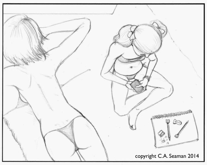
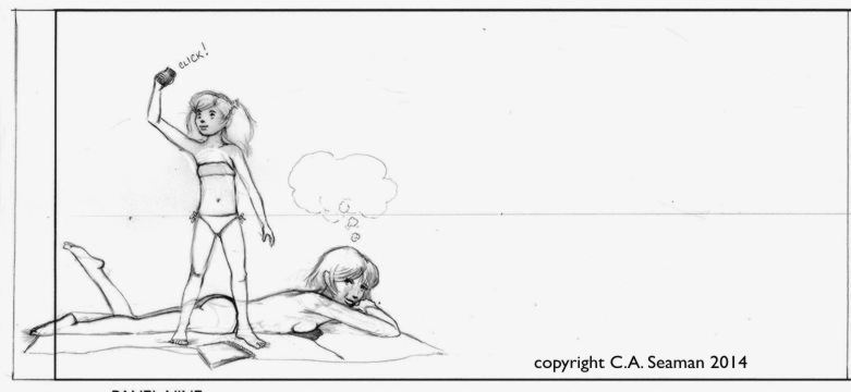
The story is, incidentally, based on something that actually happened to me once when I took a class outside to draw trees and nature and had one preferring to sit in the sun and download her images from Google.
You can’t make this stuff up. Click on the images….
1
2- flashback
3
4-5 Wally Wood always to reuse panels to save time. Who am I to argue with him?
6
7
8
9
Layout before images were added
I had a lot of trouble scanning this piece. The watercolour was a lot smoother than it projected in this image. The red type in the title also should have been orange, but I could not get the balance on that without throwing off everything else. My lettering is looking a bit better now.
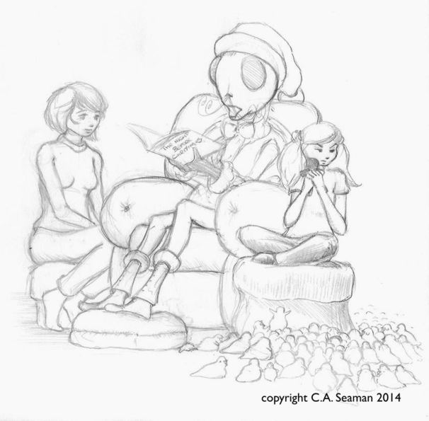
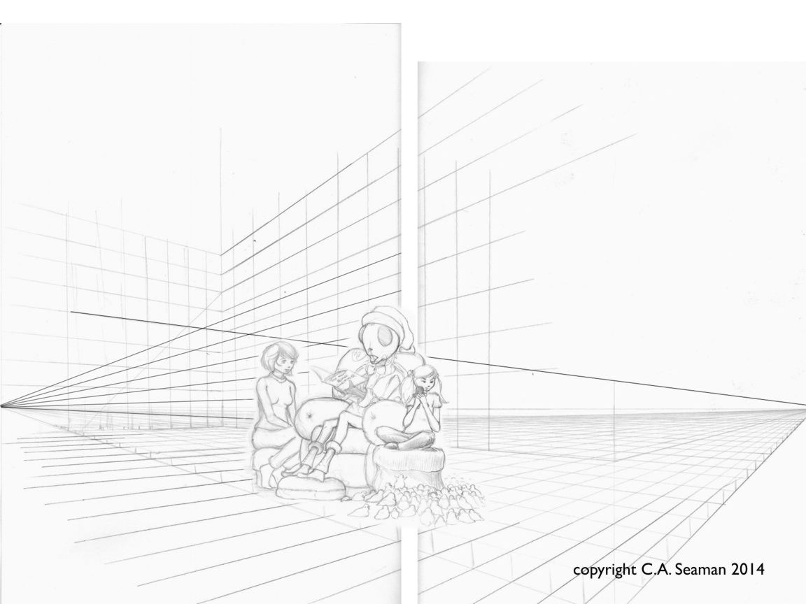
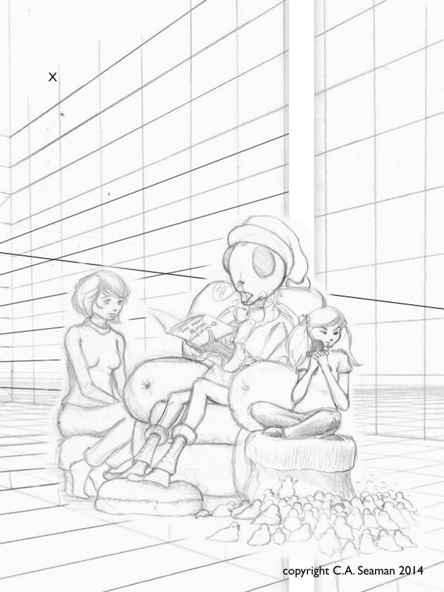
THE PROJECTS: 5 ANTHOLOGY COVER
The final project with Zephyr and Bunty was an anthology cover. We studied covers from various works like CALVIN & HOBBES, among others, and considered what time of year it would likely be released. Christmas was coming, so why not? As you can see, there were many parts to the project. Two point perspective, which for me had vanishing points 12 feet, (almost four meters), apart and leading to the parts of the planning being done in the computer using a cg grid. The final piece had to have several versions, as you can see here.
Enjoy…
Preparing two point perspective sceneCompletedPlaying with models in Poser for ideas- one of several scenesCreating the drawing with the groupCompositing the characters with the sceneCropping to create the final compositionFinished line artGraphite versionWatercolour monochrome versionFull colour final in pen and ink, watercolour mixed mediaPeople love the maggot children. I’ve even been asked to draw them at Free Comics Day, instead of the usual superheroes.
I would like to revisit this someday. It has light and dark elements to it that should appeal to a wide audience. Perhaps a collaboration of sorts might be in order to get it moving. Perhaps I should just make clones of myself instead…
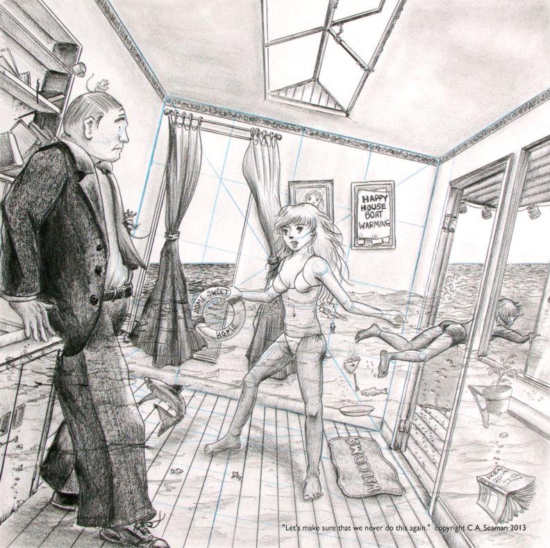
Before you go on, this is NOT some tone deaf sexist comic piece.
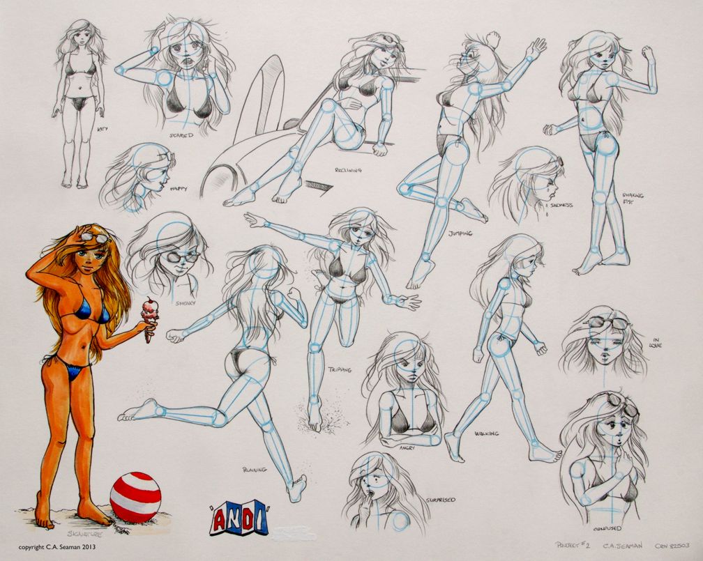
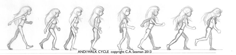
Andi actually is a remarkably complex character who hopefully will sometime once again see the light of day on my art table. She was created for the first Cartooning course I took at George Brown, and a lot of work went into filling out her character. Part of it came from others in the class, who contributed excellent suggestions when we exchanged drawings and brief outlines of our characters one night with each other and the recipient added a second drawing of a foil for our character on the spot and gave broad strokes to a backstory for that person. It was one of the best exercises I did in that class and made me much more confident in what I was doing later.
DEVELOPMENT OF ANDI AND OTHERS
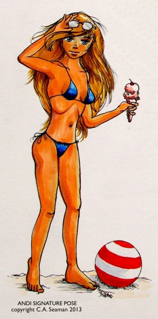
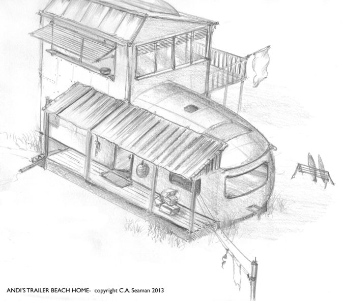
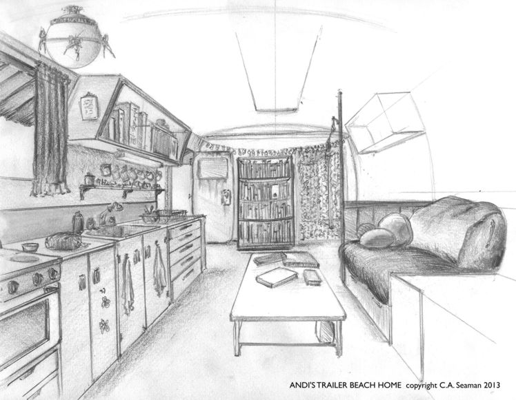
Miranda Andrew- Andi for short, was a rebel in her youth, getting pregnant at 16 and being thrown out of the house and her school. She went to live with an aunt, a progressive woman with liberal democratic ideas and a strong sense of justice for people who have rarely experienced it. She is also a cancer survivor, an activist and the perfect role model for Andi as she seeks to find her place in the world. The aunt lives on the coast and gives Andi a trailer on the beach to call home. Andi completes her education slowly, through night school and correspondence, has frequent run-ins with authorities who want to separate her from her son and over time develops into a clone of her aunt, ready to pick up where she leaves off when she goes into battle with the big C once more.
Actually, as I read this, I’m really thinking Andi is currently the right person in the right place at the right time. However, when the work was done several years ago, I only had time to develop what you see here before moving on to the next project, Zephyr Crow. Read about that in the post of the same name, coming out soon.
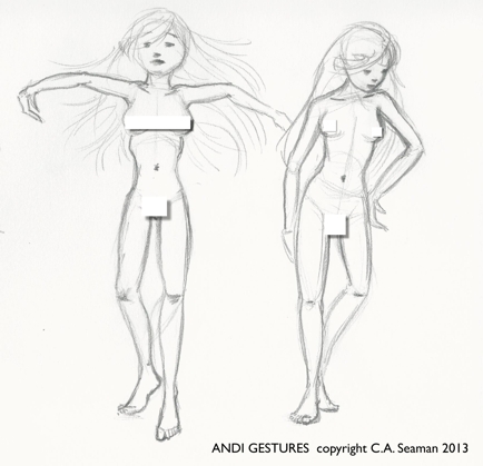
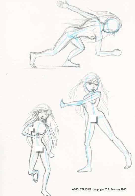
Many exercises in drawing were done to build confidence in rendering characters and drawing them quickly in a variety of gestures without models for reference. The same applied to settings, sidekicks, foils and secondary or antagonistic characters. Here are some of the drawings that came out of those exercises.
Early gesture test while sorting out the figure
Gestures 2
Gestures 3
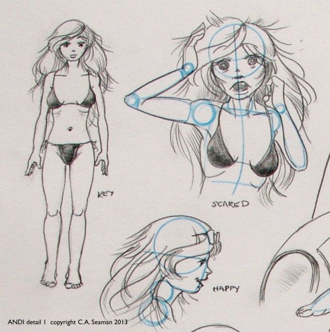
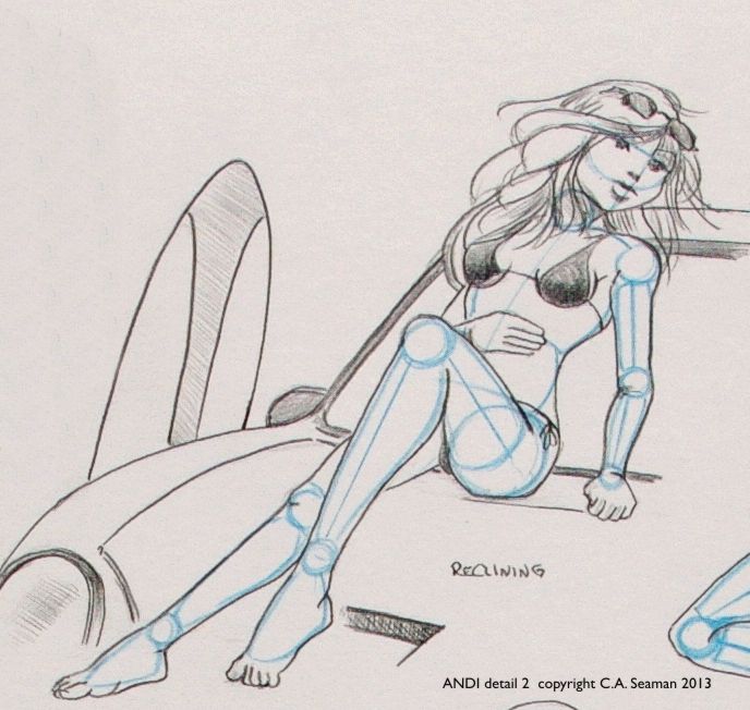
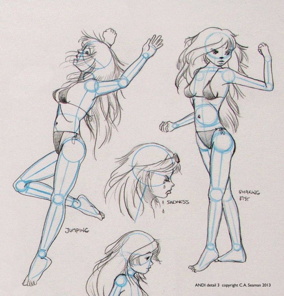
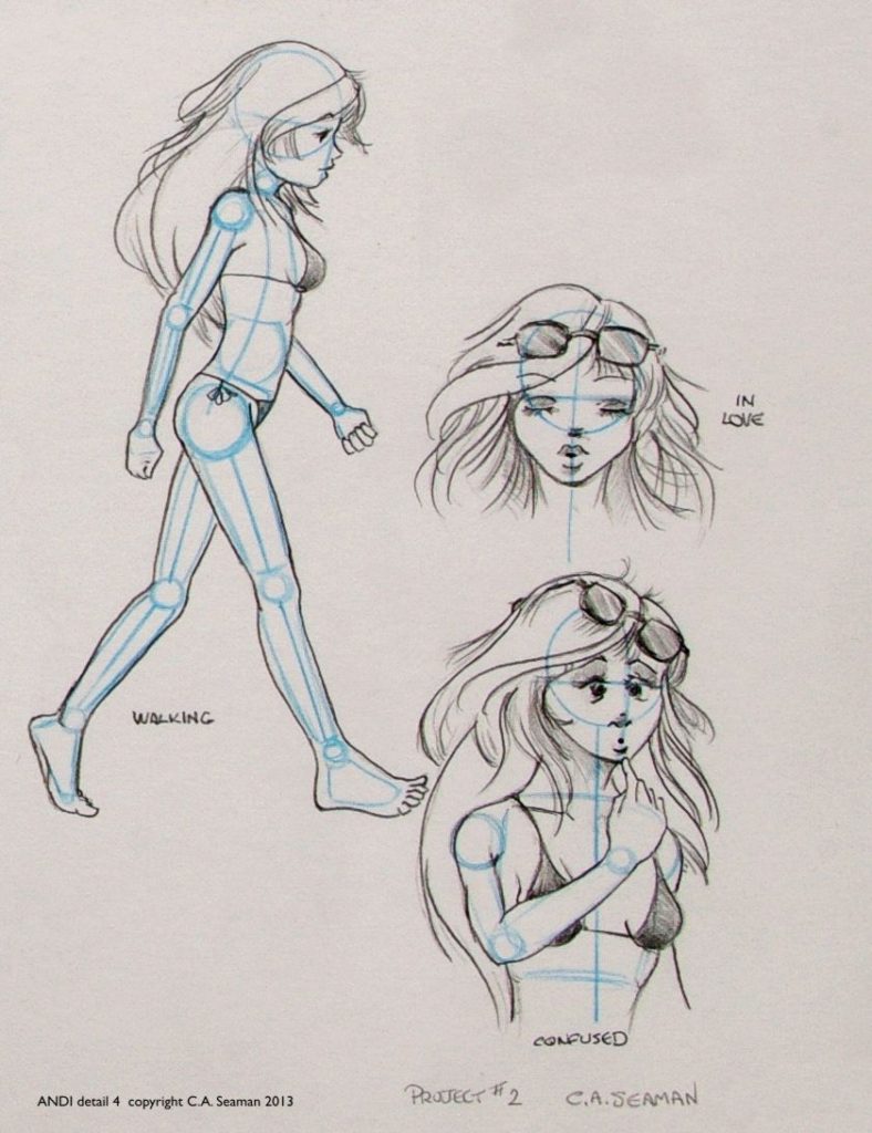
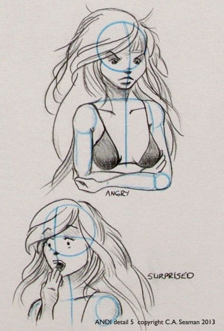
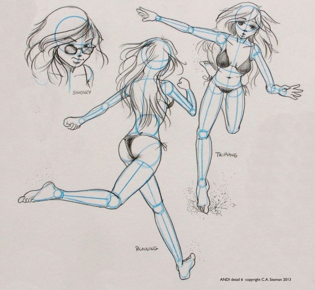
Character design sheet after preliminary work. Body joints had to be shown in non-photo blue pencil on the final image.
Details 1
2
3
4
5
6
Final piece in the course. Dialogue line was supplied. We had to build the single panel comic art around it. I threw in a lot stage business on this and it was fun for people to go and find these Easter eggs, but as I was to discover later in other Cartooning courses, it would not be wise to do it on every piece.
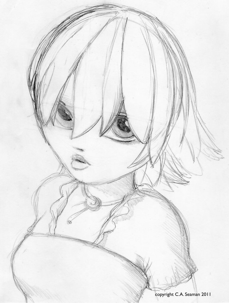
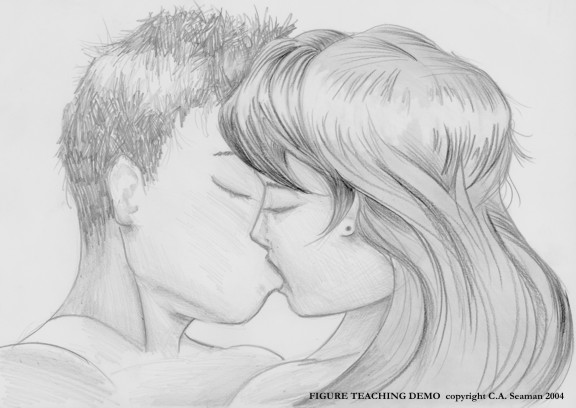
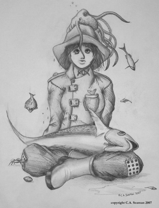
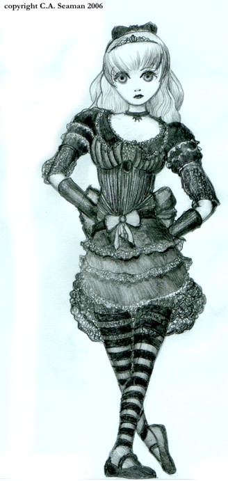
I like the look of some manga and anime. I have often been called a ‘fan’ of it, which I resent intensely, because it is a label that carries baggage in terms of pre-conceptions and associations that make me uncomfortable. While occasionally I stylize my work so that people say it reminds them of manga, I rarely actively embrace the concepts completely to do work that can actually be called manga or anime.
Having said that, I posted images in past versions of the website that definitely have that manga look about them. Some of the pieces were for students to copy, feeding into their interests and giving them the chance to develop their skills. The gallery below is filled with selected postings from that era, some of which haven’t seen the cybernetic light of day in years.
Thank-you piece for a great peer tutor
Another peer tutor piece
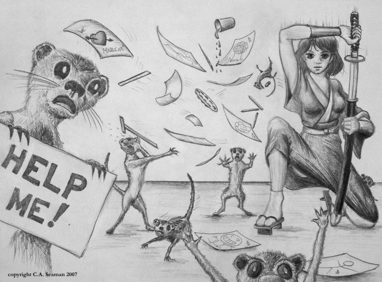
Take a wild guess…
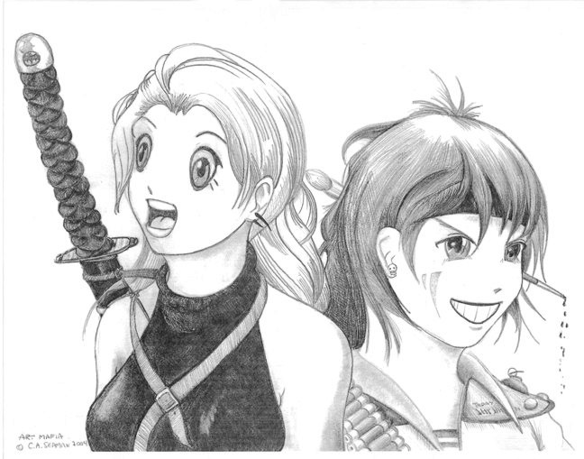
This was a great team
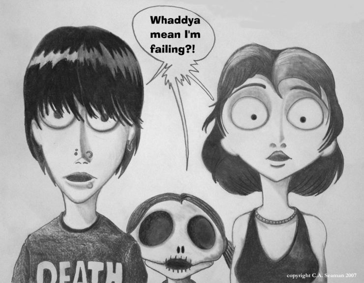
I usually posted this in the classroom before reports came out. It never failed to grab their attention.
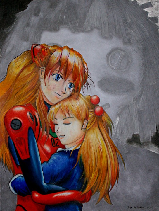
This piece was actually published as fan art in NEON GENESIS EVANGELION: THE SHINJI IKARI RAISING PROJECT. (Vol. 3) It’s mixed media coloured pencil with graphite.
Another one
Study for texture, detail, contrast and value
For the modified students at the old school
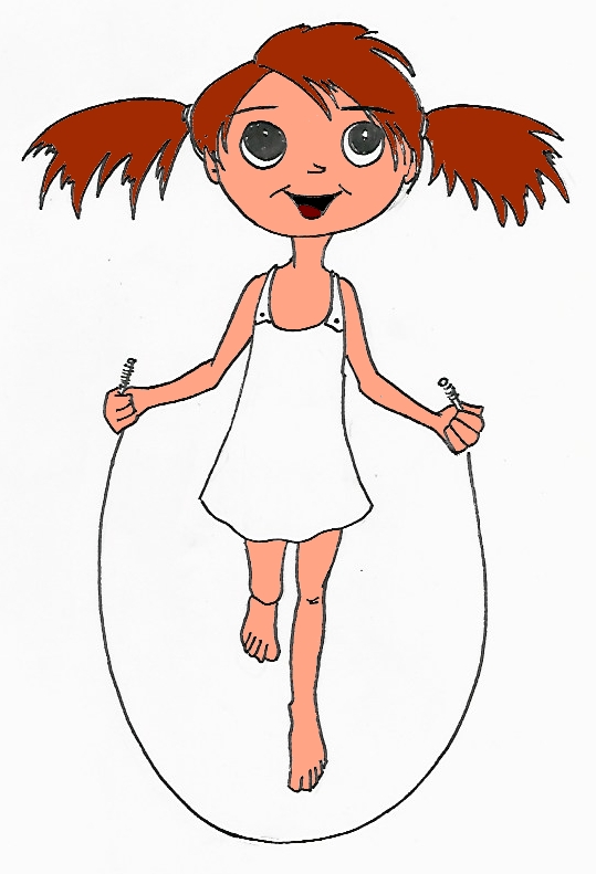
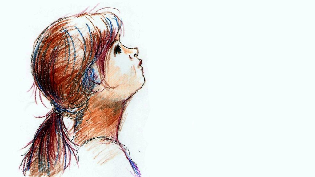
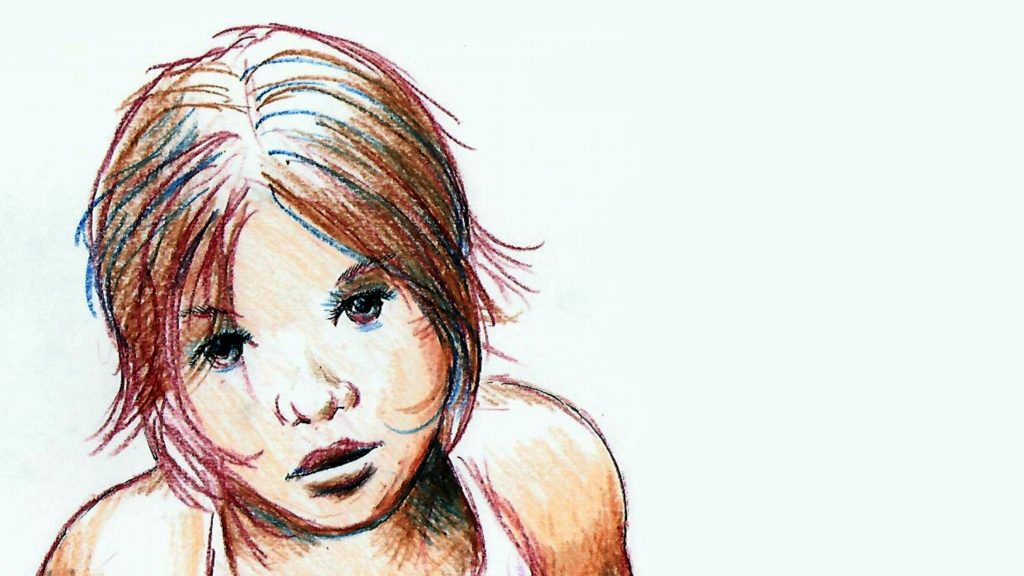
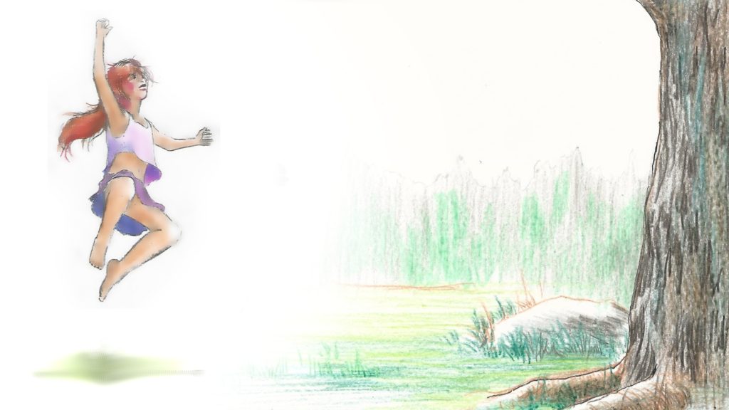
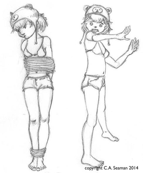
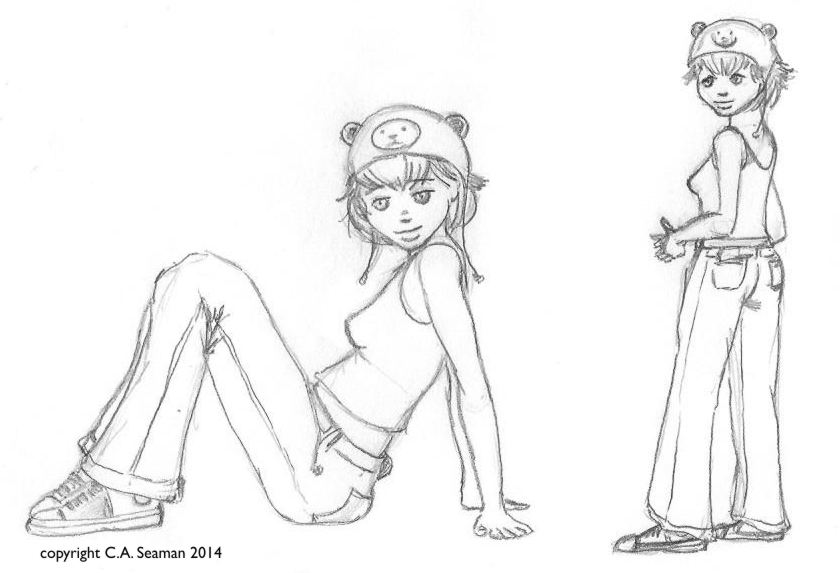
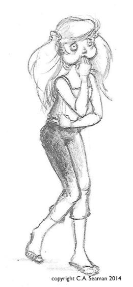
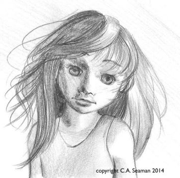
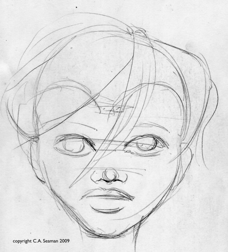
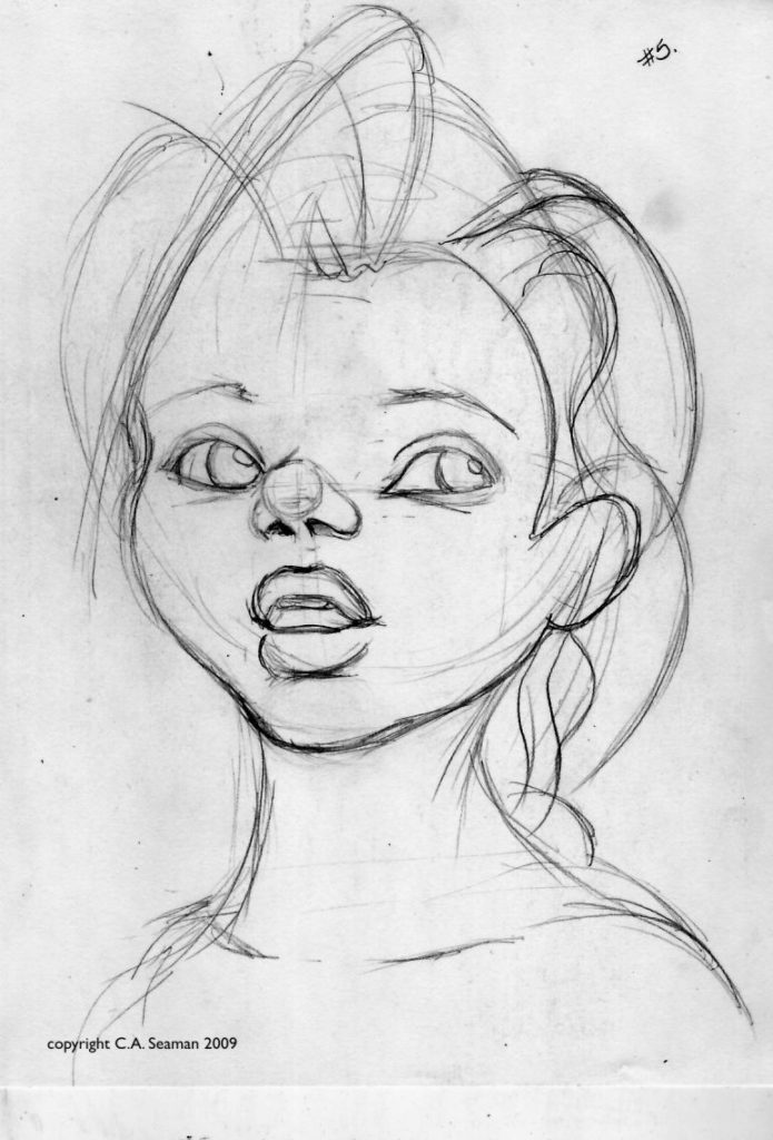
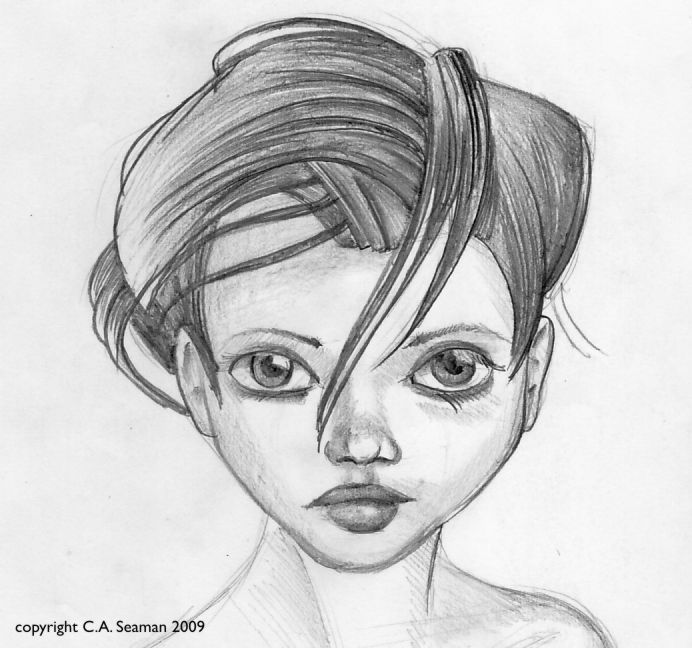
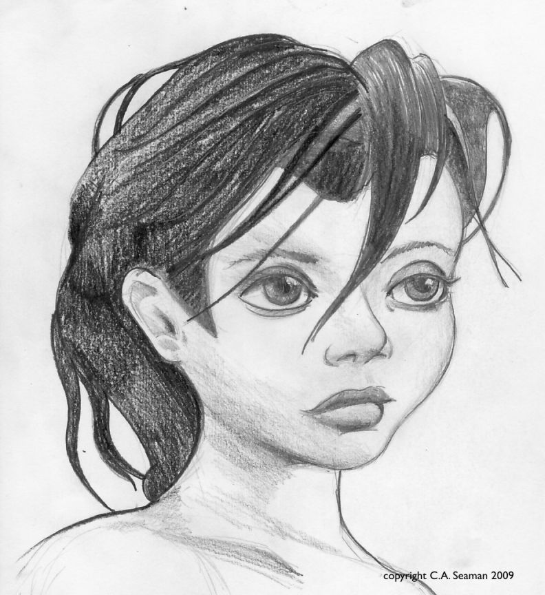
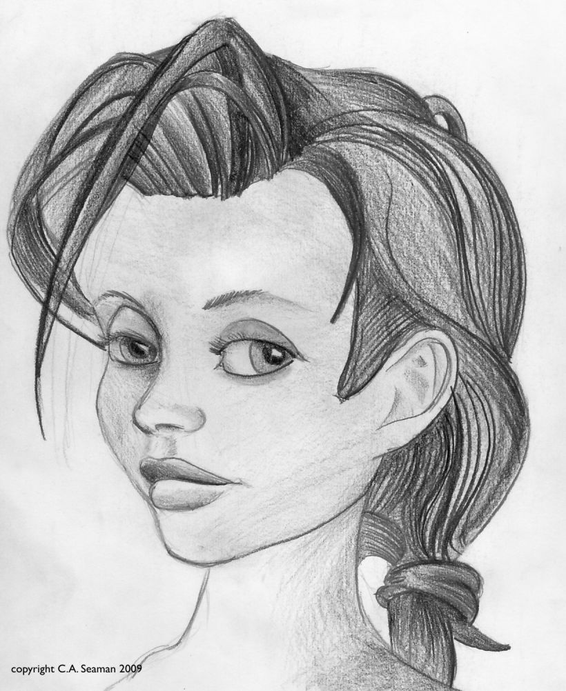
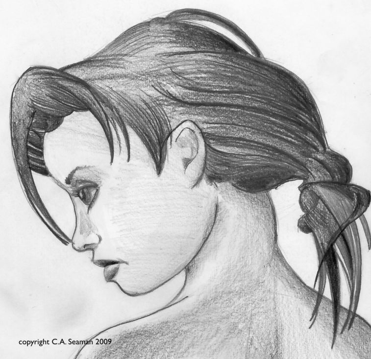
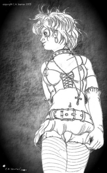
The Girl is a computer generated model that has been around for years. These studies were from poses set up in Poser, drawn when I was switching over to cg models in my art classes to deal with absenteeism among students, allowing them to keep up when, with live models, they would otherwise have foundered. And you know what? IT WORKED!
The Girl study- 2
More finish on the pieces to give students working exemplars.