This project was a for an IT firm in Toronto developing a concept for the auto industry. I am not going into any details about their concept in the project, but I was given permission to reproduce these images for the website and my portfolio.
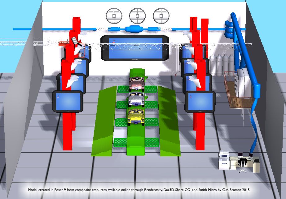
Below is a model I built to study and pose for the other images in the storyboard piece. The model was created in Poser 9 from bits and pieces of different objects that came with the software and some add-ons acquired online. The whole thing is meant to look like a toy. I studied Lego, reading from a DK book I found in the drugstore on the history of the toy building legend and used bright primary and secondary colours to help emphasize the various elements- like the columns I constructed from scratch, the tubing, cobbled together from a model of over 200 objects located on ShareCG.com. I had a list of things I had to include and this image, excluding people, contains everything on the list.
The beauty of building a ‘set’ like this, is that when working with the client, I was able to move the camera around and with him, plan the panels that eventually became the storyboard. My client was intrigued by how I start digtial in projects to create resources and finish the job with traditional media.
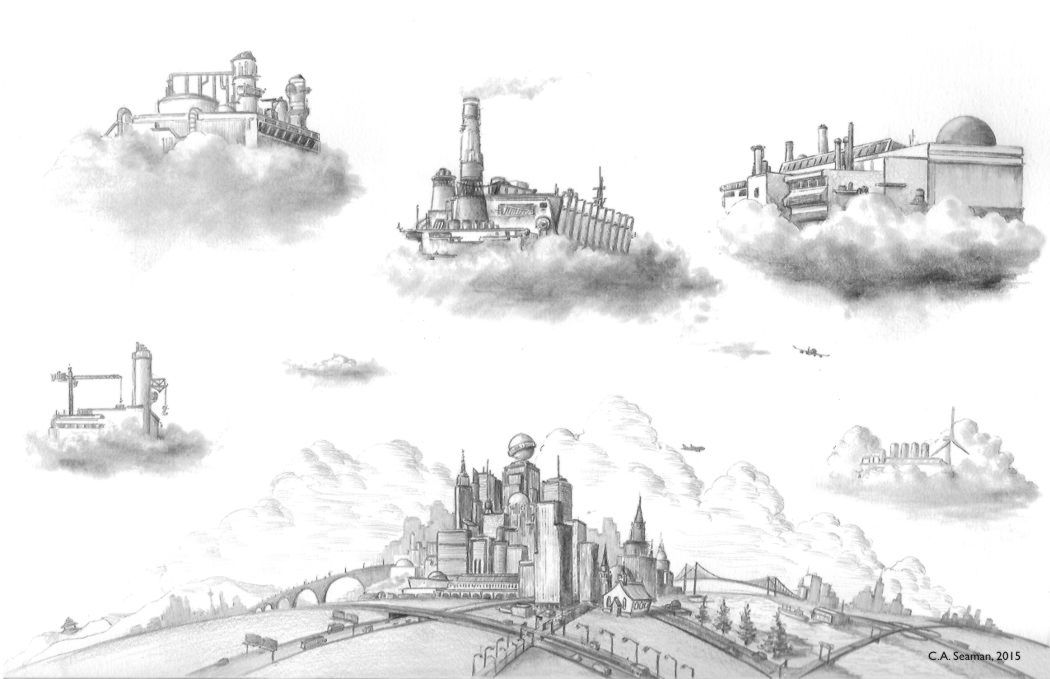
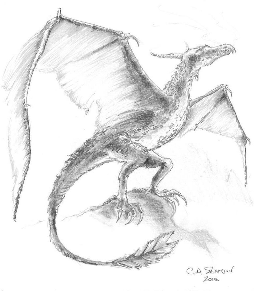
The scene below is a representation for the client of industry in the cloud. It is fanciful, as requested, and I designed it to be reminiscent of some of those maps you sometimes see where cities appear oversized against the surrounding countryside.
INDUSTRY IN THE CLOUD. Reproduced with permission. By C.A. Seaman. Graphite on vellum.
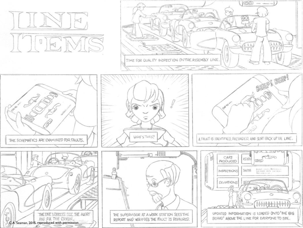
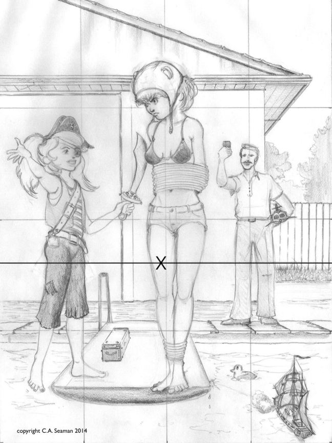
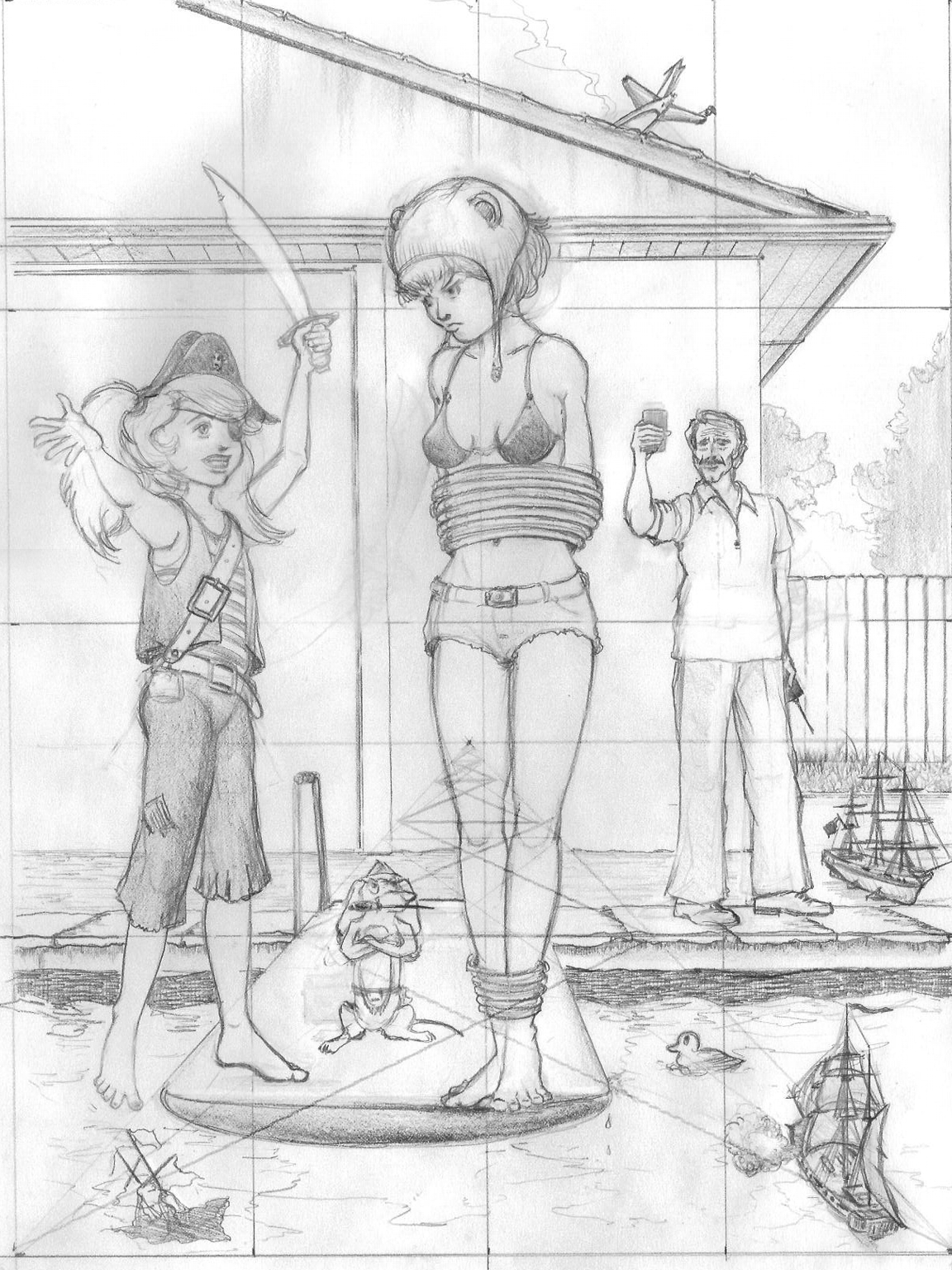
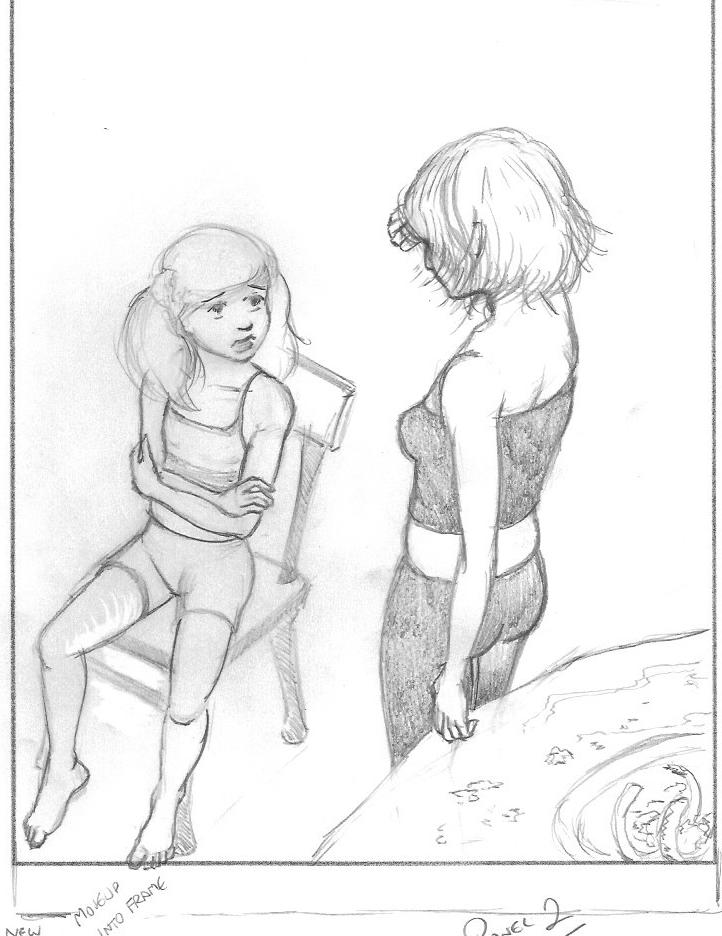
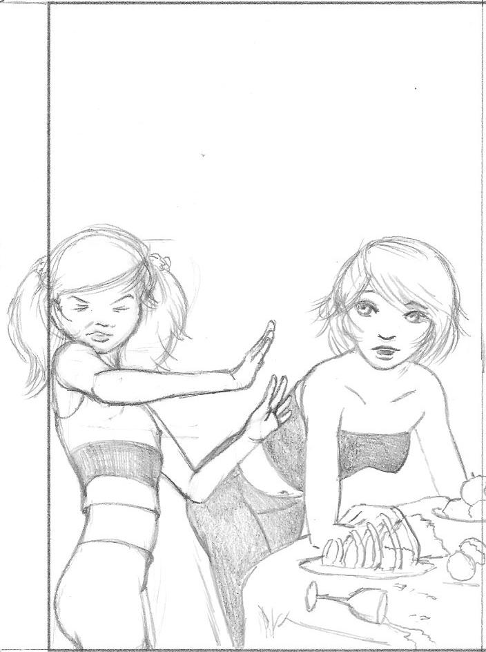
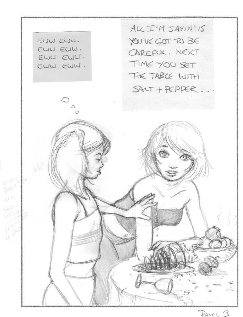
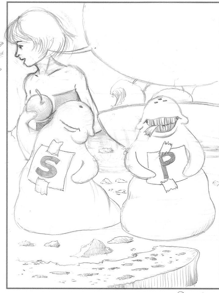
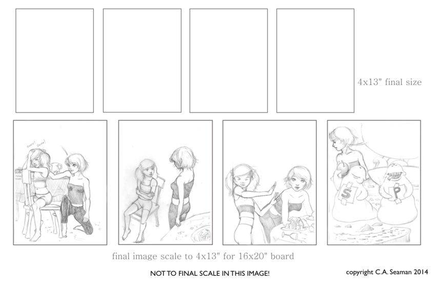
The final piece is a set of storyboards, laid out like a Sunday comic strip. I was asked to provide only line art- no colour, value or texture. It was a different kind of experience leaving something like this. However, the point is if further development takes place, this can be completed any way the client wishes. The assembly line pieces were set up with the model in Poser. I admit, the cars were a ‘light table’ job. I like to work freehand as much as possible, but I needed them to look identical, so took my composed layouts and traced those elements onto the vellum- a technique often used by comic artists- and adding the characters and various other monitor details, along with the text as I went. To create schematics for the tablet readouts, I was given templates by the client to follow and made new ones from scratch. For the automobile, I chose the vintage Corvette because it is a classic car anyone who appreciates such things should admire. Also, it had fine curves that complemented the various other elements like the characters and monitors. I finally created a logo for the piece, as there was a blank space that needed to be filled and I felt we’d come this far with the Sunday comic strip idea, so why stop?
COMIC STRIP AS STORYBOARD TO EXPLAIN CONCEPT. Reproduced with permission. By C.A. Seaman. Graphite on vellum.
LOGO DESIGN
This was a secondary project for the same person a year later, creating a logo for an online site that featured vinyl albums. It was meant to be fun and cartoony at the same time, like the retro styled art that would have been popular in a lot of animation when the albums on the website were produced.
LOGO DESIGN. Reproduced with permission. By C.A. Seaman. Mixed media on vellum.
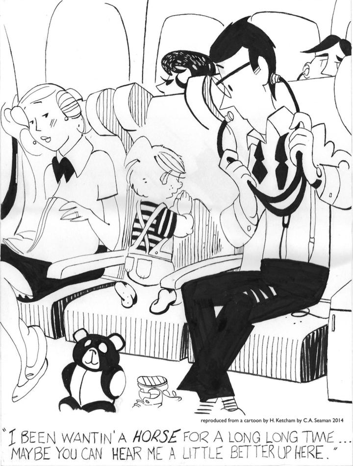
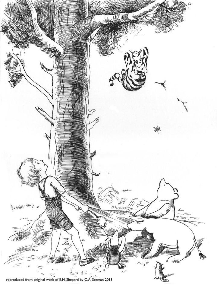
In my courses at George Brown, a valuable part of the instructive process involved reproducing panels from existing cartoons, comic strips and graphic novels. It was a great way to learn the techniques of others, test one’s observation skills, and through the use of comparable media, broaden one’s range in terms of drawing and painting. In one case, reproducing a comic strip had us taking the last panel- which had been blanked out- and creating our own ending for it. Cheating by looking up the original strip was not encouraged. Tracing wasn’t an option either. These exercises were meant to give us something like an atelier experience, where students can spend years copying from plasters and the works of the old masters before venturing out to create their own pieces from scratch. It worked for us. I remember one of the most unusual things I had to sort out was a foot belonging to Dennis the Menace. Hank Ketchum’s rendering of it was stylized, to say the least. In among the other elements, it was unremarkable. Once you looked at it on its own, it became something otherworldly and very strange.
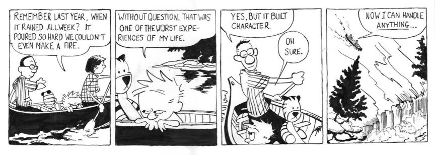
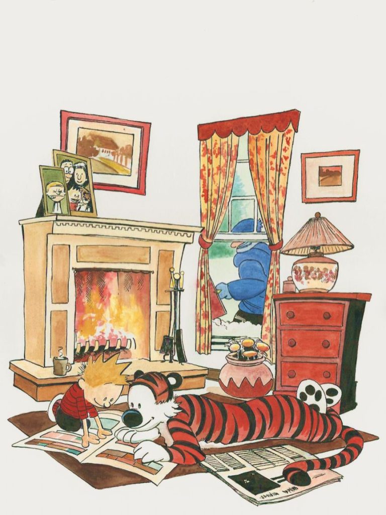
The reproduction of a Calvin & Hobbes strip with my own take on the final panel.
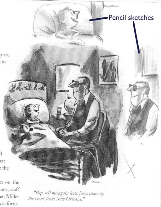
The photocopy of the Dedini piece I chose, with sketches around the margins.
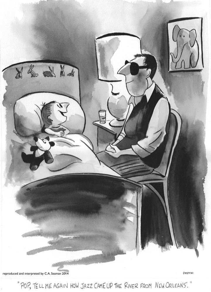
The final version.
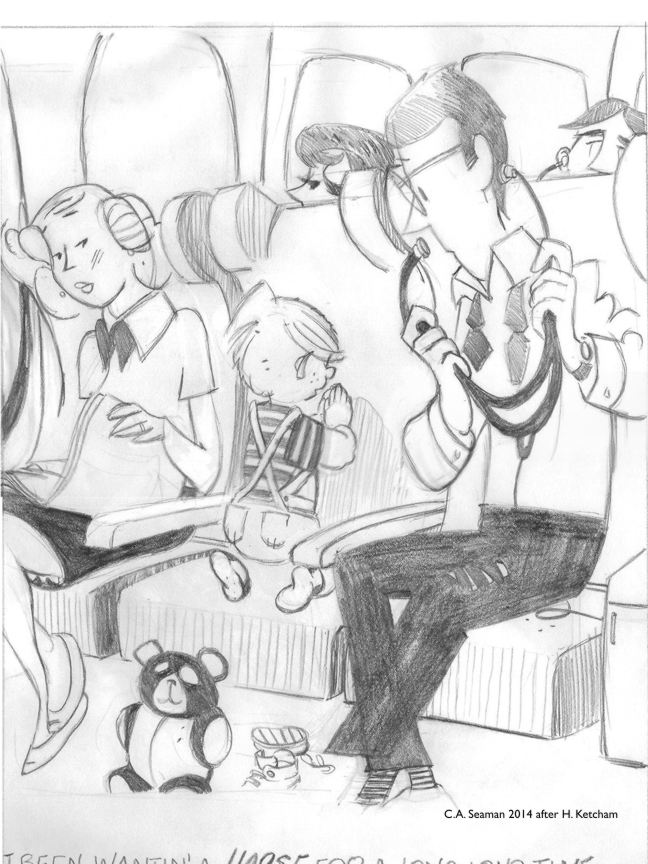
My drawing of the Dennis the Menace panel.
Completed with inking.
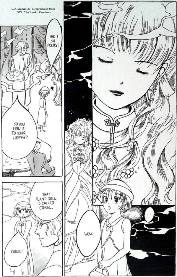
A page reproduced from a manga. The only time I ever touched mange in the courses.
Calvin & Hobbes anthology cover reproduction.
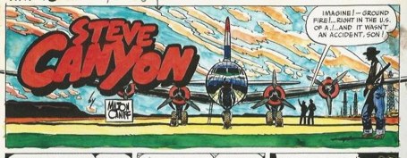
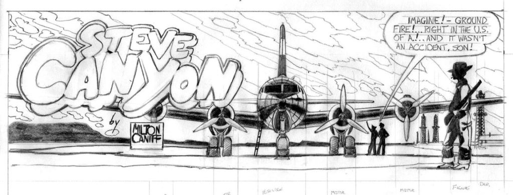
The original scan of Milt Caniff’s Steve Canyon piece
My drawing, using the placement of the engines on the DC-4 to scale the piece
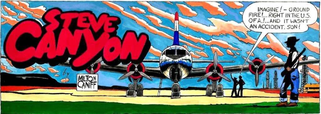
My reproduction, done with pen and ink and gouache.
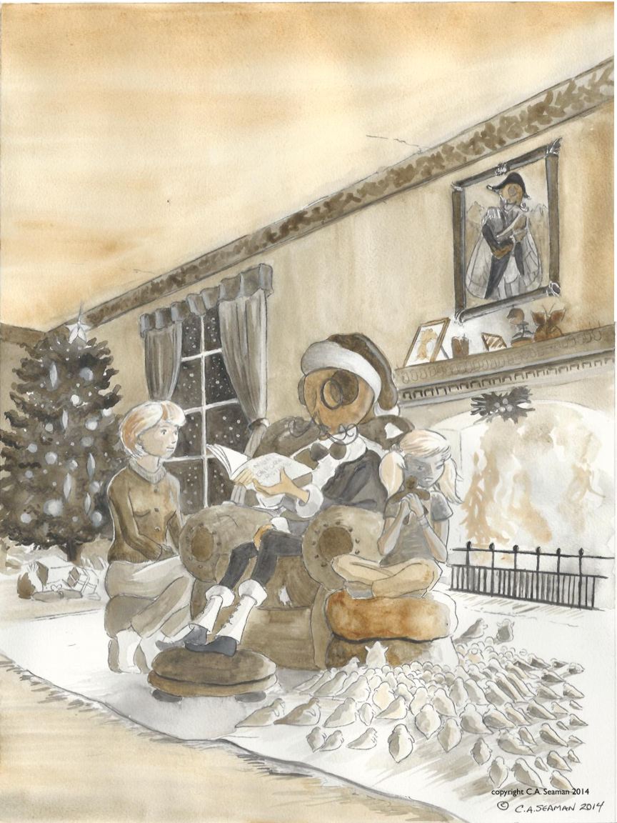
Zephyr Crow is a teenager living with her sister Bunty and her grandfather, Howard Elbee- a retired special effects movie magician from before the days of computers. Zephyr and Bunty’s divorced parents work separately overseas and have left the kids with the one relative they can trust. Howard, a widower, enjoys the company of his grand-daughters, and on the surface all seems relatively normal as they carry on from day to day.
Except for the fact that in Zephyr, Howard, and Bunty’s world normal is defined very differently from what one what imagine. Think Addams Family meets films about Hollywood…
That’s all I am going to tell you because this project is slated for further development, but has been on hold for a while. It was originally developed for the second of the cartooning courses I took at George Brown College and, modified to fit the needs of this particular Cartooning course, took on some interesting dimensions. (To read about the first Cartooning course, refer to the post on Andi, the beach princess with a difference.) What follows is development work, character sketches and completed projects like a sample one panel image, two comic strips and a projected cover design for an imagined anthology. These were all assessed projects and were all hugely useful in developing skills for me in sequential art.
ZEPHYR, BUNTY & HOWARD
Drawing of proposed title logo
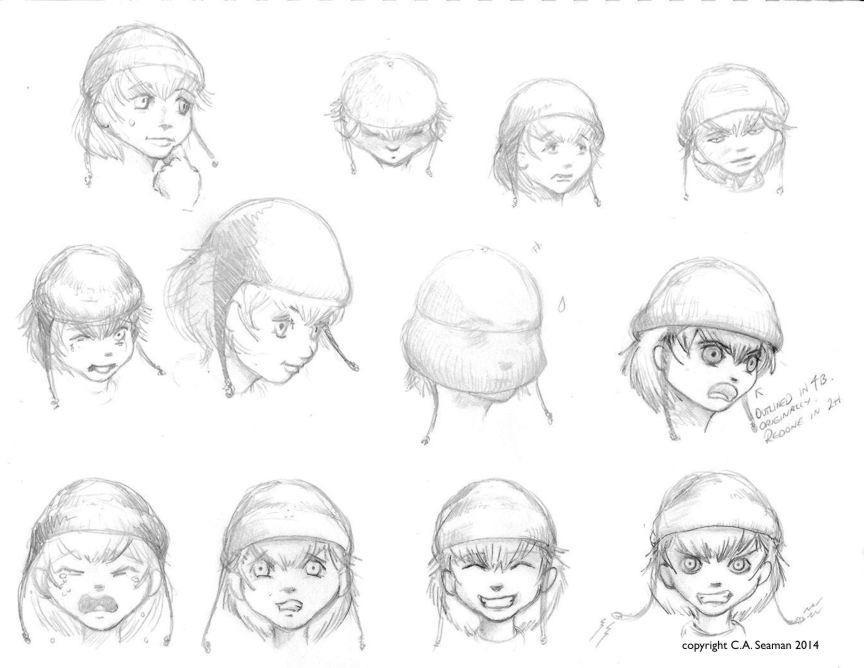
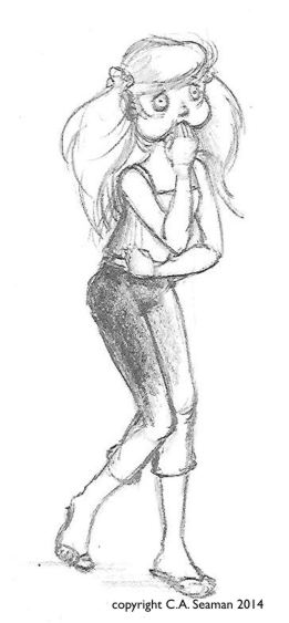
Early Zephyr expressions
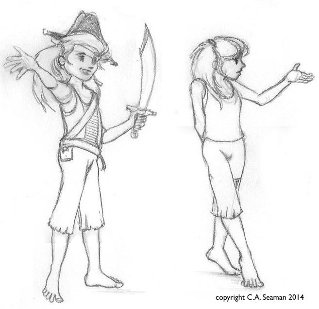
Early concepts of Zephyr
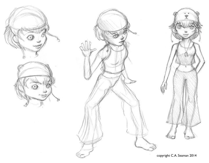
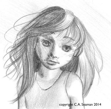
Zephyr
Zephyr
Pencil rough of Zephyr
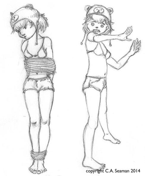
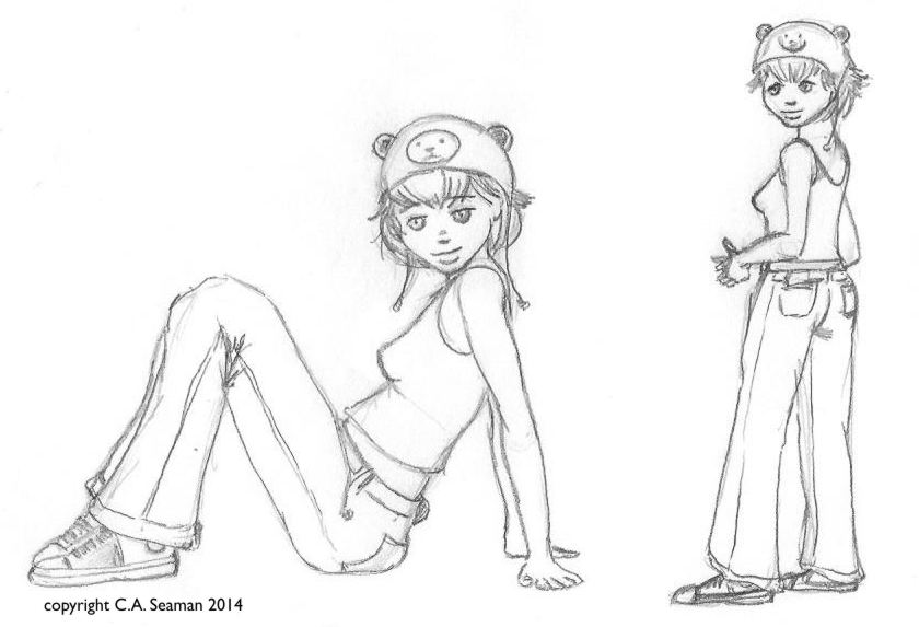
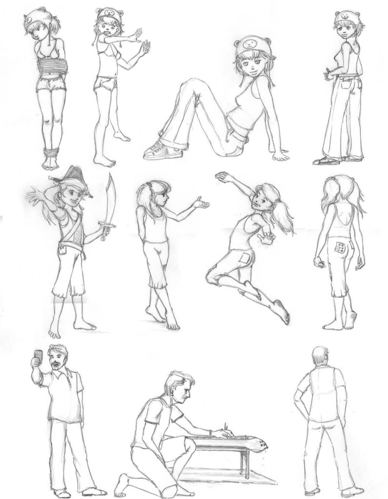
Character sheets with rotations and gestures
Bunty gestures
Bunty gestures
Pencil gesture of Bunty
Early Bunty study
Bunty and a ‘friend’
Howard in gesture poses
OTHER CHARACTERS…
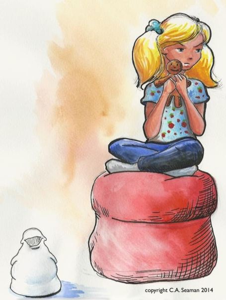
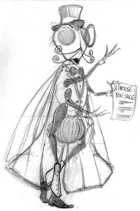
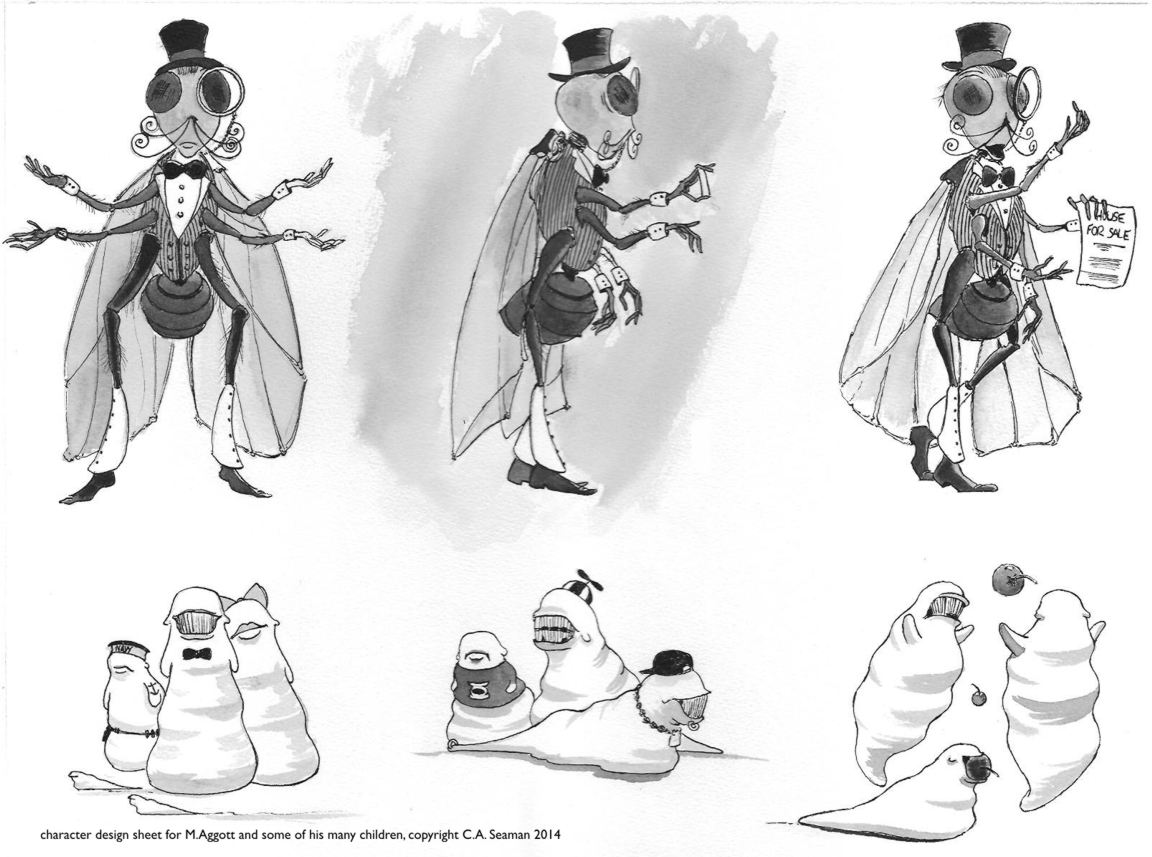
If Bunty is Zephyr’s foil in this story, other characters are actively supporting her in her adventures. I have not considered villains here as they are more likely to emerge with the stories. What appears are some of the peculiar neighbours Zephyr has, like Monsieur Aggot, a single parent and former horror film star. Monsieur Aggot is a family man as loves his children equally. He is also a real gentleman with fine manners.
Pencil study
Character sheet with rotations and some of his children
THE PROJECTS: 1 A single panel comic
The single panel comic was given to us as a way of exploring the characters in a given scenario. It was completed in pen and ink, with no use of wash or mixed media. There was guidance in terms of the subject, directing it had to be humourous. I think the dialogue was also given to us and we had to fit the subject to the line. Also, there had to be a visible demonstration of grid use and one point perspective in the piece. A good challenge, especially as Zephyr was developing as a much more serious project at that time.
Below are some process frames and the final project. You can enlarge a several images by clicking on them.
Original drawing with a gridDrawing with demonstration of one point perspectiveFinal pieceSome good points , but it was my least favourite of the project pieces I created. Too much stuff in it. Too much referential material. I also hated my lettering and thought the inking lacked polish.
THE PROJECTS: 2 A Second single panel piece, using wash and two point perspective in the design
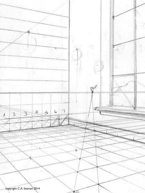
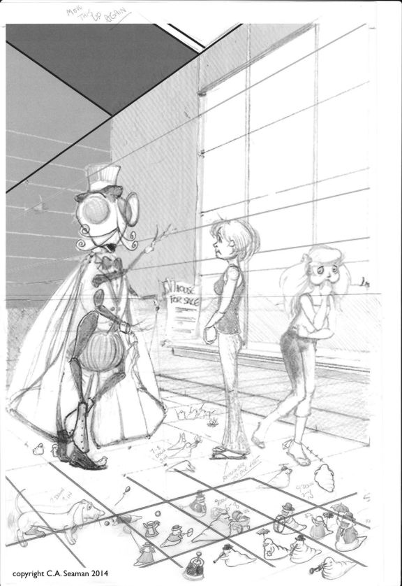
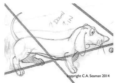
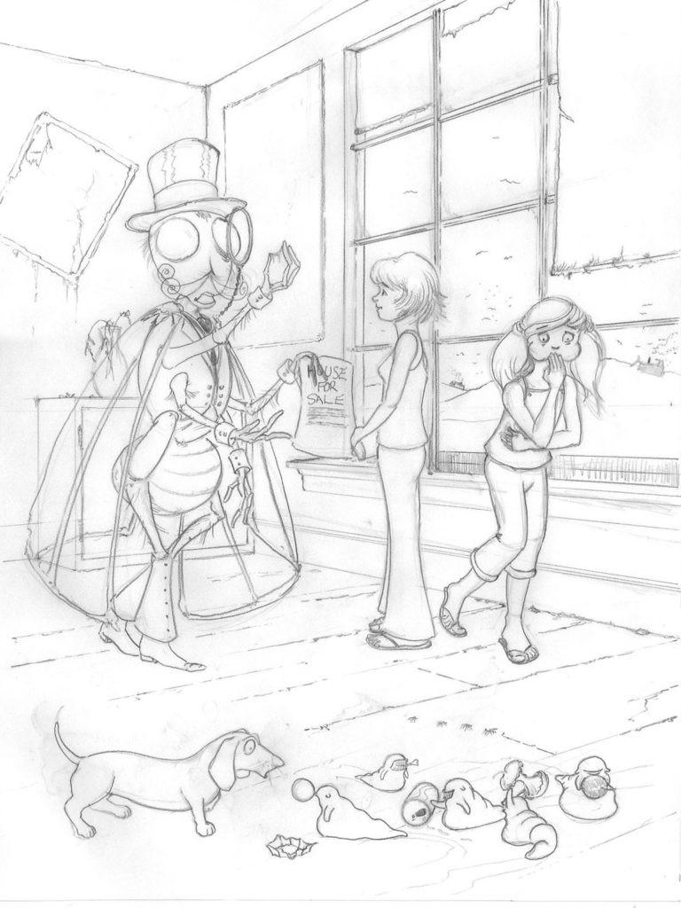
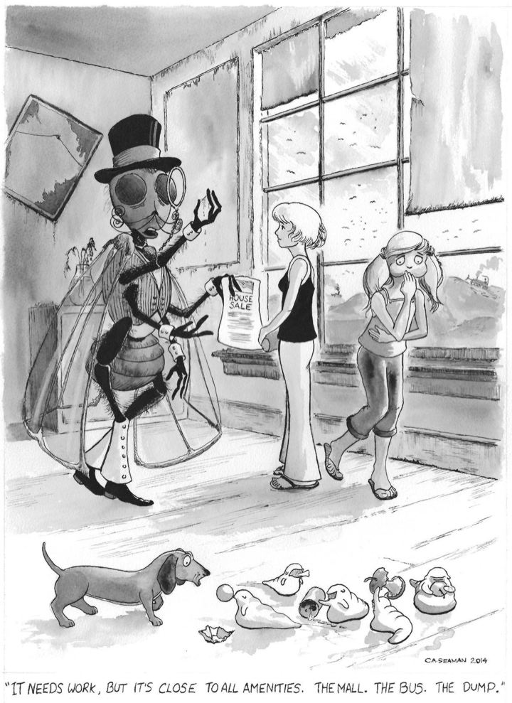
Now we are rolling along with the characters, we step up the work with a new scenario involving real estate, new personalities like Monsieur Aggot and his maggot children, the pet dog and the above mentioned technical requirements. The first image was a two point perspective exercise I did to work out the dimensions in the piece and set the characters in their correct proportions. Yes, Monsieur Aggot is one big bug. He also has a really interesting back story, but I don’t want to share it here.
Setting up the two point perspective
I printed out the perspective sheet full size and drew Zephyr, Bunty and the children into it. Monsieur Aggot was composited using photo rendering software.
Close up
Cleaned up drawing. Note the new poses for the children.
The final piece
Happiness is getting to use a wash with pen and ink. I liked the New Orleans funeral procession in the draft but decided the eating of scraps from the dump was a better fit in the end.
THE PROJECTS: 3 Four panel comic strip
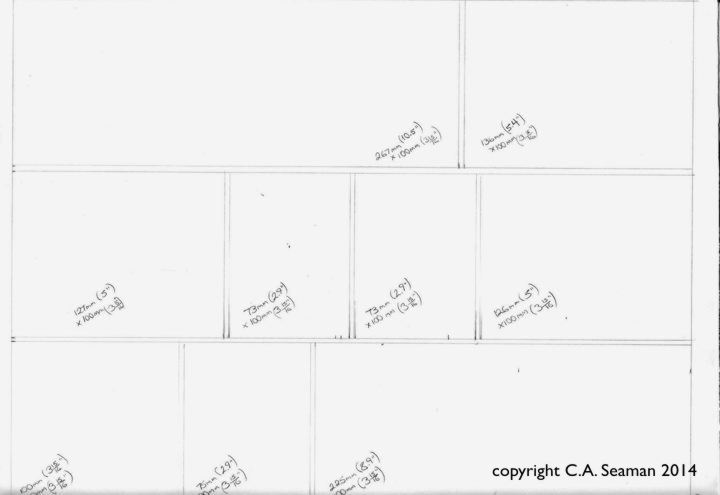
Next, we took the characters, introduced more into the piece and had to develop a four panel work on them. I was having trouble with my drawing hand at the time and created all the panels full page size first, then scanned and reduced them into the final piece to put less stress of cramping my hand with small details. It also helped me see what was worth keeping after the overload of the first piece. I had a lot more fun with this and pared down the texture a lot, giving the strip a cleaner look. If you wonder why there is so much open space at the top, remember it has to be kept clear to fit the dialogue.
The original panels are included separately and together. Click on them, etc., etc. to get bigger images.
Much more effective use of line and texture. Still hate my lettering, but not nearly as much as in Project 1. Poor Zephyr’s face is a bit twisted in Panel 3.
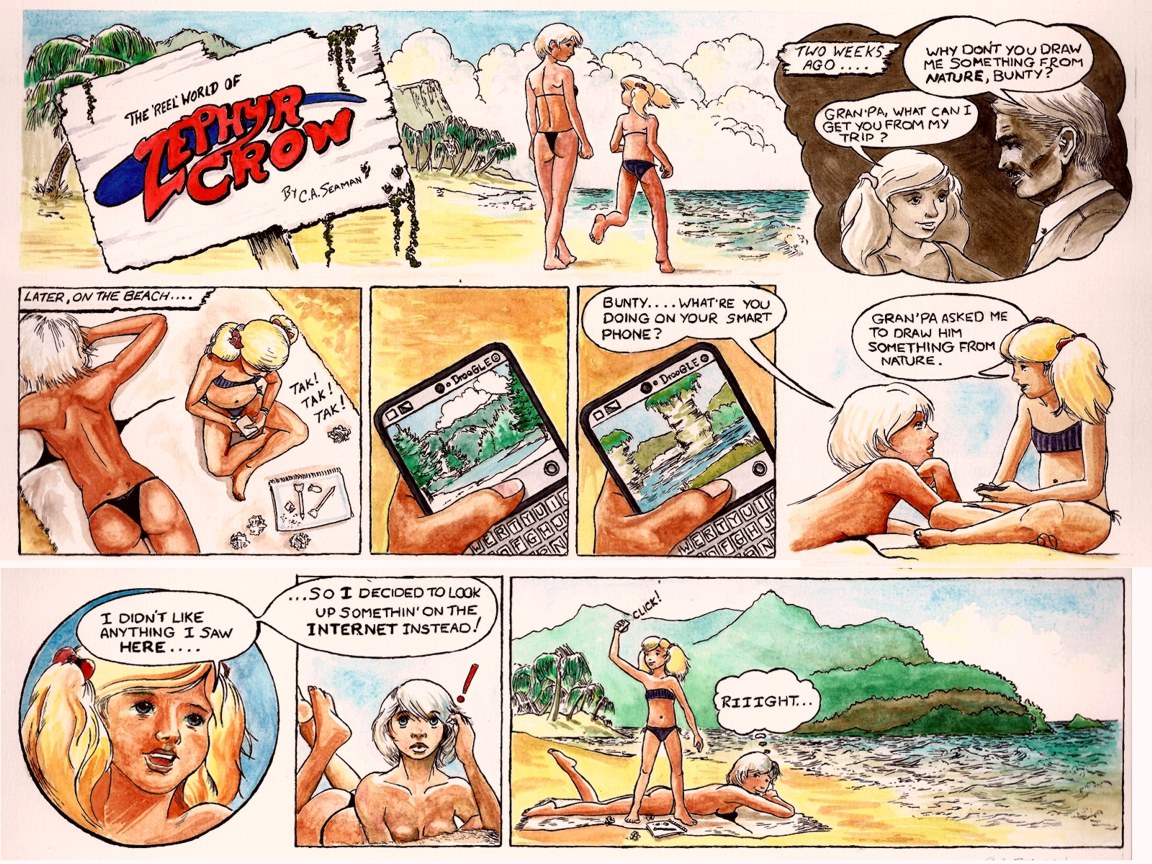
THE PROJECTS: 4 Full colour weekend paper comic strip
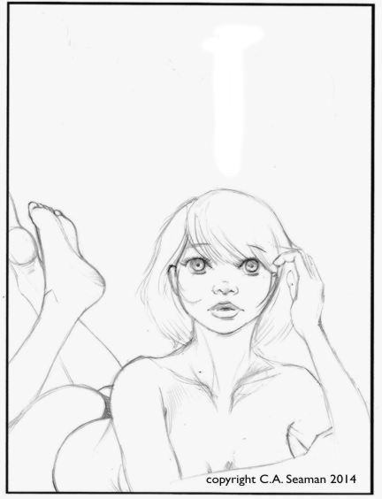
The four panel strip was a great way to develop the characters and I was stronger in my sense of what to do with them. This was a fun work to do, pulling in mixed media and full colour. I can’t recall too much else about requirements of the assignment, but getting into the rhythm, I drew the original panels large, but in scale to the finals and reduced them. It may seem like a lot of work, but I know of other professional artists- their names escape me- who do the same thing for the same reasons, often going into completing the panels and then assembling them later in the computer. I can see that in my future for graphic novel projects.
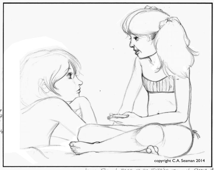
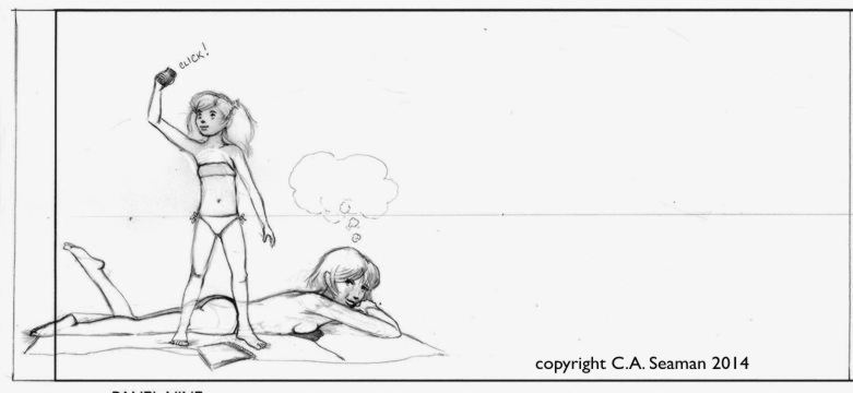
The story is, incidentally, based on something that actually happened to me once when I took a class outside to draw trees and nature and had one preferring to sit in the sun and download her images from Google.
You can’t make this stuff up. Click on the images….
1
2- flashback
3
4-5 Wally Wood always to reuse panels to save time. Who am I to argue with him?
6
7
8
9
Layout before images were added
I had a lot of trouble scanning this piece. The watercolour was a lot smoother than it projected in this image. The red type in the title also should have been orange, but I could not get the balance on that without throwing off everything else. My lettering is looking a bit better now.
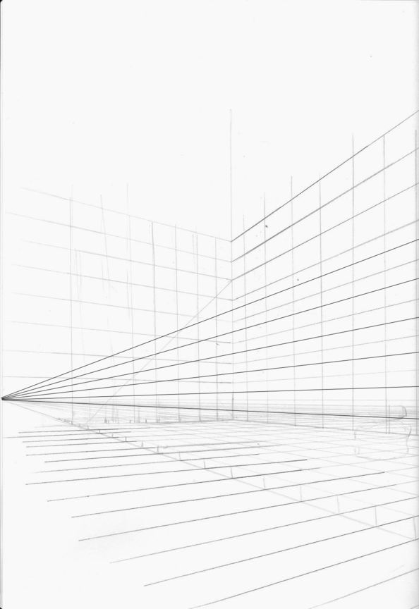
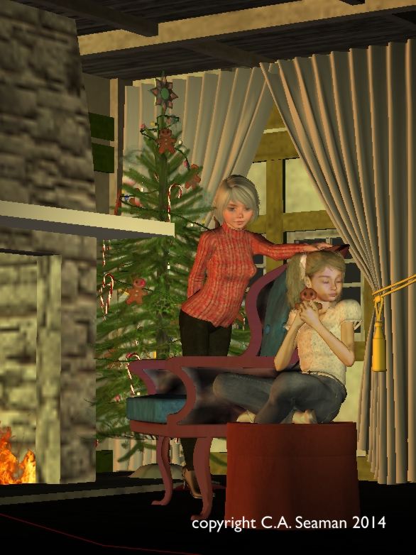
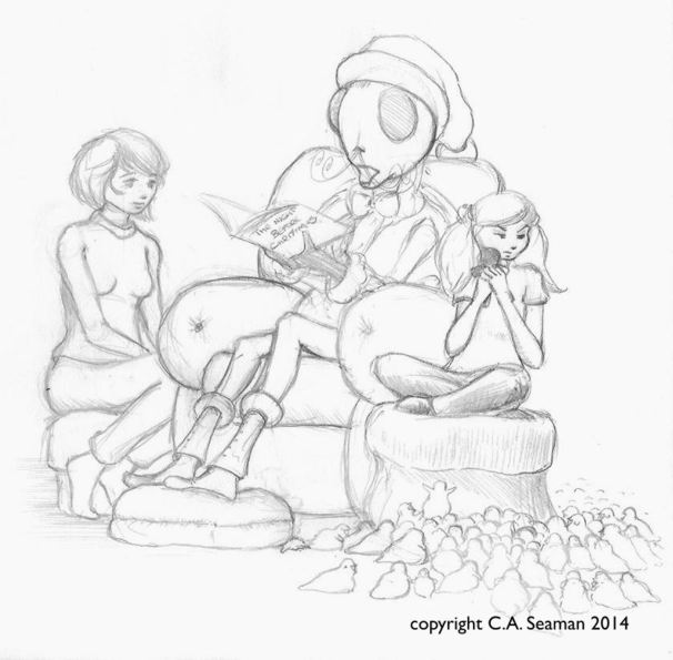
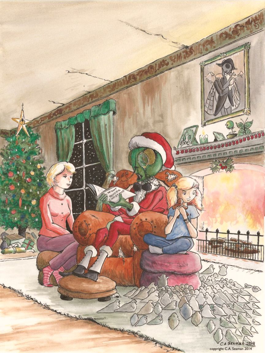
THE PROJECTS: 5 ANTHOLOGY COVER
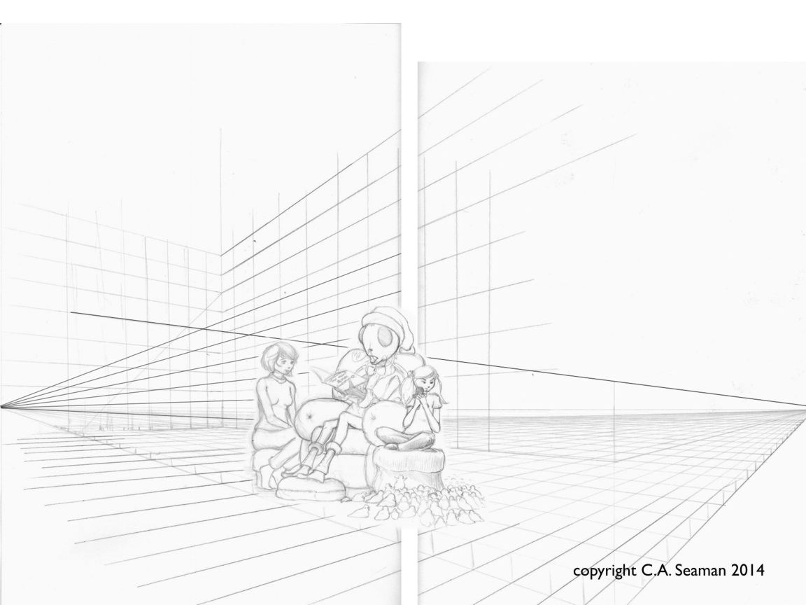
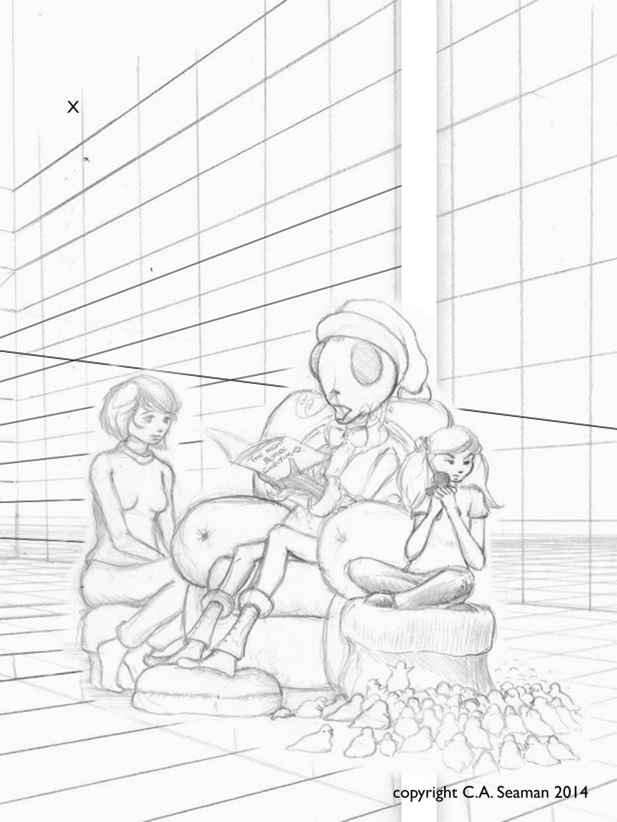
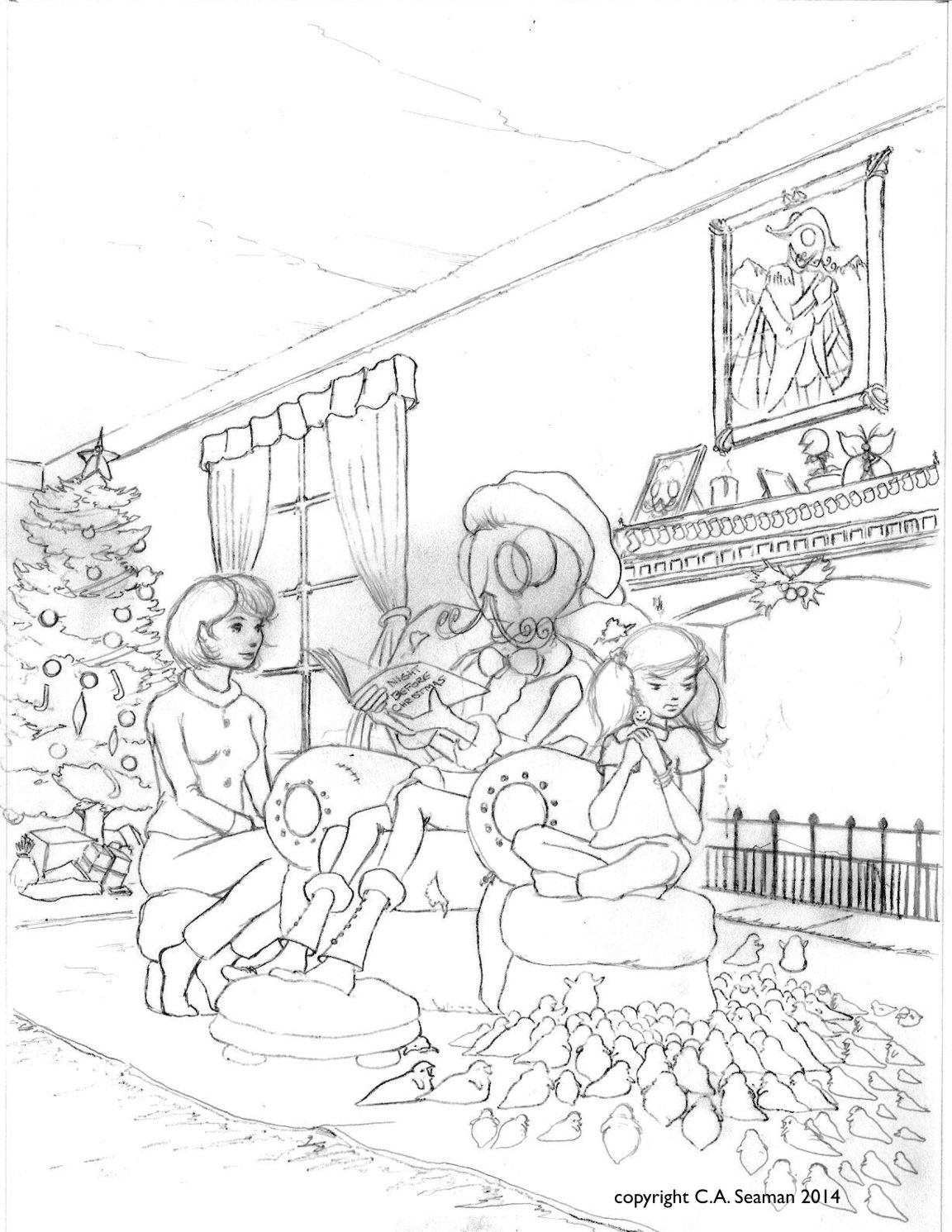
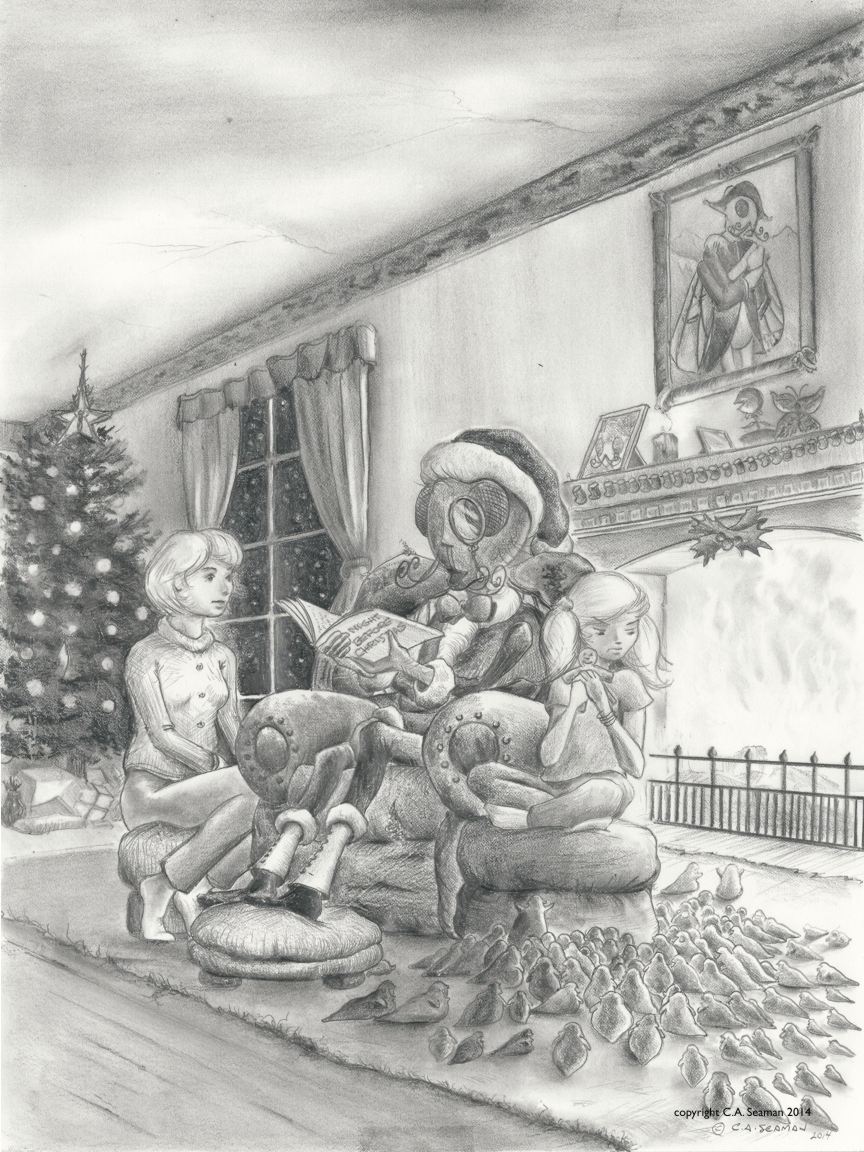
The final project with Zephyr and Bunty was an anthology cover. We studied covers from various works like CALVIN & HOBBES, among others, and considered what time of year it would likely be released. Christmas was coming, so why not? As you can see, there were many parts to the project. Two point perspective, which for me had vanishing points 12 feet, (almost four meters), apart and leading to the parts of the planning being done in the computer using a cg grid. The final piece had to have several versions, as you can see here.
Enjoy…
Preparing two point perspective sceneCompletedPlaying with models in Poser for ideas- one of several scenesCreating the drawing with the groupCompositing the characters with the sceneCropping to create the final compositionFinished line artGraphite versionWatercolour monochrome versionFull colour final in pen and ink, watercolour mixed mediaPeople love the maggot children. I’ve even been asked to draw them at Free Comics Day, instead of the usual superheroes.
I would like to revisit this someday. It has light and dark elements to it that should appeal to a wide audience. Perhaps a collaboration of sorts might be in order to get it moving. Perhaps I should just make clones of myself instead…
Before you go on, this is NOT some tone deaf sexist comic piece.
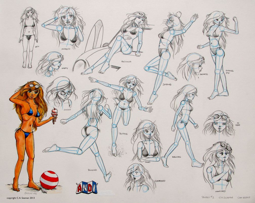
Andi actually is a remarkably complex character who hopefully will sometime once again see the light of day on my art table. She was created for the first Cartooning course I took at George Brown, and a lot of work went into filling out her character. Part of it came from others in the class, who contributed excellent suggestions when we exchanged drawings and brief outlines of our characters one night with each other and the recipient added a second drawing of a foil for our character on the spot and gave broad strokes to a backstory for that person. It was one of the best exercises I did in that class and made me much more confident in what I was doing later.
DEVELOPMENT OF ANDI AND OTHERS
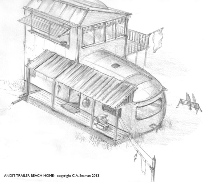
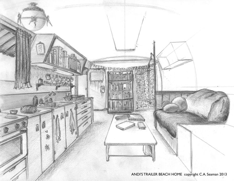
Miranda Andrew- Andi for short, was a rebel in her youth, getting pregnant at 16 and being thrown out of the house and her school. She went to live with an aunt, a progressive woman with liberal democratic ideas and a strong sense of justice for people who have rarely experienced it. She is also a cancer survivor, an activist and the perfect role model for Andi as she seeks to find her place in the world. The aunt lives on the coast and gives Andi a trailer on the beach to call home. Andi completes her education slowly, through night school and correspondence, has frequent run-ins with authorities who want to separate her from her son and over time develops into a clone of her aunt, ready to pick up where she leaves off when she goes into battle with the big C once more.
Actually, as I read this, I’m really thinking Andi is currently the right person in the right place at the right time. However, when the work was done several years ago, I only had time to develop what you see here before moving on to the next project, Zephyr Crow. Read about that in the post of the same name, coming out soon.
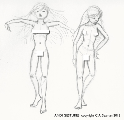
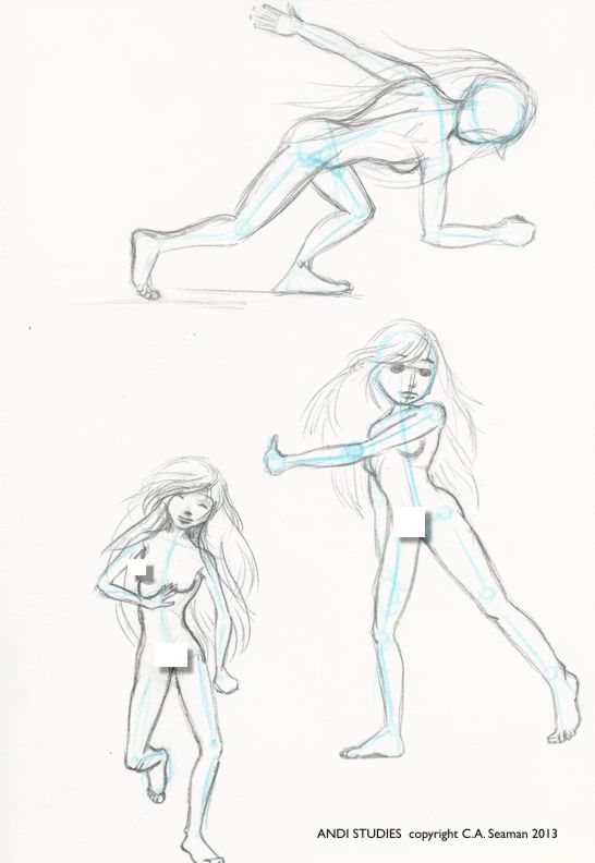
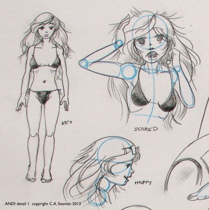
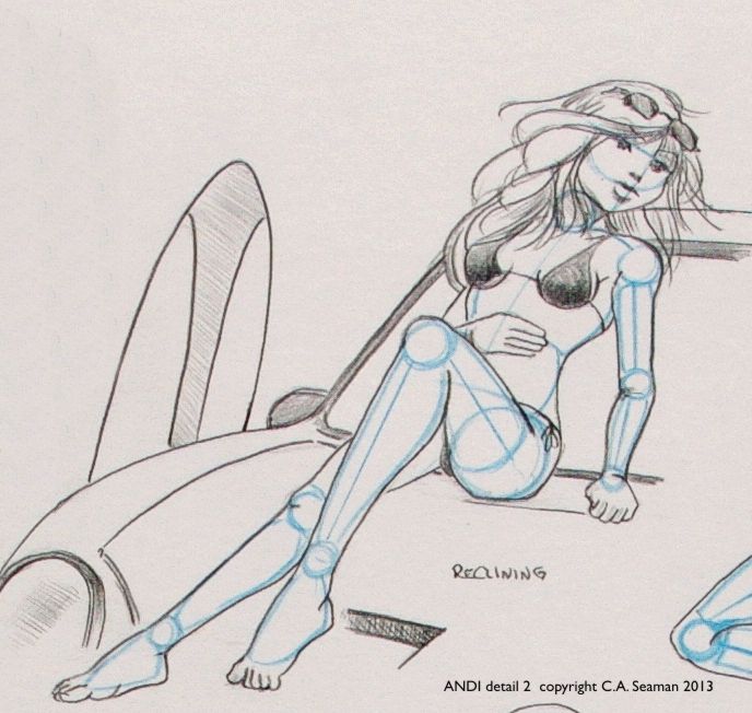
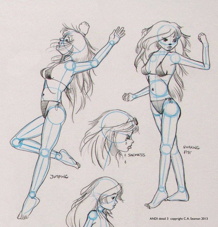
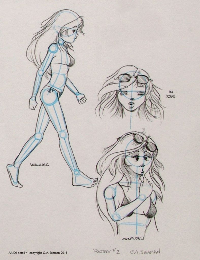
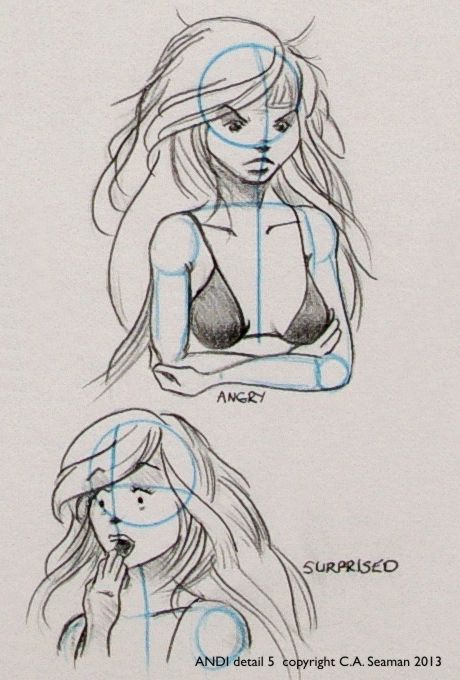
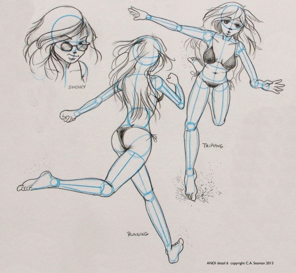
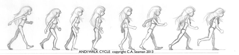
Many exercises in drawing were done to build confidence in rendering characters and drawing them quickly in a variety of gestures without models for reference. The same applied to settings, sidekicks, foils and secondary or antagonistic characters. Here are some of the drawings that came out of those exercises.
Early gesture test while sorting out the figure
Gestures 2
Gestures 3
Character design sheet after preliminary work. Body joints had to be shown in non-photo blue pencil on the final image.
Details 1
2
3
4
5
6
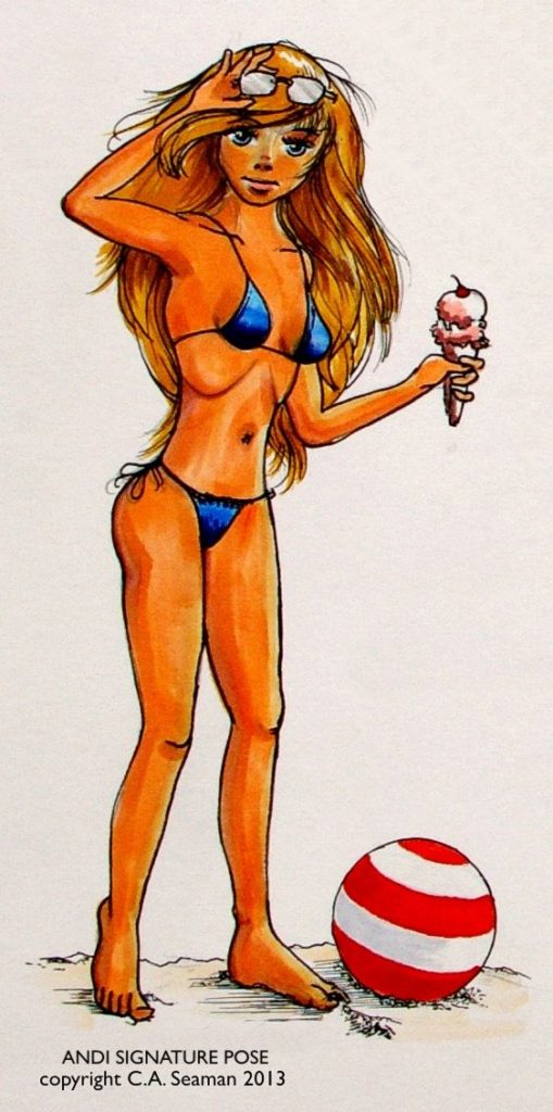
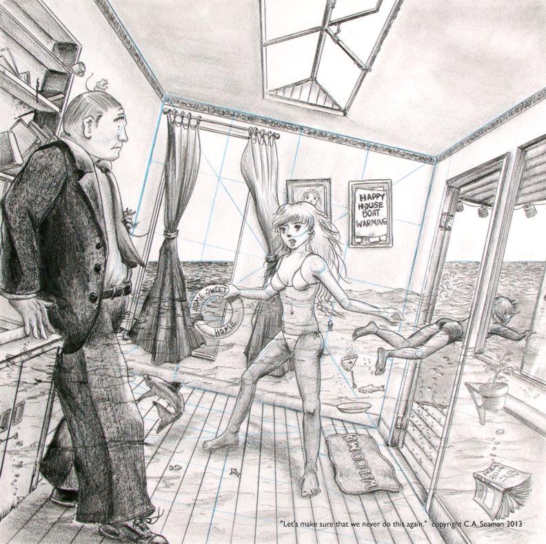
Final piece in the course. Dialogue line was supplied. We had to build the single panel comic art around it. I threw in a lot stage business on this and it was fun for people to go and find these Easter eggs, but as I was to discover later in other Cartooning courses, it would not be wise to do it on every piece.
This project was not just a lot of fun, it was a really interesting exercise in taking some beloved characters, a story that read like a cracking good yarn and putting them together using mixed media- in this case, Copic markers and coloured pencil. Having read the story and being asked to create a wrap-around cover, I had to design a composition that set up the narrative in the Darth Vader series, which begins immediately after the destruction of the first Death Star and our villain’s rather uncomfortable meeting with Emperor Palpatine to explain ‘his failure’. If you’ve read the series, try to figure out why I set it up the way I did.
The final piece
One of the most interesting fan pieces I’ve ever been asked to create. Click on the image to see a full size version.
This piece is in a private collection and may not be reproduced without permission.
As with anime and manga, I have been called a fan of comics. While not as touchy about that label, I still feel it is too compartmentalizing. If you have visited other postings in this website, you know there is more to me than the sum of one or two parts. Nonetheless, I have enjoyed creating works in the style of North American comics. What follows are some pieces from the archives of the old website.
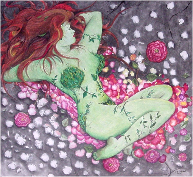
Poisy Ivy in Repose
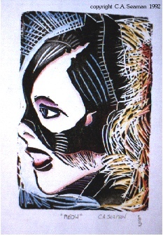
Catwoman print in mixed media
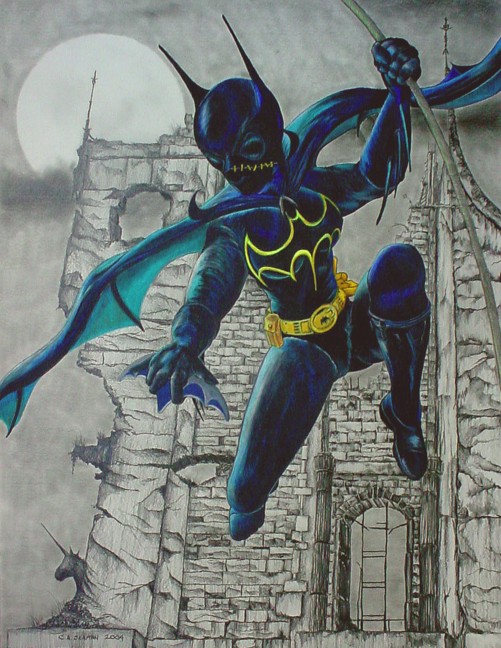
Batgirl (Casandra Cain)
From the Island of Misfit Toys
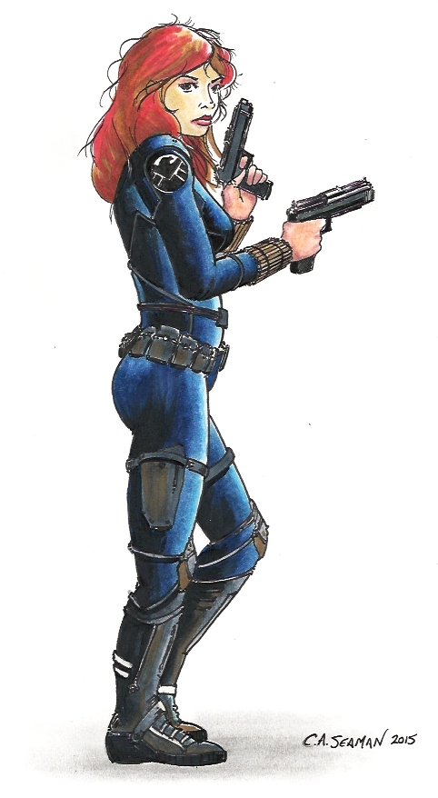
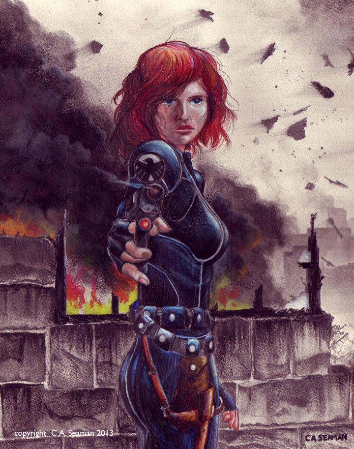
Black Widow
Black Widow mixed media
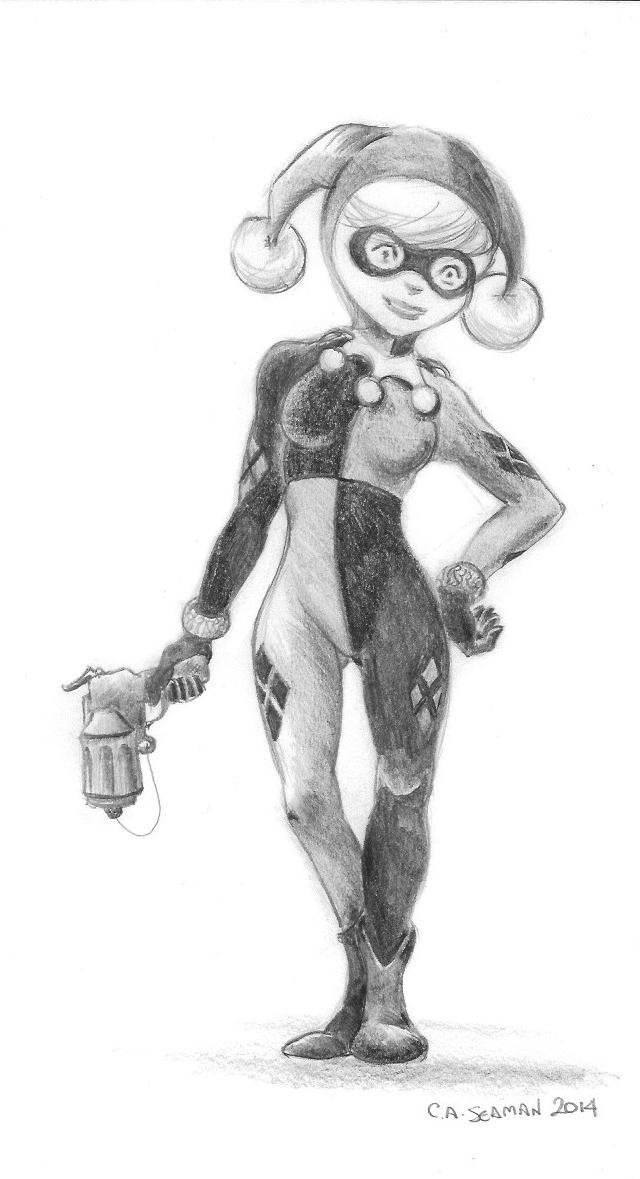
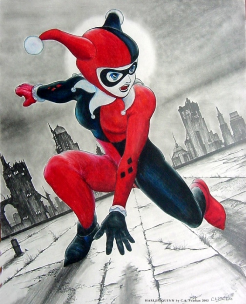
Harley Quinn, inspired by L’IL GOTHAM
Harley Quinn
Line study of Hit Girl
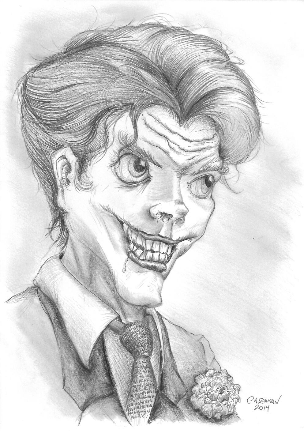
My take on Joker
Poison Ivy in Autumn- completed long before L’IL GOTHAM had Ivy going into a depression over the arrival of the harvest season and the coming of winter.
OTHER REQUEST DRAWINGS
Sonic!
In another post, I will share the creation of a comic book cover for a friend featuring one of STAR WARS’ favourite characters- Darth Vader!
(This essay reflects a practical academic application for some of the techniques and work I have developed in recent years. Feel free to read and use it. However, if you are to use it, be sure to give me credit.)
APPLICATION TO ESL
How can ESL benefit from the use of sequential art in the classroom? Historically, sequential art has already been used to help people learn the language better. Dry comics showing characters learning numbers, key words, concepts and other communication skills are present in many ESL guides. Indeed, those of us who have taken French as a Second Language at a young age will not soon forget the adventures of Jacques, Suzette and Pitou, the dog (the Francophone equivalent to Dick and Jane). However, beyond the basic function they possess in helping familiarize new learners with the language, there is little in the current material which exists that can capture the imagination of an immigrant audience in this language, and encourage it to read on in English as much for the enjoyment of reading a good story as for the obvious learning benefits it has. If immigrants are continuing to read, it is often in media printed in their own language.
What follows are some ideas on how to use existing comics, or photos to help improve literacy in the ESL learners we teach. You need not be an artist to understand these concepts.
SUGGESTED INSTRUCTIONAL STRATEGIES
Existing comics can provide a useful basis for teaching beginning language for the ESL learner. The sources are readily available in the daily newspaper. The instructor needs only to clip out strips with appropriate material and clearly defined images that are neutral in terms of controversial content, and photocopy them, (giving credit to the creative source, of course!), for the class. The use of a good photocopier is key to this process, as blurred, smudged images with poorly copied text will not work for the students. If size matters for the instructor, enlarge the strip to fill a larger piece of paper. If colour copies are available, the teacher could use them. However, many of the best comics or manga in the world is printed in black and white. Stylistically, as well in the sense of reproduction, this is a lot easier to work with, providing clearer images and less visual clutter for the reader.
What the teacher does with the strips as tools is up to that person, and what they are trying to accomplish in the class. Three possible uses for the completed comic strip are identified below:
1) Simple reader’s comprehension. Students read the strip and develop better language skills from the experience.The instructor may opt to replace text that is hard to understand or conceptually abstract with language of their own in the speech bubbles. However, remember that the material is someone else’s and copyright concerns may exist. Students can be evaluated on pronunciation, clarity of voice, inflection and knowledge of body language, expressions and basic content. Being visual, comics can teach a lot of communication skills to students simply through the way characters on the page are drawn. Many books on how to draw comics contain reference sheets on how faces that are happy, sad, frightened, or exhibit other emotions look on paper. Some of this material could be used to help educate students on the visual language of sequential art.
2) There is also the possibility that the teacher may want the students to interact more with the text of the comics. In that case, the speech bubble content may be erased and the students could be encouraged to place their own text inside. Whether the students complete this task alone or in groups is the choice of the instructor, considering the abilities of the pupils. Students could be evaluated according to appropriateness of dialogue, based on visual cues such as the action taking place, the body language or facial expressions of the characters portrayed.
3)The third strategy employing existing comics could be to take frames from strips which are familiar to students and chop them up, leaving the students to re-arrange them and develop a narrative of their own. This can also be done using magazine photos and other visual media, creating a kind of storyboard project, where images are described in short sentences or paragraphs by the students in the order in which they are arranged. This can be the most interesting of the assignments as the skills applied in this project are varied from art based to literacy based. The students could finish the project with an oral presentation, honing their skills as orators in front of their peers.
4) Students could also take existing strips, if the skill levels are not up to creating an entirely new narrative, and simply continue the story, or, if the last frame is removed, create an ending of their own.
5) Finally, take images from magazines, and lay them out for students. Using the images of their choice, they can arrange them in some order of their own and write a sentence of descriptive text to go with each. They could be encouraged to figure out some kind of narrative to go with the images and tell a story with them using three or four select pictures.
All text is copyrighted C.A. Seaman 2007, and may not be reproduced without written permission from the author/artist.