THE SPITFIRE IN COATS OF MANY COLOURS
In a new adventure, I signed up for a course in Colour Theory Foundation at George Brown College and got the chance to deepen my understanding of how colour works in art. I taught colour theory during my many years in the classroom, but the knowledge needed to get points across to my audience of adolescents was superficial compared to what I was able to examine here. It was a struggle at first, climbing to the top of the hill of existing knowledge to see from its summit the new world laid bare before me.
Working with military subjects, my palette has often been restricted to earth tones. Even when completing figurative art, intense hues were not exactly what I would be reaching for when placing them in the mixing trays. The opportunity to work with hues out of the tube in gouache has turned out to be a fun process, reuniting me with a medium I enjoy painting with.
From this point, I created a motif and used it for the subsequent pieces. I wanted to resist going to the old standby of aviation, as suggested by the instructor, but after much stewing and sketching, I saw saw on Instagram a picture of a photo-reconnaissance Spitfire entitled ‘A Perfect Example of Primary Colours’ and realised that was it.
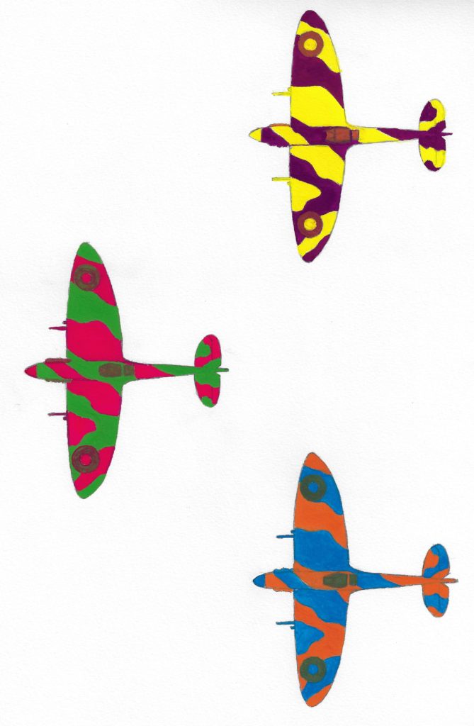
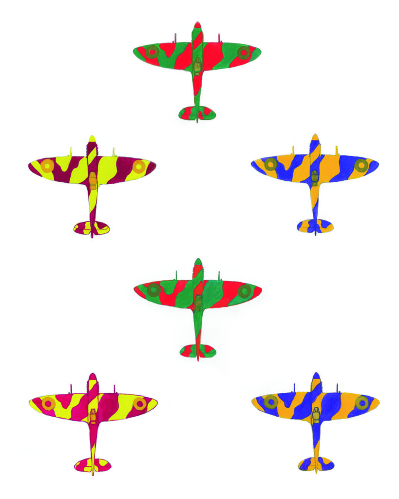
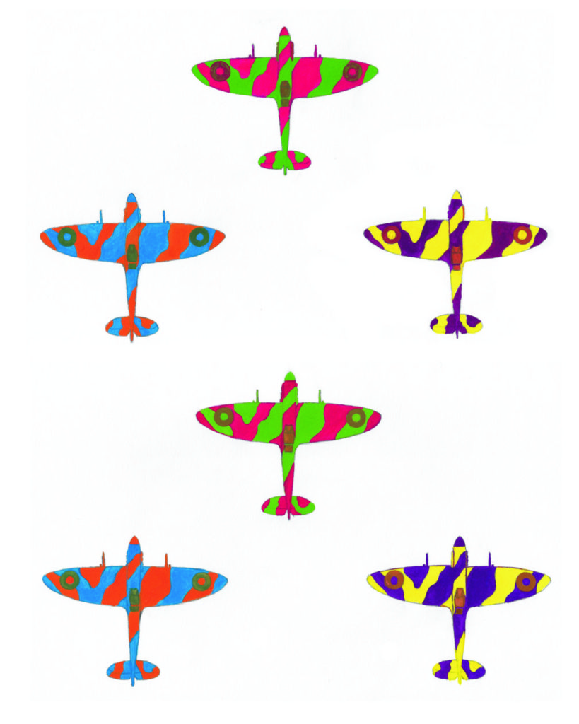
The next step was to create twelve studies of the aircraft in mixes of complimentary colours. What follows are the studies and a new composite piece I created from them.
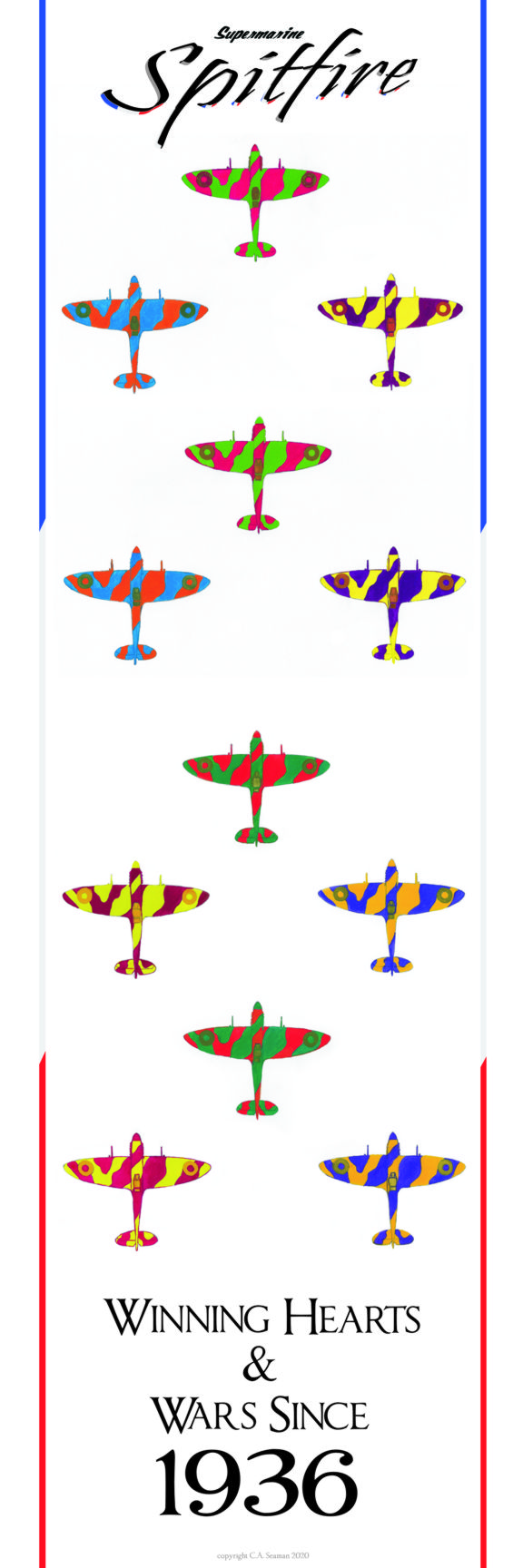
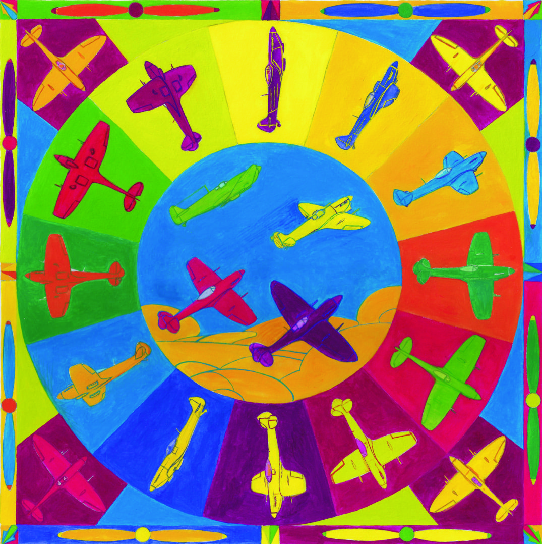
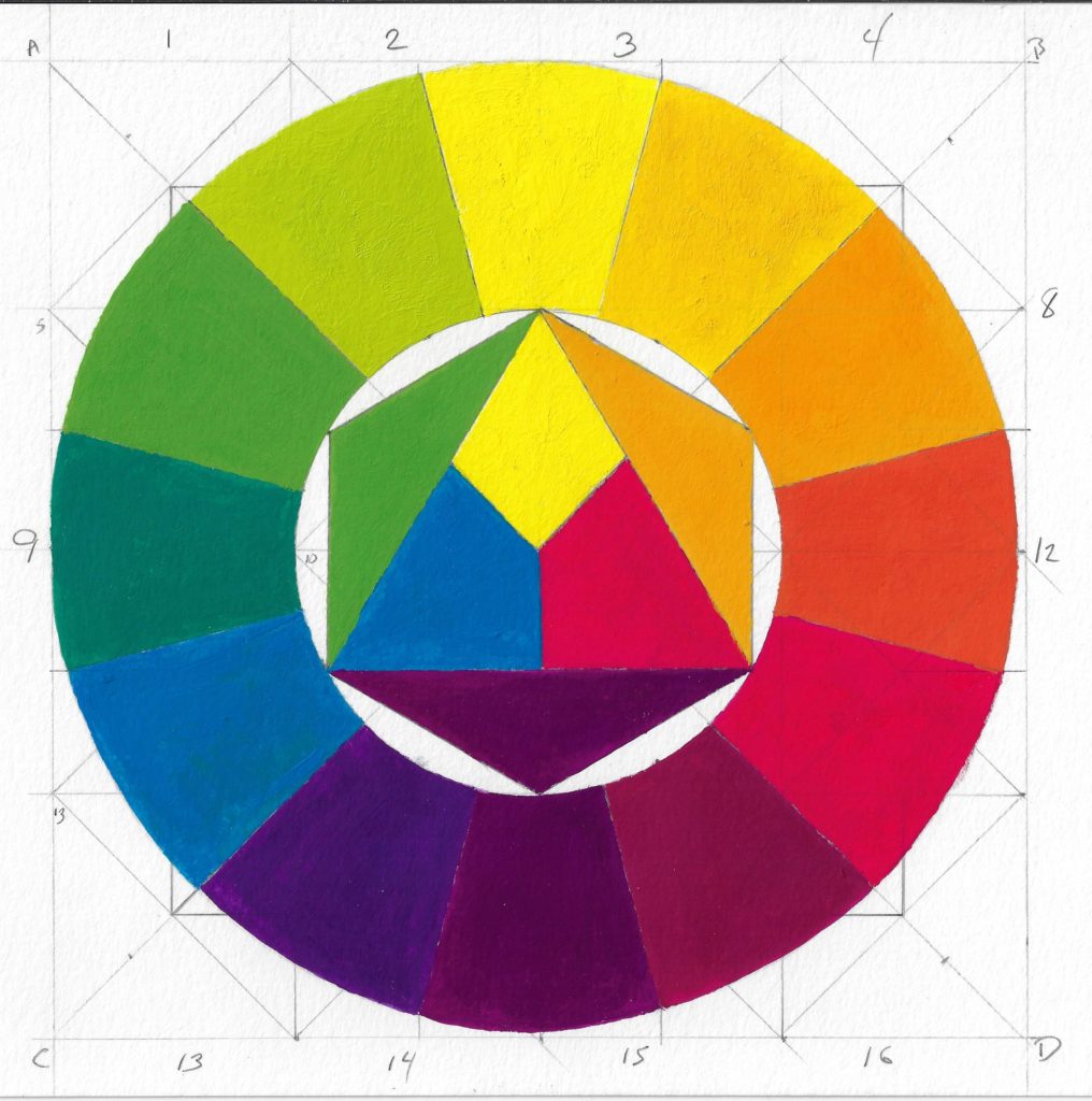
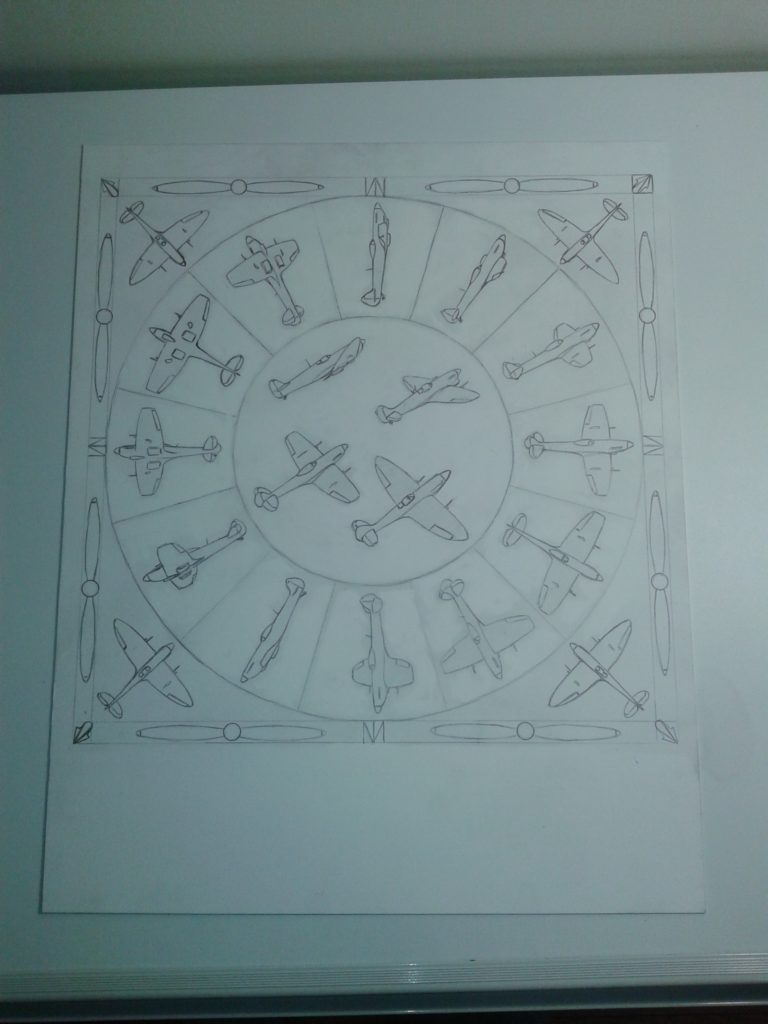
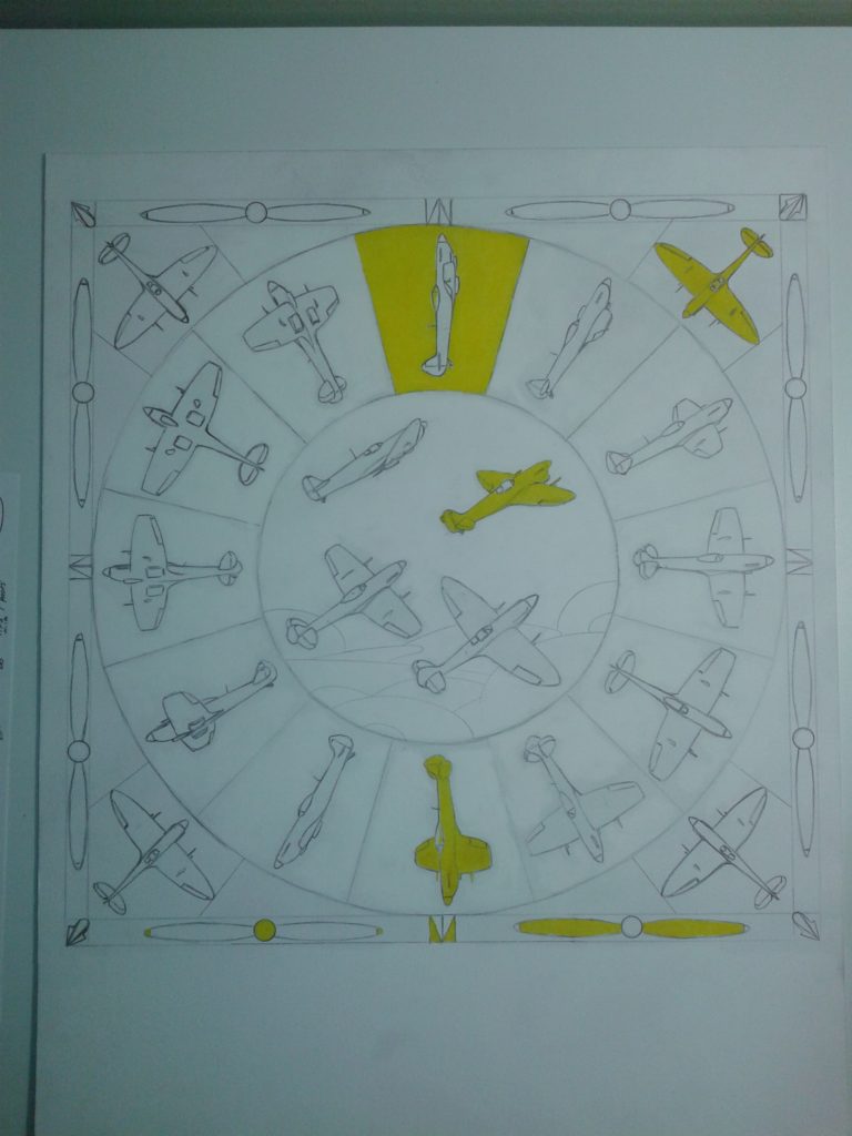
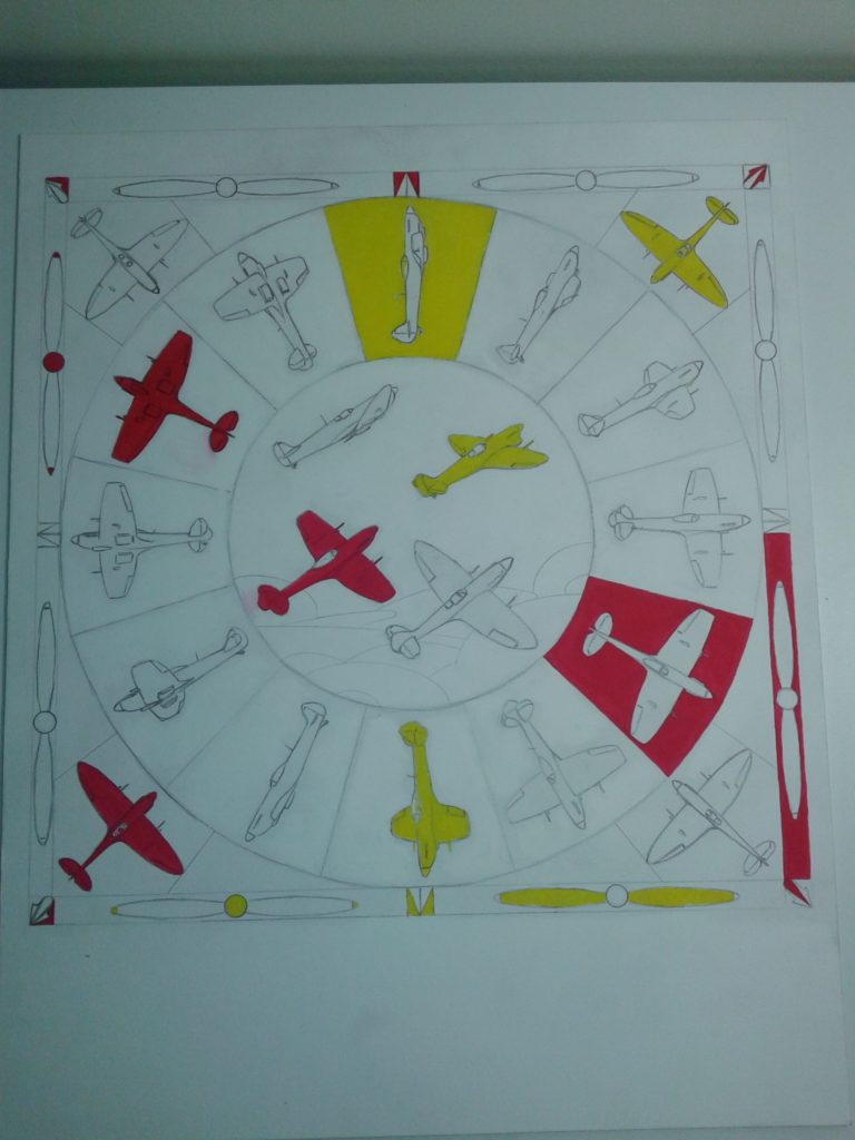
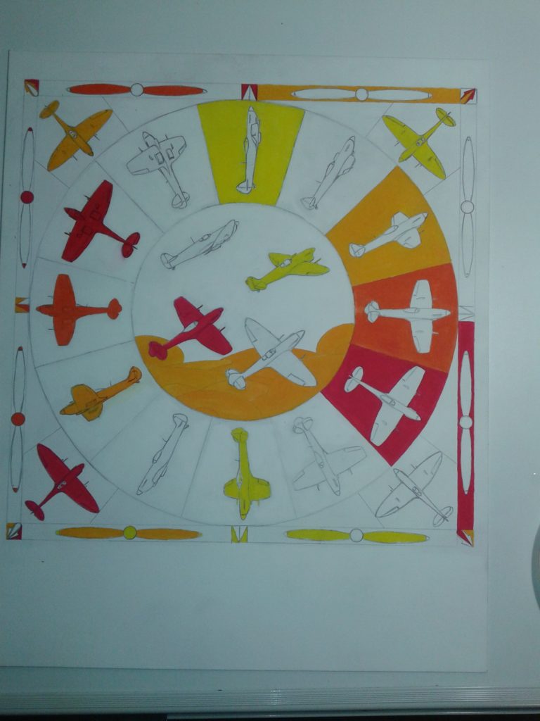
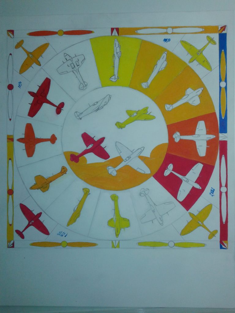
The next piece was to use the motif in a colour wheel featuring a shopping list of colour effects, including complimentary pairs, triads, tetrads, analagous colours and… the Bezold Effect! This one was so complex that I completed a primer to identify what colours went where in the piece. I then pulled out the paints and applied them using the primer one hue at a time. The images below show some of the process behind this piece.
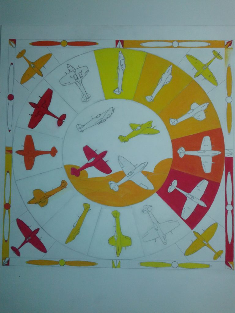
The final piece, scanned and in a better resolution follows below…