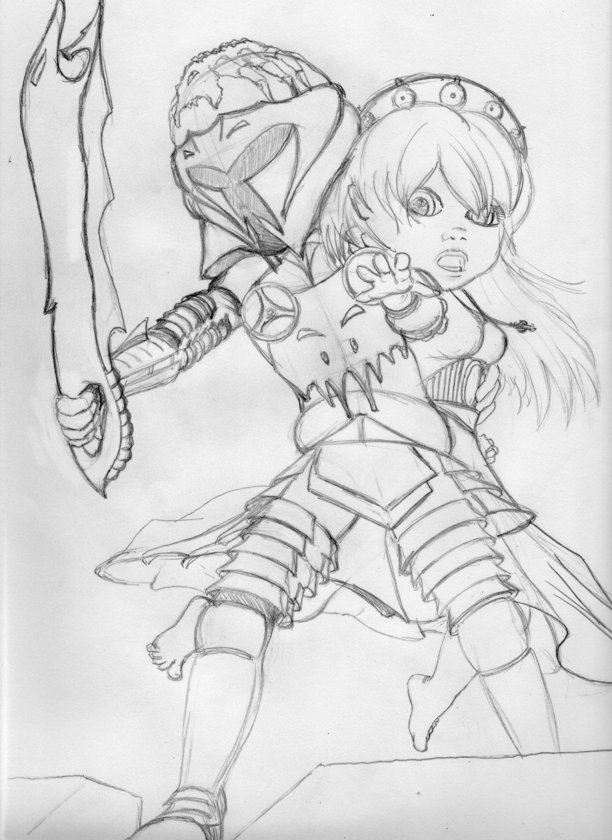
CHARACTER DESIGNS FOR AN X-BOX INDIE VIDEO GAME
The story of CORRUPTED began just as work on SARGASSO, my self-published series of books, was winding down. ‘People who knew people’ stuff happened and I was offered the chance to meet Paul and Jeff, who were developing this game for the X-Box Indie platform. We got along well and before long, I was brought in to work on character designs for the project.
Here are some things you might want to know about me at the time I began work on CORRUPTED.
- I had never played a video game on either X-Box, Playstation, or Nintendo beyond Wii. I had flown a bit on Microsoft’s Flight Simulator, (and got vertigo on the screen?!), played some games on a desktop computer that had me using directional keys to steer cars onto sidewalks and fun stuff like that. But that was it.
- I had no formal training in character design.
- Any character design I had done was based on looking at model sheets I saw in books and copying the format of figure rotations and gestures. “If that’s how Disney does it, I can too.”
- I had no concept about the architecture of what these games looked like, what sprites were, what characters and stories were popular in gaming culture or anything like that beyond FINAL FANTASY, because of the anime connections it had.
Basically, I was clueless. And being clueless made me perfect for the job apparently because although I had what was then self-taught art smarts, some skills and experience publishing a few books, my mind was a blank slate untouched by the influences of video games. Consequently, I wouldn’t inadvertently slip in some materials that buried themselves in my subconscious from previous game play experiences, leaving potential players saying things like “Hey! That’s just like the Blade of Pohtus used by Dojt Sryvat from MAGA 4: WASTELANDS OF THE REPUBLIC!”
Fans can be annoyingly observant about things like that…
Anyway, here we were, embarking on this amazing journey, and I must say I have only fond memories of my experiences with Paul, Jeff and the creative process that went into CORRUPTED. It was, in the end, what brought me to taking courses at George Brown and finally learning what all that stuff I’d been doing was actually called.
There are three parts to this story. Scroll down to read them and see the accompanying process work.
ROUGH DESIGNS
Paul saw my work from SARGASSO and while he was impressed with the illustrations, he wasn’t sure I had what he and Jeff needed for the game until I started pulling out books on manga character design and he identified with the super-deformed characters called ‘chibi’. Chibi is a super-cute form of manga character design where the figure is about three to four heads tall and the eyes are huge. The body proportions are all distorted so even crazy looking weapons look ‘cute’ to an outsider. Knowing I had resources and watching me explain them, Paul agreed to meet me again once I came up with some concepts. For that, I needed information on the characters- who they were and what they were like. I took the information and began with some further research into video game character designs, receiving much help from students in the form of screengrabs of sprites from ZELDA. One even tried to create sprites of his own to show me how it was done. From there, I sat down one day while the classes were working and I had nothing else to do and came up with two ‘chibi’ styled characters.
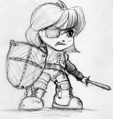
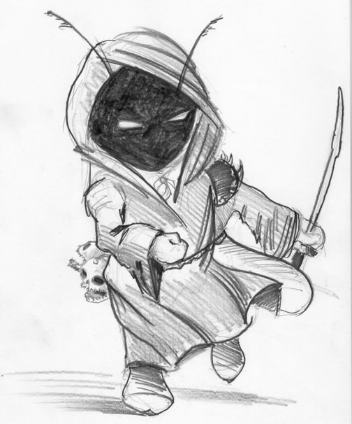
You can see the guidelines on the knight as I blocked out the character. The other one was something I did for fun, turning out to be a big hit with the students. They loved the antenna and the Jawas look to it, but really went mad over the fact the skulls on the belt were supposed to talk, hurling abuse at passersby. Originally, I was going to keep that one for myself, but with the work on SARGASSO taking up so much time, I decided to gift him to Paul and Jeff, who made him into the merchant for CORRUPTED.
Two elements carried on from this sketch of the knight to the final version, ie. the breastplate and aggressive posture. Everything else, as the character evolved, changed. As uniformity was going to be key, I did more reading, purchasing a great book called SUPER CUTE! KODOMO MANGA, written and illustrated by Kamikaze Factory from Spain and published by Collins Design (ISBN 978-0-06-192755-3). From that research, I created my own original base body template, based on a ninja pose on page 206 that caught the eye of the guys when they first saw the book. Thus, in a scrum around the dining room table in my house, we could now bash out ideas for the characters and just draw on the sheets until the pile was exhausted. The interesting thing was, though, given the information I had from Paul and Jeff, when we sat down to do this and I showed them the first revised concept, they went for it with only minor changes.
Anybody need some template sheets? I’ve got lots left over!
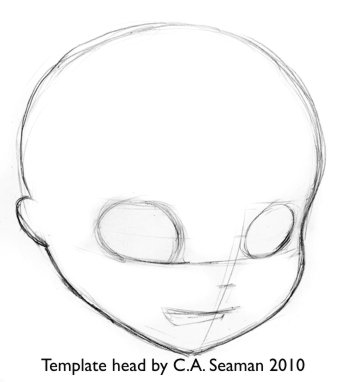
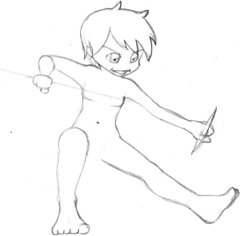
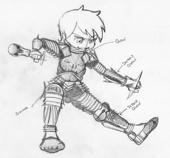
These were the base templates. The image below was the first- and main development sketch for what would become the evil knight in CORRUPTED.
A helmet design would emerge in much the same way and, unchanged, I will show it in the next section. I wanted the knight to be shown in action as befitted the nature of the game. So, the template was created to work with this as the premise from the beginning. We also worked on swords, bows and arrows and created a list of characters to be created at that point. Then, as you will see in the next section, I would create the unifed character reference sheets for an animator to use in creating the sprites. Click on “Final Character Designs” to see how they came out.
CHARACTER DESIGNS
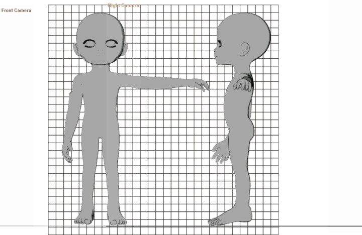
I knew the animator would need to have characters that worked from all angles, with armour and clothes lining up in multiple poses. Having read many books on the making of movies and series, I decided to create for the main characters- the evil knight, the good knight and the princess- templates with front, side, back and top views done to scale on a grid background. For the others, top and front views would do. Paul and Jeff wanted the characters to be see from the top in the game, so it was agreed to put some emphasis on heads where possible.
To unify the designs, I fired up Poser on the computer and opened Sadie a computer model who was the foundation of the original Poppy in SARGASSO. (Refer to the article on the art of SARGASSO to see some imagery to put this into context.) Enlarging her head and making her body as gender neutral as possible, I created the above mentioned views by rendering her from those angles with Poser’s cameras. By not moving the cameras once they were loaded, I was able to guarantee consistency in proportions and scale in the renderings, making it easier to line them up on the grid I would later create in Corel Photopaint.
This is Sadie, in case you haven’t seen her before.
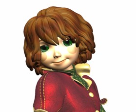
This is how I modified her for the body template. Note how the camera names are on the images I composited. I also enlarged the feet, as requested by Paul and Jeff.
Below is how I drew on the costume for the evil knight over the photocopied template. I followed the same process for all the characters, thus keeping them fairly consistent.
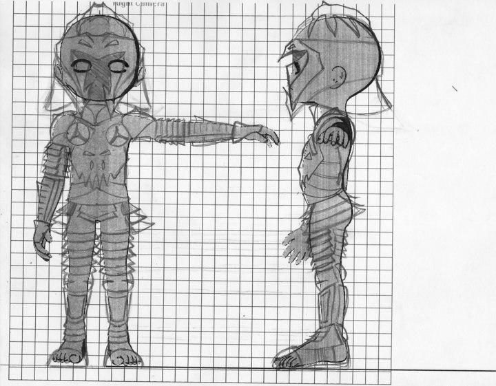
From there, I took the images to Staples, photocopied the sets and shaded on the back of each copy with a soft pencil. I then carbon-traced out the drawings to clean paper. As the grid was only useful for the initial layout to keep everything lined up, I did not need it for the final inking, which was done afterwards. I use carbon-tracing often when working on large projects to preserve all reference materials in case of a foul-up and this has proven to be a smart practise over the years on those occasions when I have had to modifiy a piece or redo the final work. I also keep the reference materials after the job is done for years in many cases, just so I can recall the creative processes used when I need to do so.
THE EVIL KNIGHT- FINAL INKS
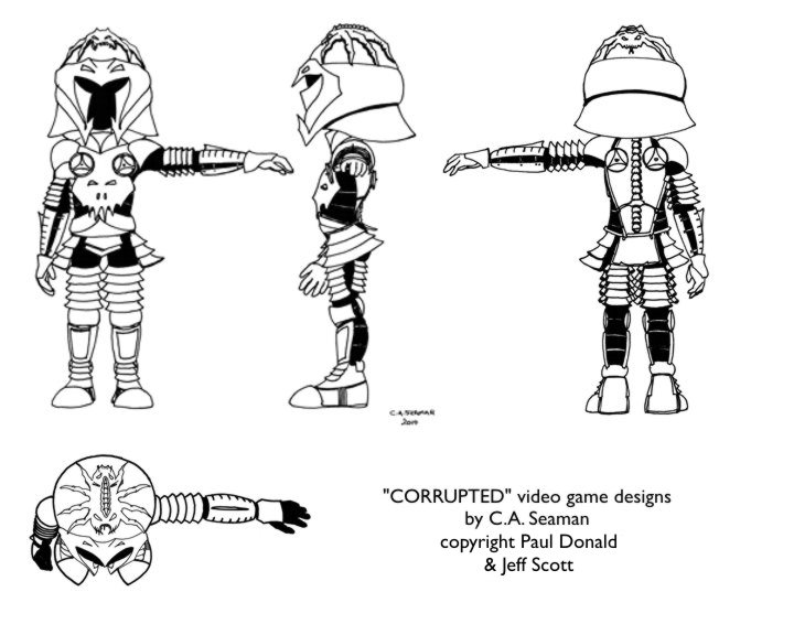
The top of the head was an important part of the design as this was what players would see most when playing the game. With the chibi design, it meant the head would overwhelm everything else around and beneath it. Thus, the evil creature possessing the knight was created as a focal point. I think that was my idea, but I could be mistaken. Looks nasty, though.
THE GOOD KNIGHT
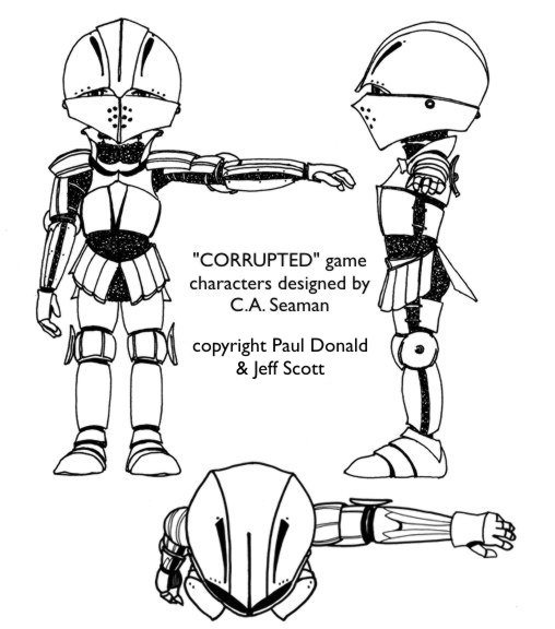
The armour on the evil knight was meant to be spiky and concave, glowing green between the plates. By contrast, I suggested the good knight should have softer forms and curves, with the armour looking more like the material I saw in reference books I consulted from the local library’s childrens’ section. Good call on the part of the librarian who helped me. The best books really were there- not in the adult section upstairs.
THE PRINCESS
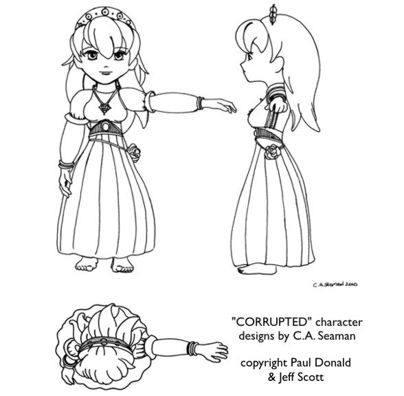
There is a reason why she is barefoot. I suggested she might have been grabbed from her chambers while engaging in her daily ablutions. There was something innocent in this presentation as well, I thought, and I transferred it to the final cover art.
THE MERCHANT
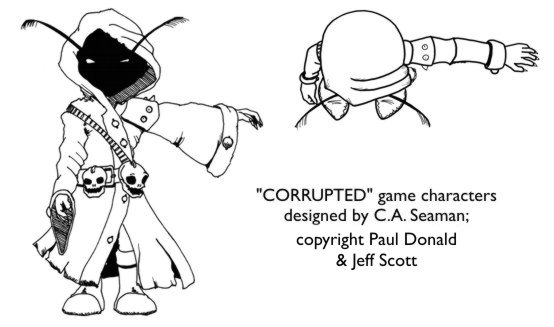
I moved the skulls to the front for more impact and gave ‘him’ nasty looking nails and a little more detail on the cloak to make him look a little less like a Jawa.
THE RANGER AND VILLAGER
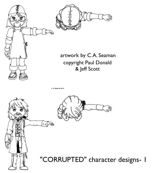
What can I say about the Ranger? Everything I’ve ever seen of them in fantasy art seems fairly consistent. Paul, Jeff and I agreed to keep it within those common concepts. As for the villager, he looks like he could be happy in a field, at the forge, or behind the counter of the local tavern.
To see how the cover and the animated evil knight came together, click on the link “The Cover Art and Logo.”
COVER, LOGO AND ANIMATION
Once the characters were done and signed off, it was a race to get the cover completed. Time was flying and I needed to start prep work for the main gig- school. Paul, Jeff and I worked through some ideas and I developed some concepts using Poser and Corel Photopaint which I thought might work. Neither Paul nor Jeff felt the love, though, and these early efforts simply became stepping stones to the final work. The meeting when we hashed out the cover concept, though, was some of the best fun I had in the whole project. It was like being in the big studios working through a creative session on a movie where everything went on the table and was bounced around until it stuck or fell apart.
Poser was fantastic as a pre-visualization tool at this stage. I used the Sadie base I developed for the templates and posed versions of her with prop weapons and sets to give the guys a feeling for the final piece. They made suggestions and eventually, we agreed on this composition after I tweaked three versions and they cast ballots by phone and email.
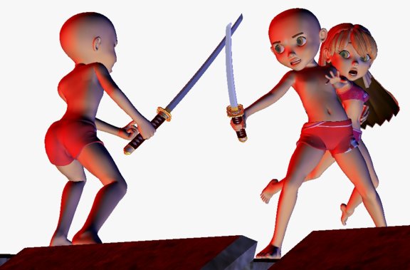
I blew up the images and carbon traced these basic forms onto larger art sheets- one each for the good and evil knight. With those templates, I then drew the armour, weapons and costumes based on the original designs. The new drawings became the foundation for the final work.
Without the CG base reference for proportions, I don’t think I could have finished the piece in time. I prefer going freehand whenever possible, but that armour and the princess’s dress was very hard to do. So having the bathing suit Sadie template as a guideline made getting to the freehand stage a lot faster. As you can see below, the guidlines are still in place, although the bodies have disappeared under the clothes and armour. Only the face of the princess remained relatively un-altered at this stage. The background is clear in both images.
I added all the buildings and background elements directly to the final piece later, hoping all the time they would work with the characters and not overwhelm them.
Please note in the gallery below, double-click on each image to bring up a larger version in a separate gallery.
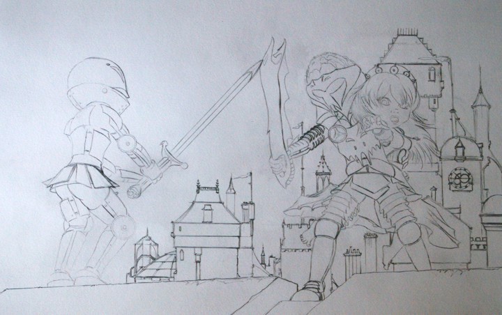
Back to Staples to create photocopies of these drawings. They would be transferred afterwards onto the 100lb paper I bought for the final art. What follows are snapshots I took as the work progressed. They are not very good, but did give Paul and Jeff tantalizing glimpses of what was to come. Paul and Jeff wanted the final work in coloured pencil- something I had not used on this scale since 2007. It was great getting back to it, though. There’s so much computer work out there that people forget that wonderful results can be obtained from these simple tools.
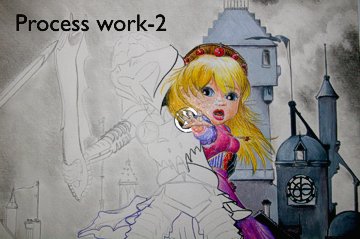
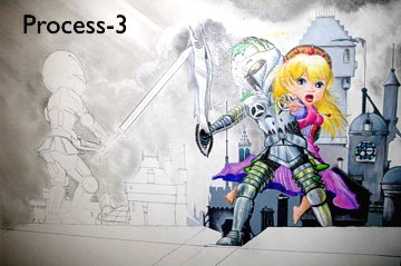
Look closely…
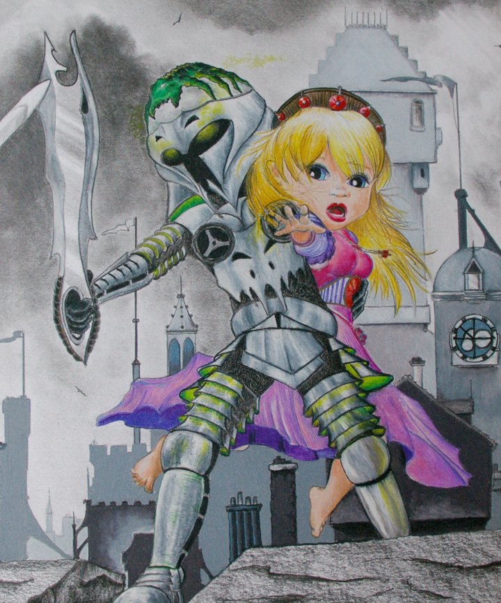
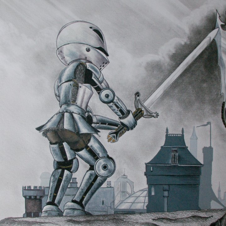
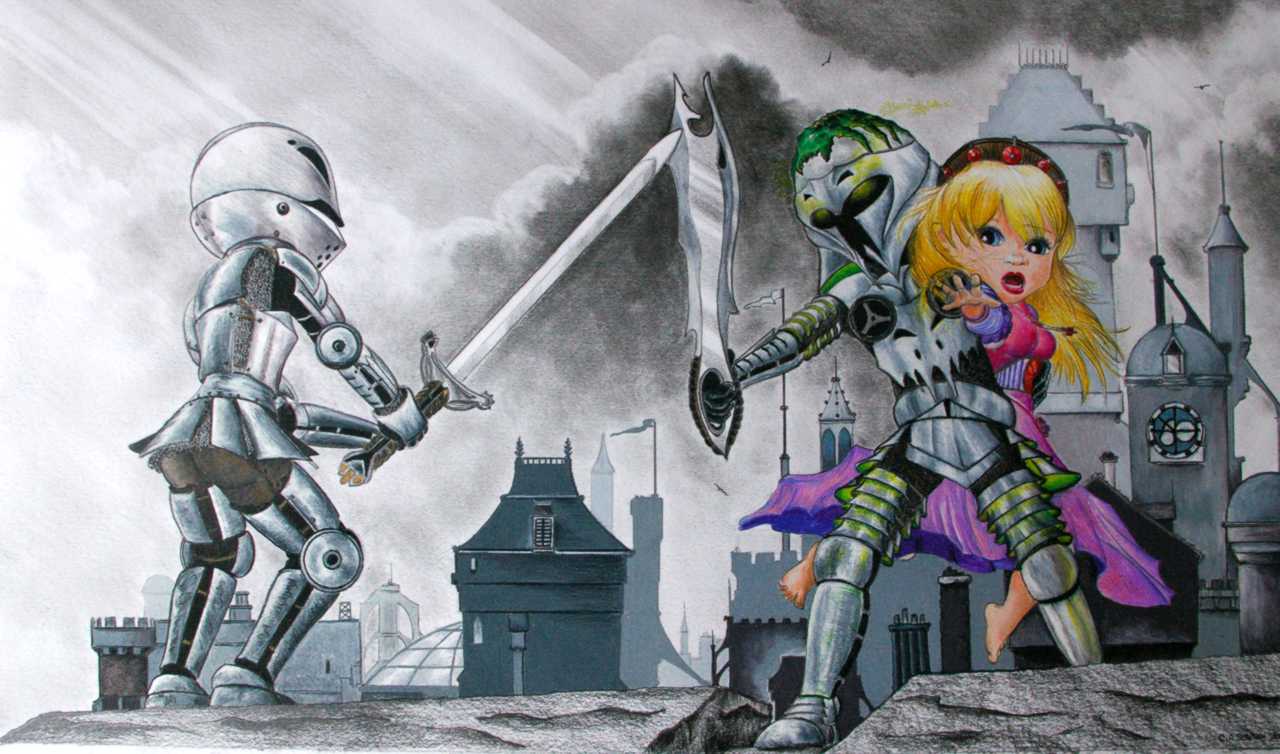
Did you see it? Just before I finished this part of the image, I reversed the sword in the hand of the evil knight. Check the transfer drawing again if you missed it. I was not happy with the piece as I working on it, but could not put my finger on it, being too close to the work. The moment I concentrated on the sword, I knew that was the problem. Once flipped, I felt hugely better about the piece and it was done in no time.
This is actually a mixed media work. The sky and stones are done with graphite pencils. Only the buildings and characters are completed with coloured pencils. The cover design at the top of the page has the colours tweaked a little from what you see here, which is closer to the original. However, I think the cover with the composited title looks wonderful. I don’t know who did it as I signed off after the cover was done. I definitely like it, though.
THE LOGO
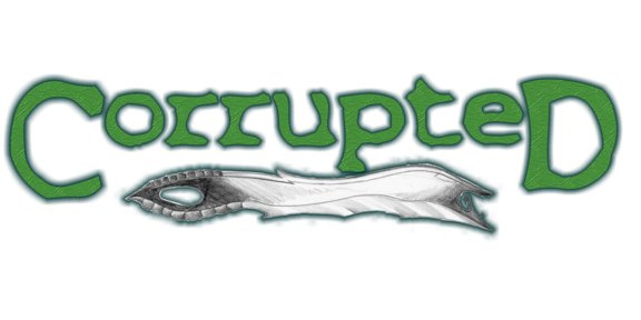
This was the second design. Green was the order of the day. I used red in the earlier version with original text I created that looked like a graffiti tag. As you can see, if you compare this one with the logo on the cover art at top, the texture on the letters has been redone. We agreed on what you see here, but I like the other on the final cover better. It looks like scales! Oh, the nasty looking thing underneath is a view of the sword in regular graphite pencil.
A WONDERFUL SURPRISE!
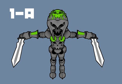
This arrived in an email one day- the evil knight as rendered by an animator in Sweden. If you read Paul and Jeff’s blog at the time, you could follow links to the creator’s own site. I think the drawings translated really well into the final model. The sword was simplified in the blade, but the handle remained pretty much as imagined. And you should have seen this guy move in the demo animation!
And that was it. At the time of writing, the game was still available on the X-Box Indie platform. People I’ve talked to who played it had a lot of fun. I did get an X-Box later and played a few games on it, but never became a huge fan because of the time involved and all the other projects I wanted to work on. I will not say ‘no’ to another stint of character design, though. CORRUPTED was just too much fun.

